2026 Style Formula: color blocking outfits street style in Motion
Color blocking outfits street style: the modern way to look bold without looking chaotic
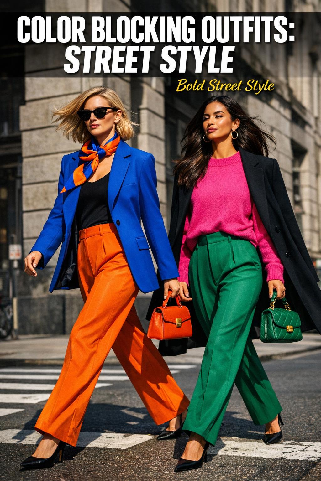
The quickest way to spot a confident dresser in New York during fashion week season isn’t always the logo on a bag or the height of a heel—it’s the ease with which they wear color. A truly good color-blocked look reads intentional from across the street: clean shapes, clear saturation, and a sense that every piece belongs in the same visual story. That’s the heart of color blocking outfits street style—a style language built on bold pairings, strong lines, and a little bit of nerve.
Street style made color blocking feel wearable because it lives in real environments: sidewalks, show venues, commutes, and long days moving from place to place. And while the trend has a history, it keeps updating—especially as editors and showgoers push saturation, sharper contrasts, and more modern proportions. If you’ve ever loved the idea of chic colorful outfits but worried you’d look “too loud,” this guide is designed to help you make decisions that feel stylish, grounded, and current heading into 2026.
Along the way, you’ll see how celebrity examples like Victoria Beckham and Gabrielle Union clarify what works, why certain color combinations for clothes look modern instead of costume-y, and how details—like a Loewe scarf—can turn a simple outfit into a street-style moment.
What color blocking actually is (and what it isn’t)
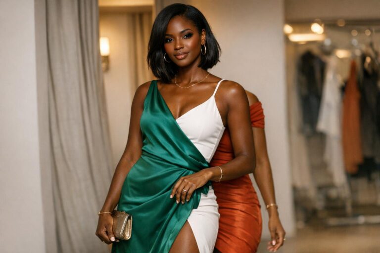
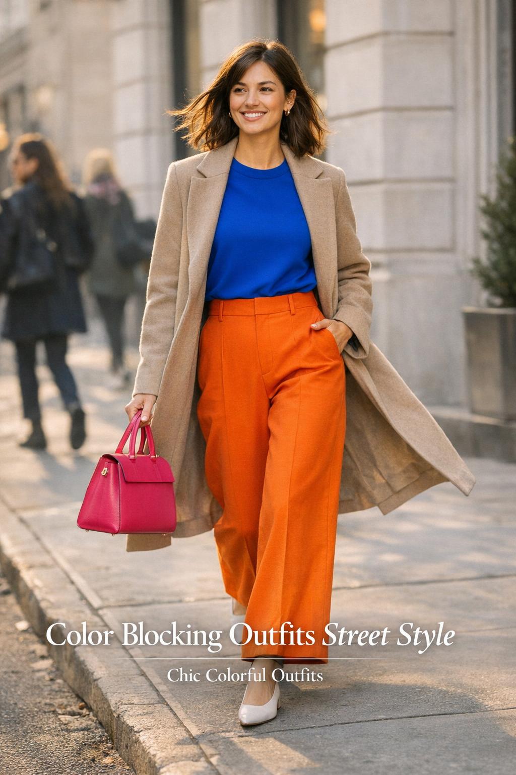
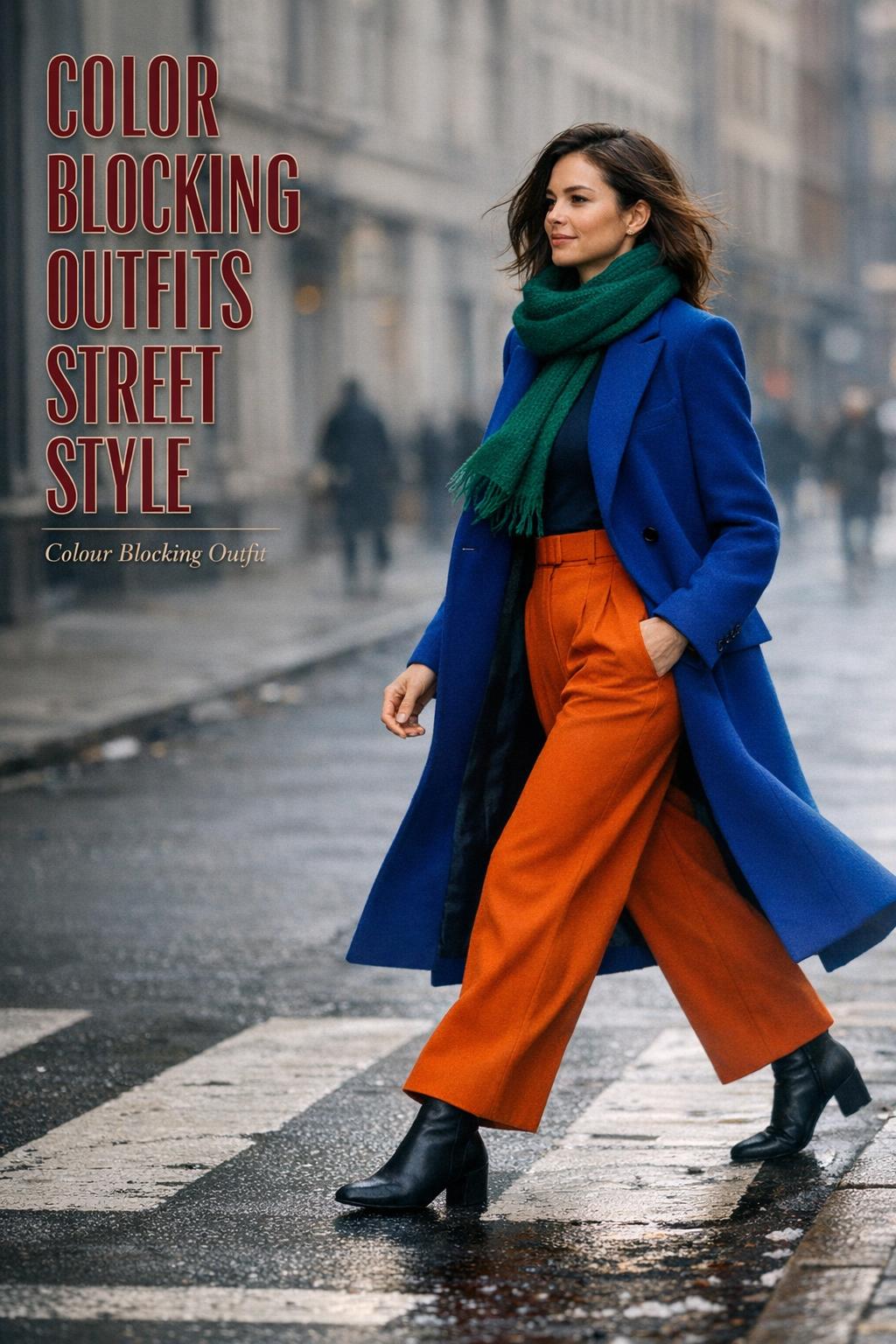
Color blocking is the practice of combining distinct, solid blocks of color in one outfit so each color reads as its own clear “panel.” The effect is graphic and deliberate, which is why it photographs well and shows up repeatedly in fashion week street-style galleries. The simplest versions rely on primary and secondary colors; more nuanced versions play with saturation and modern silhouettes so the outfit feels directional rather than retro.
What color blocking isn’t: a busy mix of multiple prints fighting for attention, or a head-to-toe rainbow with no focal point. In the best bold street style, the colors do the work—shapes stay relatively clean, and the outfit has an obvious structure (for example, one color on top, another on bottom, plus a deliberate accessory accent).
Why street style made the technique feel current again
Street style gives color blocking a real-world test: can you walk in it, sit through shows in it, and be photographed in unpredictable light? That’s why you’ll often see saturated, modern color pairings in places like Copenhagen and New York—cities that repeatedly show up as backdrops where strong color reads crisp against urban architecture. Color blocking also fits the street-style mindset: it’s expressive, quick to interpret visually, and easy to personalize without needing a complicated outfit formula.
The 2026 lens: saturation, simplicity, and “rules” that make it feel modern
As the conversation around the color-blocking trend moves into 2026, the most useful way to think about it is not as a rigid set of do’s and don’ts, but as repeatable rules that keep the look modern. Across editor-driven trend coverage, a few priorities consistently rise to the top: strong saturation, clean blocks, and a sense of modernity in how the outfit is assembled.
A colour blocking outfit can be striking and still feel effortless if you build it around clarity. Clarity can mean fewer pieces, fewer competing details, or simply choosing two colors that have a confident relationship (complementary contrast, or a primary/secondary pairing) and letting them dominate.
Tips: a practical “street” rule for bold color
If you want your color blocking to feel street-style believable—especially in a New York context—make sure you can describe the outfit in one sentence. “Blue top, red bottom, scarf as an accent” is easy. “Green shirt, orange bag, purple shoe, yellow sunglasses, and a patterned coat” usually stops being color blocking and starts becoming visual noise. When in doubt, simplify the accessories before you simplify the colors.
Iconic anchors: what celebrity color blocking teaches you about proportion and polish
Celebrity examples work best as learning tools when you focus on the mechanics, not just the fame. Two of the clearest modern reference points are Victoria Beckham and Gabrielle Union—both repeatedly used as anchors for color-blocking conversations because their outfits tend to be decisive, clean, and easy to decode.
Victoria Beckham: color blocking that looks architectural
Victoria Beckham’s color-blocking moments are often described through primary color blocks and a modern redesign of the palette. The lesson isn’t only “wear bold color,” but “wear bold color with structure.” Strong color blocks look more expensive and intentional when the silhouette is streamlined and the color placement looks planned—top-to-bottom blocks, or a single dominant block with a secondary one that supports it.
Her fashion-week-adjacent appearances (including around New York Fashion Week) also highlight a street-ready reality: color blocking reads best when the outfit can move. If your pieces pull, bunch, or need constant adjusting, the blocks visually break—especially in photos. The more stable the fit, the cleaner the block.
Gabrielle Union: technique-forward color blocking you can replicate
Gabrielle Union’s approach is often framed as “how to color block your outfit,” which signals something important: it’s not only inspiration, it’s instruction. The teachable part is technique—choosing color pairs that feel intentional and repeating a tone so the look feels cohesive. In practice, that might mean letting one saturated color lead, then echoing it with a smaller element elsewhere so the outfit doesn’t feel split in half.
In street style terms, this is a very usable strategy for anyone who wants chic colorful outfits without feeling like they’re wearing a costume: keep the outfit graphic, then add one controlled “echo.”
Brands as punctuation: the accessory detail that changes the whole read
Sometimes, street-style color blocking is made memorable by one specific product detail—like a Loewe scarf used as an exemplar accessory. The point isn’t that you need that exact scarf; it’s that an accessory with strong color can act like punctuation. It finishes the sentence of the outfit. And in fashion-week environments, those branded, recognizable accessories often become the clear focal point that helps the rest of the outfit feel deliberate.
It’s also a reminder that “brand energy” matters. A contextual mention like Saint Laurent can signal a different vibe than a playful scarf moment: sharper, sleeker, more nocturnal. Even when the brand is only part of the broader conversation, it helps define the aesthetic lane your color blocking sits in.
Color theory without the textbook: choosing color combinations for clothes that hold up on the street
The reason primary and secondary colors show up so often in street-style color blocking is simple: the eye reads them quickly. Strong, recognizable hues create immediate impact, especially in candid photography. But successful color combinations for clothes aren’t only about picking two loud colors; they’re about choosing a relationship between them that feels stable.
Think in terms of a color wheel and the idea of complementary or neighboring relationships. Complementary combinations bring high contrast and energy; closer pairings can feel more modern and calm even when the colors are saturated. The “right” choice depends on what you want your outfit to communicate and how comfortable you want to feel wearing it all day.
Primary and secondary palettes: why they keep winning in street style
Primary and secondary colors are the easiest entry point because they create clean blocks without subtlety. Street-style expressions often lean into these pairings because they photograph crisply and instantly read as a deliberate look rather than an accident. If you’ve ever looked at fashion week galleries from New York or Copenhagen and thought, “That outfit is bold but not messy,” chances are the palette is doing a lot of the work.
Tips: how to test a palette before you commit
Before you build a full colour blocking outfit, test your palette in a low-stakes way: hold the two garments next to each other in natural light, then step back. If you can’t tell which color is supposed to lead, the pairing may feel visually unsettled. Choose a “lead” color (the larger block) and a “supporting” color (the smaller block). This one decision prevents a lot of last-minute outfit doubt.
Street-style settings that change how color blocking looks: New York and Copenhagen
Color blocking isn’t worn in a vacuum; the city around you becomes part of the palette. That’s why street style coverage often ties color blocking to specific locations—New York in particular—and why cities like Copenhagen show up as reference points for showgoers and notable moments. The same colors can read differently depending on the architecture, light, and pace of the day.
New York Fashion Week: sharp contrast and modernity
In New York, color-blocking street style often leans into saturation and modernity: strong color with crisp lines, styled for movement between venues. The vibe tends to reward confidence—bolder contrasts, cleaner silhouettes, and practical decisions that still photograph well. It’s a city where street style is both lived and documented, so outfits that are easy to “read” tend to stand out.
Copenhagen: playful clarity and street-style experimentation
Copenhagen street style is frequently positioned as a place where color feels expressive and intentional. The takeaway for your own wardrobe is the idea of experimentation within structure: try unusual saturation levels or unexpected pairings, but keep the outfit grounded by maintaining clear blocks and a coherent silhouette. When the outfit is built on clean color placement, you can afford to be more adventurous in the hues.
Color-blocking formulas you can actually repeat (without looking like you’re repeating yourself)
One reason color blocking stays popular is that it’s modular. Vogue’s approach to colorful outfit formulas captures the best part of the trend: you can swap pieces while keeping the underlying logic the same. That’s how street style regulars create variety without reinventing their wardrobe each time.
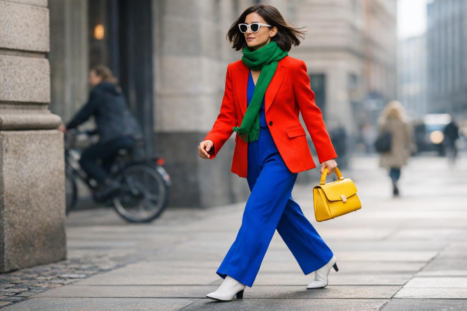
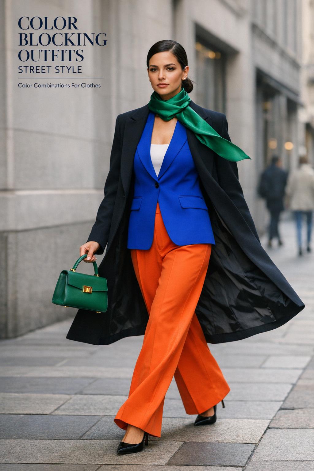
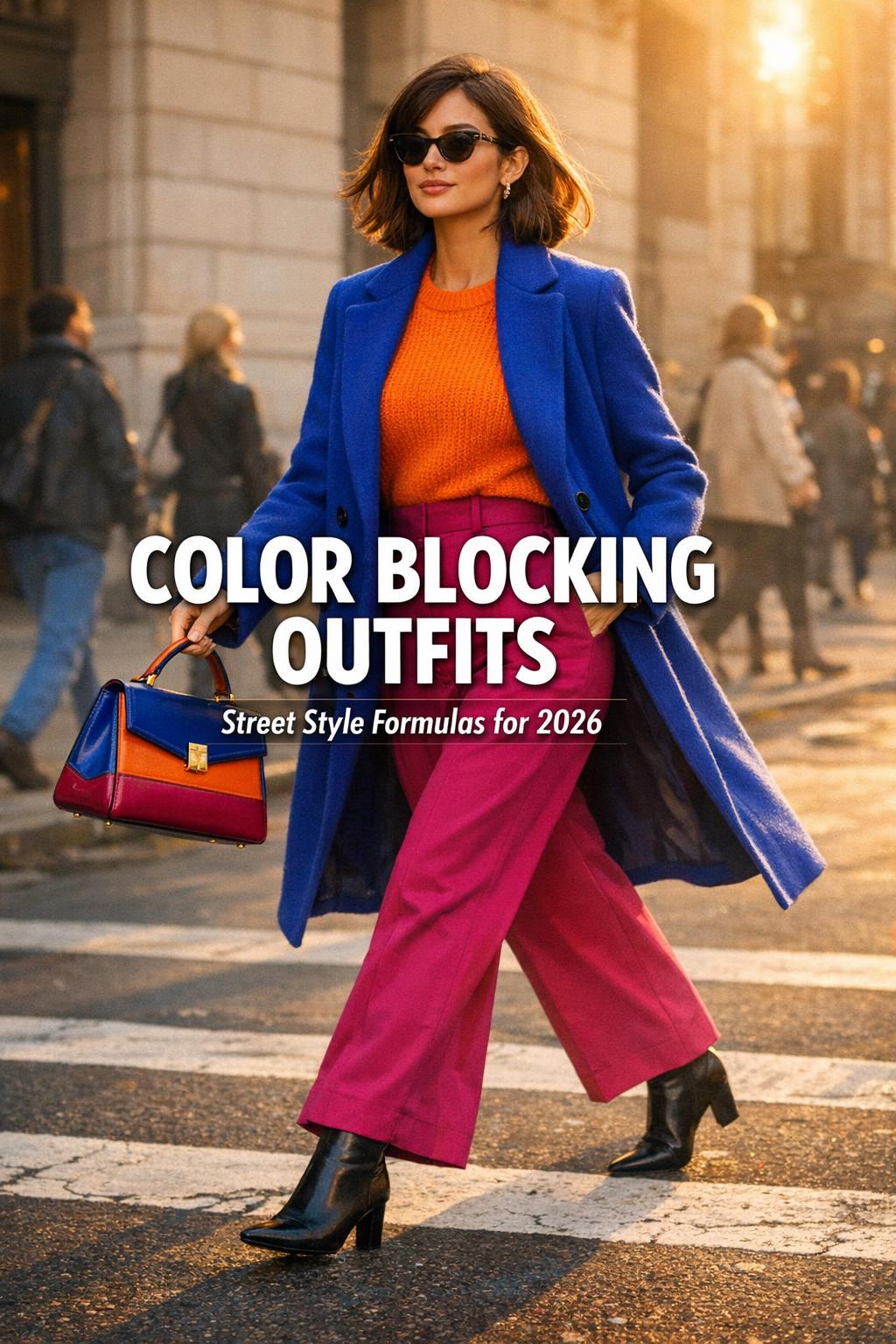
- Two-block base, one accent: two major blocks (top and bottom) plus a smaller pop via a scarf or bag.
- One hero block, one supporting block: a dominant saturated color with a secondary color that appears in a smaller area (like a layer or accessory).
- Block + neutral buffer: a neutral piece that separates two strong colors so the contrast feels intentional rather than aggressive.
- Accessory-led blocking: mostly simple clothing blocks, with the strongest color impact coming from an accessory (a scarf is a classic example).
The key to keeping these formulas from feeling repetitive is changing the proportion of each block. If you wore a large block of color on top last time, try making the larger block the bottom the next time. The formula stays stable; the visual emphasis shifts.
Tips: the “movement check” that street style demands
Do a quick movement check before you leave: sit, raise your arms, and walk a few steps. Color blocking looks best when the blocks stay clean. If a top rides up and reveals a third unintended color (or a waistband detail), you’ve accidentally added noise. The fix can be as simple as changing the tuck, choosing a cleaner layer, or using an accessory to bring the palette back into focus.
Seasonal color blocking without losing the street-style edge
Seasonality shows up repeatedly in color-blocking coverage, especially through summer outfit ideas. In practice, the shift from one season to another is less about rigid “seasonal colors” and more about how much saturation you can comfortably wear and how your outfit behaves in heat or cold. Street style is pragmatic: if you’re uncomfortable, you won’t carry the look well.
Spring and summer: lighter structure, same clarity
Warm-weather color blocking often leans into bright pairings and clean, breathable silhouettes. The biggest styling risk in summer is over-accessorizing. When it’s hot, you’ll naturally strip back layers—so let your two main blocks carry the look and keep the rest quiet. If you want an extra hit of personality, a single accessory accent can do more than multiple small items.
Fall: richer blocks and a more tailored feel
Fall color blocking is where the Victoria Beckham school of polish shines: structured pieces and bolder blocks that feel grounded. This is also the season when you can use layers to control proportion—adding or removing a layer changes the ratio of color blocks, which is one of the easiest ways to keep a bold street style outfit feeling intentional through a long day.
Building a color-blocking capsule for street style: fewer pieces, more options
Color blocking becomes dramatically easier when your closet has a small set of reliable “block” pieces. The goal isn’t to own everything in every color; it’s to own a few pieces with strong, clean color that can be recombined. A capsule approach also helps you avoid the common trap of buying one loud item and then not knowing what to do with it.
Shopping sources are often discussed in terms of where to buy, and mainstream brands such as Zara, COS, and Reformation are frequently cited as useful reference points for building modern wardrobes. The principle is to choose pieces that read as solid blocks—minimal fussy details—so they play well together across multiple outfits.
- Two to three solid-color tops that feel like clear blocks (avoid overly intricate detailing that visually breaks the color).
- Two solid-color bottoms with a clean front so the block looks uninterrupted in photos.
- One strong layer that can act as either a dominant or supporting block depending on how you wear it.
- One accessory that “finishes” the palette—a scarf is especially useful because it sits near the face and frames the whole look.
Tips: how to avoid buying “orphan” color pieces
Before you buy a new bright piece, decide what it will block with in your current wardrobe. If you can’t name at least two pairings, you’re likely purchasing an orphan that will sit unused. A capsule works when each new piece strengthens existing combinations rather than demanding a whole new supporting cast.
Accessories as the secret weapon: shoes, bags, and the scarf factor
Accessories can either elevate color blocking or undo it. In street style, accessories are also where personality shows up fastest—because they’re visible in photos, easy to swap, and often tied to recognizable brands. A Loewe scarf is a perfect example of how one item can bridge two colors and make the entire outfit feel “edited.”
The simplest way to use accessories in color blocking is to decide whether the accessory is an accent or a bridge. An accent adds one small pop of color. A bridge repeats or connects one of the outfit’s main blocks so the look feels cohesive. The mistake is adding accessories that introduce new colors without a reason, which can blur the block effect.
A practical styling scenario: the one-minute fix before you leave
Say you’ve built a strong two-color outfit, but in the mirror it feels slightly unfinished. Rather than adding another garment, try adding a scarf that repeats one of your colors or cleanly contrasts both. This is why scarf styling appears so often in color-blocking street style coverage: it’s fast, functional, and visible. It also helps in transitional weather, where you want warmth without a bulky layer that interrupts the color layout.
How to make bold street style feel wearable: proportion, comfort, and real-life constraints
It’s easy to admire bold street style in a slideshow and harder to wear it through a full day. Wearability is mostly about proportion and comfort. If color blocking is visually demanding, the fit and movement need to feel effortless—or you’ll spend the day adjusting, which breaks the look’s confidence.
Proportion is the quiet factor behind the strongest color-blocking outfits. When the blocks are balanced—either intentionally equal or intentionally unequal—the look reads designed. When the blocks are accidentally imbalanced (a color peeking out in small, random places), the outfit can look messy even if the colors are great.
Tips: the most common mistakes that flatten a color-blocked outfit
- Too many competing blocks: three or four major blocks often stop reading as “blocking” and start reading as “busy.”
- No clear lead color: if everything is equally loud, the eye doesn’t know where to land.
- Ignoring silhouette: strong color on an unstable fit looks less polished and can feel uncomfortable.
- Accessory overload: adding extra colors via shoes, bags, and scarves can dilute the main statement.
There are also moments when color blocking may not work as well: if you’re headed to a context where you need minimal visual attention, or if you know you’ll be in environments where your outfit will get dirty or scuffed. Street style often looks pristine in photos, but real life happens—choose pieces you can actually live in.
Accessibility and visual clarity: making color blocking inclusive and easy to read
Color blocking is fundamentally about contrast and clarity, which makes accessibility an important part of doing it well. Not everyone perceives color contrast the same way, and not every combination will read clearly for every viewer. Even if you’re dressing primarily for yourself, street style is a visual medium—clarity matters.
A practical approach is to rely on contrast that’s obvious in brightness and saturation, not only in hue. If two colors are similar in value, the blocks can blend together, especially in certain lighting. Clear separation—either by choosing more distinct colors or by using a neutral buffer—helps the outfit communicate its idea more reliably.
Tips: use contrast the way photographers do
Street-style photos reward outfits that hold their shape and color in mixed light. If you’re uncertain whether your blocks are distinct enough, take a quick phone photo in natural light. If the colors merge on camera, they’ll likely merge at a distance in real life. Adjust by increasing contrast (more saturation difference), simplifying the palette, or adding a separating neutral piece.
Visual storytelling for color-blocking outfits: how to make it photograph like street style
Color blocking has always been camera-friendly, which is one reason it thrives in street style galleries and fashion week coverage. The strongest looks aren’t only well-dressed—they’re well-composed. Contrast, lighting, and background all affect how your outfit reads.
If you’re dressing for an event where you know photos will happen—especially around fashion weeks—consider your likely backdrop. A high-contrast color-blocked outfit will stand out against city neutrals, while more subtle combinations can get lost. This is where saturation becomes a strategic choice: it’s not just “bright for the sake of bright,” it’s bright because it communicates clearly.
Tips: small adjustments that make a big difference on camera
- Keep the blocks uninterrupted: minimize distractions that break the color fields.
- Choose a clear focal point: a scarf, a bag, or a dominant color block helps the image read instantly.
- Think about contrast with your setting: city backdrops often favor strong, clean color.
These are the same reasons street-style editors gravitate toward clean color stories in places like New York: the pace is fast, photos are quick, and the outfit has to communicate immediately.
From trend to personal uniform: making chic colorful outfits feel like “you”
The most stylish color-blocking outfits street style aren’t memorable only because they’re bright; they’re memorable because they’re specific. The difference between wearing “a trend” and building a personal uniform is repetition with intention—using a stable set of formulas and palettes so people associate that confidence with you, not just with the moment.
One week you might channel the clean, architectural polish associated with Victoria Beckham’s approach—primary blocks with modern restraint. Another week you might lean into technique-driven color choices inspired by Gabrielle Union—strong color, cohesive repeats, and one sharp accessory that ties it together. Both approaches live in the same color-blocking world, but they tell different stories.
That’s also where editorial advice becomes personal: pick the version that supports your real routine. If you’re commuting, choose blocks that stay crisp when you move. If you’re attending shows or events, choose blocks that photograph well and still feel comfortable after hours on your feet. Style is rarely about one “perfect” outfit; it’s about choosing a system that works in your life.
FAQ
What does “color blocking” mean in street style?
In street style, color blocking means wearing distinct, solid blocks of color in one outfit so each color reads clearly and intentionally, often using bold saturation and clean silhouettes that hold up in real-world movement and photography.
How do I start with color blocking outfits street style if I’m nervous about bold color?
Start with two clear blocks of color and keep everything else minimal, then add one controlled accent (like a scarf) if you want more personality; the simplest two-color structure is the easiest way to get a bold look that still feels polished.
What are the easiest color combinations for clothes to try for a color-blocked look?
Primary and secondary color pairings are the easiest because the eye reads them quickly and they photograph clearly; choose one lead color and one supporting color so the outfit has an obvious visual hierarchy.
How is color blocking being worn for 2026?
The 2026 approach emphasizes modernity through strong saturation, cleaner blocks, and repeatable “rules” that keep outfits intentional—often focusing on a simple structure and letting proportion and silhouette do as much work as the colors themselves.
New York Fashion Week street style tends to favor sharp contrast, confident saturation, and outfits that read instantly in fast-paced photo environments, while also staying practical enough for moving between venues and wearing all day.
What can I learn from Victoria Beckham’s color blocking?
Victoria Beckham’s color blocking highlights how much structure matters: strong primary blocks look most elevated when the silhouette is streamlined, the color placement is deliberate, and the fit stays stable so the blocks remain clean as you move.
What can I learn from Gabrielle Union’s color blocking?
Gabrielle Union’s approach is useful because it’s technique-forward: pick bold colors intentionally and create cohesion by repeating a tone through a smaller element, so the outfit feels unified rather than split into unrelated pieces.
Do I need designer accessories to pull off a colour blocking outfit?
No—designer examples like a Loewe scarf are helpful because they show how one strong accessory can “finish” a palette, but the underlying principle is what matters: use accessories as either a controlled accent or a bridge that repeats one of your outfit’s main colors.
How do I keep color blocking from looking messy in photos?
Prioritize uninterrupted blocks, choose a clear focal point, and test the outfit in natural light with a quick phone photo; if the colors blend on camera, increase contrast, simplify the palette, or add a neutral buffer to separate the blocks.