Why The Vivienne Westwood Moodboard Still Feels Subversive
Pinterest boards, design presentations, runway images, and exhibition coverage have pushed the vivienne westwood moodboard into a wider fashion conversation. Yet the phrase often gets used too loosely. Sometimes it refers to a literal moodboard of tartan, punk graphics, and political iconography. In other cases, it points to the finished aesthetic itself: rebellious tailoring, archival references, and a charged visual mix that feels both historic and disruptive.
That overlap creates confusion, especially when readers are trying to compare a Vivienne Westwood-inspired moodboard with adjacent fashion aesthetics such as generic punk moodboards, exhibition-driven archival styling, or collection-based runway boards like AW19. The distinctions matter because the styling logic is not identical. A board built around Vivienne Westwood is not just “punk,” and it is not simply “British heritage” either. It operates through tension: rebellion versus refinement, political provocation versus decorative richness, structure versus deconstruction.
This comparison and style breakdown clarifies how the Vivienne Westwood visual language differs from related fashion moodboard approaches, where it overlaps with them, and how to recognize it in practice. The focus is on silhouette balance, color strategy, texture contrast, accessories, and the way collections, lookbooks, products, and exhibitions shape the overall mood.
The three aesthetics most often grouped together
To understand the vivienne westwood moodboard properly, it helps to compare three closely connected but distinct style directions: the Vivienne Westwood house aesthetic, the broader punk fashion moodboard, and the archival exhibition approach seen in museum and editorial settings such as the Bowes Museum feature and Wallpaper coverage. They share visual DNA, but they are not interchangeable.
Style overview: the Vivienne Westwood moodboard
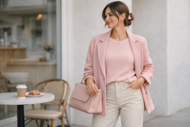
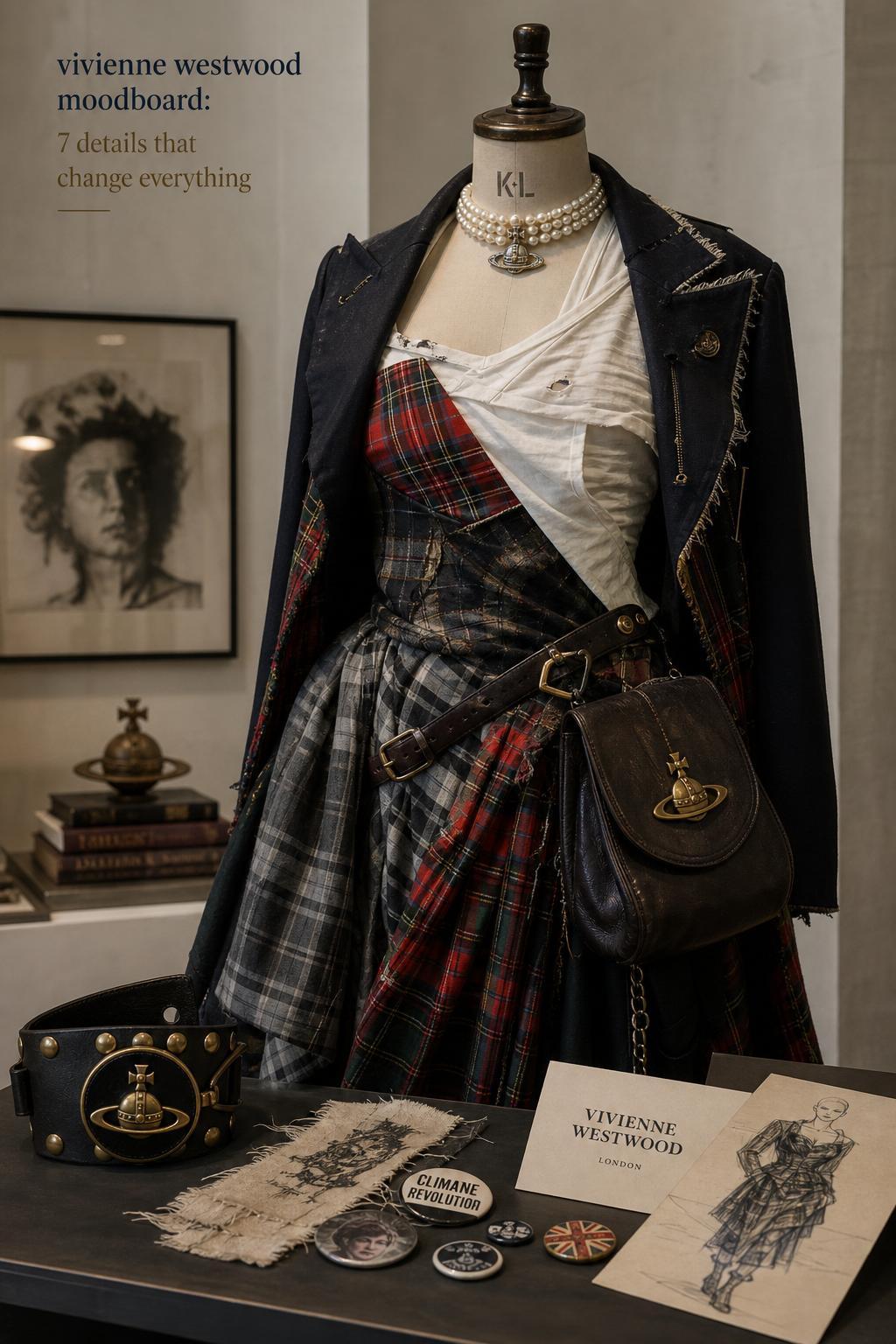
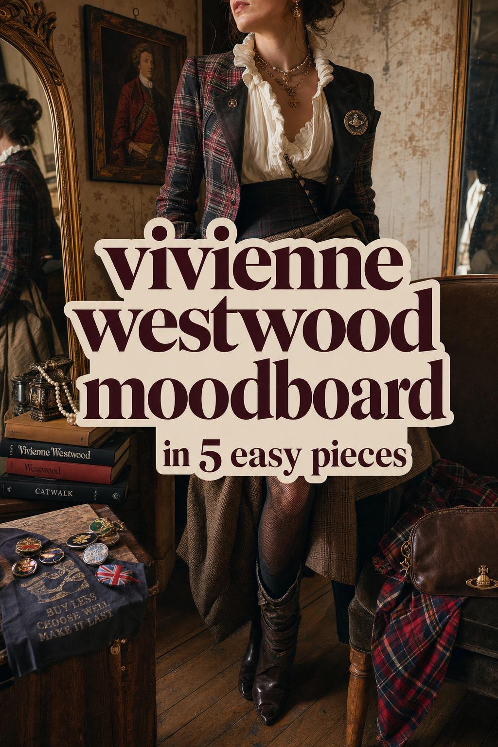
This style centers on a fashion vocabulary shaped by Vivienne Westwood, the brand’s ongoing identity, and related figures such as Andreas Kronthaler. Defining characteristics include tartan and plaid, political iconography, rebellious styling, heritage references, and imagery that feels assembled rather than smoothed out. The mood is provocative but considered. Typical silhouettes move between tailored structure and deliberate irregularity, often suggesting deconstruction, historic influence, or pirate-leaning drama. The palette can be rich and layered rather than minimal, and accessories often act as visual anchors rather than afterthoughts.
Style overview: the generic punk moodboard
The broader punk moodboard is usually more direct. It emphasizes anti-establishment energy, rawness, graphic impact, and a stripped-back visual message. Silhouettes often feel sharp, narrow, distressed, or intentionally confrontational. Compared with a Vivienne Westwood moodboard, it tends to be less archival and less interested in complex historical layering. The overall effect is immediate rather than curated through collection language or brand storytelling.
Style overview: the archival exhibition moodboard
This aesthetic appears in museum presentations, editorial retrospectives, and exhibition features. The Bowes Museum framing of “Rebel – Storyteller – Visionary” is a useful model for this approach. Instead of dressing for direct wearability, the archival exhibition moodboard arranges objects, garments, references, and images into a narrative display. The focus is less on outfit practicality and more on storytelling through artifacts, curation, and visual context. It is moodboard-like in structure, but the styling purpose differs from runway interpretation or everyday dressing.
Why these styles get confused so easily
The confusion comes from shared source material. All three aesthetics can include punk references, activism, London fashion energy, and layered visual storytelling. They may also pull from the same orbit of runway photography, lookbooks, gallery images, educational presentations, and image-hosting platforms such as Flickr, Scribd, Genially, or fashion databases like Tag-Walk. Visually, that creates overlap.
But their styling intent is different. A generic punk board prioritizes mood intensity. A museum or magazine archive prioritizes historical framing. A Vivienne Westwood moodboard prioritizes design language: how visual motifs become products, collections, accessories, and recurring brand cues. That difference in purpose changes how silhouettes are built, how accessories are chosen, and how color and texture are balanced.
Silhouette is where the comparison becomes clear
Vivienne Westwood moodboard silhouette logic
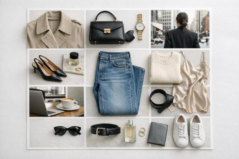
A Vivienne Westwood-inspired silhouette often looks intentionally unstable in the best sense. It may combine fitted structure with asymmetry, or classic tailoring with visual disruption. Even when the references are punk, the outfit composition usually feels designed rather than improvised. This is why the aesthetic translates well into lookbooks, seasonal collections, and product lines like the moodboard print bag or moodboard print pouch. The garments and accessories belong to a composed visual system.
Generic punk silhouette logic
In a generic punk moodboard, the silhouette reads more straightforwardly rebellious. The goal is often to communicate attitude through direct shape, roughness, and confrontation. The line can be leaner, harsher, and less invested in historic silhouette dialogue. It is powerful, but not always as layered in reference.
Archival exhibition silhouette logic
In exhibition settings, silhouette functions as evidence and narrative. A garment is presented to illustrate a period, a concept, or a curatorial point. The look may be visually striking, but it is not always arranged for everyday styling clarity. This is one reason why readers looking for wearable inspiration can feel lost when they rely only on exhibition imagery without comparing it to brand lookbooks or runway material.
Color palette and texture contrast
Color is one of the fastest ways to separate these aesthetics. The vivienne westwood moodboard generally works through layered visual cues rather than one-note aggression. Tartan, plaid, heritage-coded pattern, and politically loaded graphics can sit alongside richer tones and decorative contrasts. The result is intellectually dense. It feels assembled from references, not reduced to a single message.
The generic punk moodboard usually operates with a more immediate palette. The color story supports impact first. By contrast, an archival exhibition board may use whatever palette the historical objects require, which can create a visually mixed result that is compelling but less practical as a styling reference.
Texture follows the same pattern. Vivienne Westwood imagery often gains depth from tension between structure and irregularity. A smooth accessory, a heavily patterned textile, and a deconstructed silhouette can coexist without canceling each other out. That complexity is a defining difference from simpler punk boards, which usually rely on sharper visual repetition.
Visual anchors: bags, pouches, badges, and lookbook cues
One reason the official brand material matters in this comparison is that it shows how the moodboard concept becomes a product language. The Tokyo brand editorial around moodboard print items makes that especially clear. The moodboard is not only a backstage idea; it becomes a surface treatment, a bag, a pouch, and a badge-centered customization story. That is very different from a generic inspiration board found in a classroom presentation or user-generated image post.
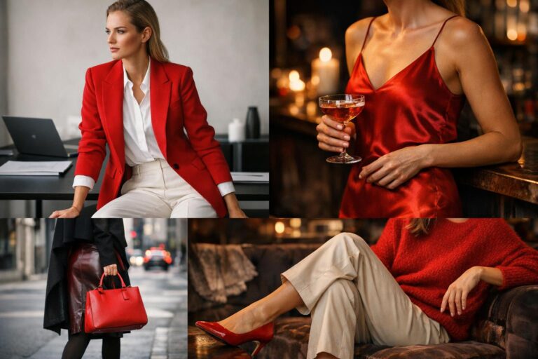
In practical styling terms, a Vivienne Westwood moodboard often includes one strong accessory that carries the narrative. A moodboard print bag can function as the visual anchor, allowing the rest of the outfit to stay controlled. A pouch or badge detail can inject the concept in a smaller dose. This brand-specific translation from concept to object is one of the clearest distinctions between the house aesthetic and broader punk references.
Tip: use one coded accessory instead of building the entire look at maximum intensity
For real-life dressing, a single accessory with moodboard cues often creates a stronger result than stacking every reference at once. A plaid-heavy outfit, political graphics, dramatic tailoring, and multiple statement elements can flatten into costume. One bag, one pouch, or one badge-driven point of emphasis keeps the outfit composition sharper.
Collection language versus general inspiration
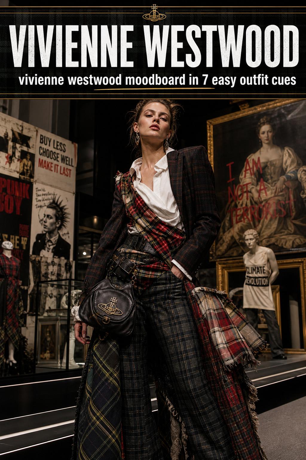
A key difference between a Vivienne Westwood moodboard and a general punk board is the presence of collection language. Editorial and runway material such as London Fashion Week Women’s AW 2019 gives the mood a seasonal framework. The board is not just “punk” or “rebellious”; it is tied to a specific moment, show atmosphere, and political climate. That framework deepens the styling logic.
Generic punk boards tend to collapse time. They gather images from different periods and moods into one immediate statement. That can work for ideation, but it lacks the precision that comes from a collection-led reading. A Vivienne Westwood moodboard works best when the references feel connected rather than random. The strongest boards usually reflect a clear axis: a season, a runway moment, a product line, or an exhibition narrative.
How AW19 changes the mood
Using an AW19 lens shifts the board toward runway context, political undertone, and show-specific atmosphere. The same tartan or punk cue can look very different when filtered through London Fashion Week imagery rather than a broad “punk fashion” search. The silhouette becomes more precise, the mood more editorial, and the visual references more coherent.
The role of people and places in shaping the aesthetic
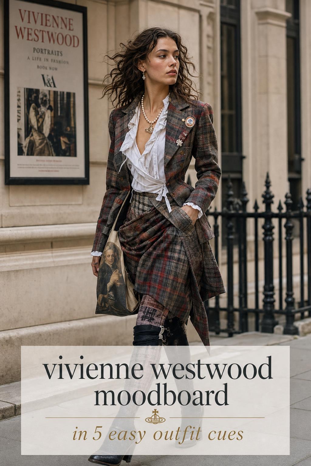
Fashion moodboards often get treated as purely visual, but the strongest ones are built around relationships: people, places, institutions, and recurring concepts. Vivienne Westwood is the central figure, but Andreas Kronthaler also matters because the brand’s visual language continues through house leadership and reinterpretation. London remains a core location because it anchors the runway and fashion week context. Tokyo matters because it appears as a retail and editorial point where moodboard concepts move into products and store storytelling. County Durham and the Bowes Museum matter because they frame the work through archival display.
By comparison, a generic punk board may borrow the attitude of place without grounding itself in actual fashion institutions or product ecosystems. An archival board may be deeply rooted in place but less concerned with contemporary outfit translation. The Vivienne Westwood moodboard sits between those poles, linking design references, commercial objects, and cultural storytelling.
- London signals runway energy, activism, and collection context.
- Tokyo signals retail presentation, brand editorial, and moodboard print accessories.
- Bowes Museum and County Durham signal archive, exhibition narrative, and object-based storytelling.
Everyday outfit translation: how each style looks in motion
On a screen, these aesthetics can seem interchangeable. In motion, they separate quickly. Everyday wear exposes whether a moodboard has practical proportion logic or only visual drama.
Layering approach
A Vivienne Westwood-inspired outfit often uses layering to create tension rather than bulk. One historical or punk-coded layer is usually balanced by a cleaner supporting piece. The generic punk approach is more likely to emphasize confrontation through repeated texture, repeated darkness, or repeated hardware. The archival approach may look visually rich in still images, but not every layered combination is wearable outside an exhibition or editorial frame.
Garment proportions
Proportion play is central to the Vivienne Westwood moodboard. The look often depends on an intentional imbalance that still feels controlled. Generic punk dressing tends to rely on straightforward tension: slim versus oversized, distressed versus fitted. Exhibition styling is less concerned with movement or daily practicality, so the proportions may be compelling but harder to adapt.
Accessories
Accessories are often the clearest separator. In a Vivienne Westwood moodboard, accessories do conceptual work. The bag, pouch, or badge can carry the story. In generic punk styling, accessories are more likely to reinforce attitude. In exhibition settings, they often function as artifacts or curatorial evidence.
Overall outfit balance
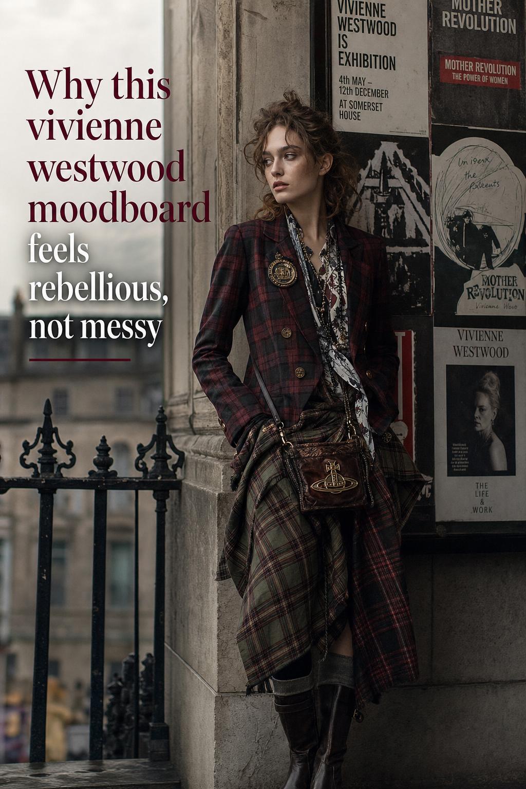
The house aesthetic usually aims for controlled dissonance. That phrase captures why these outfits feel distinctive. They are not polished in a conventional sense, but they are balanced. The punk moodboard can be more singular and blunt. The archival moodboard can be more layered and cerebral. The Vivienne Westwood moodboard sits in the middle: intellectually built, visually provocative, and surprisingly adaptable when edited well.
Side-by-side outfit comparisons
Casual daywear interpretation
A Vivienne Westwood-inspired casual outfit would likely center one strong coded element, such as a tartan-led accessory or a statement piece that references the brand’s rebellious heritage while keeping the surrounding silhouette intentional. The styling logic is to let one visual anchor define the look. A generic punk interpretation of the same scenario would push more directly into attitude, using sharper contrast and less restraint. An archival exhibition interpretation would be less practical, prioritizing reference density over everyday movement.
Fashion event or gallery visit
For a gallery, exhibition, or creative event, the Vivienne Westwood moodboard supports a richer composition. This is where historical cues, layered prints, and stronger accessories can work without feeling excessive. The punk version would read more confrontational and immediate. The archival version would suit visual drama, but it risks becoming over-curated if every element competes for attention.
Runway-inspired evening look
Using a runway frame such as AW19, the Vivienne Westwood look would likely emphasize mood, structure, and political undertone in a way that still reads as a designed outfit. A generic punk evening look might feel stronger in raw impact but lighter in nuance. An exhibition-based reading could produce a striking image, though it may lean more toward display than wearability.
Where exhibitions change the reading of the style
The museum angle is not a side note; it changes how the entire aesthetic is understood. Coverage tied to the Bowes Museum and the “Rebel – Storyteller – Visionary” framing places Vivienne Westwood within a wider narrative of fashion history, activism, and object-based storytelling. That museum logic reinforces the idea that a moodboard is not simply a collage of pretty references. It is a system of ideas made visible through garments, images, and artifacts.
This matters because many online moodboards flatten Westwood into only one trait, usually punk. Exhibition framing restores the breadth of the visual language. It brings in archival curation, story structure, and the sense that a collection can function as a cultural argument, not just a style category. Readers building a moodboard from scratch should pay attention to that broader reading or the result can become too narrow.
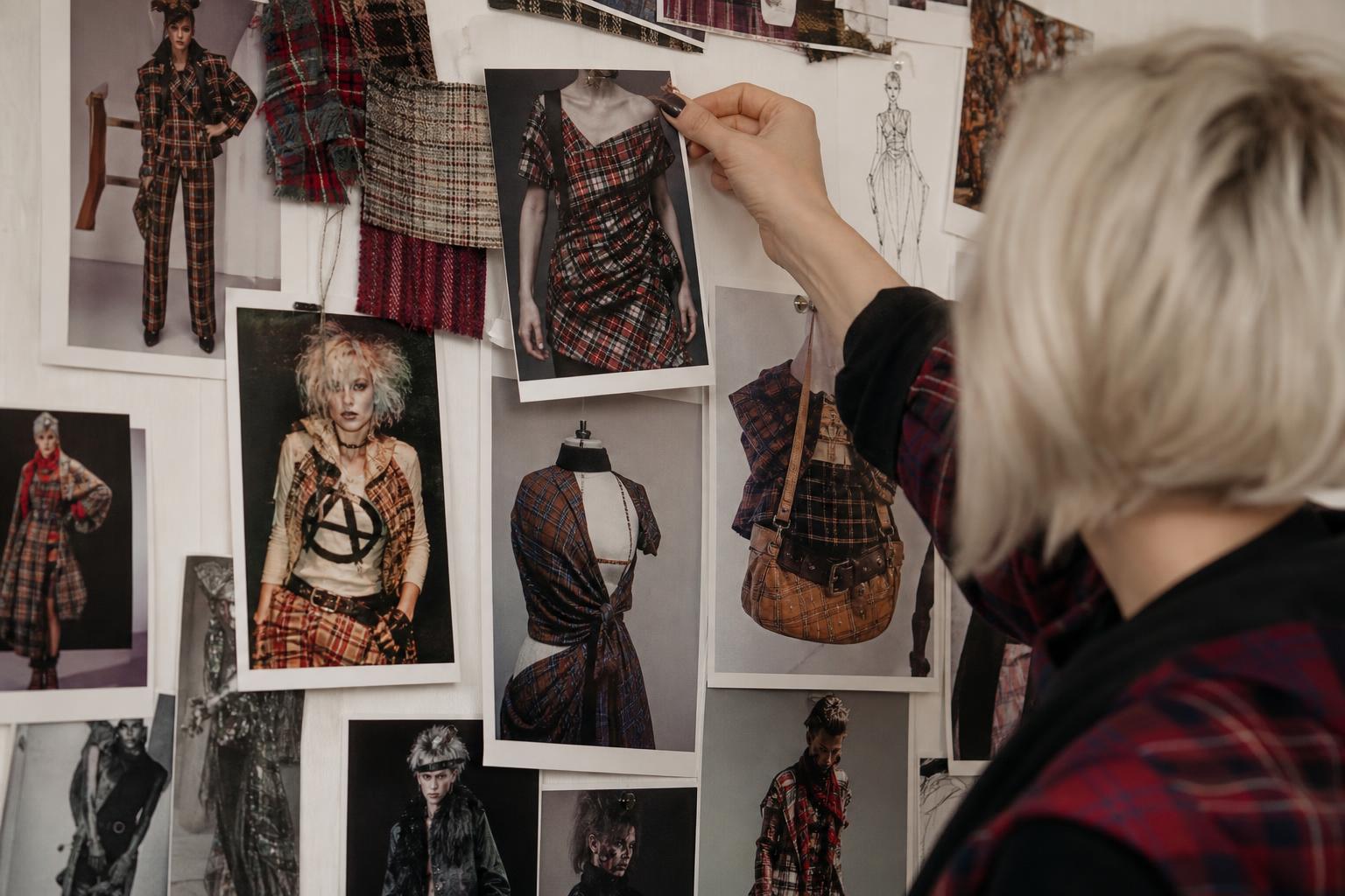
Tip: borrow the exhibition method, not the exhibition overload
The smartest takeaway from museum presentation is sequencing. Group references by idea, not by image volume. One section of tartan and plaid, one section of political iconography, one section of runway mood, and one section of accessories creates more clarity than a crowded board with no visual hierarchy.
What educational and user-generated boards often miss
Presentations on Genially or Scribd and user-uploaded inspiration images on Flickr can be useful entry points, especially for students or early-stage researchers. They often capture the broad themes correctly: Vivienne Westwood, moodboard thinking, punk, fashion history, and design references. But they tend to simplify the tension that makes the style distinctive.
Most simplified boards miss one of three things: product translation, collection specificity, or archival depth. Without product translation, the aesthetic stays abstract. Without collection specificity, the references become generic. Without archival depth, the style loses its intellectual structure. A strong Vivienne Westwood moodboard needs at least two of those dimensions, and ideally all three.
How to build a stronger Vivienne Westwood-inspired moodboard
The best boards are edited with clear visual hierarchy. The objective is not to gather everything associated with Vivienne Westwood, but to define what kind of Westwood reading you want: product-focused, runway-focused, exhibition-focused, or a careful mix.
- Start with two core motifs, such as tartan and political iconography.
- Add one runway or collection reference, such as a London Fashion Week image or an AW19 cue.
- Include one accessory or product reference, such as a moodboard print bag, pouch, or badge detail.
- Balance high-drama images with cleaner supporting visuals so the board remains readable.
- If using museum material, pair it with lookbook or brand editorial images to keep the board wearable.
This approach protects the board from becoming either too literal or too academic. It also reflects how brand storytelling, runway imagery, and exhibition material interact across the wider visual ecosystem.
Tip: define the mood before choosing the garments
If the board begins with clothes alone, the result can feel costume-like. Defining the mood first, whether rebellious, archival, activist, or collection-led, creates a stronger composition. Once the mood is set, the right silhouettes and accessories become easier to select.
Common styling mistakes with a Vivienne Westwood moodboard
Because the visual language is rich, the most common mistake is excess without hierarchy. Readers often assume that more pattern, more provocation, and more historical reference automatically create a stronger look. In practice, that usually weakens the outfit composition.
- Using every punk reference at once instead of choosing one clear visual anchor.
- Treating tartan as the entire aesthetic rather than one motif within a broader language.
- Ignoring collection context and ending up with a random collage of eras and moods.
- Relying only on exhibition imagery, which can reduce wearability.
- Forgetting the role of accessories in carrying the concept.
Another common issue is flattening the activism dimension into surface decoration. The political and rebellious current matters because it changes how the clothes are read. Without that tension, the board risks becoming merely decorative heritage styling.
When each approach works best in a real wardrobe
Choose a Vivienne Westwood moodboard approach for
- Creative work environments where strong visual identity is welcome.
- Fashion events, gallery visits, and city dressing where layered references read naturally.
- Building outfits around statement accessories, print-led pieces, or collection-inspired tailoring.
- Readers who want rebellion and polish in the same look.
Choose a generic punk moodboard approach for
- Direct, attitude-first styling.
- Outfits that rely on visual impact rather than archival nuance.
- Boards meant to communicate energy quickly.
Choose an archival exhibition approach for
- Research, presentation work, and visual storytelling.
- Gallery, museum, or editorial projects where object context matters.
- Moodboards meant to explain a fashion history narrative rather than guide immediate dressing.
In real wardrobes, the Vivienne Westwood moodboard tends to be the most adaptable of the three because it already exists across collections, official editorial material, accessories, and exhibition contexts. It can scale up or down more effectively than a pure punk board or a fully archival one.
Reading the house codes through products, runways, and institutions
One of the most useful ways to identify a true Vivienne Westwood moodboard is to look for repetition across different formats. Does the same visual logic appear in a runway season, an official lookbook, a magazine feature, a product line, and a museum narrative? If yes, the board is probably capturing the house language rather than borrowing isolated motifs.
That repetition matters. Wallpaper coverage, London Fashion Week references, official brand pages, and Tokyo retail/editorial features all point toward a connected system. Even educational decks and image archives become more useful when read against that system. The board becomes stronger when it reflects the relationship between brand, place, concept, and object.
The contemporary influence of this moodboard language
The continuing relevance of the Vivienne Westwood moodboard comes from its flexibility. It speaks to contemporary fashion not because it can be copied literally, but because it offers a method: combine visual provocation with structure, connect aesthetics to ideas, and let accessories and motifs carry part of the narrative. That is why it keeps resurfacing across editorial pages, presentations, and inspiration platforms.
Its strongest contemporary influence appears where fashion wants more than surface appeal. Street-level styling may borrow the punk charge, but the Westwood framework adds historical tension, narrative layering, and a sense of deliberate construction. That distinction is what keeps the moodboard compelling rather than nostalgic.
Final style takeaway
The core distinction is simple: a generic punk moodboard communicates rebellion, an archival exhibition moodboard communicates history, and a vivienne westwood moodboard communicates a designed visual language that holds both at once. It is not only about punk, and it is not only about archives. It is about how rebellion, storytelling, products, collections, and institutions connect.
Readers can identify the style by looking for controlled dissonance: tartan and plaid used with purpose, political and cultural references embedded in the mood, accessories that function as visual anchors, and a silhouette that feels intentionally off-balance rather than random. The most successful interpretations combine one or two strong house codes with enough restraint to keep the outfit readable.
That is also how the two worlds can be merged. Take the direct energy of punk, add the narrative depth of archival display, and filter both through the sharper structure of the Vivienne Westwood aesthetic. The result is more than inspiration. It becomes a coherent style system.
FAQ
What does “vivienne westwood moodboard” usually refer to?
It usually refers either to a literal inspiration board built around Vivienne Westwood’s visual language or to the broader aesthetic itself, including tartan, punk references, political iconography, archival storytelling, and collection-led styling cues.
How is a Vivienne Westwood moodboard different from a generic punk moodboard?
A generic punk moodboard focuses on direct attitude and anti-establishment energy, while a Vivienne Westwood moodboard adds structured design language, historical layering, product translation, and stronger links to collections, exhibitions, and brand storytelling.
Why do exhibitions like the Bowes Museum matter when studying this style?
Exhibitions matter because they show the work as a narrative system rather than a single trend, helping readers understand how garments, archives, activism, and objects fit together in a broader visual and cultural framework.
Can a Vivienne Westwood-inspired moodboard work for everyday outfits?
Yes, but it works best when edited carefully. One strong accessory, one clear motif such as tartan or plaid, and a controlled silhouette usually translate better than trying to reproduce every runway or exhibition reference at full intensity.
What visual motifs appear most often in this aesthetic?
The most consistent motifs are tartan, plaid, punk references, political iconography, rebellious tailoring, and archival or heritage-coded imagery that creates tension between structure and provocation.
How useful are educational presentations and user-generated image pages for research?
They are useful as starting points because they often gather core themes such as punk, fashion history, and moodboard references, but they usually need to be balanced with official brand material, runway coverage, and exhibition context for a fuller understanding.
What role do accessories play in this moodboard style?
Accessories often carry the concept. Items such as a moodboard print bag, pouch, or badges can serve as the visual anchor of the outfit, allowing the rest of the look to remain balanced and more wearable.
Why is AW19 often discussed in relation to the Vivienne Westwood moodboard?
AW19 is relevant because it provides a collection-based frame for reading the moodboard through runway atmosphere, London Fashion Week context, and political undertones rather than treating the aesthetic as a vague set of punk references.
What is the biggest mistake people make when building this kind of moodboard?
The biggest mistake is adding too many references without hierarchy. A strong board needs a clear mood, a small number of core motifs, and enough structure to connect products, collections, and visual storytelling in a readable way.