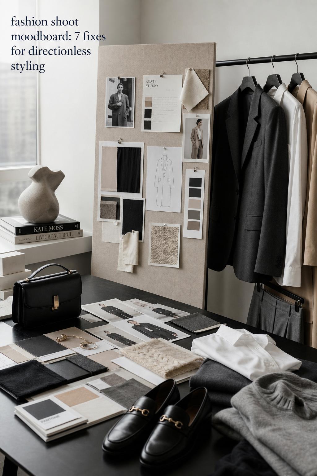
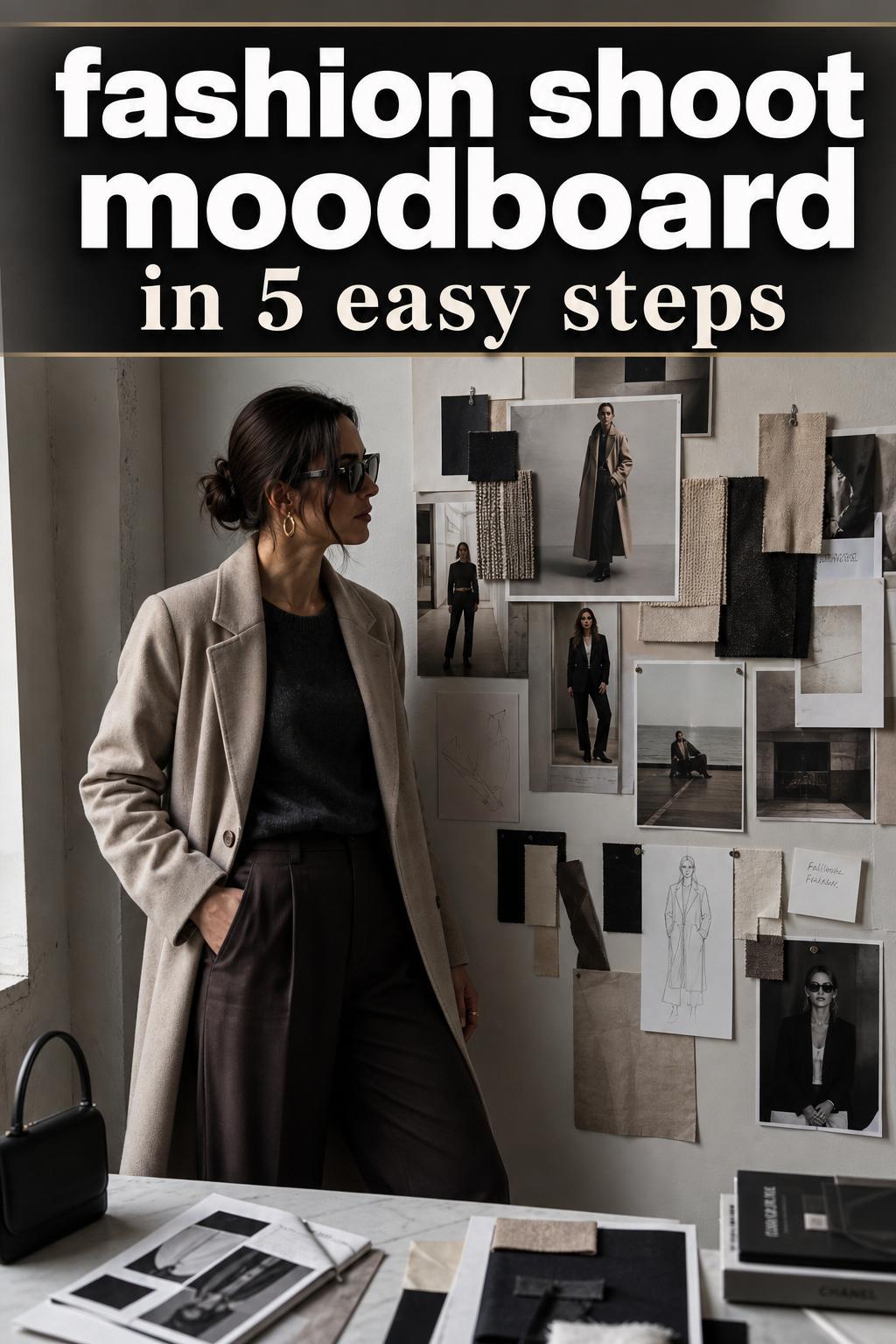
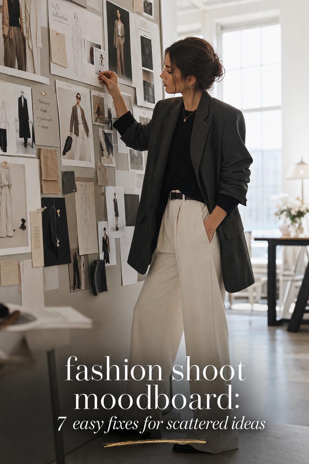
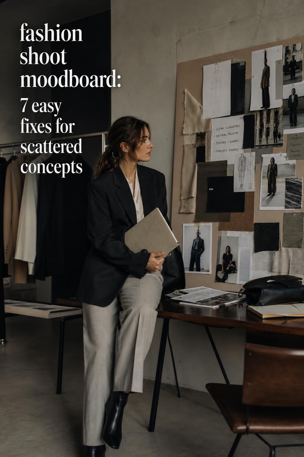
Modern Fashion Shoot Moodboard for Polished Editorials
The visual language behind a fashion shoot moodboard
A strong fashion shoot moodboard is less about collecting attractive images and more about building a controlled visual identity. The mood sits at the center: the color temperature, the silhouette direction, the texture story, and the emotional tone all need to point in the same direction. In fashion terms, that means every reference should support the same aesthetic logic, whether the final shoot feels polished, minimal, dramatic, soft, or editorial.
This is why the format remains so appealing across creative work in the United States. A moodboard gives immediate shape to an idea that can otherwise stay vague. It is commonly used for fashion shoots because it helps align styling, image references, wardrobe decisions, and the overall visual rhythm before the camera is even involved. The result is clarity: the team understands what the story should look like, how it should feel, and which choices belong in the frame.
What makes a fashion shoot moodboard especially compelling is its ability to turn concept into styling direction. A single board can define proportion play, tonal layering, movement, and visual anchor pieces. It also explains why certain looks work together while others break the composition. That combination of inspiration and structure is exactly what keeps the moodboard essential in fashion image planning.
Why a moodboard matters before the first look is styled
Before clothing, accessories, or image references are selected, the moodboard functions as the framework for decision-making. It helps separate a broad aesthetic idea from a usable visual system. In practical terms, that means the board defines whether the shoot should lean toward clean lines, layered softness, high contrast, tonal neutrals, or a more directional editorial finish.
This early clarity matters because fashion styling is cumulative. One piece affects the next. A sharply structured silhouette asks for different supporting textures than a fluid, romantic shape. A muted palette changes how accessories should behave. A board that is too broad creates visual confusion later, while a board with a focused mood allows every styling choice to reinforce the same concept.
In real planning scenarios, the moodboard also prevents unnecessary drift. It keeps the creative approach consistent when multiple people are involved and reduces the chance of mixing references that look attractive individually but conflict when placed in one fashion narrative.
Start with the aesthetic, not the clothing
One of the most common mistakes in building a fashion shoot moodboard is beginning with random garments rather than a clearly defined aesthetic. Clothing should support the concept, not replace it. The stronger method is to identify the visual identity first: relaxed minimalism, sharp urban polish, soft tonal romance, understated streetwear, or another clear style direction.
That first step sets the tone for every later choice. Once the mood is clear, silhouettes become easier to select. You can decide whether the shape language should feel oversized, tailored, elongated, compact, fluid, or intentionally mixed. Fabric and color then follow with more precision because they are responding to a clear visual brief instead of competing for attention.
Core elements to define first
- overall mood and emotional tone
- silhouette balance and shape direction
- dominant color palette
- texture contrast or tonal consistency
- level of polish, from relaxed to editorial
When these foundations are set first, the moodboard becomes useful rather than decorative. It starts to function like a visual brief with enough specificity to guide styling choices without flattening creativity.
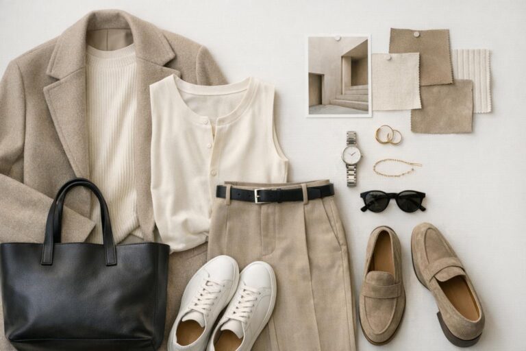
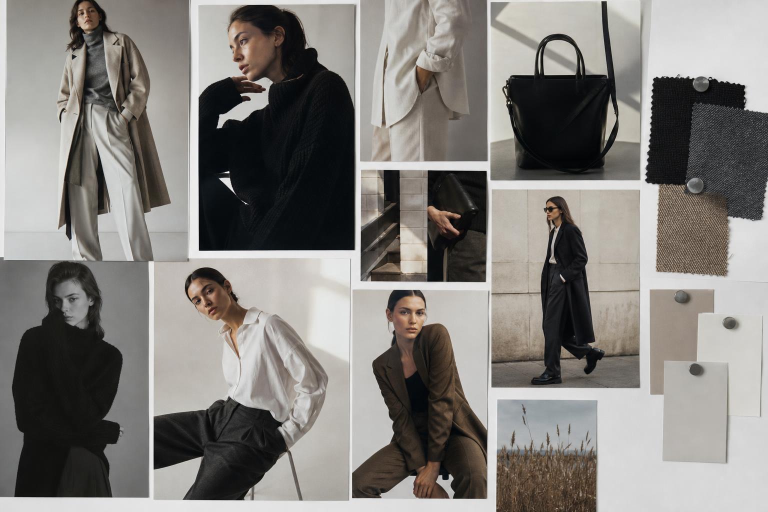
Look: relaxed minimal layers
This interpretation of a fashion shoot moodboard leans into restraint. The mood is clean, modern, and intentionally quiet, with an emphasis on silhouette balance rather than overt detail. The visual identity depends on soft structure: pieces that hold shape without feeling rigid, layered in a way that appears effortless but still composed. It is the kind of direction that works well when the goal is to create a polished aesthetic with strong visual breathing room.
The clothing language here centers on neutral layers, matte textures, and elongated lines. Think fluid trousers, a refined knit, a tailored outer layer, and accessories that serve as subtle anchors rather than statement interruptions. The palette stays controlled through cream, soft beige, stone, charcoal, or muted black. Fabrics should create texture through contrast, not print, so wool, fine knit, crisp cotton, and smooth suiting materials all support the mood.
- key garments: tailored coat, straight-leg trousers, fine knit, clean shirt
- footwear: minimal boots or sleek loafers
- accessories: compact bag, restrained jewelry, clean belt line
This look works because tonal layering gives the board cohesion, while the mix of soft and structured pieces keeps the visual story from feeling flat. In a moodboard, this kind of styling is especially effective when the objective is clarity, sophistication, and a contemporary editorial finish.
Look: neutral street style
A neutral street-style direction brings more energy into the board without sacrificing control. The mood shifts from quiet polish to urban ease, but the aesthetic still relies on discipline. Volume plays a larger role here, with proportion becoming the visual hook. An oversized jacket, wide trouser, or relaxed hoodie can act as the main silhouette statement, while the palette keeps the overall outfit composition grounded.
The strongest version of this look avoids chaotic layering. Instead, it uses a reduced color range and allows shape to do the work. Taupe, washed black, gray, cream, and earthy neutrals create a balanced backdrop for stronger forms. Cotton fleece, denim, structured twill, and technical textures introduce variation without breaking the board’s consistency. Sneakers or boots can support the visual tone, depending on whether the board is leaning more casual or sharper.
This interpretation fits the aesthetic because it pairs ease with intention. The relaxed pieces suggest movement and modernity, while the neutral palette maintains discipline. In a fashion shoot moodboard, that tension often creates the most visually compelling image references.
Style tip: keep one visual anchor
Street-influenced styling can easily become overloaded if every element is oversized or highly directional. A better approach is to keep one dominant anchor, such as the jacket or trouser shape, and let the rest of the outfit support it. That preserves proportion play while keeping the board legible.
Look: soft weekend aesthetic
This version of the moodboard softens the edge and introduces a more relaxed emotional tone. The silhouette feels less architectural and more fluid, with drape and comfort becoming central to the visual message. It is ideal for fashion concepts built around ease, natural light, or a softer editorial identity where the styling should feel approachable yet still curated.
Key pieces may include a soft cardigan, a flowing skirt or relaxed trouser, a lightweight layer, and understated accessories. The palette remains gentle: cream, oatmeal, faded gray, blush-tinted neutrals, or muted earth tones all support the mood. Texture matters more than ornamentation here. Soft knits, brushed fabrics, washed cotton, and fluid materials help create the low-pressure elegance this aesthetic needs.
Why this look works is simple: softness becomes the styling logic. Instead of using contrast to create impact, it uses continuity. Each piece contributes to the same visual tone, which makes the board feel complete and intentional rather than merely casual.
How image references shape outfit direction
A moodboard is not only a clothing board. Image references determine the styling choices just as much as garments do. When the references emphasize clean framing, quiet color, and negative space, the outfits usually need simplicity and control. When the references suggest movement, layering, or dense visual texture, the styling can carry more complexity. The relationship works in both directions.
This is why random inspiration images often weaken the final board. If the visual references suggest one atmosphere and the outfit references suggest another, the result feels fragmented. A coherent fashion shoot moodboard should make the connection between image style and styling direction immediately understandable.
What to evaluate in each reference image
- how much structure exists in the silhouette
- whether the palette is tonal, high-contrast, or muted
- how texture appears on camera
- whether the overall mood feels polished, undone, soft, or sharp
- how much visual space the composition allows around the outfit
Using this lens keeps the board analytical rather than purely aspirational. The strongest moodboards are built from references that can actually guide styling decisions.
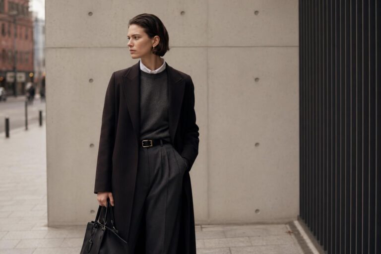
Look: structured editorial tailoring
For a more directional board, structured tailoring introduces immediate authority. The aesthetic becomes sharper, more composed, and visually assertive. This is where line, shoulder definition, and proportion precision matter most. The mood can still be minimal, but it carries stronger tension and a more formal editorial presence.
The clothing formula often centers on a blazer, coat, or sharply cut trouser balanced by a simpler underpinning. A fitted knit, clean shirt, or sleek top gives the look control without introducing excess detail. Dark neutrals, classic monochrome, or tightly edited earthy shades all work, depending on whether the board should feel severe or quietly luxurious. Fabric behavior is essential here; materials need enough body to hold shape and maintain a crisp visual line.
This look fits the aesthetic because tailoring creates instant hierarchy in the image. The structure tells the eye where to focus, and that makes the board stronger overall. When used well, tailoring becomes the visual anchor that organizes every other element.
Look: texture-led tonal dressing
Some moodboards avoid dramatic shape and instead build interest through surface and tonal depth. That is the role of texture-led tonal dressing. The silhouette can remain relatively simple, but the outfit still feels dimensional because the fabrics create subtle shifts across the same color family. This approach is especially effective when the board needs calm sophistication without looking plain.
A tonal outfit in cream, brown, gray, or muted olive can become far more editorial when different materials are layered with precision. Smooth fabric against brushed knit, soft wool against crisp cotton, or matte surfaces against slight sheen all create visual movement. The pieces do not need aggressive styling; the power comes from how they interact as a complete composition.
This look works because it produces depth without noise. On a fashion shoot moodboard, that often translates as maturity and confidence. It shows that visual richness does not require a crowded palette or excessive detailing.
Building color logic into the board
Color is one of the fastest ways to communicate mood, yet it is often handled too broadly. A useful moodboard does not simply gather colors that look attractive together. It builds a color logic that supports the intended visual identity. That could mean tonal neutrals for restraint, low-saturation earth shades for warmth, or sharper monochrome for a more editorial effect.
The key is consistency. If the board mixes cool gray minimalism with warm romantic beige softness without a clear reason, the styling direction becomes unstable. Strong color systems help determine not only garments but also accessories, texture choices, and the general energy of the shoot.
Tips for controlling the palette
Start with one dominant tone family and one supporting accent at most. This prevents the board from feeling scattered. If the visual references already contain strong color information, keep the outfit references more disciplined. If the images are muted and sparse, the clothing can carry slightly more color variation without breaking the overall mood.
Look: monochrome contrast study
Monochrome styling gives a fashion shoot moodboard immediate clarity. The mood is direct, graphic, and controlled, often with stronger impact than a more colorful concept. What matters is not only black and white as colors, but how contrast is distributed across the outfit. A board with deep dark layers and sharp highlights reads very differently from one built around softer gray transitions.
This look usually depends on clean shapes and disciplined finishing. A dark tailored base, a crisp shirt, a sleek coat, or a sharp knit can form the visual core. Footwear and accessories should echo the same level of refinement. Because the palette is reduced, every cut and fabric choice becomes more visible. That means wrinkled or visually weak pieces tend to disrupt the whole composition more quickly than they would in a busier color scheme.
The reason this look succeeds is precision. Monochrome exposes proportion, texture, and line with very little distraction. On a moodboard, that makes it especially useful for concepts where structure and image clarity matter more than softness or ornament.
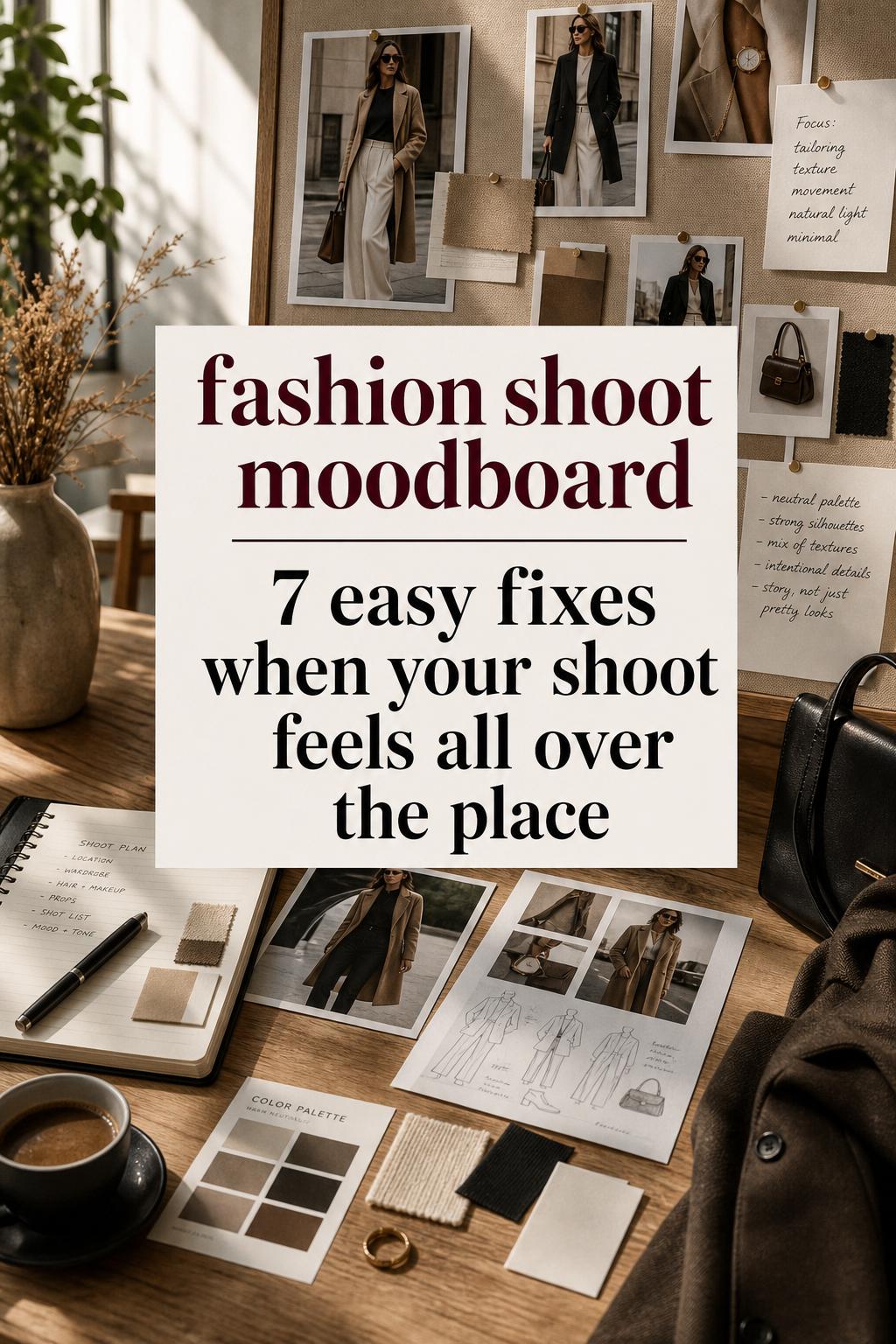
What stylists typically refine after the first board draft
The first version of a moodboard is rarely the most useful one. Early drafts often contain too many references, too many directions, or repeated imagery that adds volume without adding clarity. Refinement matters because a board should act as a working tool, not simply an archive of inspiration.
One practical adjustment is removing images that are attractive but nonessential. Another is checking whether the clothing references actually reflect the same mood as the visual references. A third is reducing duplicate silhouettes so the final board communicates a stronger point of view. These revisions make the board easier to use when styling and selecting pieces.
Common refinement moves
- cut repeated references that do not add new information
- replace vague outfit inspiration with sharper silhouette examples
- tighten the palette if the board feels visually noisy
- check that texture direction stays consistent
- keep the strongest images that define the mood fastest
This editing stage is often what separates a board that looks appealing from one that can genuinely direct a fashion shoot.
Look: understated statement dressing
Not every strong moodboard needs to be loud. Understated statement dressing works by placing one expressive element inside an otherwise disciplined composition. The mood remains refined, but there is a clear focal point: perhaps a dramatic coat shape, a directional accessory, or a striking proportion shift. Everything else is reduced to support that center.
The clothing pieces should be selected for contrast in importance, not necessarily contrast in color. A sculptural outerwear piece can sit over a minimal base of straight trousers and a fitted knit. A strong boot or accessory can sharpen an otherwise soft silhouette. The palette can remain neutral so that the board communicates confidence rather than excess.
This interpretation fits the aesthetic because it gives the eye a single clear visual anchor. In a moodboard, that creates hierarchy and prevents the composition from feeling busy. It also helps define what the shoot wants to say in one glance.
A practical approach to outfit variation across one board
A good fashion shoot moodboard should not show the exact same outfit repeatedly. It needs variation, but variation within a recognizable system. That means the looks should feel related through palette, silhouette family, or texture direction, even if each one expresses the aesthetic differently.
For example, one board can include a tailored version of the concept, a softer relaxed interpretation, and a street-informed version, as long as all three share the same visual language. This prevents repetition while making the shoot feel fully developed. It also creates room for styling flexibility once the actual wardrobe is selected.
How to recreate that variation without losing cohesion
- repeat a controlled palette across all looks
- keep a consistent silhouette principle, such as relaxed volume or sharp tailoring
- use different textures to create distinction
- let accessories shift the tone slightly without changing the concept
- maintain one clear mood across every reference
This is often where the most convincing boards stand out. They show range, but they never lose identity.
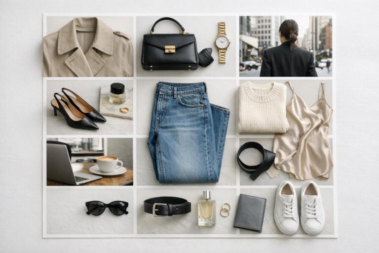
Look: polished off-duty balance
This moodboard direction sits between dressed and relaxed. The visual mood is composed but not formal, with styling that suggests ease while still looking intentional. It is especially effective for concepts that need everyday wearability with a fashion-forward finish. The silhouette usually combines one refined element with one casual one, creating balance rather than uniformity.
A crisp trouser with a soft knit, a tailored jacket with relaxed denim, or a clean coat layered over simple separates can all support this idea. The palette works best when it remains edited, allowing the contrast in formality to become the main visual story. Texture should help bridge the gap between polished and casual so the overall composition feels cohesive.
The reason this look belongs on a strong board is that it translates well. It is visually clear, easy to understand, and grounded in realistic styling logic. That makes it useful when the shoot concept needs to feel aspirational without becoming distant or overly theatrical.
Context matters: where the moodboard will be used
A moodboard designed for a tightly controlled editorial concept may need stronger shape direction and clearer styling hierarchy. A board intended for a softer fashion presentation may benefit from more approachable silhouettes and gentler tonal transitions. The context affects how specific the references should be and how bold the outfit ideas can become.
This matters in practical planning because a board that is too abstract can be difficult to translate into real styling. At the same time, a board that is overly literal may not leave enough room for creative adjustment. The best approach is to build enough precision into the visual identity that the direction is unmistakable, while still leaving room for refinement in actual garment selection.
Insight-driven note: what weakens many boards
The most frequent issue is mixed intention. A board tries to be minimal, romantic, street, and sharply tailored at once. Each of those can work on its own, but when they are combined without a clear hierarchy, the fashion direction becomes diluted. Strong boards choose a lane first, then build nuanced variation inside it.
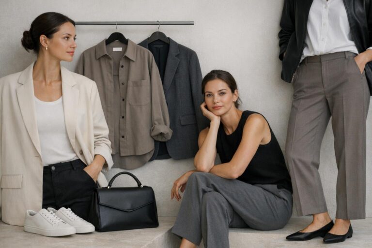
Key pieces for a strong moodboard aesthetic
Because a moodboard is about visual direction, some wardrobe pieces appear repeatedly for a reason. They are versatile, readable, and effective at communicating shape. Tailored outerwear, clean trousers, knit layers, crisp shirting, simple dresses, structured footwear, and compact accessories all help define a styling concept quickly. Their value is not only in trend relevance but in visual clarity.
The exact mix depends on the intended mood, but the principle remains the same: choose pieces that express the concept without requiring too much explanation. A strong garment on a moodboard should communicate line, attitude, and palette contribution at a glance. If it creates confusion, it is probably not the right reference.
- tailored coat or blazer for structure
- relaxed or straight trouser for proportion control
- knitwear for softness and texture depth
- clean shirt for shape contrast
- boots, loafers, or sleek sneakers for tonal grounding
- minimal accessories to hold visual focus
Turning inspiration into a usable board
The final test of a fashion shoot moodboard is simple: can it guide action? A beautiful board that offers no clear styling path is still incomplete. The useful version tells you what silhouettes to prioritize, what palette to maintain, what textures to include, and how dressed or relaxed the final looks should appear.
That is why the best boards feel both visual and strategic. They are compelling enough to establish mood immediately, but clear enough to support practical choices. Each reference has a role. Each look variation contributes to the same story. The styling logic remains consistent from the first image to the final garment selection.
When that balance is in place, the moodboard becomes more than inspiration. It becomes the structure behind a coherent fashion aesthetic, and that is exactly what makes it so effective.
FAQ
What is a fashion shoot moodboard?
A fashion shoot moodboard is a visual planning tool that defines the aesthetic direction of a shoot through curated references. It helps organize mood, silhouette, color palette, texture, and overall styling logic so the final concept feels cohesive.
What should be included in a fashion shoot moodboard?
A useful board should include image references, outfit direction, silhouette cues, color relationships, and texture ideas that all support the same visual identity. The strongest boards are edited carefully so every element reinforces the same mood rather than introducing unrelated inspiration.
How many looks should one moodboard suggest?
There is no fixed number, but the board should show enough variation to express the concept from more than one angle. A tailored version, a softer interpretation, and a more relaxed or street-informed look can work well together if they share the same palette and styling language.
How do you keep a moodboard from looking messy?
Clarity comes from editing. Remove repeated images that do not add new information, tighten the color palette, and make sure the styling references align with the same mood. A board usually feels messy when too many visual directions are competing at once.
Should a moodboard focus more on outfits or overall atmosphere?
It needs both, but they should support each other. Atmosphere gives the shoot emotional tone, while outfit direction translates that tone into wearable styling decisions. If one is strong and the other is vague, the board becomes harder to use.
What is the biggest mistake people make with a fashion shoot moodboard?
The biggest mistake is mixing too many aesthetics without a clear hierarchy. Minimal, romantic, sharply tailored, and street-influenced ideas can all be effective, but they need a unifying structure or one dominant mood to avoid visual confusion.
How do you choose the right color palette for a moodboard?
Choose a palette based on the emotional tone and styling direction of the concept. Tonal neutrals create calm sophistication, monochrome creates graphic clarity, and muted warm shades can add softness. The key is consistency across all references.
Can a fashion shoot moodboard include casual pieces?
Yes, as long as the casual pieces align with the visual identity of the board. Relaxed garments can work beautifully in a polished concept when silhouette, texture, and palette are still controlled. The issue is not casualness itself, but whether the piece supports the overall mood.
How do you know when the moodboard is finished?
The board is finished when the visual direction is immediately clear and every reference has a purpose. If you can identify the mood, the silhouette logic, and the styling path at a glance, the board is likely strong enough to guide the shoot.