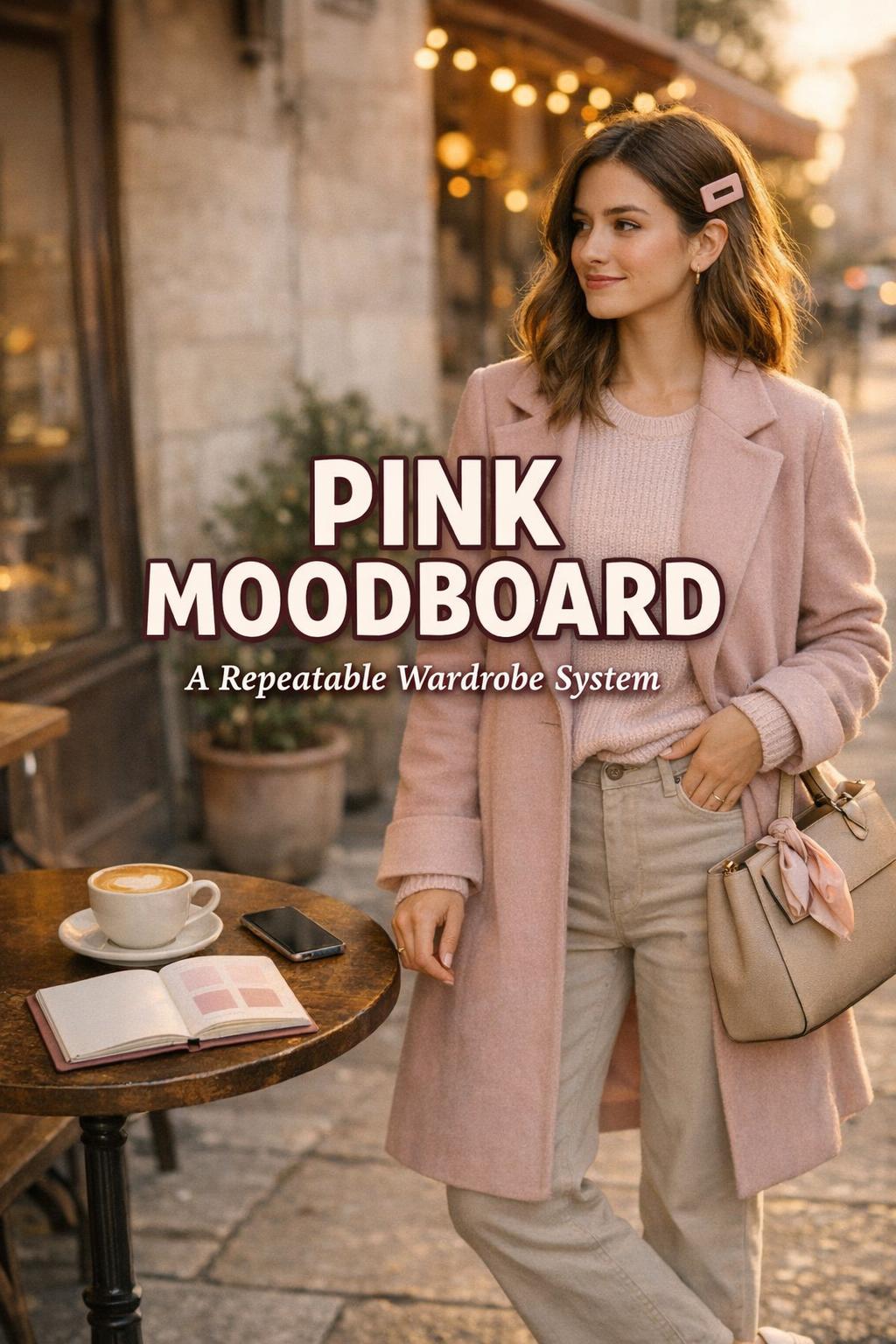
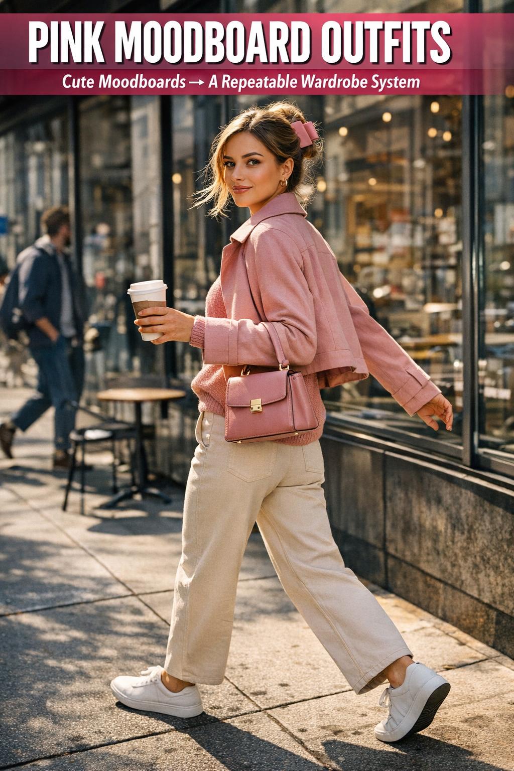
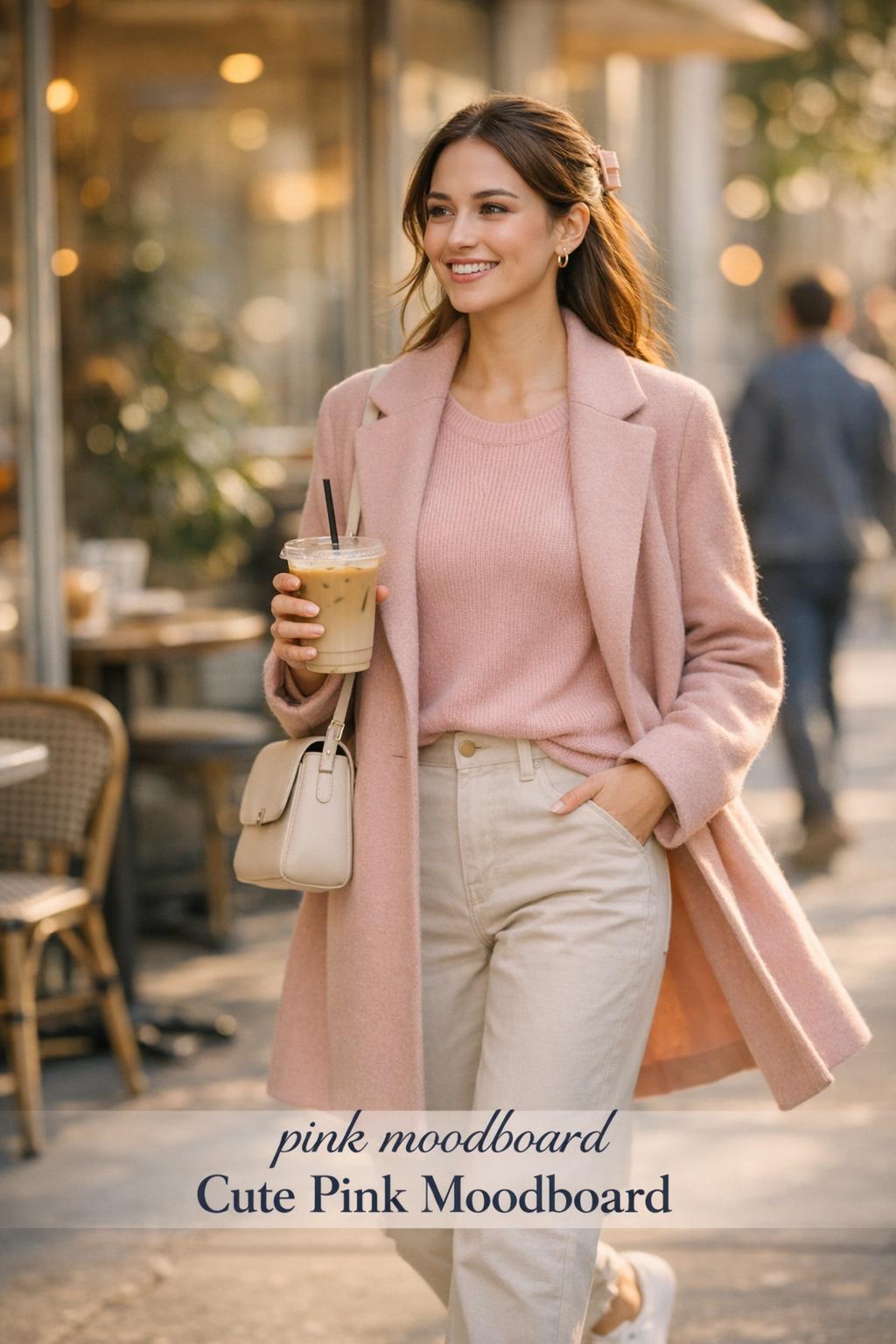
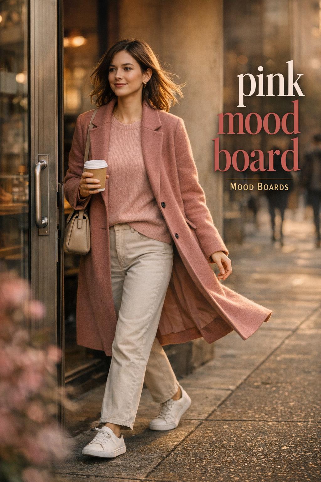
Pink Moodboard Styling: Soft Structure for Everyday Looks
Introduction
A pink moodboard is less about a single “pretty” color and more about building a controlled visual identity: softness, warmth, and a deliberate sense of cohesion. In fashion terms, it reads as tonal styling—shades of pink used as the main thread—supported by textures that keep the look dimensional rather than flat. The result can be airy and romantic, clean and minimal, or playful and graphic, depending on how you anchor the palette.
This aesthetic shows up where you want polish without severity: coffee runs that still feel styled, casual workdays where you need to look pulled together, weekends built around comfort, and content-forward settings where the outfit needs to photograph with clarity. “Soft pink moodboard” energy is especially wearable because it can be gentle without being overly delicate—if the silhouette and fabric choices do the heavy lifting.
The appeal is practical as much as it is visual. Pink works as an instant mood-setter, and a well-built mood board pink concept makes outfit decisions faster: you’re not chasing trends, you’re composing within a framework. That’s also why cute moodboards (and especially a cute pink moodboard) keep circulating—there’s a clear, repeatable formula that still leaves room for personal interpretation.
How to read a pink moodboard as a wardrobe system
A mood board isn’t just “inspo.” Treated intelligently, it’s a wardrobe logic tool: it defines your dominant color family (pink), your supporting neutrals (the tones that stop pink from feeling costume-y), and your texture strategy (the materials that add depth). This is why mood boards translate so well into outfits—you’re not copying a single image, you’re adopting a consistent visual language.
For a soft pink moodboard, the styling goal is controlled gentleness. Think tonal layering, light-to-medium contrast, and silhouettes that feel easy rather than rigid. For a cute pink moodboard, the logic shifts: you lean into contrast (crisp edges, playful proportions, noticeable accessories) while still keeping the palette coherent so the look reads “curated,” not chaotic.
Key pieces that do most of the work
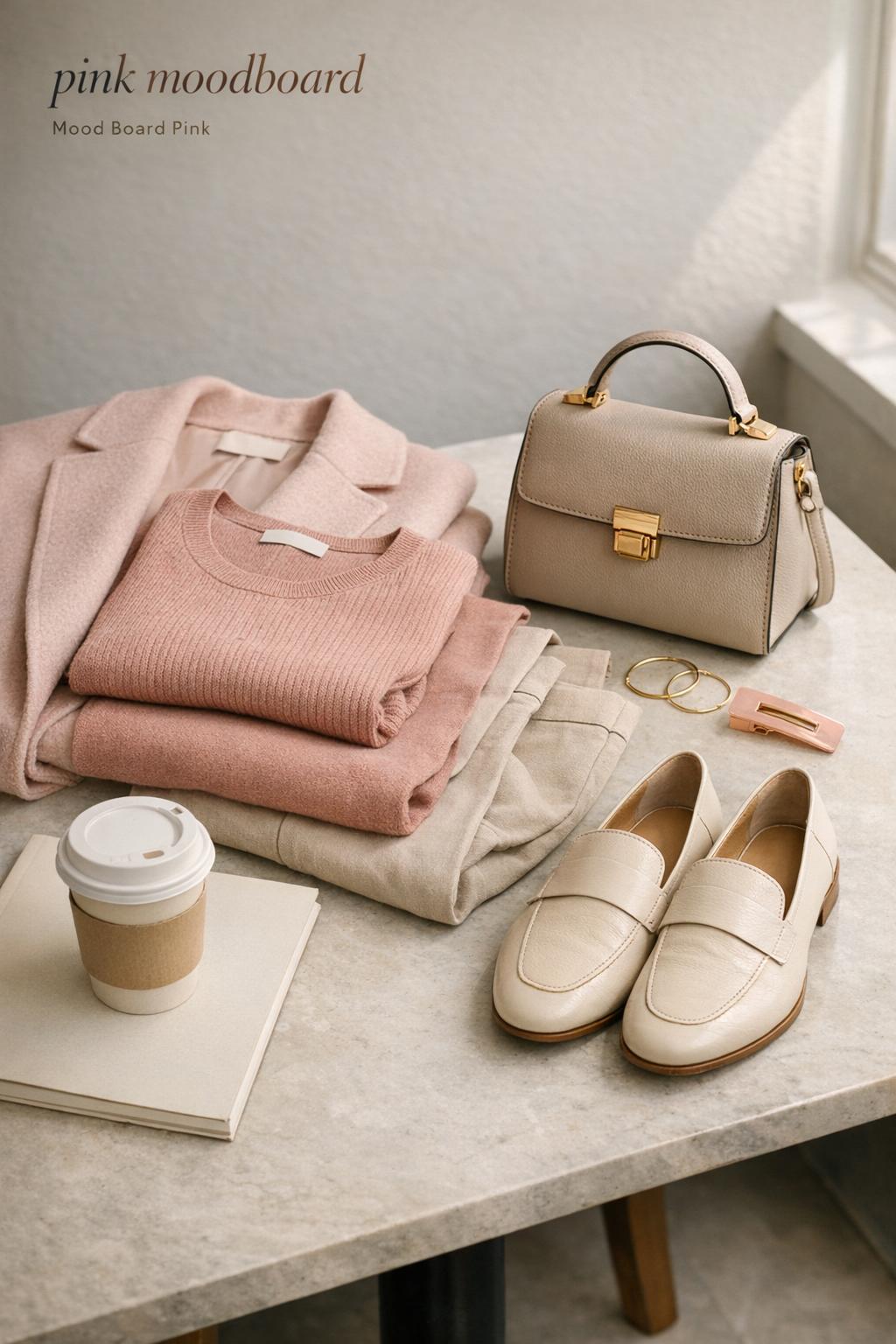
The fastest way to make mood boards wearable is to rely on a small set of “visual anchors”—items that repeatedly deliver the same aesthetic message. In a pink moodboard wardrobe, those anchors are typically your outer layer, your most visible knit, or your statement bottom. Once those are consistent, everything else can rotate.
- A pink-toned outer layer (coat, jacket, cardigan) to set the palette immediately
- A knit or soft-texture top to signal “soft” without needing extra styling
- A clean, simple bottom (trouser, straight-leg denim, skirt) to keep the look structured
- Shoes that align with the mood: sleek for minimal, playful for cute moodboards
- One accessory category that repeats (bag, hair detail, or jewelry) to create continuity
Look: tonal minimalism for a soft pink moodboard
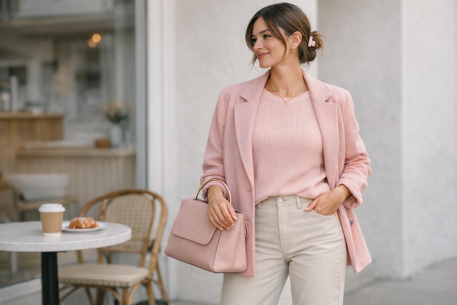
This look is the quiet end of the pink moodboard spectrum: streamlined, low-contrast, and intentionally understated. The silhouette is clean through the body—nothing fussy—so the color story reads as sophisticated rather than sugary. It’s the kind of outfit that feels appropriate in everyday public spaces where you want to look refined without looking overdone.
Build it around tonal layering: a soft pink knit with a slightly deeper or dustier pink outer layer to create dimension. Pair with a simple, straight bottom in a calm neutral so the pink stays the focal point. Texture is the main styling tool here; choose fabrics that look soft to the eye so the mood lands immediately.
- Key garments: soft pink knit top, pink-toned outer layer, straight-leg neutral bottom
- Footwear: clean, minimal shoes to maintain the streamlined effect
- Accessories: one polished bag and restrained jewelry to avoid competing with the palette
Why this outfit works: the palette is cohesive, but the look still has structure because the silhouette is controlled. A soft pink moodboard becomes elevated when you let proportion and texture do the work instead of adding extra “cute” details that can dilute the editorial clarity.
Look: cute pink moodboard with playful proportion
“Cute” doesn’t have to mean childish; it’s about deliberate play. This version of the mood board pink aesthetic uses proportion as the main design element—shorter lengths against longer lines, or volume balanced by something sleek. The vibe is crisp and camera-ready, the kind of outfit that naturally fits settings where style is part of the point.
Keep the pink prominent but introduce a sharper contrast point: a cleaner, more structured piece that makes the softness feel intentional. The palette can still be pink-forward, but the outfit benefits from at least one element that reads “graphic” in shape—something that creates a clear outline and makes the look feel designed.
- Key garments: a pink statement top or layer paired with a structured bottom or structured outer layer
- Footwear: a more “defined” shoe shape to support the cute moodboards energy
- Accessories: one playful detail (hair, bag, or jewelry) as the finishing signal
Why this outfit works: cute moodboards succeed when the outfit has one obvious styling decision. The proportion play becomes the visual anchor, and the pink palette becomes the unifying factor—so the look reads cohesive even when it’s playful.
Look: relaxed pink layers for long, real-life days
A pink moodboard can’t live only in perfect lighting; it has to survive a full day of movement. This look is built around comfort-first construction—soft layers that don’t restrict—while still maintaining a curated palette. The silhouette is gently oversized in one area and cleaner in another, creating an easy balance that still looks intentional.
Use a soft pink moodboard approach: choose a base that feels like loungewear in texture, then add a slightly more “public-facing” layer on top. The key is tonal continuity—your pinks should feel related—so even relaxed pieces don’t look random when combined.
Why this outfit works: the aesthetic holds because the palette is consistent and the silhouette is balanced. Real-world wearability comes from choosing fabrics that don’t wrinkle into chaos and layers that can be adjusted as your day changes.
Style tip: keep the softness, add one “edge”
Relaxed outfits can drift into looking unfinished. The fix is not more accessories—it’s one crisp element: a cleaner shoe, a sharper bag shape, or a more structured outer layer. In mood boards, this is the “contrast note” that keeps softness from becoming shapeless.
Look: polished pink for work-leaning settings
This interpretation treats pink as a strategic color rather than a statement. The silhouette is more tailored: clean lines, controlled volume, and a composition that reads competent and modern. It’s ideal for environments where you want personality without sacrificing credibility.
Keep the pink moodboard energy concentrated in one or two pieces, and let the rest of the outfit act as a stabilizer. A soft pink moodboard can still look professional if you prioritize fabric structure—materials that hold shape—and keep the overall styling minimal.
- Key garments: one pink focal piece, one structured layer, one neutral foundation piece
- Footwear: streamlined and practical for walking and long hours
- Accessories: restrained, repeatable essentials that don’t distract from the palette
Why this outfit works: the tailored silhouette “contains” the sweetness of pink, so the color reads as confident. The mood board pink idea becomes a framework for polish—less about novelty, more about consistency.
Look: weekend softness with a romantic finish
This is the version that leans into the emotional side of a pink moodboard: gentle, airy, and intentionally pretty. The silhouette is fluid, with pieces that move—nothing overly stiff—so the overall vibe feels light. It’s made for casual social plans where you want to look elevated but still approachable.
Keep the palette in the soft range to avoid visual heaviness. A soft pink moodboard benefits from fabrics that catch light in subtle ways, giving dimension without requiring loud pattern or contrast. The key is restraint: romantic doesn’t mean overloaded.
Why this outfit works: softness is expressed through fabric behavior and color harmony rather than excessive detail. That’s how cute pink moodboard energy can mature into an editorial, wearable outfit instead of a costume.
Look: street-clean pink with sharper contrast
This look treats pink as a highlight, not a haze. The mood is modern and clean, with stronger contrast and clearer lines. The silhouette typically features one structured or slightly boxy element paired with a simpler foundation, creating a confident shape that reads current without relying on loud styling tricks.
To keep it within a pink moodboard framework, limit the palette to pink plus one stabilizing neutral. The contrast should look intentional—like a graphic design choice—rather than accidental. The outfit feels especially strong when the pink is placed where the eye naturally lands: outer layer, top, or a central accessory.
Why this outfit works: contrast creates clarity, and clarity photographs well. That’s why mood boards translate into this style so easily—your outfit composition becomes legible at a glance.
Common mistakes that make pink moodboards look flat in real outfits
A pink moodboard is visually persuasive on a screen, but outfits live in real light, real weather, and real movement. The most common styling issues come from treating pink as the only concept, instead of balancing it with proportion, texture, and a clear focal point. When those elements are missing, the look can read as either overly sweet or strangely unfinished.
- Using one single pink tone everywhere: tonal styling needs micro-variation or texture contrast to avoid looking one-dimensional.
- Overloading on “cute” details at once: cute moodboards work best when the playfulness is concentrated in one intentional decision.
- Ignoring silhouette balance: if everything is oversized or everything is tight, the softness can turn into visual clutter or visual harshness.
- Skipping a grounding neutral: a mood board pink palette needs a stabilizer so the eye has a place to rest.
- Choosing delicate fabrics without structure for long days: softness is a mood, but wearability still matters.
Tip: pick your “pink role” before you get dressed
Decide whether pink is the headline (dominant) or the accent (supporting). If it’s dominant, keep silhouettes simple and let texture carry the interest. If it’s an accent, increase structure elsewhere so the pink reads intentional and not incidental.
How to build your own mood boards (without getting stuck)
Mood boards are useful only if they translate into repeatable outfits. The practical approach is to define boundaries: what “counts” as your pink, what neutrals you’ll allow, and what textures signal your version of the aesthetic. This keeps a mood board pink concept from turning into an endless collection of images that never becomes a wardrobe.
A simple framework that keeps the aesthetic cohesive
Start with three decisions: your primary pink range (soft vs saturated), your contrast level (low vs high), and your silhouette bias (relaxed vs tailored). From there, each outfit becomes a variation, not a reinvention—which is exactly why cute pink moodboard styling can be consistent even when it’s playful.
- Primary pink range: commit to “soft pink moodboard” tones or a brighter pink direction, but don’t mix extremes without a plan.
- Contrast level: decide whether you want tonal layering or sharper neutral contrast.
- Silhouette bias: choose one dominant shape language (tailored, relaxed, or proportion-play) to reduce decision fatigue.
- Texture strategy: pick two or three textures you repeat to create continuity across outfits.
Where the pink moodboard aesthetic fits best (and where it can struggle)
In everyday U.S. styling contexts, a pink moodboard wardrobe thrives in situations where the outfit can be read quickly: casual errands, weekend meetups, low-key gatherings, and work settings that allow personal style. It’s also strong for photo-heavy moments because tonal palettes create immediate cohesion.
Where it can struggle is in environments that demand strict uniformity or where practicality dominates—places where delicate tones or softer fabrics are harder to maintain. The fix is not to abandon the aesthetic, but to adapt it: keep pink as an accent, choose more structured materials, and reduce styling details so the look remains functional.
Conclusion
A pink moodboard works as a style system because it’s visually decisive: it sets a tone, creates cohesion, and makes outfits feel curated with less effort. Whether you lean into a soft pink moodboard, build cute moodboards with playful proportion, or keep pink as a polished accent, the strongest results come from the same logic—balanced silhouettes, controlled contrast, and intentional texture. Adapt the framework to your wardrobe, and pink becomes not just a color choice, but a repeatable aesthetic.
FAQ
What is a pink moodboard in fashion terms?
A pink moodboard is a curated visual direction that uses pink as the dominant palette signal, then supports it with consistent neutrals, textures, and silhouette choices so outfits read cohesive rather than random.
How do I make a soft pink moodboard look grown-up instead of overly sweet?
Keep the palette tonal and restrained, prioritize clean silhouettes, and add one structured element as a visual anchor so the softness reads intentional and polished.
What’s the difference between cute moodboards and a minimal pink moodboard?
Cute moodboards rely on playful proportion or a noticeable styling detail as the focal point, while minimal pink moodboards depend more on tonal layering, clean lines, and subtle texture contrast for interest.
How can I wear a cute pink moodboard without looking costume-like?
Concentrate the “cute” element into one decision—such as proportion, a single accessory, or a distinct silhouette—then keep the rest of the outfit clean so the look stays curated.
How do mood boards help me get dressed faster?
Mood boards reduce decision fatigue by setting boundaries for color, contrast, and silhouette, which turns outfit building into selecting within a system instead of inventing a new look each time.
Should pink be the main color or just an accent?
Choose based on your setting and comfort level: use pink as the headline for a stronger aesthetic statement, or keep it as an accent when you need more neutrality, then maintain cohesion through consistent styling and texture choices.
Why do some pink outfits look flat even when the colors match?
Matching colors alone can create a one-note effect; outfits need dimension through texture contrast, micro-variation in tone, and silhouette balance to look intentional in real light.
What’s the easiest way to start building mood board pink outfits from what I already own?
Pick one pink piece you already wear confidently, pair it with a stabilizing neutral base, then repeat that formula while swapping textures or proportions to create multiple variations without changing your aesthetic.