How to Build a Bridgerton Moodboard With a Clear Aesthetic Lane
Bridgerton moodboard culture: why “regencycore” splinters into multiple aesthetics
A search for a bridgerton moodboard rarely stays in one lane. The same visual universe feeds interior design, costume styling, and even themed social gatherings—so the moodboard becomes a shared language rather than a single “look.” That’s why people can use the same reference points (Regency-era interiors, ornate textures, portrait art, fashion-house inspiration) yet arrive at very different outcomes.
This is where the confusion starts: “bridgerton core,” “bridgerton core aesthetic,” “bridgerton vibes aesthetic,” and “bridgerton aesthetic” get used as if they’re interchangeable. In practice, they often describe different styling priorities: some boards center on set-design logic (furniture, art, textiles), others are costume-led (silhouette and embellishment), and a third category is community-led (Pinterest and Tumblr boards that remix the visual codes into fan-first mood stories).

This comparison breaks down the three most common styling approaches behind a bridgerton moodboard—set-decorator Regencycore, costume-driven romance, and fan-curated “Bridgerton vibes”—so you can identify what you’re actually looking at, borrow the right elements for your own board, and build a more coherent visual direction for home, events, or outfits.
Style overview 1: set-decorator Regencycore (the production-grade “bridgerton core aesthetic”)
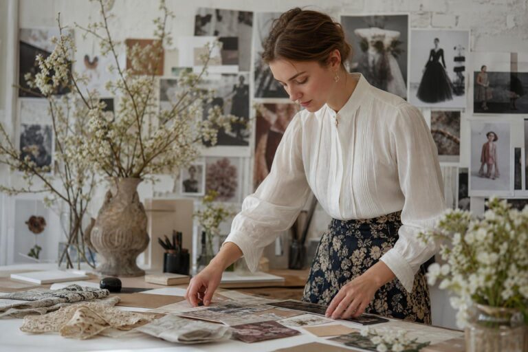
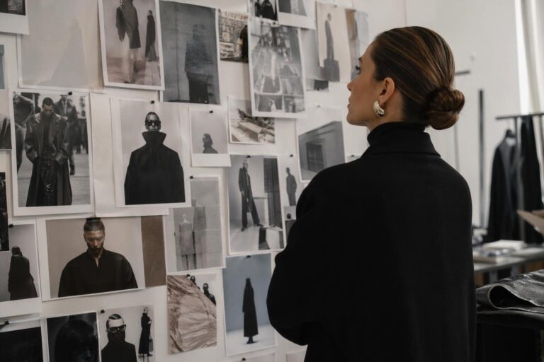
This version of the bridgerton core aesthetic is grounded in how a production team uses mood boards as a practical communication tool. The logic is less “collect pretty pictures” and more “align the team on a controlled visual vocabulary.” In the Bridgerton context, set decorator Gina Cromwell’s approach highlights the moodboard as a working document: it guides decisions about interiors, art, textiles, and how all of those pieces read together on camera.
Defining characteristics are editorial restraint and deliberate sourcing. The board is built from references pulled from books and period magazines, with specific mention of titles like World Of Interiors, and art references that include Dutch masters. The mood is Regency-inspired but curated, with an emphasis on rooms that communicate status, romance, and drama through decor.
Visually, expect a strong interior-design backbone: furniture silhouettes, framed art, wall treatments, and textile samples that can be translated into real set dressing. Even when fashion imagery appears, it’s often there to support the atmosphere of a scene rather than to dictate personal styling.
Silhouette logic
The “silhouette” here belongs to spaces: how furniture shapes, mirror placements, and framed artworks create lines of sight and a sense of grandeur. Instead of outfit proportions, the board focuses on composition—how visual anchors (a painting, a gilded frame, a dominant textile) control what your eye reads first.
Color palette and texture
Rather than naming a single palette, this approach is driven by texture contrast and cohesion: layered textiles, art tones inspired by classic painting references, and repeated finishes that make the “Bridgerton” look feel intentional. The moodboard edits down options so the final palette doesn’t become chaotic.
Overall mood
Polished, scene-ready, and strategically romantic—Regency aesthetics filtered through a modern production workflow. The key tell is that every image seems to explain a decision: “this fabric supports this room,” “this art reference supports this emotional tone,” “this furniture scale supports this kind of social interaction.”

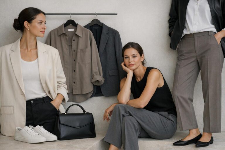
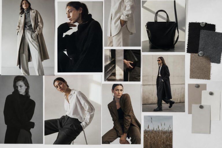
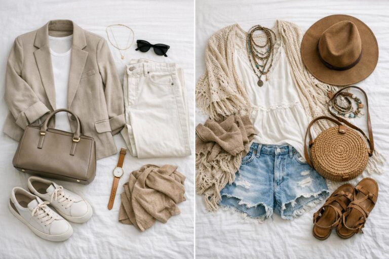
Style overview 2: costume-driven romance (the fashion-forward “bridgerton aesthetic”)
The costume-led bridgerton aesthetic starts with clothing as the main storytelling engine. It’s informed by the show’s wardrobe conversation: references, moodboard-like imagery, and the way outfits build character presence. In this lane, the moodboard is a styling compass—less about rooms, more about silhouettes, trims, and an overall “best outfits” viewpoint.
Because it’s anchored in costume design thinking, this approach naturally links to fashion institutions and references that read as high-impact inspiration. Dior is part of this reference ecosystem, functioning as a shorthand for fashion-house polish and aspirational design language. Julia Quinn also appears as an anchoring entity in the aesthetic conversation, tying the imagery back to the authorial world that the visual identity draws from.
Compared to set-decorator boards, these boards feel more body-centric: they suggest how fabric moves, where structure sits on the frame, and how an outfit’s mood shifts with accessories. Even if you’re creating a bridgerton moodboard for interiors or events, costume-led boards are often where people borrow color harmonies and embellishment cues.
Silhouette logic
Silhouette is the lead visual signal: waist placement, sleeve volume, and the balance between softness (drape, layered textures) and formality (clean structure, refined finishing). The moodboard imagery tends to foreground full looks, not just detail shots, because proportion play is part of the message.
Color palette and texture
Color works like character coding: outfits read as deliberate statements rather than neutral backdrops. Texture is equally important—polish, sheen, and surface interest communicate occasion and hierarchy. This is where “bridgerton pattern” becomes a practical concept: repeated motifs and decorative surfaces are used to build an instantly recognizable visual identity across looks.
Overall mood
Romantic, styled, and designed to be remembered in a single frame. The costume-driven bridgerton vibes aesthetic is about impact—what reads quickly as “Regency-inspired,” even when the references are filtered through contemporary fashion sensibilities.

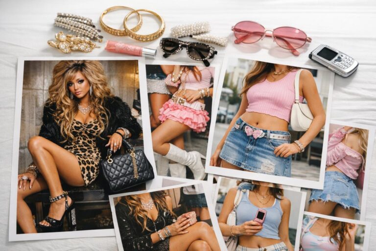
Style overview 3: fan-curated “Bridgerton vibes” (Pinterest/Tumblr moodboard language)
Fan-created boards on platforms like Pinterest and Tumblr function differently from production or editorial design boards. They’re image-first, fast to consume, and built around curation rather than internal project alignment. A Tumblr post titled like a character-focused moodboard (for example, “penthony” themes) doesn’t have to explain a workflow; it has to deliver a feeling.
This is the bridgerton vibes aesthetic at its most flexible. You’ll see character references (including figures like Penelope Featherington appearing in imagery), a mix of costumes and interiors, and sometimes season-adjacent energy (like season 3 anticipation) expressed through mood rather than facts. The board’s authority comes from cohesion and emotional clarity, not from production constraints.
In these boards, “bridgerton core” often becomes shorthand for a curated romantic identity: soft lighting cues, ornate details, floral motifs, and an overall sense of social drama. It’s also where “bridgerton pattern” gets interpreted broadly—anything that visually signals the world is fair game, from decorative textiles to accessory-level motifs.
Silhouette logic
Silhouette is suggestive rather than specific. You might see close-ups, partial outfit shots, and decorative fragments—because the goal is mood coherence. The “outfit” is often implied through a series of visual cues rather than shown head-to-toe.
Color palette and texture
Palettes can be tighter than you’d expect because curation rewards repeatable visuals. Texture is often amplified: glossy fabrics, ornate trims, floral surfaces, painterly art references—anything that reads as romantic and elevated in a scroll.
Overall mood
Immediate, emotive, and character-coded. The board doesn’t need to be “accurate” to feel convincing; it needs a strong through-line that translates instantly to a viewer.

The key differences: what changes when the moodboard is for a set, a wardrobe, or a vibe?
All three aesthetics share Regency inspiration, but they diverge in intention. Intention determines what gets included, how tightly it’s edited, and what counts as a “successful” bridgerton moodboard.
1) The “unit of styling” is different
Set-decorator Regencycore styles a room; costume-driven boards style a body; fan boards style a feeling. That shift changes everything from image selection to layout. A board built like Gina Cromwell’s working tool prioritizes furniture scale, art placement, and textile pairings. A Vogue-style costume conversation prioritizes silhouettes and how references translate to outfits. Pinterest and Tumblr boards prioritize flow: how one image emotionally leads into the next.
2) Editing discipline vs abundance
Production boards emphasize “do not overindulge in inspiration; edit.” That editing is a professional requirement: too many competing references create misalignment across departments. Fan boards can intentionally embrace abundance; the scrollable format rewards variety as long as the emotional tone stays consistent.
3) Reference sources signal different credibility
Set design references can include books, period magazines, and painterly art like Dutch masters; these sources support texture, realism, and the “weight” of the world. Costume-driven boards borrow from fashion references, including Dior, to elevate the look through a recognizable luxury lens. Fan boards often remix both categories plus character imagery, using curation skill rather than archival depth as the credibility marker.
4) “Bridgerton pattern” means different things in each style
In a set-design board, bridgerton pattern reads as textiles and repeated interior motifs—how patterns distribute across upholstery, drapery, and decorative surfaces without visual clutter. In a costume board, bridgerton pattern reads as dress-level surface design and consistent motifs that tie looks together across scenes. In fan boards, it becomes a flexible signal: florals, ornament, and anything that reads romantic at a glance.
Visual style breakdown: how to recognize each approach in five seconds
If you’re saving images quickly—especially from Pinterest—being able to label what you’re looking at prevents the most common moodboard problem: mixing incompatible boards and ending up with a diluted aesthetic. These visual tells help you sort saves into the right “bin” before you start building a final bridgerton moodboard.
Layering approach: space-layering vs outfit-layering vs collage-layering
Set-decorator Regencycore layers surfaces: textiles, art, furniture, and architectural cues in a coherent room composition. Costume-driven romance layers garments and styling details: silhouette, trim, and accessories. Fan-curated boards layer meaning: character energy, scene mood, and visual rhythm created by image sequencing.
Proportion play: scale is the giveaway
In set design boards, scale is literal—chairs, frames, walls, and the spatial relationship between objects. In costume boards, scale is body-relative—volume and structure against the figure. In fan boards, scale is emotional—close-ups and details are used to intensify mood even if you never see the “full look.”
Accessory logic: functional props vs finishing touches vs symbolic objects
Production boards treat accessories as props and set-dressing tools: items must read correctly in a room. Costume boards treat accessories as finishing touches that complete an outfit’s hierarchy. Fan boards treat objects symbolically—an accessory can stand in for a character arc or romantic tension without needing practical context.
Overall balance: controlled clarity vs high-impact glamour vs curated emotion
A production-grade bridgerton core aesthetic looks controlled and intentional, often with fewer images that carry more decision-making weight. Costume-driven boards often look more glamorous and outfit-forward. Bridgerton vibes aesthetic boards look like emotional curation—cohesion comes from atmosphere rather than from rules.
How moodboards actually get used: the practical bridge between inspiration and execution
The reason “bridgerton moodboard” content spans Architectural Digest, Vogue, and fan platforms is simple: mood boards function as both inspiration and workflow. In production, they’re a communication tool that aligns multiple collaborators. In personal style and home projects, they’re a decision filter—something you return to when you’re tempted to add “just one more” conflicting reference.
Gina Cromwell’s set-focused framing is useful even for personal boards because it emphasizes sourcing, editing, and clarity. A board is not only a collage; it’s a brief you can understand later. If you’re building a bridgerton aesthetic for a home corner, a themed gathering, or a wardrobe direction, the same principle applies: you need fewer, stronger visual anchors and a clear logic for how they connect.
Tips: use a “communication caption” under every anchor image
A fast way to make your board function like a professional tool is to add a short caption to the images that matter most. Keep it practical: “art reference for warm neutrals,” “textile texture for romantic softness,” or “silhouette cue for structure.” This mirrors the production mindset where the moodboard must communicate across a team, even if your “team” is just future-you revisiting the board before you commit to a direction.
Side-by-side comparison: building a bridgerton moodboard for fashion vs interiors vs a Regencycore game night
The easiest way to see the differences is to apply each aesthetic to the same real-world task. Below, the goal stays constant, but the styling logic changes based on whether you’re thinking like a set decorator, a costume designer, or a fan curator.
Scenario A: a personal wardrobe board (costume-driven romance wins)
For wardrobe, the costume-driven bridgerton aesthetic is the cleanest foundation because it’s built around silhouette and finishing. Use references that clarify your “hero proportion” first (where you want structure, where you want softness), then refine with bridgerton pattern cues and a consistent surface story. Dior-style reference energy is useful here as a quality bar: not for copying, but for checking whether your board’s pieces align in polish level.
A common failure mode is mixing outfit boards with heavy interior boards and ending up with a vibe that’s ornate but not wearable. Solve that by limiting interior imagery to a small number of palette anchors: one textile texture, one art tone reference, one decorative motif.
Scenario B: a home corner or room refresh (set-decorator Regencycore wins)
Interiors need the production logic: furniture, art, and textiles must coexist for long periods, not just for a photo. Use a Gina Cromwell-style method—seek ideas in unconventional places, pull from print sources, and edit aggressively. World Of Interiors works as a shorthand for editorial interior references, and Dutch masters-style art references help establish a classic visual gravity that reads instantly as “period-inspired.”
The bridgerton core aesthetic here is about distribution: if your board is all ornate detail shots, the result can feel busy. A room board needs wide shots, mid shots, and detail shots so you can see how the “Bridgerton look” holds together at different distances.
Scenario C: a Regencycore game night (fan curation meets practical selection)
A themed gathering is where bridgerton vibes aesthetic boards shine—because mood matters as much as accuracy. But the twist is that you also need functional picks: this is where a Regency board-games moodboard becomes a useful model. Titles like Love Letter: Bridgerton and Impropriety directly reinforce the social dynamics people associate with Bridgerton, so the moodboard can map visuals to activities instead of stopping at decor.
Use the fan-board approach for the emotional narrative (romance, drama, social tension), then borrow the set-decorator discipline for edit control: one core palette, a tight pattern story, and a few high-impact decorative cues that can be executed in a home setting.
Outfit example comparisons: same occasion, three different Bridgerton-style interpretations
These comparisons aren’t about listing specific garments; they’re about seeing how outfit composition shifts when you change the underlying moodboard logic. Think of this as a diagnostic tool: when your look feels “off,” it’s often because you’re mixing styling philosophies.
Example comparison: “polished daytime” in the bridgerton core aesthetic vs the bridgerton vibes aesthetic
A costume-driven bridgerton core aesthetic interpretation prioritizes silhouette balance: a defined structure point (to keep the look formal) paired with a controlled romantic texture story (to keep it soft). The board would show full outfits and reference imagery that clarifies proportion play, with bridgerton pattern used as a deliberate motif rather than an all-over explosion. A bridgerton vibes aesthetic interpretation is more collage-led: the outfit is built around mood cues and recognizable signals (ornate textures, romantic motifs, character-coded colors), even if the silhouette isn’t the primary message.
Example comparison: “evening drama” through costume-led glamour vs set-inspired restraint
Costume-led glamour pushes impact: the moodboard would emphasize standout references, refined finishing, and a surface story that reads in low light—exactly the kind of high-contrast, high-polish energy that fashion references like Dior can help calibrate. A set-inspired approach takes a different route: it treats the outfit as part of a scene. The board would pull palette and texture cues from interiors and art references (including Dutch masters-style tones) to create a look that feels integrated rather than attention-seeking.
Example comparison: “social gathering” outfit logic vs “social gathering” environment logic
For a gathering like a Regencycore game night, a costume-first approach chooses a single hero cue—silhouette or bridgerton pattern—and keeps the rest controlled for comfort and movement. A vibes-first approach coordinates with the environment: your outfit becomes one more decorative element that harmonizes with the room’s palette, the music/soundscape mood-setting, and the curated activities (like Love Letter: Bridgerton), so the overall composition feels cohesive in photos and in person.
What stylists and set-minded moodboarders do differently: sourcing, editing, and “visual accountability”
The biggest gap between a casual board and a production-grade bridgerton moodboard is accountability: every image should have a job. Production workflows treat mood boards as decision tools, which is why the advice to edit is repeated so often. The more ornate the inspiration—Regency interiors, embellished costumes, painterly art—the more editing matters, because ornament can quickly become noise.
Start with sourcing discipline. Pulling from books and magazines creates a different visual texture than pulling only from social feeds, and it often results in more consistent lighting, composition, and detail. Referencing editorial interior sources such as World Of Interiors helps set a standard for how rooms are styled and photographed. Pair that with art references (including Dutch masters) to lock in a period-inflected tonal base, then layer in Bridgerton-specific cues: romantic flourishes, decorative textiles, and character-coded color decisions.
Tips: run an “edit pass” before you add anything new
Before adding more images, do a pass where you remove anything that doesn’t match your board’s top three rules. For example: “palette stays within one family,” “ornament is controlled,” “silhouette matches the intended level of formality.” This mirrors how a set decorator like Gina Cromwell would keep a board tight enough to communicate clearly across a production team.
Common bridgerton moodboard mistakes (and how to fix them without losing the romance)
Bridgerton-inspired boards fail in predictable ways because the aesthetic is inherently maximal: ornate textures, art, florals, decorative surfaces, and high-impact styling. The fix is rarely “make it simpler” in a generic way; it’s “make the logic clearer.”
- Mistake: mixing set design, costume, and fan edits in one unsorted board. Fix: separate into three folders first (interiors, outfits, vibes), then build a final board from one dominant category.
- Mistake: treating “bridgerton pattern” as an all-over requirement. Fix: designate one pattern role: hero motif, supporting motif, or background texture—never all three at once.
- Mistake: skipping art references. Fix: add one to three classic art cues (Dutch masters-style tonal references work well) to stabilize color and mood.
- Mistake: saving only detail shots. Fix: include wide context images (rooms or full outfits) so you can evaluate proportion and balance.
- Mistake: not defining the purpose (home, event, wardrobe). Fix: write a one-sentence brief at the top: “Bridgerton core aesthetic for a Regencycore game night,” or “bridgerton aesthetic wardrobe direction with romantic structure.”
When to choose each style: a decision guide based on real-world constraints
Choosing the right approach isn’t only about taste; it’s about constraints—space, time, comfort, and how long you need the aesthetic to hold up. A board meant for a single photo moment can be more aggressive than a board meant to guide purchases or a room you’ll live with.
Choose set-decorator Regencycore when longevity and cohesion matter
This is the strongest approach for home decor and any scenario where multiple elements must coexist without visual fatigue. It’s also ideal when you need to communicate a look to other people—partners, collaborators, or anyone helping with an event—because it treats the moodboard as a practical communication tool.
Choose costume-driven romance when the goal is wearable polish
This works best for personal style because it begins with silhouette and finishes, which are the fastest levers for making “Regency-inspired” read in real life. If you want the bridgerton core aesthetic without feeling like you’re wearing a costume, this board type keeps the focus on proportion, fabric effect, and a controlled motif story.
Choose bridgerton vibes aesthetic when you’re designing an experience
For themed gatherings, fan events, or anything meant to be consumed visually (photos, shared boards, party previews), fan-curated logic is a strength. It’s also the most flexible for blending references: character moodboards, romantic motifs, and Bridgerton-adjacent touches like Regency board games can all sit together as long as the emotional through-line is clear.
Building a bridgerton moodboard that doesn’t fall apart at execution time
The most functional bridgerton moodboard is one you can execute without constant second-guessing. The production mindset is useful here: the board should narrow options, not expand them. That’s why guidance like “seek ideas in unconventional places” must be paired with strict editing; research breadth is only valuable if you consolidate it into a coherent visual brief.
A practical structure is to choose one dominant aesthetic lane (set-decorator Regencycore, costume-driven romance, or bridgerton vibes aesthetic), then pull only a limited number of “guest” references from the other lanes. For instance, an interior board can borrow one Dior-level fashion reference purely to calibrate polish, while a wardrobe board can borrow one World Of Interiors room image to stabilize palette and texture direction.
Tips: use three anchors to lock the board
Choose three anchor images that define (1) palette, (2) texture/pattern, and (3) silhouette or scale. Everything else must support one of these anchors. This prevents the common Bridgerton problem: adding more ornament until nothing stands out. It also makes your bridgerton core aesthetic easier to communicate—whether you’re planning a room, an outfit direction, or a Regencycore game night built around Love Letter: Bridgerton or Impropriety.

FAQ
What is a bridgerton moodboard supposed to include?
A bridgerton moodboard typically includes Regency-inspired references that clarify color, texture, and mood, often pulling from interiors (furniture, textiles, art), costumes (silhouette and finishing), and curated fan imagery; the best boards also include a few anchor images and are edited tightly so the overall direction stays coherent.
How is “bridgerton core aesthetic” different from “bridgerton vibes aesthetic”?
Bridgerton core aesthetic usually describes a more structured, production-style approach where mood boards function as practical tools to guide decisions (like set design or wardrobe logic), while bridgerton vibes aesthetic is more fan-curated and emotion-led, prioritizing atmosphere and visual rhythm over workflow precision.
What sources work best for a Regencycore moodboard?
Print and editorial references are especially effective, including interior-focused sources like World Of Interiors and classic art references such as Dutch masters, because they provide consistent composition and tonal cues that translate well into interiors, styling, and overall Regencycore atmosphere.
Who is Gina Cromwell and why is she connected to mood boards?
Gina Cromwell is a Bridgerton set decorator associated with using mood boards to guide set design decisions, emphasizing sourcing references, editing inspiration, and using boards as communication tools so interior elements like furniture, art, and textiles align with the intended Regency-inspired look.
How do I stop my bridgerton aesthetic moodboard from feeling cluttered?
Use an edit-first workflow: define a short brief (home, wardrobe, or event), select three anchor images for palette/texture/scale, and remove any reference that doesn’t support those anchors; this reflects the production approach of not overindulging in inspiration and keeping the board clear enough to guide decisions.
What does “bridgerton pattern” mean in styling terms?
Bridgerton pattern refers to the repeated motifs and decorative surfaces that signal the Bridgerton world—such as textile patterns or ornament-inspired details—and it works best when assigned a clear role (hero motif or supporting texture) rather than applied everywhere at once.
Can a bridgerton moodboard be used for a party or game night?
Yes—Bridgerton-inspired moodboards translate well to event planning when they connect visuals to atmosphere and activities, such as a Regencycore game night that pairs decor and soundscape mood-setting with themed games like Love Letter: Bridgerton or Impropriety.
Why do some Bridgerton moodboards reference Dior?
Dior appears as part of the fashion reference ecosystem used to communicate polish, glamour, and aspirational design language, helping costume-led boards calibrate the level of refinement even when the final look remains rooted in Regency-inspired styling cues.
Where do Pinterest and Tumblr fit into bridgerton moodboard building?
Pinterest and Tumblr function as high-volume, image-driven curation spaces where fan-made boards and character-focused edits shape the bridgerton vibes aesthetic; they’re most useful for atmosphere and motif discovery, but they work best when combined with an edited structure so the final board remains actionable.