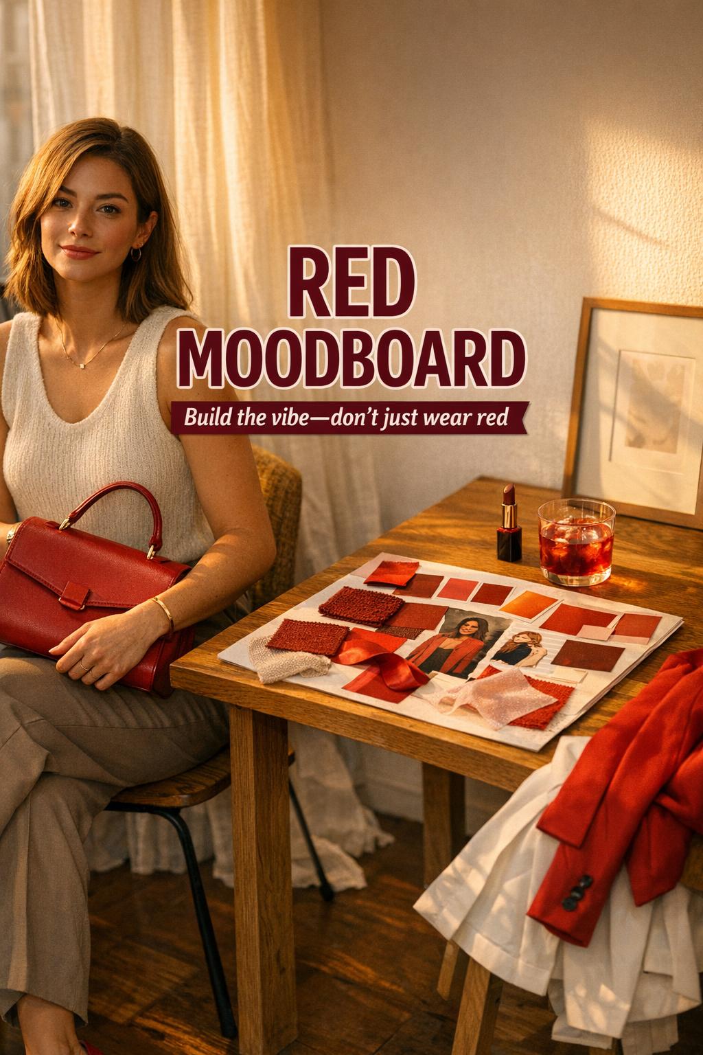
How to Build a Red Moodboard With Editorial Impact
Introduction
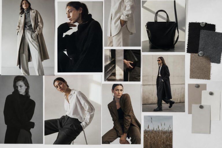
A red moodboard is less about a single color and more about a controlled atmosphere: high-impact, visually anchored, and impossible to ignore. In outfit terms, it reads as a deliberate style identity—whether that identity leans polished and minimal, romantic and soft, or shadowy with a vampire aesthetic color palette that pushes red into deeper, darker territory. The point is cohesion: red becomes the organizing principle that holds silhouette, texture, and detail in a single frame.
This aesthetic shows up where you want presence without chaos: city evenings, gallery openings, date nights, and any moment that benefits from a strong visual signature. It’s also a natural Pinterest-forward look because it translates instantly in photos—red acts as a built-in focal point, guiding the eye the way a good composition should.
What makes it popular is the range inside the constraint. “Red” can be lacquered and sharp, warm and wearable, or dramatic and nocturnal. A mood board red approach gives you a system: pick the red family you’re committing to, build neutrals that support it, and use texture contrast to keep the look dimensional rather than flat.
How to Think in Red Moodboards (Not Just “Wearing Red”)
Red moodboards work when you treat red as a visual anchor, not a novelty. The most reliable styling logic is to decide where the red lives—near the face for impact, at the waist for structure, or at the feet for a grounded statement—and then keep everything else intentionally quieter. This is how a red aesthetic moodboard stays editorial instead of costume-coded.
Next is proportion play. Red reads larger than it is, so a small red detail can carry an entire outfit, while an all-red garment needs clean lines to avoid visual noise. Finally, texture does the heavy lifting: matte knits feel cozy and approachable, satin feels cinematic, leather feels assertive, and sheer layers can steer red into romantic or vampy territory depending on what sits underneath.
- Pick your red direction: cherry-bright, brick-warm, wine-dark, or true primary red.
- Choose a neutral support system: black for drama, white for graphic clarity, or muted tones for softness.
- Build one statement point: coat, blouse, dress, bag, or shoe—then echo red subtly elsewhere if needed.
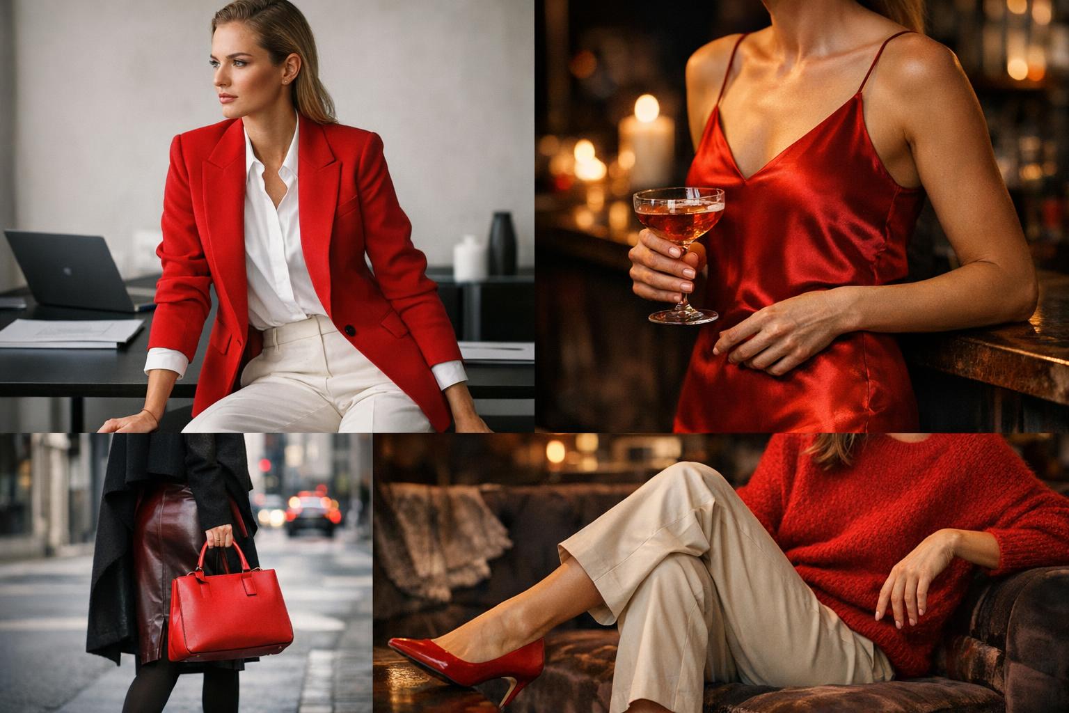
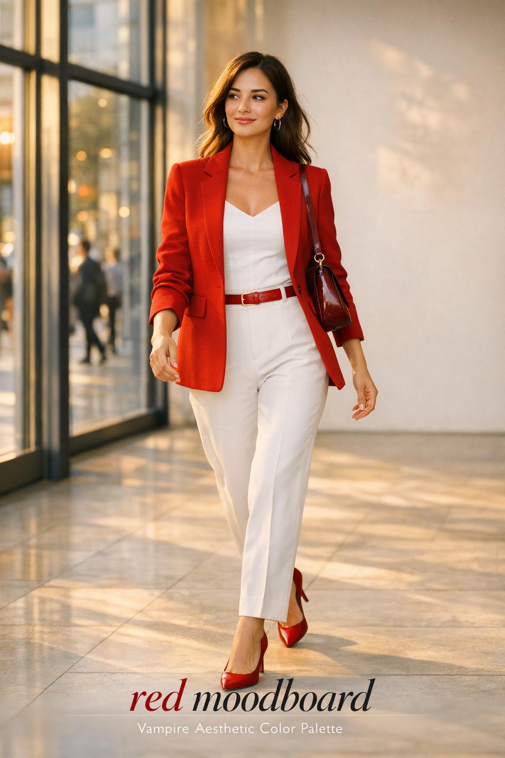
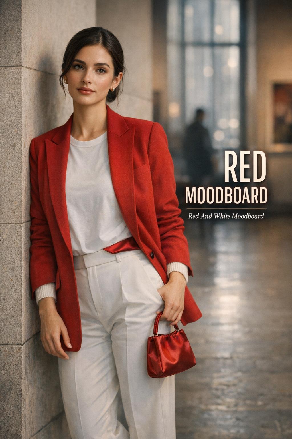
Look: The Graphic Red and White Moodboard
This look channels the clean, high-contrast energy of a red and white moodboard: crisp, modern, and intentionally structured. The silhouette works best when it’s slightly architectural—sharp shoulders, defined waist, or a straight column line—so the palette feels like design rather than randomness.
Keep the base white or off-white to amplify the red. A red blazer over a white top creates immediate hierarchy, while white trousers or a white skirt keep the eye moving. Fabrics should be smooth and decisive—cotton poplin, structured suiting, or a clean knit—because the color contrast is already doing the talking. Add one red accessory only if the blazer isn’t the statement; otherwise, let the blazer carry the entire composition.
- Key garments: red blazer, white top, white tailored trousers or a white midi skirt
- Footwear: minimalist flats or sleek heels in neutral tones
- Accessories: a compact bag that either matches the red or stays neutral to protect the contrast
Why it works: a red-and-white palette is naturally editorial because it reads as intentional color theory—high contrast, clear focal points, and no ambiguity. The trick is to keep the cuts clean so the outfit feels like a moodboard made wearable, not just “red plus white.”
Look: Soft Cherry Knit Layers (Everyday Red Aesthetic Moodboard)
This interpretation takes the intensity down without losing identity. The mood is warm, approachable, and tactile—like a red moodboard translated into a weekend uniform. The silhouette should feel relaxed but not sloppy: a slightly oversized top balanced by a straighter bottom, or a fitted knit balanced by a looser trouser line.
Let a cherry or berry-toned knit be the hero—sweater, cardigan, or knit top—then build soft neutrals around it. Texture contrast is key: pair the knit with smoother fabrics so the red looks rich rather than heavy. If you’re building a mood board red concept for real life, this is where you prioritize comfort: knits move with you, photograph well, and still communicate color intent.
- Key garments: cherry knit sweater or cardigan, neutral bottoms in a clean fabric
- Footwear: simple shoes that won’t compete with the knit texture
- Accessories: minimal jewelry, optional red lip if you want the color echoed near the face
Why it works: knits soften red’s natural dominance. The outfit keeps a clear focal point (the knit) while neutral supports prevent the look from tipping into costume territory.
Style Tip: Where Red Should Sit to Control the Mood
Placement is the fastest way to steer red moodboards into different aesthetics. Red near the face reads bold and communicative; red at the waist reads structured and styled; red at the feet reads grounded and subtle. If an outfit feels “too red,” it’s usually not the color—it’s the distribution. Consolidate red into one zone and simplify everything else.
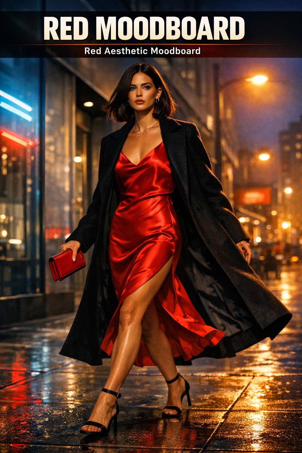
Look: Satin Red Slip Energy (Night-Ready, Clean Lines)
This is the sleek, evening-leaning version of red moodboards: fluid, glossy, and minimal in construction. The silhouette should skim rather than cling—movement is part of the visual. A slip shape is effective because it gives red a continuous surface, which reads confident and controlled.
Choose satin or a similarly light-catching fabric to make the red feel dimensional. Keep layering strategic: one sharp outer layer or a clean, minimal top layer can add structure without cluttering the line. Accessories should be edited—one statement element at most—because satin already creates visual activity through shine.
- Key garments: red satin slip dress or red satin skirt with a minimal top
- Footwear: streamlined heels or refined flats
- Accessories: small bag, restrained jewelry, one focal detail (earrings or a cuff)
Why it works: the shine makes red feel cinematic, while the simple silhouette prevents the look from becoming overwhelming. This is a red aesthetic moodboard built on purity of line and fabric behavior.
Look: The Vampire Aesthetic Color Palette (Wine Red + Shadow Neutrals)
A vampire aesthetic color palette pushes red into its most dramatic register: wine, oxblood, or blood-red tones paired with deep neutrals. The mood is nocturnal and stylized, but it doesn’t need to be theatrical. The strongest version is controlled: a sharp outer layer, a dark base, and one saturated red element that reads like a deliberate signature.
Build the outfit with texture contrast to keep it modern. A matte dark base gives the red room to glow; a smoother or slightly glossy red piece becomes the focal point. The silhouette works best with structure—think clean lines and intentional proportion—because it keeps the palette from feeling like a costume. If you want the vampy energy without committing fully, use red in accessories and keep garments mostly dark.
- Key garments: dark base pieces with one wine-red statement item
- Footwear: sleek boots or sharp, minimal shoes
- Accessories: controlled metal accents, optional deep red lip for tonal continuity
Why it works: deep reds behave like a neutral with a pulse. They’re dramatic but still wearable when anchored by dark tones and clean silhouettes, making this one of the most cohesive red moodboards for evening settings.
Look: Street-Polished Red Accent (Small Red, Strong Impact)
This look is for days when you want the mood board red identity without committing to a full statement garment. The silhouette can stay classic and practical—straight-leg lines, layered basics—while one red accent becomes the visual anchor. The effect is sharp, not loud.
Choose one red element: a bag, a shoe, or a top layer that’s easy to remove indoors. Keep the rest of the outfit in a restrained neutral range so the accent reads intentional. This is also the most flexible way to build red moodboards across seasons: you can keep your base consistent and rotate the red piece depending on weather and occasion.
- Key garments: neutral base outfit with a single red statement accessory or layer
- Footwear: neutral footwear unless shoes are the red accent
- Accessories: one red focal item, minimal additional color
Why it works: red doesn’t need volume to deliver impact. This is proportion logic—small area, high saturation—so the outfit stays wearable and the aesthetic still reads clearly.
Common Red Moodboard Mistakes (and the Fix)
Most red moodboard outfits fail for one of three reasons: too many competing reds, no neutral structure, or mismatched textures. A bright red top with a different bright red shoe can look accidental if the reds don’t match closely; a red-heavy outfit without a neutral anchor can feel visually loud; and mixing multiple high-impact textures (like shine plus heavy pattern plus hardware) can overwhelm the palette.
- Mistake: mixing multiple reds that don’t harmonize. Fix: keep one primary red and echo it subtly, or commit to a single red family (cherry, brick, wine).
- Mistake: no visual rest. Fix: add a neutral block (black, white, or a quiet neutral) to create breathing room.
- Mistake: shine everywhere. Fix: balance one glossy piece with matte fabrics so the red feels dimensional, not chaotic.
Look: Monochrome Red, Done Clean (When You Want Maximum Identity)
A monochrome approach is the most direct interpretation of red moodboards, but it’s also the easiest to get wrong. The silhouette needs clarity—either tailored and streamlined or intentionally oversized with controlled proportions—so the color reads as a design choice. When everything is red, the eye starts reading texture, seam lines, and fit more intensely.
The most wearable monochrome red approach uses tonal variation: slightly different reds within the same family, or one red with subtle shifts in fabric finish. Keep hardware and accessories minimal to avoid visual clutter. This is where fabric choice becomes the styling: a matte red layer next to a smoother red layer creates depth without introducing new colors.
- Key garments: red top layer + red base pieces in the same tonal family
- Footwear: red shoes for full commitment or neutral shoes to soften the effect
- Accessories: minimal, clean lines, avoid competing statement elements
Why it works: tonal layering turns a single color into a full composition. This is the most “mood board red” version of the aesthetic because it relies on harmony, not variety.
Where These Red Moodboards Wear Best (Real-Life Context)
Red moodboards perform differently depending on lighting and setting. High-contrast looks—especially a red and white moodboard—read crisp in daylight and indoor bright spaces, making them strong for daytime city plans or professional environments where you want polish. Satin-heavy looks come alive at night, where shine catches ambient light and feels intentional rather than flashy.
For long wear—commutes, dinners, events—the most practical versions are the knit-led red aesthetic moodboard and the red-accent street-polished formula. They keep the identity while staying comfortable and adaptable. The vampire aesthetic color palette shines in evening venues and low light, but it can feel heavy in bright midday settings unless you lighten the silhouette or reduce the number of dark elements.
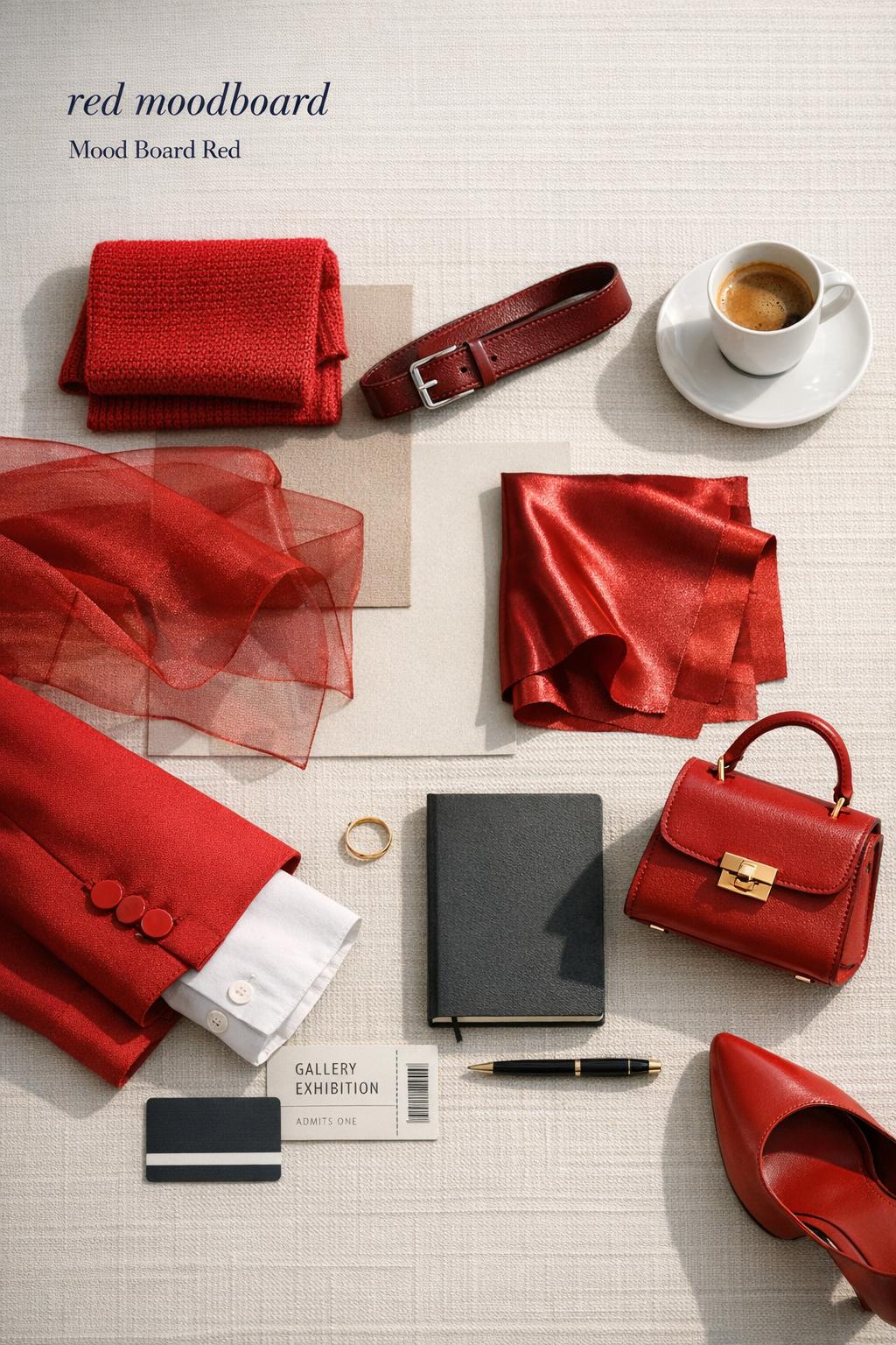
Key Pieces That Build a Mood Board Red Wardrobe
If you want repeatable red moodboards instead of one-off outfits, prioritize a small capsule of red “anchors” and neutral “support” pieces. The anchors are what carry the mood; the supports keep it wearable across settings. The goal is not quantity—it’s reliability, so you can recreate the same aesthetic across different occasions.
- Red anchors: a structured red layer, a soft red knit, and one evening-friendly red piece with shine
- Neutral supports: clean base layers and bottoms that don’t fight with red’s intensity
- Accent strategy: one red accessory that can “stamp” the mood on a neutral outfit
How to Recreate the Look Without Overthinking It
Start with one decision: is your outfit a red statement garment or a red accent? Then build outward using only one additional variable—either texture contrast or silhouette contrast. For example, if the red piece is structured, keep the rest soft; if the red piece is glossy, keep the rest matte. This keeps the outfit composition clean and prevents the most common red moodboard issue: too many “loud” elements competing at once.
When you want a fast win, default to a red and white moodboard formula for sharp clarity or a vampire aesthetic color palette for evening drama. Both are naturally cohesive because they rely on a limited palette and clear visual hierarchy.
Conclusion
Red moodboards work because they give your outfits a built-in point of view: a controlled palette, a clear focal point, and a styling logic that translates across casual and elevated settings. Whether you lean graphic with a red and white moodboard, soft with a knit-based red aesthetic moodboard, or cinematic with a vampire aesthetic color palette, the aesthetic stays consistent when you keep red intentional, neutrals supportive, and texture contrast deliberate.
FAQ
What makes a red moodboard outfit look cohesive instead of chaotic?
Cohesion comes from visual hierarchy: one primary red focal point, supportive neutrals, and controlled texture contrast so the eye knows where to land first.
How do I build a red and white moodboard without looking too harsh?
Use clean silhouettes and keep the red concentrated in one structured piece, then let white stay simple and uninterrupted so the contrast reads crisp rather than aggressive.
What’s the easiest way to wear red moodboards for daytime?
Use a soft red knit as the anchor or choose a single red accent (like a bag or shoes) over a neutral base so the mood reads intentional but remains practical.
How do I make a vampire aesthetic color palette feel wearable?
Keep the silhouette clean and structured, use a dark neutral base, and choose one wine-red statement piece so the palette feels stylized and modern rather than costume-like.
Can I do monochrome red without it feeling overwhelming?
Yes—use tonal layering within the same red family and balance matte and smooth finishes so depth comes from texture and shade variation instead of extra colors.
Where should red go in an outfit if I want a subtle effect?
Place red at the feet or in one accessory so it functions as a small but strong visual anchor while the rest of the outfit stays neutral and calm.
Why do some red outfits look “off” even when the pieces are nice?
The most common issue is mixing reds that don’t harmonize; keeping to one red family and using neutrals to create visual rest usually fixes the imbalance immediately.
What’s the difference between red moodboards and a red aesthetic moodboard?
Red moodboards can span multiple style directions, while a red aesthetic moodboard implies a more consistent identity—repeatable silhouettes, textures, and a clear red palette that stays recognizable across outfits.