How to Style a Dior Moodboard for Spring Dressing
Some style problems are not about finding more clothes. They are about finding a clearer visual direction. That is exactly where a dior moodboard becomes useful. Whether you are dressing for a fashion week event, building editorial outfits, planning a refined wardrobe refresh, or trying to translate couture references into real outfits, the challenge is usually the same: the inspiration feels rich, but the final look can become scattered.
Dior references often pull from art, literature, campaign imagery, botanical motifs, and craft traditions all at once. Jonathan Anderson’s Dior debut moodboard, for example, connected Andy Warhol polaroids of Lee Radziwill, Jean-Michel Basquiat, Dracula, Dangerous Liaisons, and Dior book totes. In another Dior context, the visual language moved toward Niki de Saint-Phalle and Cindy Sherman. Dior Men SS2024 added ronghua, Nanjing craftsmanship, and a cross-cultural dialogue shaped through Kim Jones and collaborators. The result is beautiful, but not automatically easy to wear.
This guide solves that problem by turning moodboard imagery into practical styling logic. Instead of treating a Dior-inspired board as abstract fashion fantasy, it breaks down how to build wearable outfits from the same cues: silhouette balance, texture contrast, color discipline, accessory focus, and setting-appropriate polish. The goal is not costume. The goal is a composed, intelligent wardrobe direction that feels artful and usable.
Why a Dior-inspired wardrobe can feel difficult to translate
The difficulty starts with density. A Dior moodboard rarely depends on one idea alone. It can combine haute couture polish, campaign photography, literary symbolism, visual art, historical romance, and modern runway references. That layered richness is what makes the brand so compelling, but it also creates a common styling mistake: wearing every influence at once.
There are also practical constraints. An outfit has to work in weather, through movement, across long days, and in social environments that may not support overt runway drama. A look inspired by Gothic romance, Warhol portraiture, Basquiat energy, or a Paris Fashion Week visual story needs editing before it becomes useful in daily life. Without that edit, the outfit can feel too theatrical, too precious, or visually overloaded.
Another issue is context. A Dior campaign moodboard can support a photoshoot, but a real wardrobe has to perform in offices, city walking, travel days, gallery visits, dinners, and events. The challenge is balancing style with function while preserving the moodboard’s emotional core. That is where structure matters more than excess.
The working method: use the moodboard as a design compass, not a shopping list
In the Dior context, a moodboard works best as a design compass. It helps define what your outfit should communicate before you decide what to wear. This shift is essential. Instead of copying images literally, identify what the board is telling you about line, mood, palette, and visual anchors.
A practical Dior-inspired outfit usually relies on four decisions. First, choose one dominant reference: art-led, literary, botanical, campaign-driven, or craft-focused. Second, build around a clear silhouette. Third, keep the palette disciplined. Fourth, let one statement element carry the board’s strongest personality. This method keeps the styling intentional.
- If the board references Warhol and Lee Radziwill, focus on polished portrait elegance rather than piling on every vintage cue.
- If Basquiat is the key signal, introduce expressive contrast through one graphic or textural focal point, then keep the rest controlled.
- If Dracula or Dangerous Liaisons informs the mood, use tension between romance and restraint instead of turning the look into period costume.
- If ronghua and Nanjing craftsmanship are the lead inspiration, prioritize refined floral structure, softness, and surface detail over novelty.
This is the difference between an outfit that references Dior and one that simply borrows random luxury signifiers.
Core dressing principles behind a successful Dior moodboard look
Start with a visual anchor
Every effective outfit composition needs a center of gravity. In a Dior-inspired look, that could be a book tote, a tailored layer, a floral headwear element, a strong print, or a portrait-like color story. Without a visual anchor, references such as Warhol, Basquiat, Niki de Saint-Phalle, or Cindy Sherman compete rather than connect.
Control the palette before adding detail
Color harmony stabilizes rich references. If your inspiration comes from Gothic romance or literary drama, a narrower palette helps prevent visual noise. If your board pulls from a more expressive art source, like Basquiat or Saint-Phalle, use one brighter note against a quieter base. This creates proportion play within the color story rather than chaos.
Use texture contrast to replace over-accessorizing
Many readers try to make an outfit feel more “fashion” by adding too many pieces. Dior-inspired dressing usually works better through texture contrast: smooth versus tactile, polished versus crafted, structured versus soft. That principle is especially relevant when drawing from ronghua or from campaign imagery where surface and finish matter as much as silhouette.
Keep historical references edited
Dracula and Dangerous Liaisons can suggest atmosphere, but atmosphere is not the same as costume. In practical styling, historical reference should shape proportion, romance, or mood rather than dictate literal replication. A modern wardrobe benefits from suggestion, not reenactment.
Match the outfit to movement and setting
A Paris-centered moodboard may imply elegant city movement, while a fashion event may call for sharper image-making. A daily wardrobe still needs walkability, layering flexibility, and comfort over several hours. That means your Dior inspiration should be adjusted depending on whether you are dressing for a gallery, a creative workplace, a dinner, or a runway-adjacent event.
Reading the major Dior moodboard directions and how to wear them
The Warhol and Lee Radziwill direction: polished portrait dressing
This direction is ideal for readers who want elegance without stiffness. The styling logic is about composure, clean lines, and an image that feels curated rather than casual. The mood is less about trend and more about visual poise. In practical terms, this means selecting pieces that hold shape and read clearly from a distance.
The strongest wardrobe translation is a streamlined outfit with one elevated carry piece, such as a Dior book tote, and controlled tonal layering. This works particularly well for city appointments, a smart lunch, or fashion-facing professional settings where polish matters but overt formalwear would feel excessive.
The Basquiat direction: expressive contrast with structure
Basquiat-based references bring energy, but that energy needs containment in wearable styling. The most effective approach is pairing one expressive element with a stable silhouette. Graphic impact can come from print, color blocking, or a more directional accessory, while the rest of the look remains composed. This creates tension without losing sophistication.
This route suits readers who want a stronger fashion identity but still need practical outfits. It is especially useful for events, creative offices, or evening settings where a moodboard-driven look should feel intentional rather than decorative.
The Dracula and Dangerous Liaisons direction: romance under control
This is one of the easiest Dior references to overdo. The workable version is built on restraint. Focus on elongated lines, deep mood, and one romantic detail rather than a fully theatrical composition. The key is tension between severity and softness. That tension is what gives the outfit authority.
For a dinner, cultural event, or evening city look, this can be exceptionally effective. It communicates literary confidence and visual depth while staying wearable if the silhouette remains clean.
The Niki de Saint-Phalle and Cindy Sherman direction: image-conscious artistic dressing
This direction works for readers drawn to fashion editorial language. The styling challenge here is balancing statement-making visuals with coherence. Because these references point to strong image construction, the outfit should feel edited and self-aware. A good result often comes from pairing one visually assertive piece with a disciplined base palette.
This approach suits creative events, fashion week environments, and situations where clothing is expected to communicate perspective. It is less about conventional minimalism and more about controlled visual narrative.
The ronghua and Nanjing craft direction: softness, form, and cross-cultural refinement
Dior Men SS2024 introduced another useful moodboard framework: craftsmanship translated through floral structure and contemporary elegance. With Kim Jones, Edward Crutchley, Zhao Shu Xian, Stephen Jones, and Cecile Feilchenfeldt in the broader collaborative orbit, the emphasis moves toward considered detail rather than obvious flourish.
To wear this well, prioritize subtle material interest and shape. Floral cues should feel integrated, not novelty-driven. This is particularly effective for spring events, design-focused settings, and looks that need softness without losing precision.
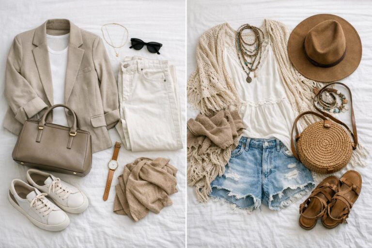
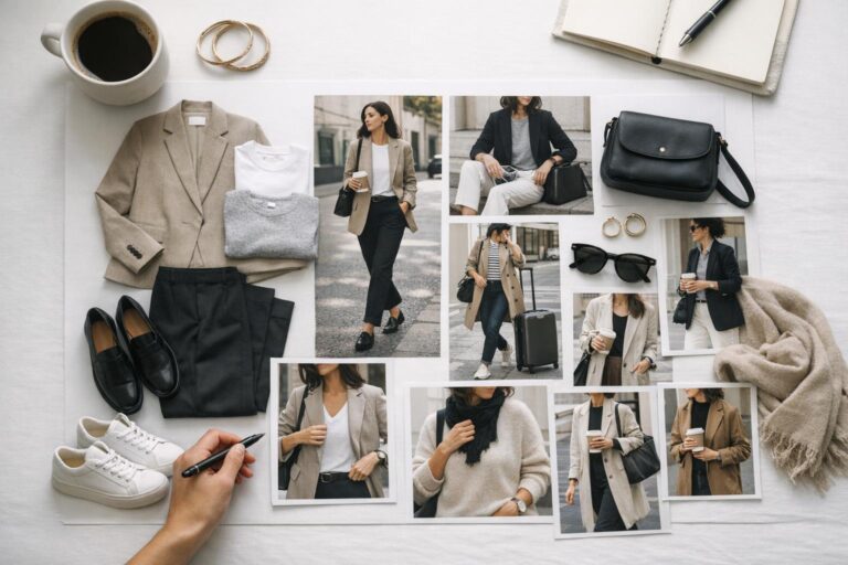
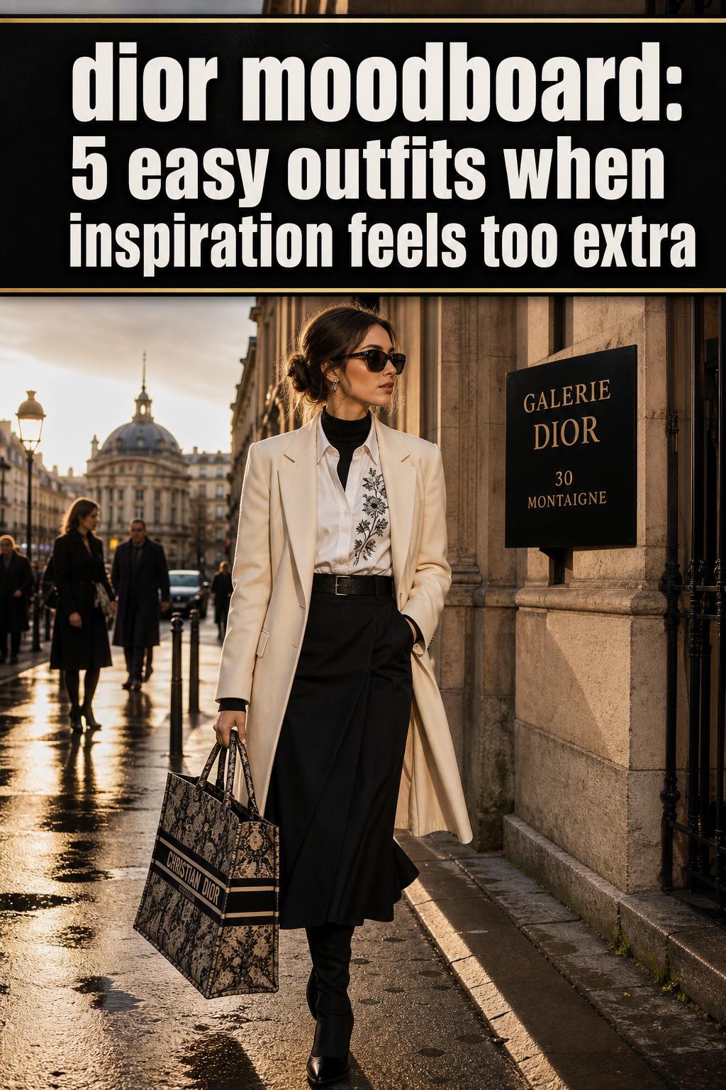
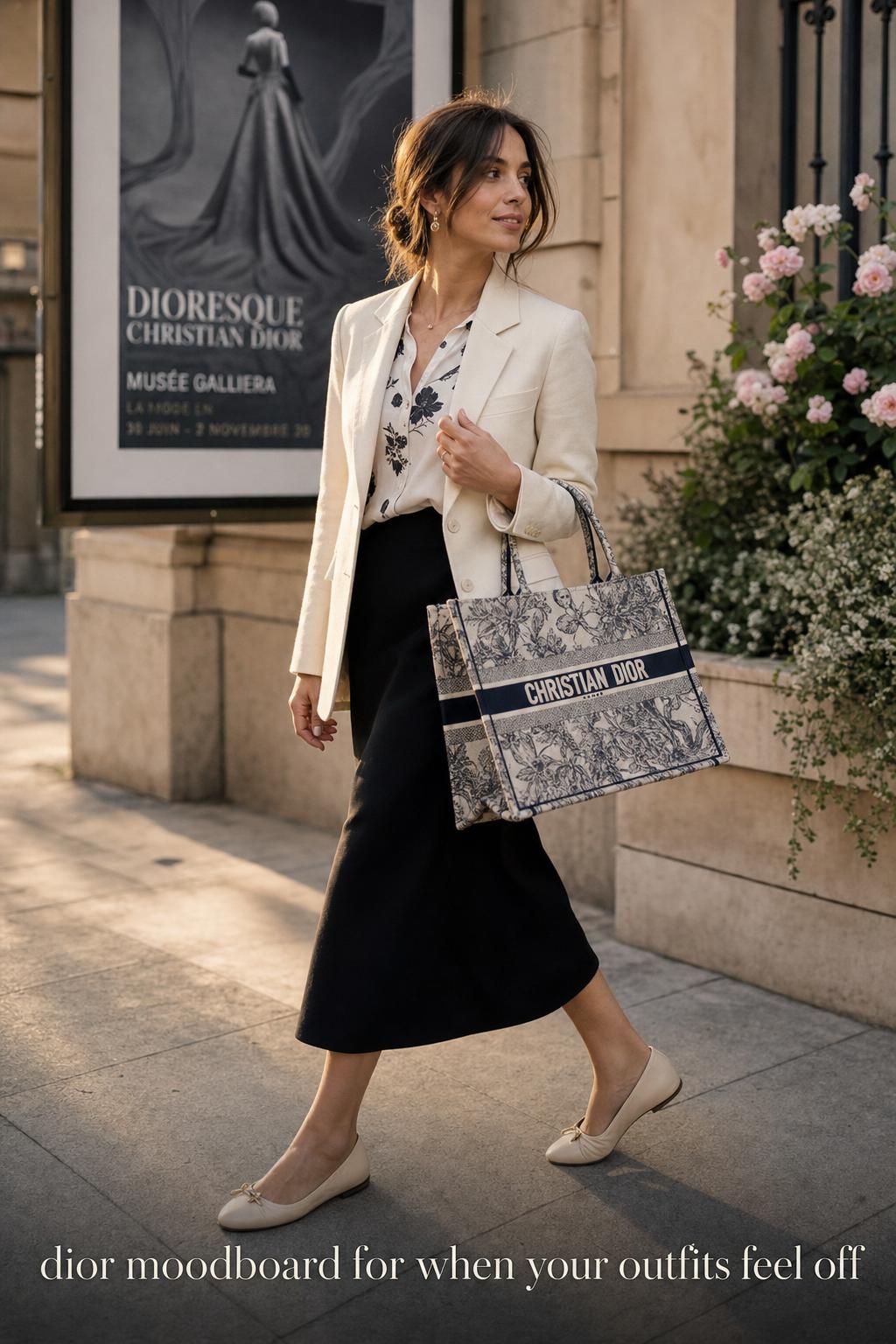
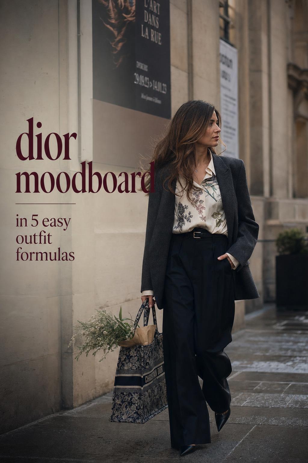
Outfit solution: refined city dressing built around the Dior book tote
This outfit solves the problem of wanting visible Dior moodboard energy without becoming overdressed for daytime. Start with a clean, structured base and let the Dior book tote function as the visual anchor. The tote is useful because it carries both brand language and intellectual styling cues, especially when the broader moodboard includes literary references such as Dracula or Dangerous Liaisons.
The combination works because the bag gives the outfit narrative weight, while the surrounding clothing can stay streamlined. A tailored outer layer and simple separates create silhouette balance. The tote introduces editorial intent, but the total composition remains practical for walking, meetings, and city transitions.
This is the strongest option for readers who want a Dior campaign moodboard effect in a real-world setting. It is polished, legible, and easy to repeat without feeling costume-like.
Outfit solution: art-led smart casual for creative work or gallery settings
For readers inspired by Basquiat, Niki de Saint-Phalle, or Cindy Sherman, the challenge is usually avoiding visual overload. The practical answer is a smart casual formula with one high-impact art cue and one stabilizing tailored piece. This creates a dialogue between expression and discipline.
The reason this combination performs well is that it respects both movement and image. In a gallery setting, a fashion office, or an event near Paris Fashion Week energy, the outfit needs to look visually aware without sacrificing ease. A controlled silhouette keeps the composition sharp, while the art reference stops it from becoming generic.
This look also adapts well across seasons because it can be layered. Add or remove structured outerwear depending on temperature, but keep the central art-driven note visible so the moodboard logic remains intact.
Outfit solution: literary evening dressing with Gothic restraint
Many evening outfits become predictable because they rely only on formality. A Dior-inspired literary approach offers a stronger point of view. Use Dracula and Dangerous Liaisons as mood references, but filter them through a disciplined silhouette. The most successful version combines darkness, polish, and one romantic accent.
This works because evening light changes how texture and line are perceived. A sharper outline and controlled surface contrast read more powerfully at night than excessive embellishment. The outfit feels intelligent rather than simply dramatic. It is especially effective for dinners, fashion events, and cultural occasions where atmosphere matters.
If you add too many overtly historical elements, the look can lose modernity. The stronger solution is one visual suggestion of romance paired with modern clarity elsewhere in the outfit composition.
Outfit solution: botanical tailoring inspired by Dior Men SS2024
This is the answer for readers who want softness and fashion credibility without obvious femininity or excess ornament. The visual source here is the ronghua-focused language associated with Dior Men SS2024, Nanjing craft references, and the contemporary elegance developed through collaboration. Floral influence appears through form, texture, and color rather than obvious decorative messaging.
In practical styling terms, the look should be tailored but not rigid. The silhouette needs enough structure to keep the floral idea refined. This balance makes the outfit appropriate for daytime events, spring presentations, and design-led settings where detail is appreciated at close range.
The reason this direction is useful is that it broadens the idea of a Dior moodboard beyond Paris romance alone. It shows how craft, geography, and material culture can shape an outfit while still feeling current.
Outfit solution: fashion week composition with controlled statement dressing
A fashion week environment creates a very specific challenge. The outfit has to register visually in photographs and public space, but it also needs stamina. Readers often overcompensate by layering too many trend cues. A Dior-based solution is more strategic: choose one image-making element, one tailored anchor, and one practical component that supports movement.
This formula works well because it reflects how moodboard-driven dressing operates in editorial contexts. The statement piece delivers memorability. The tailored anchor creates visual discipline. The practical component keeps the outfit usable throughout the day. In Paris or any city event setting, this balance is what separates style from overstyling.
- Use one statement piece only, not several competing focal points.
- Keep the palette coherent so photographers and real life read the outfit the same way.
- Choose accessories that support long hours, not just a brief entrance moment.
- Let the moodboard influence the tone of the look rather than every single item.
How geography changes the styling logic
Location matters in a Dior moodboard because place affects both references and wearability. Paris remains central to much of Dior’s image vocabulary, especially in fashion week and campaign contexts. That often encourages polished city dressing, sharper silhouette definition, and an elevated relationship between outerwear and accessories.
Nanjing enters the picture through ronghua and craftsmanship, shifting the moodboard from pure image culture toward making, technique, and material delicacy. That difference matters when building outfits. A Paris-coded look might rely on graphic polish and urban poise. A Nanjing-linked craft reference might ask for softer textural transitions and more attention to detail at close range.
Dublin appears in the literary conversation through Bram Stoker’s Irish roots, adding another layer to the Gothic and narrative side of the Dior board. This does not require a literal location-based costume. It simply expands the emotional palette available to the wardrobe: romance, tension, atmosphere, and cultural reference.
Where readers usually go wrong with Dior-inspired styling
The most common mistake is treating every reference as equally important. If Warhol, Basquiat, Lee Radziwill, Dracula, Cindy Sherman, and ronghua all appear in your inspiration folder, they should not all appear in one outfit. Moodboards are meant to organize ideas, not flatten them into a single crowded look.
Another mistake is misunderstanding luxury dressing as constant decoration. Dior moodboard styling is often strongest when one piece carries the emotional intensity and the rest of the outfit provides structure. This is particularly important in daytime settings, where too many statement elements can make the look feel unstable.
A third problem is ignoring practicality. Shoes that limit movement, layers that do not respond to weather, or accessories chosen only for image can derail the effect quickly. A well-built outfit should still work after several hours of walking, sitting, commuting, or socializing.
Practical tips for building your own Dior moodboard wardrobe
Tip: organize references by mood, not by category alone
Instead of collecting random pictures of Dior campaigns, art, and runway details, group them by the feeling they produce: polished portrait, artistic tension, literary romance, or botanical refinement. This makes styling decisions faster because each outfit starts with a clear emotional brief.
Tip: translate house codes into wearable signals
Dior Oblique, toile-inspired pattern language, Miss Dior references, and book tote imagery are easier to wear when they appear as one focused signal rather than a full branded stack. The outfit benefits from one recognizable code supported by quieter pieces.
Tip: let accessories do part of the storytelling
Accessories are one of the smartest ways to carry a Dior campaign moodboard into everyday styling. A tote, headwear element, or print-driven accent can convey the reference without requiring a full editorial outfit. This is especially useful when the setting is professional or daytime.
Tip: adapt the look to climate and duration
If the day involves movement, city walking, or changing indoor and outdoor temperatures, prioritize tonal layering and stable footwear. A moodboard that looks perfect on a screen still has to function over hours. Practicality protects elegance.
A simple framework for styling from inspiration boards without losing clarity
When a board feels too visually rich, use a three-part editing system: source, silhouette, signal. The source is the main reference point, such as Warhol, Basquiat, Saint-Phalle, Sherman, Dracula, or ronghua. The silhouette is the shape that translates that source into wearable clothing. The signal is the one detail that makes the reference legible.
For example, if the source is Cindy Sherman, the silhouette may be clean and image-aware, while the signal could be one sharply chosen visual accent. If the source is Dangerous Liaisons, the silhouette may become more elongated and romantic, while the signal could be a single refined detail that suggests period tension without imitating it literally. This framework keeps the outfit coherent.
It also helps with wardrobe repetition. Once you know your strongest Dior moodboard direction, you can remix it across settings instead of inventing a completely new image every time.
Fashion intelligence takeaway: what makes a Dior moodboard useful in real dressing
The value of a Dior moodboard is not that it gives you more images. Its value is that it sharpens decision-making. It teaches you to identify the dominant influence, define the outfit’s visual anchor, and control how art, literature, craft, and brand language enter the wardrobe.
Jonathan Anderson’s Dior moodboard showed how Warhol, Lee Radziwill, Basquiat, Dracula, and Dangerous Liaisons can coexist in one design conversation. Dior’s broader moodboard language has also moved through Niki de Saint-Phalle, Cindy Sherman, Paris Fashion Week framing, and the cross-cultural craft story of Dior Men SS2024 with Kim Jones and ronghua. For readers, the lesson is clear: the strongest outfits do not copy this density literally. They edit it into one clear direction.
Once that principle is understood, Dior inspiration becomes surprisingly practical. It can guide city dressing, event wardrobes, creative work outfits, and statement evening looks with far more precision than trend-led styling alone.
FAQ
What defines a Dior moodboard?
A Dior moodboard is defined by curated visual references that guide the tone of a collection, campaign, or styling direction. In the Dior context, that often includes art, literature, campaign imagery, craft references, accessories such as book totes, and a strong sense of silhouette and atmosphere.
How can I use a Dior moodboard for everyday outfits?
Use it as a filter rather than a literal template. Choose one dominant inspiration, keep the palette controlled, build around a clear silhouette, and let one item act as the visual anchor. That approach makes the look wearable while preserving the moodboard’s personality.
Why are artists like Andy Warhol, Basquiat, Niki de Saint-Phalle, and Cindy Sherman connected to Dior moodboards?
These artists appear as reference points because Dior moodboards often draw from visual culture beyond fashion alone. Warhol, Basquiat, Saint-Phalle, and Sherman each represent a distinct image language, and those languages can shape color, mood, styling emphasis, and the overall narrative of a collection or editorial direction.
How do literary references like Dracula and Dangerous Liaisons translate into clothing?
They translate best through atmosphere rather than costume. In practical styling, that usually means controlled romance, darker tonal direction, cleaner lines, and one suggestive detail that hints at drama or tension without turning the outfit into historical reenactment.
What is the easiest mistake to make with a Dior-inspired outfit?
The easiest mistake is using too many references in one look. Dior moodboards can hold multiple ideas at once, but an outfit usually cannot. The strongest result comes from editing the board into one clear visual message supported by proportion, palette, and texture control.
How does Dior Men SS2024 change the idea of a Dior moodboard?
Dior Men SS2024 expands the concept by bringing in ronghua, Nanjing craftsmanship, and a cross-cultural approach shaped through Kim Jones and collaborators. It shows that a Dior moodboard can be driven by craft, material delicacy, and floral structure, not only by classic Paris-centered romance or campaign imagery.
Are Dior book totes useful in moodboard-led styling?
Yes. Dior book totes work well because they act as both functional accessories and visual anchors. They are especially effective in outfits shaped by literary references or campaign-inspired styling, where the accessory can carry much of the narrative while the clothing remains streamlined.
What should I focus on first when building a Dior-inspired moodboard?
Start with the mood rather than the product. Decide whether your board is about polished portrait elegance, artistic contrast, literary romance, or botanical craft refinement. Once that is clear, selecting silhouettes, accessories, and colors becomes much easier and more coherent.