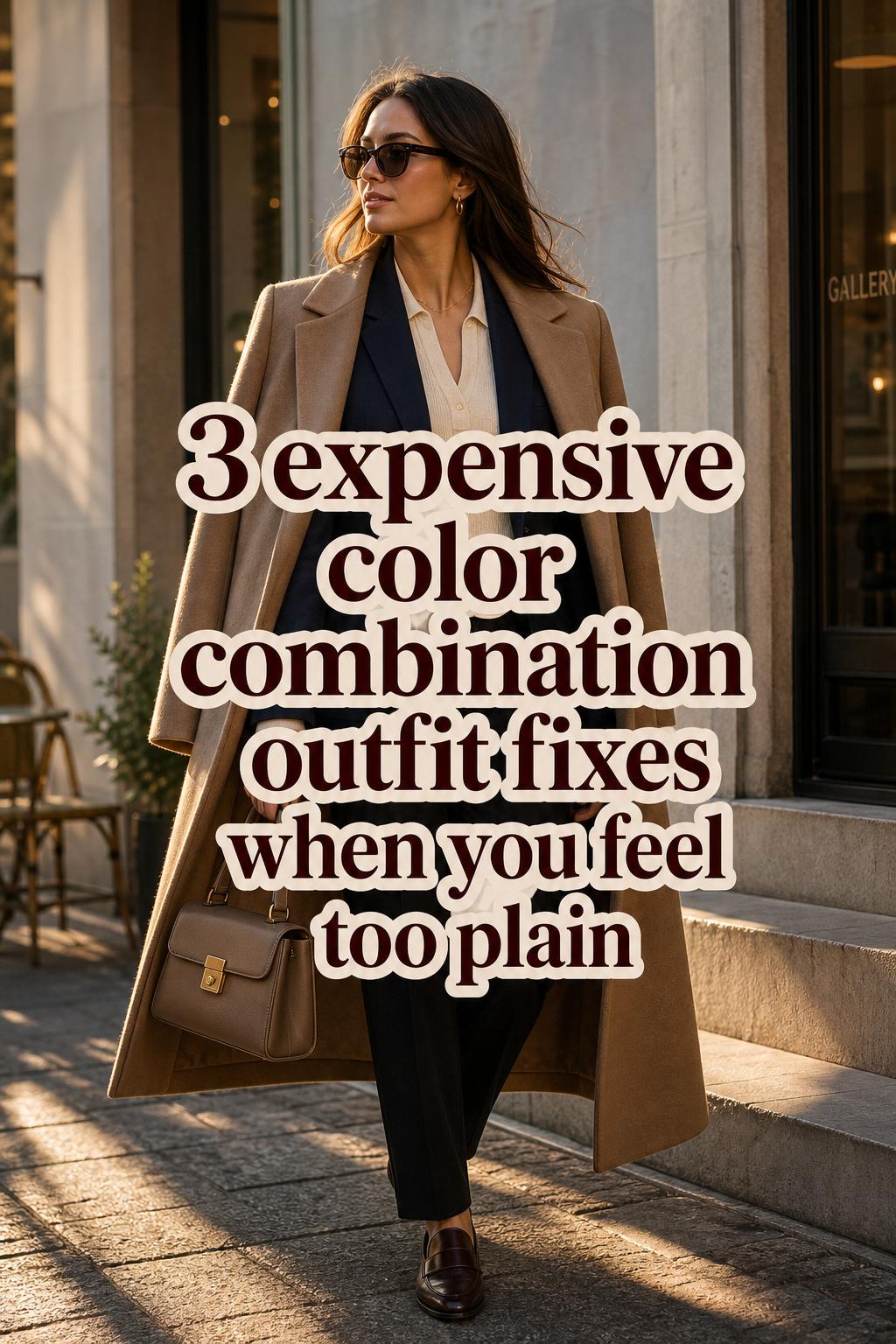
Expensive Color Combination Outfit for Quiet Luxury Style
Luxury in dressing is often less about labels and more about control. The expensive color combination outfit has a distinct visual identity: composed, intentional, and quietly polished. Instead of relying on loud contrast or trend overload, it uses color depth, tonal balance, and texture contrast to create a look that feels refined from a distance and even stronger up close.
The mood is modern minimalism with editorial precision. Think cream breaking up navy, beige softened by grey, emerald grounded by chocolate brown, or black sharpened with a richer neutral rather than a brighter accent. This aesthetic moves easily between city dressing, office wardrobes, travel looks, fashion-week-inspired street style, and evening settings where understated elegance usually reads more elevated than anything overtly flashy.
Its appeal is practical as much as visual. These combinations work because they translate runway-to-street styling into wearable formulas, and because they make room for fabric, silhouette, jewelry, and finish to speak clearly. In other words, color does not work alone. It works in relationship with proportion, fit, metallic accents, and the quiet confidence of a well-edited palette.
What makes a color combination look expensive
A luxe color pairing usually shares three traits: depth, restraint, and clarity. Depth means the shades feel considered rather than flat. Navy often reads richer than a standard bright blue, ivory feels softer than stark optical white, and taupe introduces nuance that a simpler tan may not. Restraint matters because too many competing tones can weaken the visual anchor of an outfit. Clarity comes from strong outfit composition, where each color has a role instead of appearing accidental.
Texture is the second layer of the equation. The same palette can look entirely different depending on whether it appears in cashmere, silk, satin, wool, velvet, or a generic blend. Editorial styling across fashion media often reinforces this point indirectly: neutrals with a clean drape, jewel tones with surface richness, and metallic accents with disciplined placement consistently create a more premium effect than color alone.
Proportion also shapes how expensive an outfit feels. A dominant base color, a secondary balancing shade, and a controlled accent usually work better than equal distribution. This is where monochrome styling and tonal dressing remain reliable. Luxury minimalism depends on harmony, not noise. The eye should move through the outfit with ease.
The palette logic behind an expensive-looking wardrobe
Across editorial coverage, certain themes repeat because they consistently deliver. Neutrals remain the foundation: black, cream, navy, beige, grey, taupe, ivory, and brown form the core vocabulary of color combinations that look expensive. Metallic accents, particularly gold, function as finishers rather than centerpieces. Seasonal shifts then adjust the temperature of these palettes, with spring and summer leaning softer and autumn fashion colour combinations becoming deeper and warmer.
The practical value of these shades is that they can be styled with minimal logos while still appearing directional. That matters for anyone trying to create high-end color pairing ideas without relying on branding. A cream knit with navy trousers, or a beige coat over grey tailoring, can look more elevated than a louder statement outfit simply because the palette feels intentional and the silhouette balance is clear.
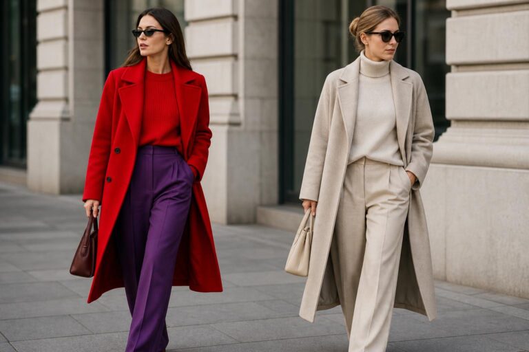
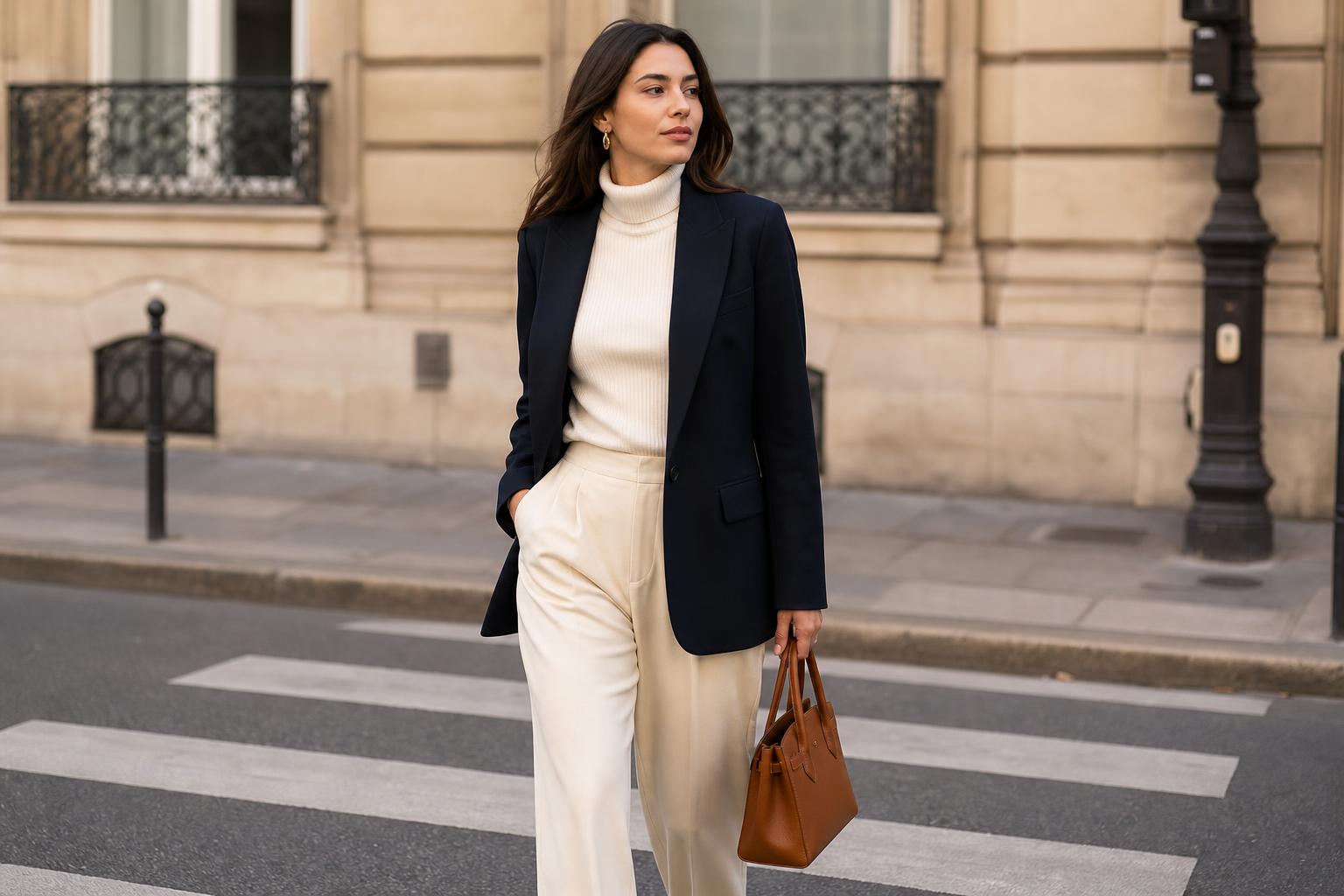
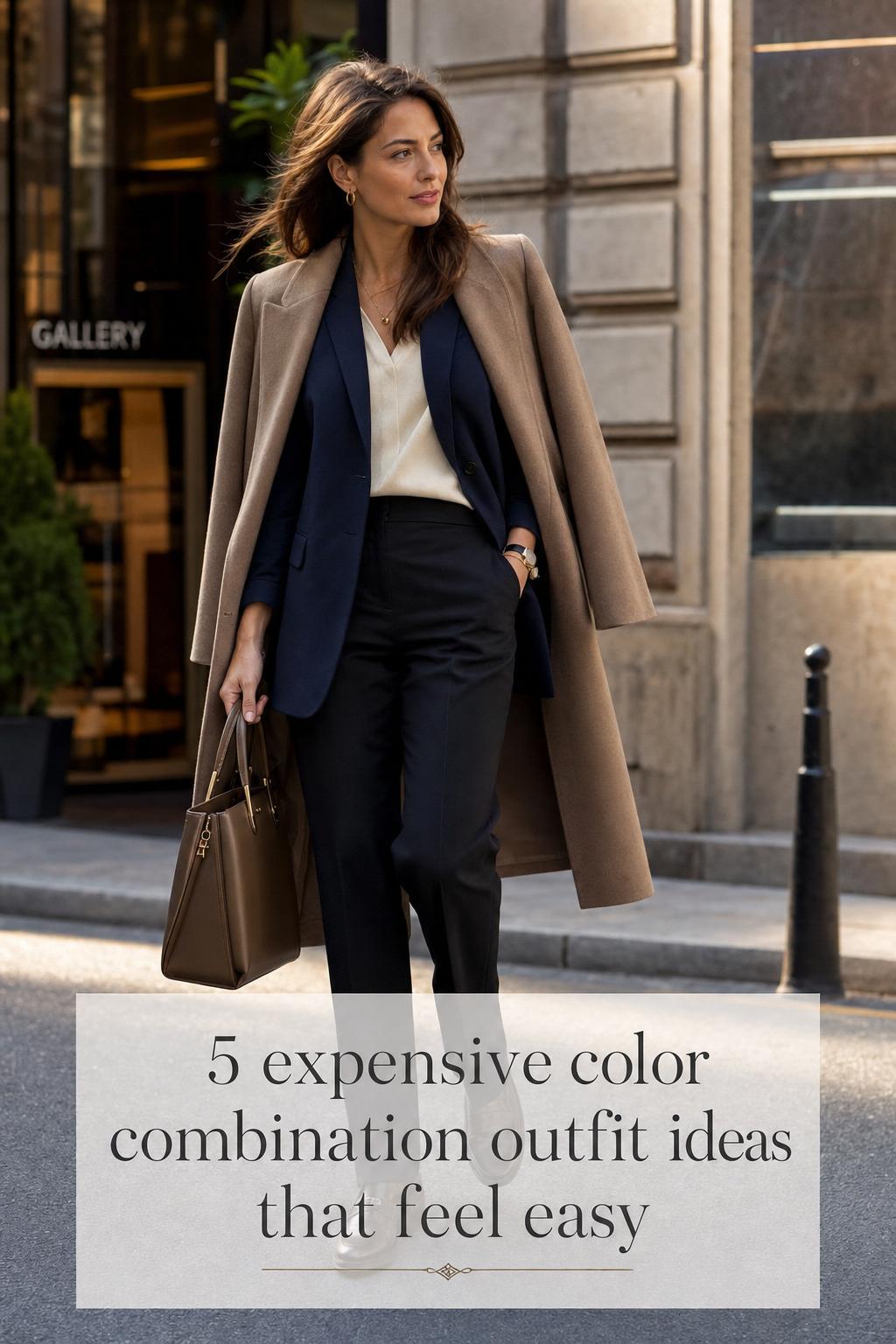
Look: navy restraint with cream clarity
This is one of the strongest interpretations of the expensive color combination outfit because it feels crisp without becoming severe. The silhouette works best when navy leads the composition, with cream acting as the visual break that softens the structure. A longline coat, wide-leg trouser, or tailored knit in deep navy gives the look gravity, while cream near the face or at the center of the body creates light and polish.
Cashmere, wool, and soft matte knits support this palette particularly well. A navy wool blazer over a cream fine-knit top, paired with navy trousers, creates tonal depth that black alone can sometimes flatten. Cream loafers, a structured handbag, or a slim scarf can continue the palette without interrupting it. Black can be introduced carefully through a belt, eyewear, or shoe sole to sharpen the finish.
- Key garments: navy wool blazer, cream knit, tailored navy trousers
- Footwear: cream or black loafers, polished ankle boots
- Accessories: gold jewelry, structured bag, slim black belt
This look works because navy has the depth associated with heritage dressing, while cream removes the heaviness that full dark dressing can create. It is ideal for office settings, city lunches, or travel wardrobes where repeat wear matters. It also aligns with the editorial preference for neutral grounding and understated elegance seen in both seasonal and evergreen fashion coverage.
Style tip: where to place the cream
Keeping cream close to the face usually makes the outfit look more deliberate and more expensive. A cream blouse, knit, or scarf frames the palette, while cream on the lower half can sometimes feel heavier unless the fabric has fluid drape.
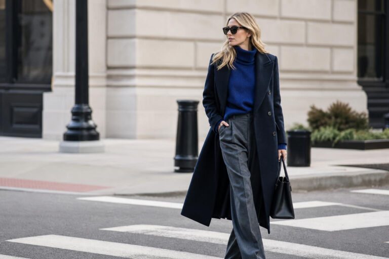
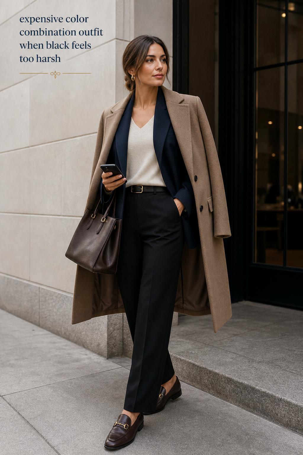
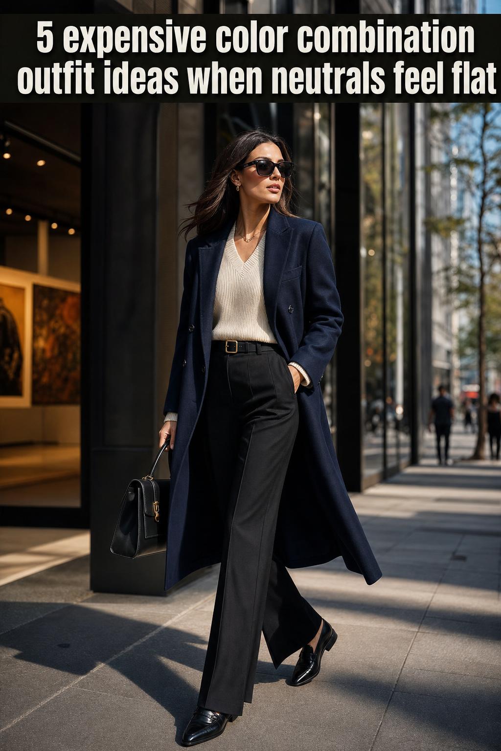
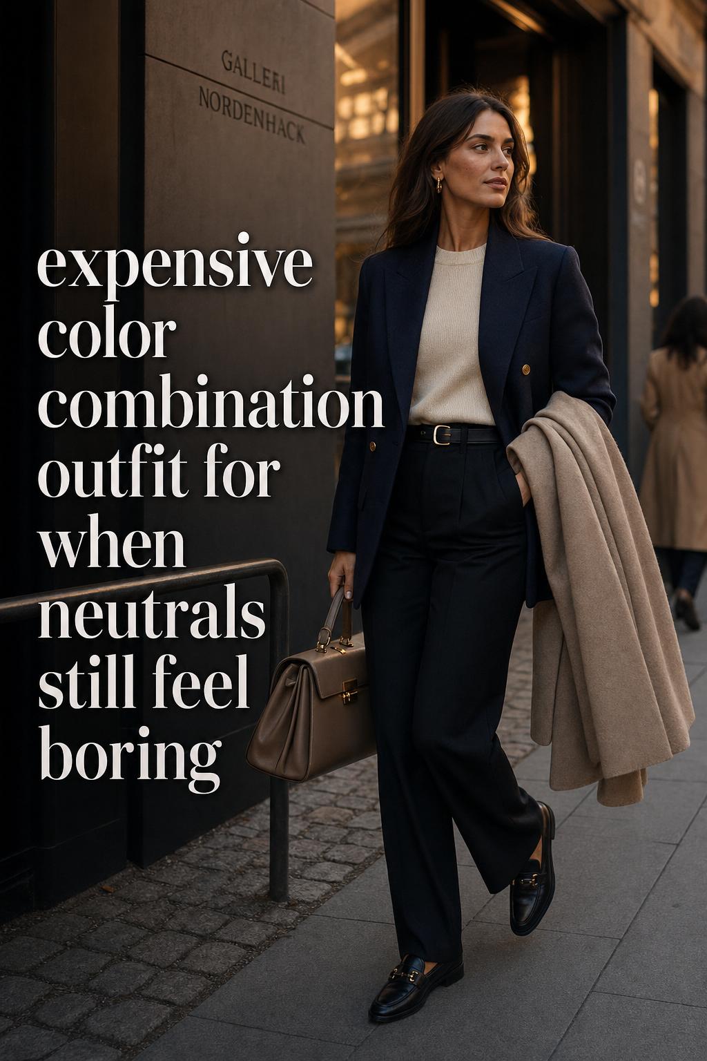
Look: black and navy with a quiet editorial edge
Black and blue repeatedly appear in expensive-looking outfit guidance, but the version that reads most elevated is black paired with deep navy rather than a bright cobalt. This look has a more urban, fashion-editor sensibility. It suits sharper silhouettes: straight-leg trousers, a structured coat, a fitted knit column, or a clean midi shape that keeps the palette focused.
The success of black and navy depends on visible shade separation. If both tones are too similar in low-quality fabric, they can blur rather than layer. Wool, twill-like tailoring, matte knits, or satin used in a single controlled piece help the palette hold its sophistication. A black coat over a navy knit dress, or navy trousers with black outerwear, feels polished because the contrast is subtle rather than theatrical.
This combination fits the luxury minimalism approach especially well. It signals confidence because it does not try too hard to explain itself. In practical terms, it is one of the easiest high-end outfit color palettes to build from an existing wardrobe, particularly for city dressing influenced by New York or European runway habits implied through fashion-week styling.
Look: beige and grey with metallic gold
If the previous looks are crisp, this one is quieter and more atmospheric. Beige and grey create an expensive-looking outfit color palette because warm and cool neutrals balance each other. Beige adds softness; grey introduces modernity. The result is a controlled palette that feels polished without becoming sterile.
A light beige coat layered over a cool grey knit and tailored trousers creates tonal layering with real visual intelligence. Gold jewelry or a bag clasp becomes the accent rather than a competing feature. This is where metallic accents matter most: not as overt shine, but as a finishing detail that strengthens the palette’s warmth. Fabrics with a soft hand, such as cashmere blends, brushed wool, or smooth knits, make the combination read more refined.
- Key garments: beige coat, grey knit, straight or wide-leg trousers
- Footwear: taupe boots, grey pumps, soft beige flats
- Accessories: gold earrings, gold watch, bag with brass hardware
This look is especially effective for daytime meetings, gallery visits, and transitional season dressing. It also answers a common style challenge: how to make an outfit look expensive with color when you prefer soft neutrals over black. Beige and grey do that by creating tonal tension without visual noise.
How to recreate the look without losing depth
Choose one dominant tone and one supporting tone. If beige dominates, use grey in smaller, cleaner areas such as knitwear, trousers, or shoes. If grey dominates, keep beige in outerwear or accessories so the palette stays anchored instead of drifting into flatness.
Look: deep navy, taupe, and ivory for understated elegance
This palette is the definition of quiet luxury without overstatement. Deep navy provides structure, taupe adds softness and subtle complexity, and ivory introduces a light point that keeps the outfit open. The silhouette can be fluid rather than sharply tailored here: a draped coat, straight knit dress, soft trouser, or relaxed shirting all work as long as the lines remain controlled.
Ivory works best in smoother fabrics because it reflects light more gently than bright white. Taupe in suede-like finishes, knitwear, or soft tailoring gives the composition a calm, expensive finish. A deep navy outer layer prevents the palette from becoming overly delicate. In practice, this look performs well for readers who want a monochrome luxe styling feel without wearing one color head to toe.
The reason it looks elevated is contrast management. Nothing is too bright, too cold, or too saturated. The palette sits in the middle ground where mature color coordination tends to feel strongest. It is also highly wearable across seasons, which explains why understated neutrals remain central to luxe color pairings across fashion editorials.
Look: emerald green and chocolate brown with heritage depth
Among the richer combinations, emerald green and chocolate brown stand out because they suggest heritage luxury rather than trend-driven styling. Emerald adds jewel-tone richness; chocolate brown acts as the grounding force. Together they create a look that feels deliberate, especially in colder seasons or evening-adjacent dressing.
Texture matters intensely here. Emerald in velvet, satin, or a smooth knit has more authority than a flat synthetic finish. Chocolate brown in wool, leather-look accessories, or a soft coat gives the palette body. Gold jewelry can be added sparingly, echoing the emerald/bronze/gold mood that appears across both fashion and luxury interior references. The result is sophisticated, but it requires discipline. Too many additional colors dilute the richness.
- Key garments: emerald knit or blouse, chocolate brown trousers or coat
- Footwear: dark brown boots or pumps
- Accessories: gold jewelry, dark structured bag, subtle hardware
This look is especially strong for autumn events, dinners, and fashion-forward daytime wear. It connects well with fall and autumn color narratives because it uses warmth and depth rather than brightness to create impact. For readers who want something beyond classic neutrals, this is one of the most credible ways to wear color and still maintain a luxury impression.
Why fabric and finish change the entire result
Two people can wear the same palette and achieve very different outcomes because color is always filtered through material. Silk, satin, cashmere, wool, and velvet interact with light in a way that makes shades appear fuller and more dimensional. Even a simple cream-and-navy look appears more expensive when the cream has softness and the navy has a dense, matte depth instead of a shiny, overly thin finish.
This is one of the most useful distinctions for everyday dressing. If the palette is neutral and the silhouette is controlled, upgrading the texture often matters more than adding another color. Satin can make ivory look luminous, cashmere can make beige feel richer, and wool can give navy or brown the density that luxury wardrobes rely on. By contrast, low-structure fabrics can cause expensive color combinations to lose their authority.
Texture contrast that supports a luxury effect
The strongest combinations usually mix one soft or fluid texture with one structured surface. A satin skirt with a wool knit, a cashmere sweater with tailored trousers, or a velvet top under a matte coat creates visual interest without forcing the color story. The contrast is subtle, but it gives the outfit depth.
Metallic accents and hardware finishes
Gold remains the most frequently flattering choice for beige, brown, cream, emerald, and warm neutral palettes. Silver or platinum-toned finishes can suit cooler greys and sharper black-led looks, but consistency matters more than preference. Inconsistent metals often make an outfit feel less resolved. A bag clasp, belt buckle, earrings, and watch do not need to match perfectly, yet they should feel related enough to preserve the palette’s internal logic.
The accessory matrix: how bags, belts, shoes, and jewelry complete the look
An outfit rarely looks expensive because of clothing alone. Accessories reinforce the palette and can either sharpen the visual message or weaken it. Bags, belts, and shoes should echo the color story rather than interrupt it. A taupe shoe in a navy-taupe-ivory look feels more integrated than a random bright accent, while dark brown footwear can ground emerald and chocolate palettes more effectively than black.
This is where the idea of an accessory ecosystem becomes useful. Hardware finishes, leather tone, and jewelry metal all contribute to how complete the outfit feels. In fashion coverage, jewelry is often presented as a final enhancement, and that is accurate. Gold jewelry with beige and grey, or subtle metallic accents with cream and navy, can make neutral dressing look intentional rather than plain.
- Match shoe depth to the darkest color in the outfit when possible
- Use handbags as support pieces, not competing statement colors
- Keep belt hardware aligned with jewelry tone for a cleaner finish
- Let one metallic family lead the look
Heritage luxury references also fit naturally here. Structured bags, polished belts, and clean shoes support luxe color pairings because they preserve line and finish. Even when no logo is visible, the outfit reads considered. This is one reason minimal-logo styling consistently appears in guidance about expensive-looking outfits.
Look: cream, black, and controlled shine for evening minimalism
For an evening interpretation, cream and black remain one of the clearest expensive-looking color combinations. The difference between ordinary and elevated lies in finish control. Rather than a harsh high-contrast split, the palette works best when one tone dominates and the other frames it. Cream as the main field feels elegant; black as the structure keeps it sharp.
A cream satin blouse with black tailored trousers, or a cream column dress with black outerwear and a black heel, creates enough contrast to feel dressed up without becoming predictable. Gold jewelry can soften the severity; silver can make it feel cooler and more directional. This is a practical formula for dinners, evening work events, and polished social settings where excessive color can feel less sophisticated than a distilled palette.
The reason this look fits the aesthetic is simple: it uses color restraint to let silhouette and fabric lead. Cream provides light, black provides architecture, and the metallic finish gives the final controlled accent. It is one of the most enduring ways to create luxury color coordination in a wardrobe that values repeat wear.
Seasonal shifts: spring and summer 2026 versus fall and winter 2026
Seasonal color trends matter, but the most expensive-looking outfits usually adapt trend direction into a stable palette rather than chasing novelty. Spring 2026 color pairings, as seen through editorial trend reporting, lean toward softer combinations and a more intentional use of color tension. Pinks and softer palettes, including moodier versions linked to the Barbiecore conversation, can feel refined when anchored by neutrals instead of being styled at full intensity.
In practical terms, spring and summer work best when cream, ivory, beige, or taupe frame the brighter note. A muted pink or dusty rose element can feel polished if the rest of the outfit remains clean and neutral. This keeps the palette aligned with the expensive-looking principle of restraint. Runway-to-street translation matters here: the boldness of a show look often becomes more wearable and more luxurious when softened by neutrals.
For fall and winter 2026, the editorial direction shifts toward warm depth. Autumn fashion colour combinations favor creams, browns, navies, and richer jewel tones. This is where emerald, chocolate brown, taupe, and darker neutrals become especially powerful. The fabric story also deepens, with wool, velvet, and heavier knits strengthening the palette’s sense of richness.
A quick seasonal adjustment rule
In warm months, let light neutrals expand and keep your accent color soft. In colder months, increase shade depth and texture density. The palette can remain similar across the year, but the fabric weight and tonal saturation should change with the season.
City mood: how location changes the styling language
Location influences how an expensive color combination outfit is read. In a New York-leaning style context, black, navy, grey, and cream often feel sharper and more urban. The silhouette tends to be cleaner, the contrast slightly stronger, and the accessories more structured. This makes black-and-navy or cream-and-black combinations especially effective for city wardrobes built around tailoring and outerwear.
In Los Angeles, the same expensive-looking principles can shift toward softer beige, ivory, taupe, and muted metallic accents. The palette feels lighter, but the underlying logic remains the same: controlled color, polished texture, and accessories that reinforce rather than distract. Milan and Paris runway influences, logically tied to seasonal fashion shows and editorial styling, support both directions. The difference is not whether the palette looks luxurious, but how sharply or softly it is interpreted.
This matters because copying a palette without adjusting the finish or silhouette to your environment can make it feel off. A dense wool navy look that thrives in one city may need a lighter drape and cream balance elsewhere. Luxury dressing is often contextual. The strongest outfits respond to setting as much as color theory.
What cheapens the look, even with a good palette
Good colors cannot fully rescue weak styling decisions. One of the most common mistakes is using over-bright contrast in the hope that it will create impact. More often, it breaks the visual calm that expensive-looking palettes rely on. Another issue is inconsistent texture. A refined neutral outfit loses force when one piece has visible low-quality shine and another has no depth at all.
Fit is equally important. Fashion and lifestyle coverage repeatedly connect color with fabric and silhouette for a reason. An expensive-looking outfit should not feel crowded, pulled, or shapeless. Wide-leg trousers need enough length to look intentional. Coats should hold their line. Knitwear should drape or frame the body cleanly. Ill-fitting pieces interrupt the luxury perception faster than almost any color mistake.
- Too many competing accent colors
- Bright contrast without neutral grounding
- Inconsistent metals across jewelry and hardware
- Flat fabrics that weaken color depth
- Excessive logos overwhelming the palette
The correction is usually straightforward: simplify the composition. Reduce one color, improve one texture, align the metallic finish, or choose a stronger silhouette. Expensive style rarely needs more. It needs better editing.
Look: soft pink grounded by neutral structure
Not every luxury-coded palette has to be serious. Softer spring color pairings can still feel elevated when the color is controlled and supported by the right neutrals. A muted pink or dusty rose, influenced by the softer side of trend movements like Barbiecore, works best when it appears as the romantic note inside a sharper framework.
Try a dusty rose knit with ivory trousers and a taupe coat, or a muted pink satin blouse under a beige blazer. This approach gives the color room to feel modern rather than sugary. The palette remains clean, and the structure prevents the softness from becoming overly youthful. Metallic accents should stay subtle, with gold often complementing the warmth of the pink family more naturally.
This look fits the larger aesthetic because it translates a trend into a composed wardrobe language. It reflects the idea found across seasonal editorials: color trends gain sophistication when filtered through neutral styling and careful proportion. Softness, on its own, is not what makes it expensive. Softness anchored by restraint is.
Real-world outfit formulas that keep the aesthetic consistent
The strength of this style category is its repeatability. Once the palette logic is clear, building everyday looks becomes easier and more strategic. These formulas are less about copying a single outfit and more about maintaining a visual identity across different settings.
- For work: navy blazer, cream knit, tailored navy trouser, gold earrings
- For daytime city wear: beige coat, grey knit set, taupe boot, structured bag
- For evening: cream satin top, black trouser, black heel, subtle metallic jewelry
- For autumn events: emerald blouse, chocolate brown trouser, dark bag, gold watch
- For transitional spring: dusty rose knit, ivory trouser, taupe outer layer
These combinations remain cohesive because each one uses a visual anchor, a supporting shade, and one carefully placed accent or metallic finish. They also adapt well to capsule wardrobe thinking. The same cream knit or taupe coat can move through several looks, which reinforces the aesthetic instead of fragmenting it.
Key pieces for this aesthetic
A few wardrobe categories carry most of the visual work: a navy or black tailored outer layer, a cream or ivory knit, a beige or taupe coat, a grey knit or trouser, one richer jewel-tone top, and accessories with consistent hardware. These are the pieces that make expensive color combinations easier to execute repeatedly.
Editorial notes from fashion media and brand-led styling
Fashion editors consistently frame expensive-looking palettes through styling guidance rather than rigid rules. That perspective matters. It explains why the same pairings keep returning across magazine features and list-based style coverage. The message is not that one formula is universally superior, but that certain relationships between color, texture, and proportion repeatedly signal polish.
Brand examples also appear as supporting references, with names such as Faithfull The Brand used in editorial contexts to illustrate how refined color dressing can feel modern rather than formal. The value of these references lies less in any single item and more in how they translate directional styling into wearable combinations. Runway influence is present, but it is edited for daily life.
This is also why image-led styling remains so central to the topic. Color pairings are best understood visually, yet the logic behind them is surprisingly consistent: richer depth, disciplined contrast, supportive accessories, and fabrics that give the colors enough body to look intentional.
Practical tips for making color alone do more work
Sometimes the goal is not a full wardrobe reset but a better understanding of what already exists in your closet. In that case, color can become a strategic editing tool. Start by identifying which shades already look refined in your wardrobe under natural light. Deep navy, cream, beige, grey, taupe, brown, black, and one jewel tone are often enough to build a strong expensive-looking rotation.
Then test the finish. A neutral that looks flat in one fabric may look rich in another. Jewelry should be selected after the clothing palette is set, not before. Shoes and bags should support the outfit’s darkest or warmest note. This process may sound analytical, but it becomes intuitive quickly, and it is exactly what gives polished wardrobes their consistency.
- Anchor the outfit with one dominant neutral
- Add a second shade for tonal layering, not competition
- Use metallic accents with discipline
- Choose fabrics that deepen the color rather than flatten it
- Let fit and silhouette carry as much weight as the palette
That is the real logic behind luxury color psychology in dressing. Expensive-looking style does not happen through color names alone. It comes from how shades behave together, how they are placed on the body, and how the finishing details confirm the mood.
Conclusion
The expensive color combination outfit works because it is less about spectacle and more about composition. Neutrals with depth, jewel tones with grounding, metallic accents with restraint, and fabrics that add dimension all contribute to an aesthetic that feels polished, modern, and highly wearable. Whether your style leans sharp and urban or soft and tonal, the principle remains the same: refine the palette, support it with texture, and let the outfit feel resolved. That is what makes the look adaptable, lasting, and consistently elevated.
FAQ
Which neutral pairings look most expensive?
Cream and navy, beige and grey, black and cream, and deep navy with taupe or ivory are among the most reliable neutral pairings because they create depth without looking harsh. Their strength comes from tonal balance and how easily they work with polished fabrics and subtle metallic accents.
Can color alone make an outfit look expensive?
Color can improve the impression of an outfit, but it does not work alone. Fabric quality, silhouette balance, fit, and accessories all affect whether a palette reads polished or flat. A strong color combination becomes much more effective when the texture and finish support it.
Do black and navy really work together?
Yes, black and navy can look extremely refined when the navy is deep enough to create visible separation from black. The pairing works best in structured or matte fabrics and usually feels strongest when one color leads and the other acts as the supporting tone.
What metals work best with expensive-looking color combinations?
Gold is especially effective with beige, cream, brown, emerald, and other warm-toned palettes, while cooler silver-toned finishes can suit grey, black, and sharper navy-led looks. The key is consistency across jewelry and hardware so the outfit feels visually resolved.
How do I make soft colors like pink look more luxe?
Use softer shades such as muted pink or dusty rose with grounding neutrals like ivory, taupe, beige, or grey. Keeping the palette controlled and the silhouette clean prevents the softness from feeling overly sweet and helps it read as a refined spring color pairing instead.
What fabrics make these color pairings look better?
Cashmere, wool, silk, satin, and velvet tend to give color more depth and a more premium surface. These fabrics hold or reflect light in a way that makes neutrals look richer and jewel tones feel more dimensional than they often do in lower-structure materials.
What should I avoid if I want my outfit to look expensive without logos?
Avoid overly bright contrast, too many accent colors, inconsistent metals, weak fabric finish, and poor fit. Expensive-looking outfits usually depend on restraint, so simplifying the palette and improving proportion often has a stronger effect than adding more statement pieces.
Are jewel tones harder to style than neutrals?
They can be slightly less forgiving because they need stronger grounding, but they are not harder when paired well. Emerald green with chocolate brown is a strong example because the brown absorbs the richness of the jewel tone and keeps the overall effect sophisticated rather than loud.
How should I adapt expensive color combinations by season?
In spring and summer, lean into lighter neutrals and softer accents, including muted pinks and ivory-based combinations. In fall and winter, deepen the palette with navy, brown, taupe, emerald, and richer textures such as wool or velvet to create a more seasonal sense of luxury.