What to Wear: Winter Color Palette clothes for City Style
Cold-weather dressing often fails for one simple reason: the clothes are practical, but the color story is disconnected. A navy coat, warm beige knit, muted olive scarf, and dusty boots may all be useful on a January morning, yet they do not create the sharp, polished impact associated with winter color palette clothes. In seasonal color analysis, winter wardrobes work best when the palette is cool, clear, and visually decisive. That is why black, white, jewel tones, icy shades, and strong contrast appear again and again in the most effective winter outfits, from capsule wardrobes to runway styling cues linked with names such as Victoria Beckham.
The most useful way to approach a winter color palette is not as a rigid list of shades, but as a framework for outfit composition. The palette influences how a coat anchors a look, how knitwear softens a strong trouser line, and how texture changes the perceived intensity of a color. True winter, deep winter, cool winter, and bright winter each shift that formula slightly. Understanding those differences makes shopping easier, outfit planning faster, and wardrobe building far more coherent.
The visual logic behind a winter palette
A winter color palette is defined by coolness, clarity, and contrast. In clothing, that usually means dark neutrals such as black and charcoal, bright jewel tones such as sapphire and emerald, and crisp light accents like stark white or icy pastel variations. The effect is clean rather than muted. Even when the outfit is minimal, the overall composition tends to look graphic, refined, and intentional.
This is where winter color analysis becomes practical. Instead of choosing colors one by one, the system groups shades that naturally support each other. Black trousers feel stronger with a jewel-toned knit than with a dusty earth tone. A white shirt looks more convincing under a charcoal coat than under a warm camel layer. These are not arbitrary style rules; they reflect how cool, high-contrast palettes behave visually in clothing.
Core concepts of winter color analysis
At its foundation, winter color analysis focuses on cool undertones, stronger saturation, and a preference for contrast. The wardrobe equivalent is simple: colors should look clear rather than softened, crisp rather than hazy, and cool rather than golden. This is why jewel tones and cool neutrals dominate winter wardrobe color guides across fashion blogs, magazines, and styling references.
High-contrast styling is especially important. A winter outfit often becomes more convincing when it includes a strong visual anchor, such as black against white, sapphire against charcoal, or emerald against ink-dark tailoring. The silhouette may be simple, but the contrast creates definition. That is one reason winter palettes photograph well and feel naturally aligned with polished city dressing in fashion centers such as New York and Los Angeles.
Winter palette versus other seasonal wardrobe directions
Within seasonal palette systems, winter stands apart because it is less about softness and more about precision. The wardrobe feels sharper. Neutrals are cleaner. Accent colors are more saturated. Even the icy shades used in cool winter wardrobes tend to appear crystalline rather than powdery. This makes winter color palette outfits particularly effective for structured coats, tailored trousers, column dresses, sleek knitwear, and statement accessories with clear visual lines.
That said, winter does not always mean dramatic. A quiet black, gray, and white outfit can still sit firmly in the winter family. The key is not loudness; it is clarity. A minimal palette with strong contrast often communicates winter more effectively than a busier outfit with too many mid-tone colors.
The four winter subtypes and how they change the wardrobe
Most practical guides to winter color palette clothes divide the season into four useful directions: true winter, deep winter, cool winter, and bright winter. These categories help refine the wardrobe, especially when deciding between jewel tones, dark shades, and icy accents. The difference is subtle in theory but significant in actual shopping.
True winter: high contrast and classic jewel tones
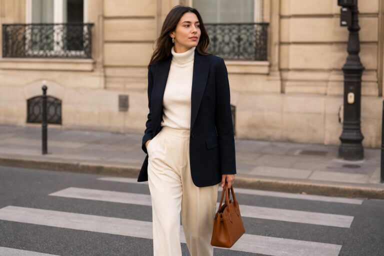
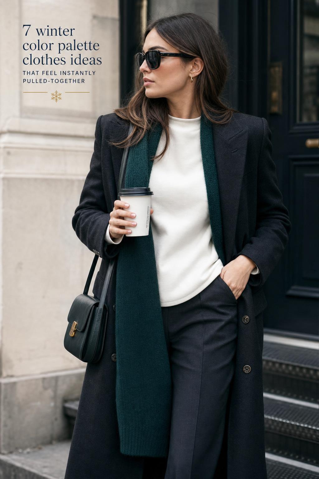
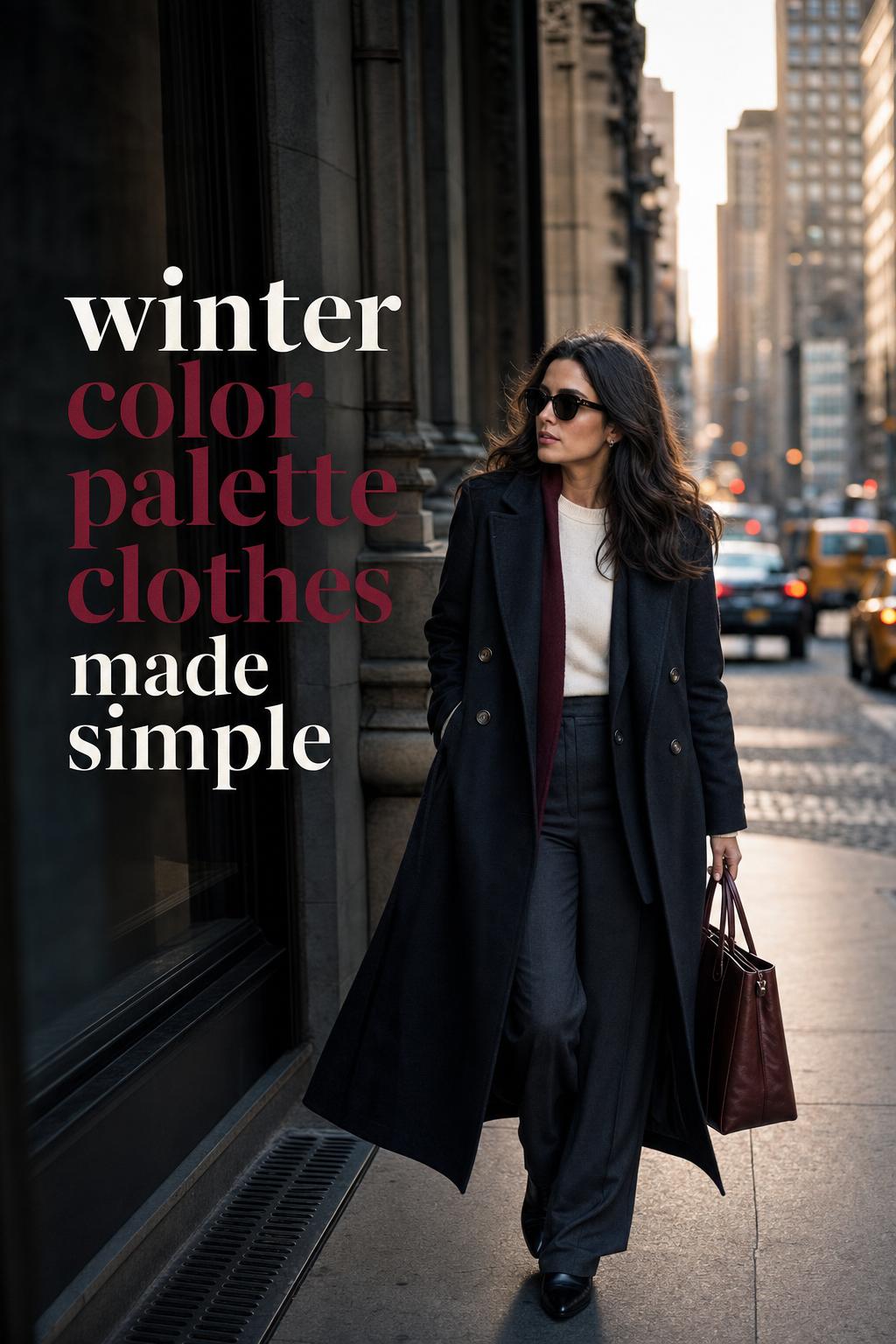
True winter is the clearest expression of the season. Think black, white, sapphire, and emerald, with a wardrobe built around sharp contrast. This subtype suits clothing that depends on definition: black wool coats over bright knitwear, white shirting with dark trousers, and streamlined dresses in jewel-toned fabric. The outfit composition is direct, balanced, and highly legible from a distance.
Style-wise, true winter works especially well in urban dressing. A black overcoat, white top, and sapphire accessory create immediate structure without overcomplication. This is also the subtype most often echoed in editorial styling and high-contrast runway references.
Deep winter: dark richness with controlled intensity
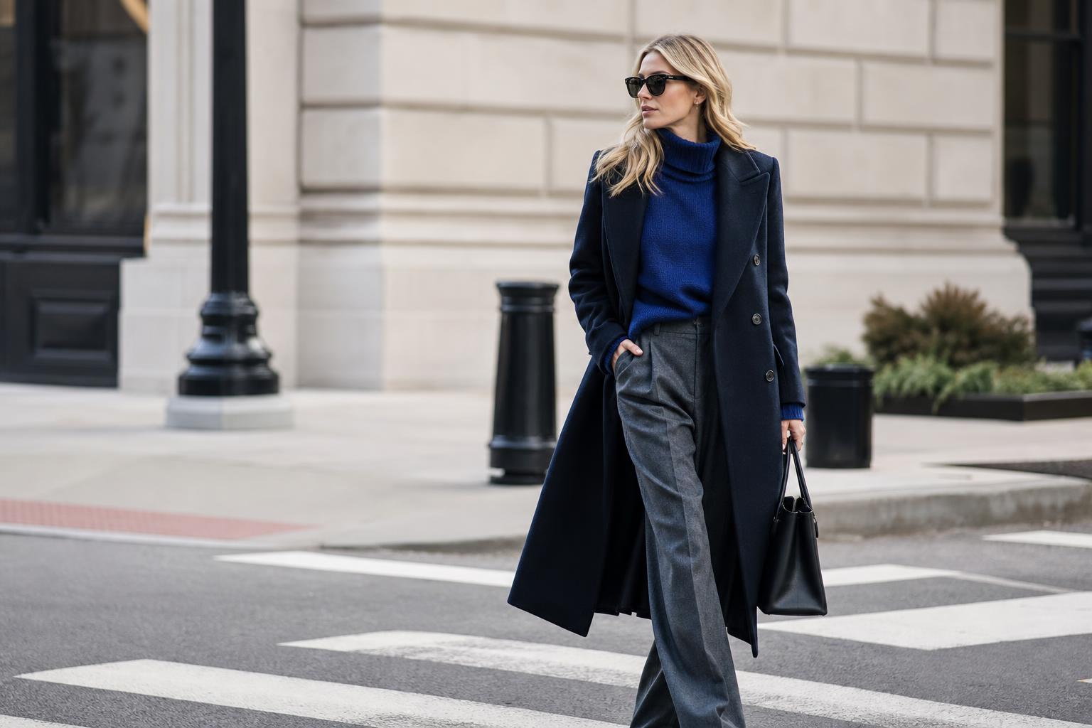
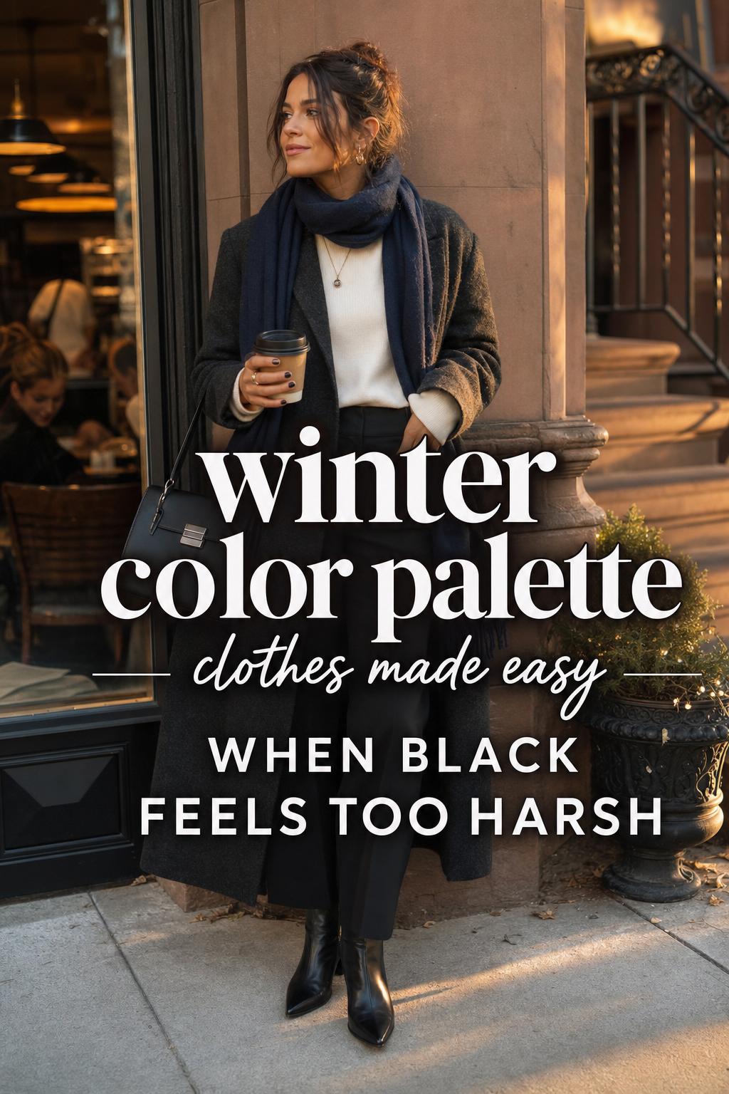
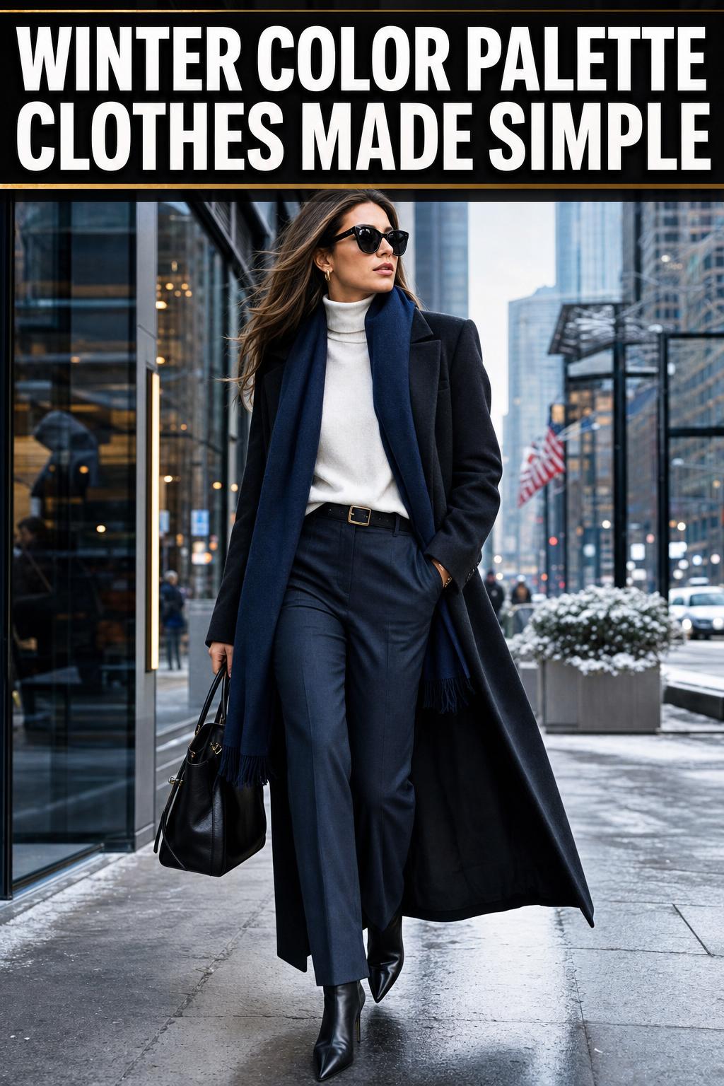
Deep winter pulls the palette toward richer, darker hues without losing the cool base. Burgundy, charcoal, and pine green become especially useful here. The mood is more shadowed than true winter, which makes this subtype ideal for wardrobes built around dark tailoring, evening textures, and winter layering that needs depth without becoming muddy.
Deep winter outfits often look strongest when the color story is compact. A charcoal trouser, burgundy knit, and black boot combination feels grounded because all three elements sit within the same dark, cool register. It is a sophisticated option for anyone who prefers subtle drama over bright contrast.
Cool winter: icy accents and refined neutrals
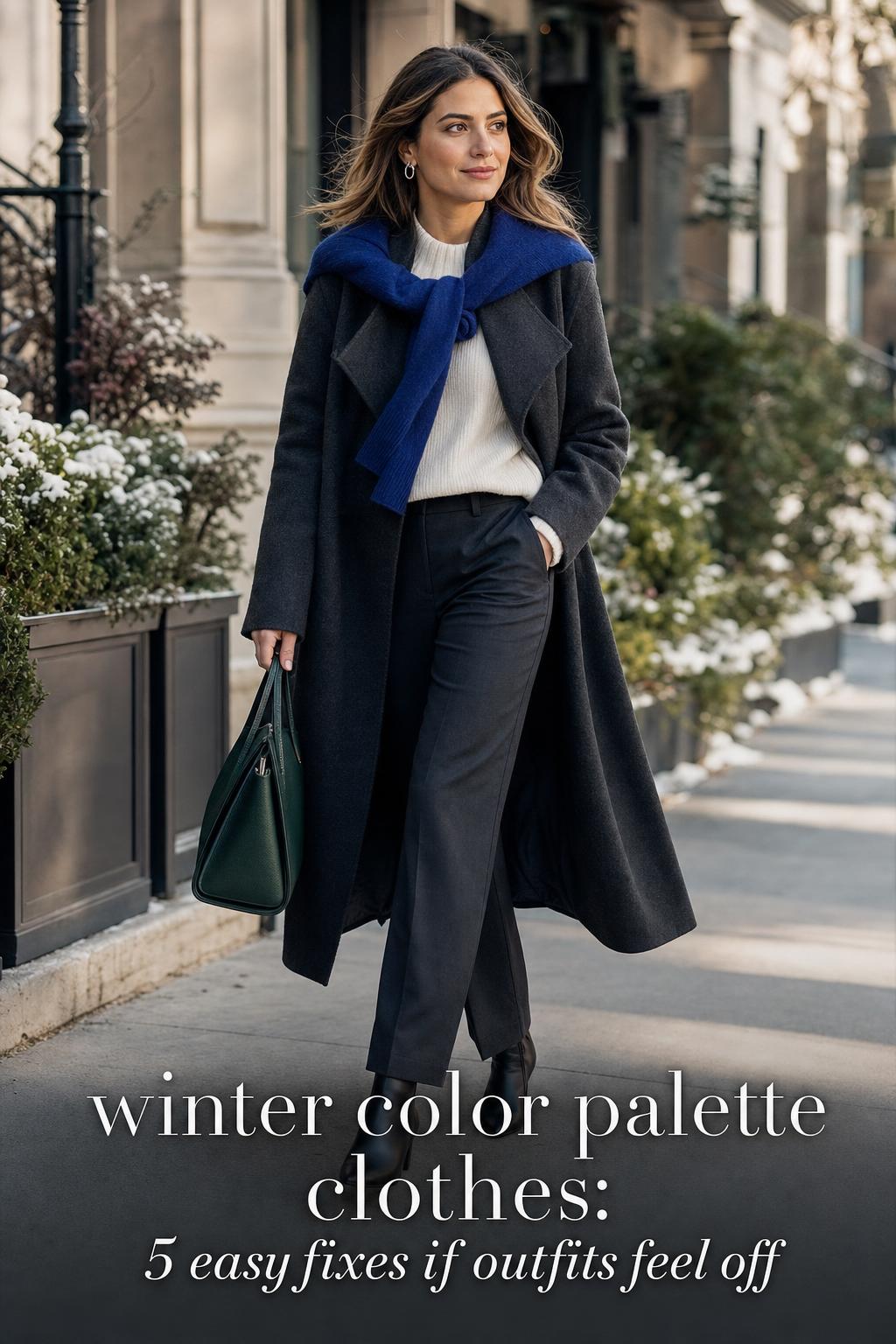
Cool winter emphasizes coolness above depth. Crystal gray, icy blue, and icy pink come forward, often balanced by black, gray, or clean white. In wardrobe terms, this creates a lighter winter expression that still maintains precision. It is especially effective in knitwear, scarves, blouses, and tonal layering where subtle shifts in cool color can read elegant rather than severe.
A cool winter wardrobe benefits from restraint. Too many dark colors can overpower the icy character, while too many pale tones can weaken the structure. The best combinations use a cool neutral to anchor the look and one or two clear accents to keep the palette intact.
Bright winter: vivid impact and cleaner statement dressing
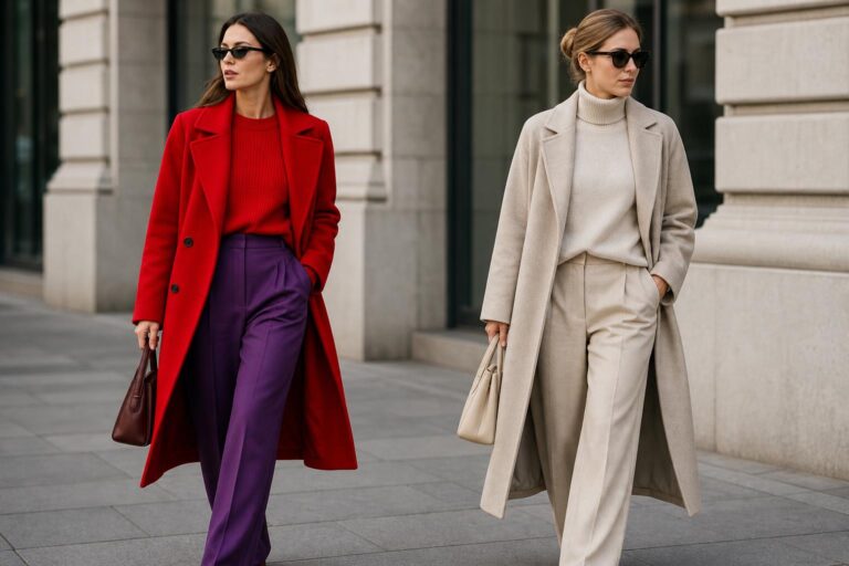
Bright winter brings the highest visual energy of the four subtypes. Royal blue, crystal red, and emerald act as statement colors, often supported by sharp neutrals. This subtype favors color-blocking, bold accessories, and outfit compositions that rely on saturated focal points rather than tonal blending.
Because bright winter is vivid, proportion becomes important. One dominant statement piece, such as a royal blue coat or crystal red knit, usually works better than several competing bright garments. The strong color needs visual breathing room, which black or white can provide effectively.
The core colors that build a winter wardrobe
A strong winter wardrobe is easier to manage when the colors are organized into neutrals, core colors, and accents. This approach supports both capsule dressing and trend-driven styling. It also reduces the common problem of owning attractive individual pieces that do not combine into coherent outfits.
- True winter: black, white, sapphire, emerald
- Deep winter: burgundy, charcoal, pine green
- Cool winter: icy blue, icy pink, crystal gray
- Bright winter: crystal red, royal blue, emerald
These colors work because they reinforce the winter principles already discussed: coolness, contrast, and saturation. Neutrals create structure, jewel tones create focus, and icy shades create light without warmth. Together, they form a reliable base for coats, sweaters, dresses, trousers, and accessories.
How neutrals function in winter outfits
Black and white are the most recognizable winter neutrals, but charcoal and crystal gray also play a major role. They create silhouette clarity and allow stronger colors to remain controlled. A jewel-toned coat can feel excessive if layered over another saturated piece, but it becomes elegant when grounded by black trousers and a gray knit. Neutrals are not just fillers; they are the architectural elements of the outfit.
For capsule wardrobe planning, neutrals should cover the most-worn items first: outerwear, trousers, boots, and one or two layering knits. Accent colors can then rotate through tops, scarves, handbags, or dresses. This structure creates versatility without diluting the winter palette.
How to build winter color palette clothes into a capsule wardrobe
A winter capsule wardrobe is most successful when it prioritizes repeat wear, contrast balance, and texture variety. The goal is not to own every winter shade. The goal is to create a compact system where each item can support several outfit combinations without color conflict.
The essential wardrobe categories
Start with outerwear, knitwear, trousers, dresses, and accessories. In a winter wardrobe color guide, these categories matter because they carry most of the visual weight. A coat sets the palette immediately. Trousers stabilize the look. Knitwear introduces texture contrast. Accessories either sharpen the composition or blur it.
- A black or charcoal coat as the outer layer anchor
- One or two jewel-toned sweaters for color focus
- Dark trousers for repeat styling
- A dress in sapphire, burgundy, or emerald for day-to-evening versatility
- Scarves, handbags, or jewelry in icy or bright accents
This formula works because it separates the stable pieces from the expressive ones. The base remains consistent, while the accents shift depending on subtype, occasion, or trend direction.
Outfit templates that simplify decision-making
One of the easiest ways to wear winter color palettes consistently is to rely on outfit templates instead of reinventing the wheel each morning. A black coat, white top, dark trouser, and sapphire scarf is a true winter template. A charcoal coat, burgundy knit, and black boot is a deep winter template. A crystal gray knit with black trousers and icy blue accessories works for cool winter. A bright winter version might use a royal blue statement knit against white and black basics.
These combinations succeed because they follow repeatable styling logic: one neutral base, one strong color direction, and enough contrast to maintain visual structure. They also adapt easily for workwear, weekend dressing, or evening plans simply by changing footwear or accessories.
Color pairings that create the strongest winter outfits
Color pairing is where winter palettes become truly useful. Individual shades matter, but the relationship between them matters more. Some pairings create definition and polish, while others flatten the outfit or confuse the seasonal message. The most reliable winter combinations tend to involve neutrals and jewel tones, monochrome dressing with a crisp accent, or controlled color-blocking.
Neutrals with jewel tones
This is the backbone of winter styling. Black with emerald, white with sapphire, charcoal with burgundy, and gray with royal blue all create clear visual hierarchy. The neutral acts as the frame, while the jewel tone becomes the focal point. This keeps the outfit strong without making it chaotic.
For readers who want practical, repeatable combinations, this is the safest direction. It works across coats, sweaters, dresses, and accessories, and it remains consistent with both personal color analysis and current winter fashion color trends.
Monochrome versus color-blocking
Monochrome winter dressing is especially effective in deep winter and cool winter wardrobes. A charcoal-to-black outfit or a gray-based tonal look can feel sleek, modern, and highly wearable. The success comes from subtle shifts in value and texture, not from dramatic color contrast.
Color-blocking, by contrast, suits true winter and bright winter particularly well. A strong division between black and white, or between a vivid jewel tone and a sharp neutral, creates a more graphic silhouette. This is where celebrity style references become relevant. Trend-driven coverage from outlets such as Who What Wear and Marie Claire often highlights these sharper, cleaner combinations because they translate well to runway styling and image-led fashion reporting.
Tips for getting the contrast level right
- Use one dominant contrast point, such as black and white, then let other pieces support it.
- If the outfit already includes a bright jewel tone, keep additional colors limited.
- Choose accessories that echo the main color story instead of introducing unrelated warm shades.
- When layering, keep the darkest piece near the outer silhouette for stronger definition.
Why fabric changes the look of winter colors
Color does not exist in isolation. Fabric changes how a shade is perceived, how much light it reflects, and how formal or casual it feels. This is one of the most overlooked aspects of winter color palette clothes, even though it can determine whether a jewel tone looks luxurious, flat, or overly harsh.
Velvet, wool, satin, and camelhair in winter styling
Velvet intensifies depth, which makes it a natural partner for deep winter shades such as burgundy and pine green. Wool softens color slightly while still holding structure, so it works well for black, charcoal, sapphire, and emerald coats or knitwear. Satin reflects light, which can sharpen icy shades and bright winter colors, especially in dresses or blouses. Camelhair appears in the broader fabric discussion around winter wardrobes, but within a strict winter palette it needs careful handling because warm camel tones may sit outside the clearest cool spectrum.
The practical lesson is simple: fabric can either reinforce or distort the palette. A bright royal blue in satin will read differently from royal blue in heavy wool. A black velvet blazer can deepen the drama of a winter evening outfit, while a matte black knit may feel quieter and more everyday. The best winter wardrobes use this fabric variation intentionally.
Texture contrast as a styling tool
Texture contrast matters because winter outfits are often built from layers in similar color families. When the palette is restrained, texture becomes the differentiator. A smooth satin blouse under a wool coat, or a velvet accessory against a structured knit, keeps the outfit dimensional. This is especially useful in monochrome looks, where tonal layering needs visual depth to avoid feeling flat.
Tip: if a winter outfit feels too stark, adjust texture before changing color. A charcoal wool trouser with a soft knit and polished leather accessory often feels more balanced than adding another color unnecessarily.
Runway signals, celebrity cues, and fashion media influence
Winter dressing does not happen in a vacuum. Trend reports, celebrity styling, and designer collections shape how shoppers interpret seasonal palettes. Victoria Beckham is one of the clearest examples linked with winter color direction, particularly when fashion media discuss winter 2025 and 2026 color trends. Her visual language often aligns with what winter wardrobes do best: structured silhouettes, high contrast, and controlled color impact.
What celebrity styling adds to palette dressing
Celebrity references are useful when they illustrate proportion, not just color. A high-contrast coat and trouser combination can look editorial on a red carpet or in street style coverage, but the transferable lesson for everyday wear is usually about balance. A clean line, a dominant focal piece, and a restrained palette are easier to adopt than a head-to-toe trend look.
That is why celebrity-led winter fashion coverage remains relevant. It helps translate abstract trend language into visible outfit formulas: black with jewel tones, strong outerwear, and minimal distractions around the statement color.
How trend years affect a winter wardrobe without replacing it
References to winter 2025 and 2026 color trends matter most at the accent level. A well-built winter capsule wardrobe does not need to be replaced each year. Instead, trend shifts can enter through a sweater, a scarf, a dress, or a handbag in a current jewel tone or bright accent. This protects the integrity of the wardrobe while allowing it to feel current.
Pantone forecasts and runway signals are best used as calibration tools rather than strict shopping instructions. If the trend cycle favors vivid blues or dramatic reds, bright winter wardrobes may absorb that energy easily. If the seasonal mood leans darker and richer, deep winter wardrobes already have a strong foundation in place.
A U.S.-focused shopping strategy for true winter colors
Shopping for winter color palette clothes in the U.S. is easier when the search starts with category and retailer behavior rather than impulse browsing. Many shoppers know they need jewel tones or cool neutrals, yet they still end up with warm, muted pieces because the buying process is unstructured. A better approach is to define the palette first, then verify the color in daylight or clear product photography before purchasing.
What to look for when shopping online
Online retailers often sort products by trend, occasion, or silhouette, not by seasonal color analysis. That means the shopper has to translate. Search for black, white, charcoal, sapphire, emerald, burgundy, royal blue, crystal gray, or icy variations depending on subtype. Product names matter less than the actual visual read of the garment.
For U.S. shoppers, this process is especially relevant because winter wardrobes often need to work across different climates, from colder East Coast settings such as New York to milder West Coast conditions such as Los Angeles. The same palette can function in both places, but the fabric weight and layering strategy may differ. A wool coat may dominate in one region, while lighter layering and statement knitwear may carry more of the outfit in another.
In-store verification and swatch thinking
In-store shopping offers one major advantage: immediate color comparison. Hold a possible purchase next to known winter neutrals such as black, white, or charcoal. If the color suddenly looks warm, dusty, or softened, it may not sit comfortably within a winter palette. This is a simple but effective form of swatch verification.
Tip: when buying a statement coat or dress, test whether it can pair with at least three neutral items already in the wardrobe. If it only works in isolation, it is a beautiful piece but not a strategic one.
Inclusive palette thinking: winter colors across a range of skin tones
One of the most useful developments in winter palette dressing is a broader understanding of how the same seasonal logic can support diverse skin tones. The key point is not that every winter shade will look identical on everyone. It is that the winter framework still offers a coherent path: coolness, clarity, and contrast can be expressed through different combinations of neutrals, jewel tones, and icy accents depending on personal preference and visual comfort.
For some, stark black and white may feel ideal. For others, charcoal, crystal gray, burgundy, or emerald may create a more balanced relationship with the face while still remaining fully within the winter palette. This is where subtypes become practical rather than theoretical. They offer nuance without breaking the system.
How to make the palette feel more personal
The easiest adjustment is placement. If a very bright color feels overpowering near the face, use it in trousers, skirts, shoes, or bags instead of tops or scarves. If black feels severe as a top layer, try charcoal or crystal gray in knitwear while keeping black in trousers or boots. This preserves the winter palette while improving wearability.
This balance-driven approach is also more realistic than forcing one universal formula. The strongest winter wardrobes do not just follow color theory; they translate it into garments that feel flattering, practical, and repeatable.
Common mistakes that weaken a winter wardrobe
Even well-intentioned winter wardrobes can lose clarity when a few recurring mistakes enter the mix. Most of these problems are not dramatic. They are small shifts in color temperature, contrast, or texture that gradually make the wardrobe harder to style.
- Adding too many warm neutrals that disrupt the cool base
- Choosing muted shades instead of clear jewel tones
- Layering several mid-tone colors with no strong visual anchor
- Ignoring fabric finish, which can dull or distort color
- Buying statement pieces that do not connect to existing neutrals
A strong winter wardrobe is disciplined, but not rigid. The point is not to reject every off-palette item. The point is to understand why some clothes work harder than others. Once that is clear, shopping becomes more selective and outfit planning becomes significantly easier.
Real-life outfit scenarios that apply the winter palette well
Abstract color theory becomes more useful when applied to everyday scenarios. Consider a weekday office outfit in New York: a charcoal wool coat, black trousers, white knit top, and emerald earrings. The coat creates structure, the trousers anchor the silhouette, the white keeps the look crisp, and the emerald acts as a refined focal point. The palette is controlled, professional, and seasonally aligned.
For a weekend setting in Los Angeles, the formula may shift in fabric weight rather than color logic: black tailored pants, a crystal gray fine-knit sweater, a royal blue handbag, and sleek sunglasses. The palette remains winter, but the outfit responds to climate and movement. That flexibility is one of the strongest arguments for building a wardrobe around palette logic rather than isolated pieces.
An evening example is equally straightforward. A burgundy velvet dress with black outerwear and minimal jewelry suits deep winter because the fabric increases depth while the black sharpens the edges of the look. A bright winter version could use a crystal red satin blouse with black tailoring, allowing the statement color to hold attention without overwhelming the silhouette.
Practical tips for wearing winter color palettes every day
The most successful winter wardrobes are not necessarily the largest or most expensive. They are the most coherent. Daily dressing becomes easier when color decisions are simplified and each item supports the same visual direction.
- Choose one dominant neutral family for the wardrobe, usually black or charcoal.
- Add two to three signature accent colors based on subtype.
- Use icy shades to lighten the palette without introducing warmth.
- Keep accessories aligned with the same cool, clear color logic.
- Evaluate new purchases against existing coats, trousers, and knitwear before buying.
Tip: photograph outfits in daylight. Winter colors reveal their strength more clearly in natural light, and this helps identify whether a shade looks crisp, cool, and coherent with the rest of the wardrobe.
FAQ
What is the best definition of winter color palette clothes?
Winter color palette clothes are garments chosen from a cool, clear, and often high-contrast color family that typically includes black, white, charcoal, jewel tones, and icy accents. The wardrobe focus is on crispness and visual definition rather than softness or warmth.
What colors belong to a true winter wardrobe?
A true winter wardrobe usually centers on black, white, sapphire, and emerald, with strong contrast as a defining feature. These colors work especially well in coats, tailoring, dresses, and knitwear because they create a sharp, polished outfit composition.
How is deep winter different from cool winter?
Deep winter leans into richer, darker shades such as burgundy, charcoal, and pine green, while cool winter emphasizes cooler and lighter accents such as icy blue, icy pink, and crystal gray. Deep winter feels moodier and more shadowed, while cool winter looks cleaner and more crystalline.
Can I wear winter colors if I am not a true winter by color analysis?
Yes, but placement and intensity matter. Many people can wear winter-inspired colors successfully by using them in outerwear, trousers, bags, or shoes rather than directly near the face, or by choosing softer winter neutrals such as charcoal and crystal gray instead of relying only on stark black and white.
What are the easiest winter color combinations to wear?
The easiest combinations are usually neutrals with jewel tones, such as black with emerald, white with sapphire, or charcoal with burgundy. These pairings are dependable because the neutral anchors the look and the color acts as a clear focal point.
Do fabrics affect how winter colors look in clothing?
Yes. Velvet tends to deepen rich winter shades, wool provides structure and slightly softens the surface, and satin increases reflectivity, which can make bright or icy colors appear sharper. Fabric choice changes the mood and intensity of the same color.
How do I know if a color looks winter-appropriate in daylight?
A winter-appropriate color typically looks cool, clear, and defined in natural light rather than warm, dusty, or muted. Comparing it against black, white, or charcoal is a practical test, because true winter-friendly shades usually remain crisp beside those neutrals.
What should I buy first for a winter capsule wardrobe?
Start with a black or charcoal coat, dark trousers, one or two jewel-toned sweaters, and accessories that stay within the same cool palette. These pieces create the structural base of the wardrobe and make it easier to add dresses, scarves, or statement items later.
Are black and white enough for a winter wardrobe?
They can form a strong foundation, but most winter wardrobes benefit from additional colors such as sapphire, emerald, burgundy, royal blue, or icy accents. These shades prevent the wardrobe from feeling repetitive while preserving the clean, high-contrast character that defines winter dressing.