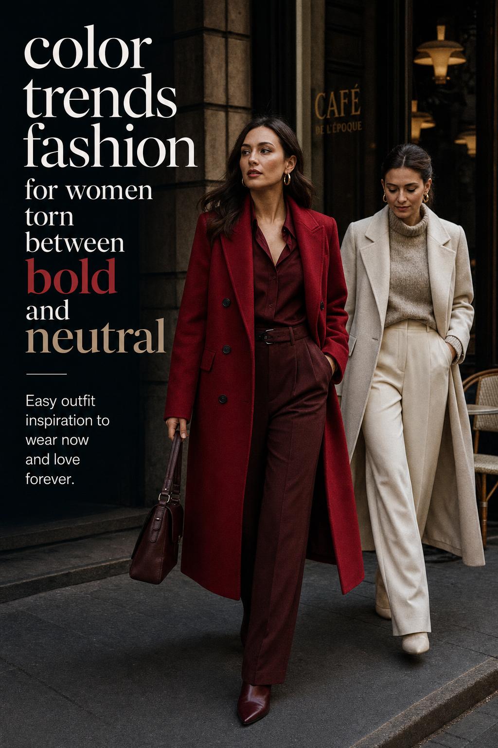
City Color Trends Fashion: Bold vs Neutral Style
Fashion conversations around color trends fashion often blur together because people use the same vocabulary to describe very different styling ideas. A bright seasonal palette, a quiet tonal wardrobe, a trend-led statement outfit, and a minimalist color story can all sit under the same umbrella, yet they function in distinct ways. The real difference is not simply which shades appear on the runway or in stores. It is how color is organized, how it supports silhouette, and how it shapes the mood of an outfit.
This comparison focuses on two styling approaches that are frequently discussed together in modern wardrobes: bold statement color dressing and tonal neutral color dressing. Both are relevant within contemporary fashion, both can feel current, and both respond to shifting color trends in different ways. The useful distinction is practical rather than abstract. One approach treats color as the visual anchor. The other uses restraint, texture, and proportion to create interest.
Understanding the contrast between these approaches makes trend adoption easier. Instead of copying a palette without context, readers can identify which color direction aligns with their lifestyle, wardrobe habits, and comfort level. The result is a clearer way to read seasonal palettes, style outfits with intention, and mix modern fashion color ideas into everyday dressing without losing cohesion.
The two color directions shaping modern wardrobes
In practice, many current outfits fall into one of two color systems. The first is expressive and visibly trend-driven: high-impact shades, strong contrast, and outfits built around immediate visual presence. The second is controlled and tonal: soft neutrals, layered shades from the same family, and combinations that feel polished through balance rather than intensity.
These approaches are often confused because both can look modern, editorial, and intentional. A monochrome beige outfit and a saturated color-blocked outfit may appear equally fashion-aware, yet they communicate different priorities. One emphasizes calm refinement. The other foregrounds energy and fashion momentum. That distinction matters when evaluating color trends fashion through a styling lens rather than a purely trend-report lens.
Style overview: bold statement color dressing
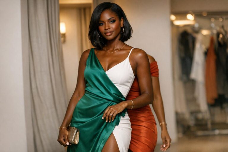
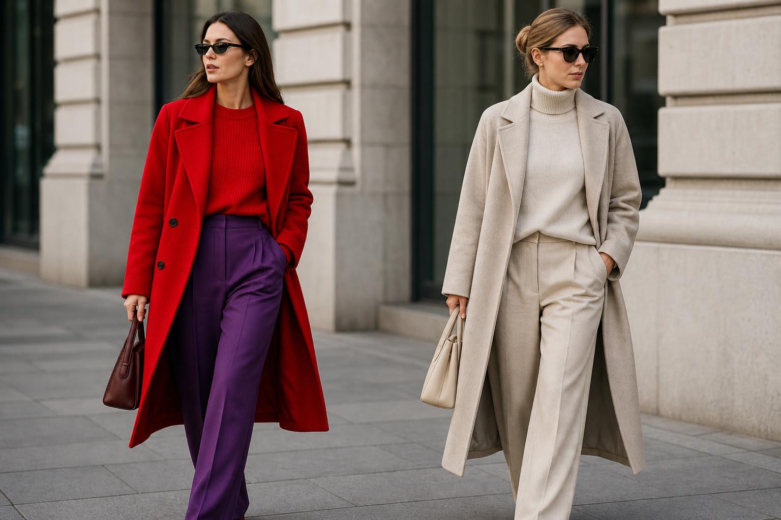
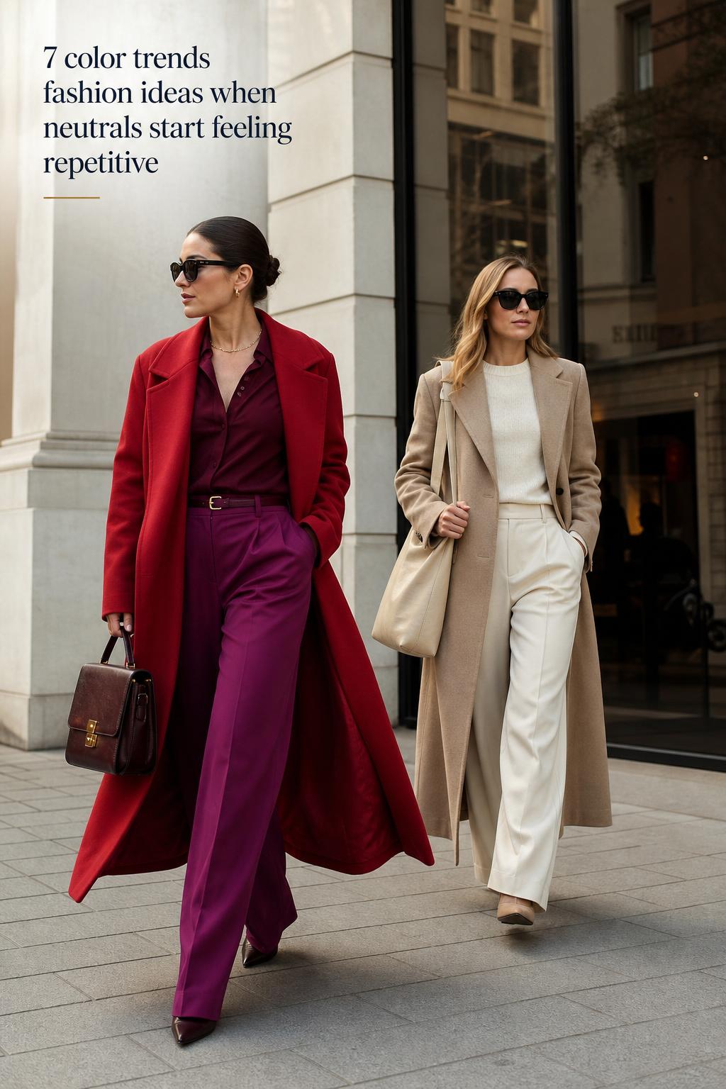
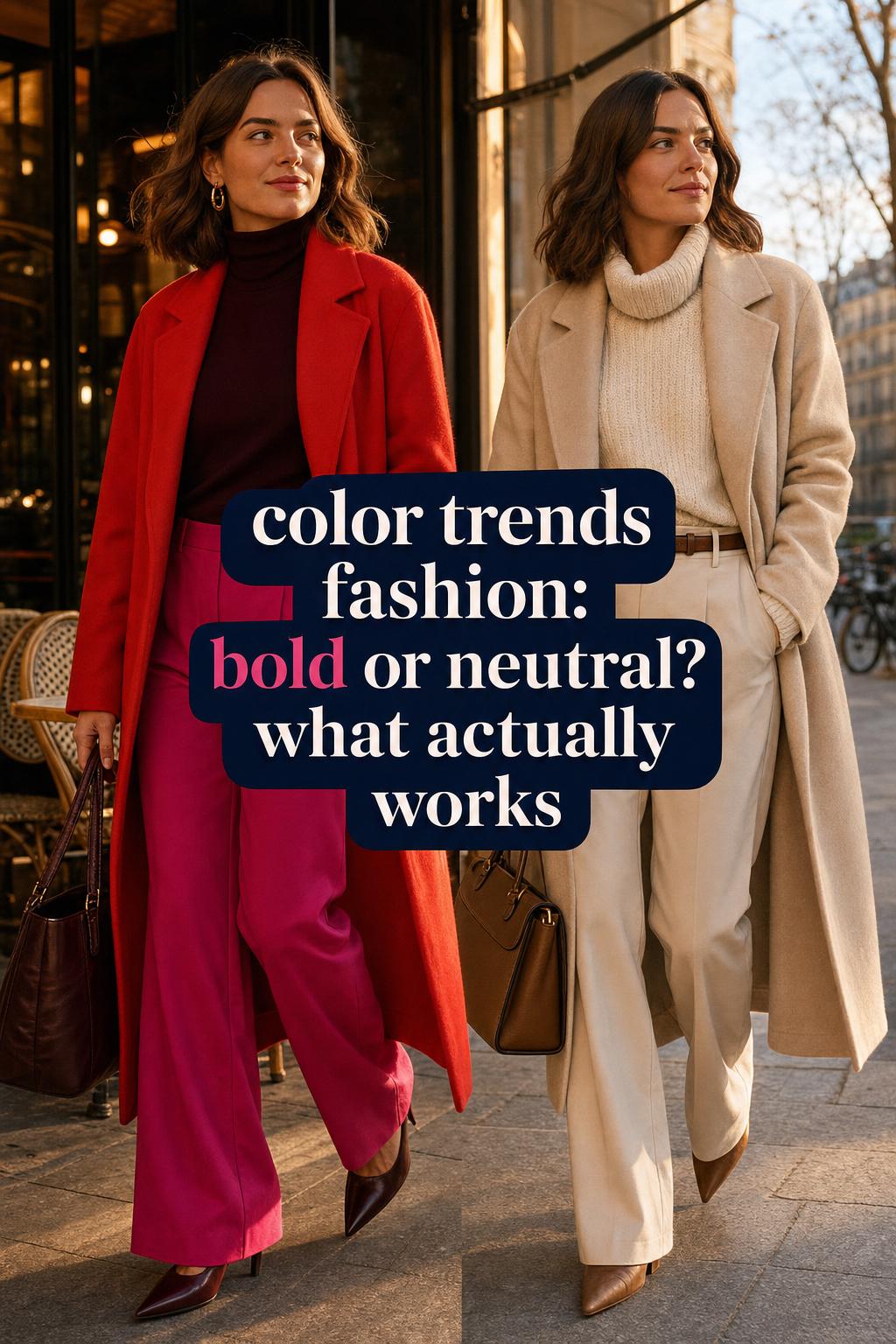
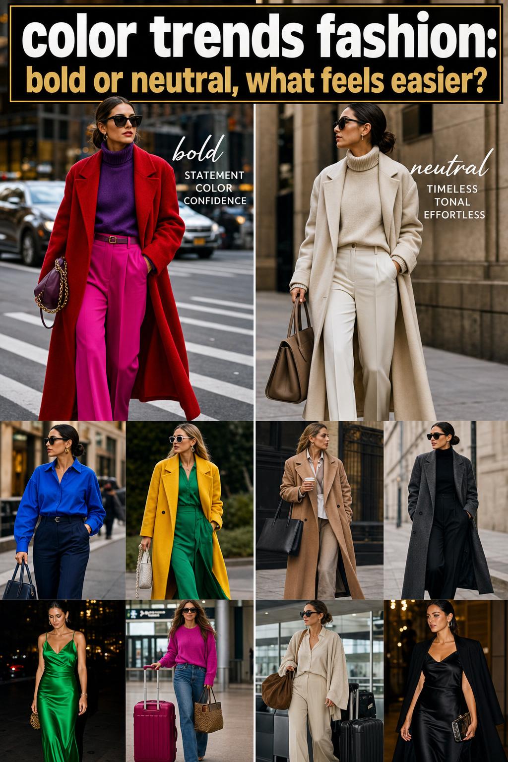
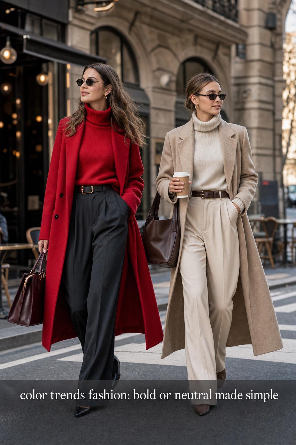
Bold statement color dressing is defined by saturation, contrast, and immediacy. The outfit usually centers on one dominant shade or a deliberate clash of multiple vivid tones. Silhouettes may be simple or dramatic, but the palette is what commands attention first. This approach often works best when color is treated as the primary design element rather than an afterthought.
Typical silhouettes include clean tailoring, column dressing, oversized separates, or uncomplicated shapes that allow strong color to remain legible. Fabrics tend to matter because smooth surfaces show color more clearly, while textured materials can either intensify or soften the impact. The overall mood is directional, energetic, and trend-aware.
This style is often associated with wardrobes that welcome visible change from season to season. It adapts quickly to emerging palettes and works especially well for people who enjoy using a statement piece as the center of their outfit composition.
Style overview: tonal neutral color dressing
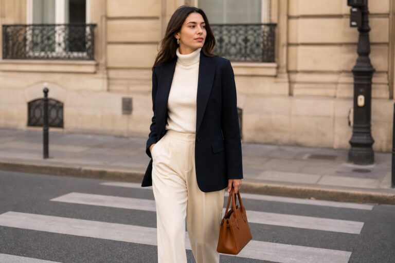
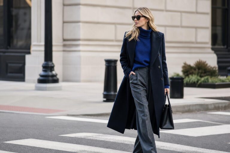
Tonal neutral dressing relies on subtle variation rather than sharp contrast. Instead of one bright focal color, it builds depth through shades that sit close together: cream with oatmeal, charcoal with black, soft brown with camel, or muted gray layered with stone. The appeal comes from color harmony, texture contrast, and silhouette balance.
Typical silhouettes often include tailored trousers, long coats, knitwear, relaxed shirting, refined basics, and clean outerwear. Because the palette is quieter, construction and proportion become more visible. Fabrics such as wool, knit, cotton, satin, denim, and leather create interest without requiring a dramatic hue shift. The mood is polished, composed, and often more enduring than trend-dependent.
This is not the absence of color. It is a disciplined use of color. In many wardrobes, tonal dressing offers the easiest entry point into current color conversations because it feels wearable across work, travel, and everyday settings.
Why these styles are often discussed together
The overlap comes from the fact that both approaches answer the same modern question: how should color function in an outfit today? In one case, color operates as the statement. In the other, color supports a more architectural reading of the clothes. Both can look intentional and current, which is why trend coverage often places them side by side.
There is also a shared dependence on editing. A strong bright look fails if too many competing shades dilute the visual anchor. A tonal neutral look fails if similar shades blur together without enough texture or proportion play. In both cases, success depends on restraint, but the restraint appears differently. Bold dressing edits shape so color can lead. Tonal dressing edits color so shape and texture can lead.
The main differences in silhouette, palette, and styling logic
Color as headline versus color as framework
The clearest distinction is visual hierarchy. In bold statement dressing, the eye registers color first. A vivid coat, bright knit, or saturated dress establishes the outfit before details become visible. In tonal neutral dressing, the eye reads the whole composition more slowly. Shape, line, fabric, and fit work together because no single hue overwhelms the outfit.
Contrast versus continuity
Bold color dressing often uses contrast to create impact. That contrast may come from complementary shades, unexpected pairings, or one saturated item set against a simpler base. Tonal neutral dressing relies on continuity. The shades sit in close dialogue, creating smooth transitions across the outfit. This continuity often gives tonal outfits a more refined and composed finish.
Trend responsiveness versus wardrobe longevity
Statement color looks tend to respond more directly to seasonal shifts. They capture the momentum of current fashion discussions quickly and visibly. Tonal neutral dressing usually has greater longevity because it depends less on a single trend cycle and more on repeatable combinations. That does not make it less current. It simply means the expression of trend is subtler.
Formality and context
Neither style is inherently casual or formal, but they communicate differently in shared settings. Bold color can feel more expressive in social spaces, creative workplaces, and occasions where a visible fashion choice feels appropriate. Tonal neutral looks often integrate more seamlessly into mixed environments because their restraint reads polished without appearing severe.
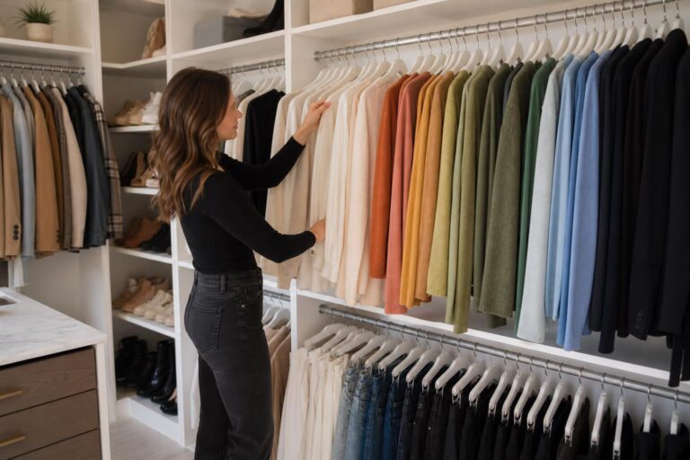
Wardrobe building strategy
A statement color wardrobe usually grows around selected focal pieces. A person may build outfits from a bright blazer, saturated trousers, or a standout knit. A tonal wardrobe is usually constructed through coordination. The power comes from how pieces relate to one another, making repeats and layering easier over time.
How they look in real life: a visual style breakdown
Layering approach
Bold color dressing often keeps layering simpler so the palette stays readable. If several layers are involved, they are usually edited with purpose to prevent visual noise. Tonal dressing can support more complex layering because close shades create continuity. A long coat over a knit and tailored trousers in related tones often looks rich rather than busy.
Proportion play
In statement color outfits, exaggerated proportions can amplify the fashion effect, but they need discipline. An oversized silhouette combined with a very bright palette works best when one element remains clean, such as a streamlined trouser or simple shoe. In tonal neutral outfits, proportion play is often the main source of interest. Wide-leg trousers, long outerwear, and compact knitwear become more noticeable when color remains quiet.
Accessories and visual anchors
Bold color styling often uses accessories to either echo the main hue or ground it. A neutral bag or shoe can stabilize a bright look, while a matching accessory can create stronger intentionality. Tonal neutral styling treats accessories as textural punctuation. Leather, suede, metal hardware, or a structured bag can shift the outfit from flat to fully composed.
Footwear choices
With statement color, footwear usually falls into two categories: either it extends the color story or it acts as a stabilizing element. With tonal dressing, shoes are often part of the continuity. The goal is less disruption and more visual flow, which helps elongate the silhouette and preserve the calm structure of the outfit.
Overall outfit balance
The bold approach depends on controlled emphasis. The outfit needs one clear message. Tonal dressing depends on layered nuance. The outfit needs enough differentiation in surface, fit, or shade to avoid looking unfinished. In both cases, the strongest results come from knowing where the eye should land first.
Where color trends fashion becomes most practical
Color discussion often becomes abstract until it is tied to actual wardrobe decisions. The most useful way to interpret color trends fashion is not by asking which shade is dominant in a given moment, but by asking how that shade will function in your existing closet. Will it work as a statement piece, or should it be integrated into a tonal framework?
This distinction changes buying choices. A vivid seasonal tone may be ideal in outerwear, knitwear, or accessories if your wardrobe is mostly neutral. By contrast, if you already dress in strong color, trend movement may matter less than adjusting combinations, contrast levels, or proportions. The trend is then filtered through an established style system rather than followed literally.
For many people, this is where confusion around modern color direction begins. They may admire trend-led palettes visually but live more comfortably in tonal outfits. That does not mean ignoring current fashion. It means translating it in a way that matches real usage.
Tip: evaluate color by wear frequency
A striking hue can feel exciting at purchase but difficult to repeat if it only works in one styling formula. A tonal piece may appear quieter initially but earn far more wardrobe use. The better choice depends on whether you want immediate visual impact or long-term outfit flexibility.
Outfit comparisons that show the difference clearly
Casual daytime dressing
A bold statement approach to a casual outfit might center on one saturated knit or coat, supported by clean denim or simple trousers. The logic is straightforward: everyday pieces create familiarity while color creates the fashion point. This keeps the outfit approachable without losing momentum.
A tonal neutral version of the same casual outfit would focus on shade variation and texture. Think a soft knit, relaxed trousers, and outerwear in related tones. The outfit reads intentional because the pieces are coordinated through color family rather than contrast. The effect is quieter but often more adaptable across a full day.
Workwear interpretation
For workwear, statement color dressing usually works best when the silhouette is tailored and the palette is edited. A strong blazer or dress can add energy, but too many competing tones may reduce clarity in professional settings. The outfit succeeds when structure balances the brightness.
Tonal neutral workwear often leans on precision. Matching or near-matching separates, refined outerwear, and subtle texture shifts project authority without sharp contrast. This approach tends to integrate easily into offices because it looks composed and modern while remaining understated.
Evening or dinner styling
In an evening context, a statement color outfit often relies on one memorable shade with clean styling around it. The power comes from directness. A vivid dress, a sharp suit, or a bright fluid top can carry the entire look if accessories stay controlled.
Tonal neutral evening dressing tends to feel more atmospheric. Darker or softer shades layered with sheen, knit, tailoring, or sleek accessories can create depth without visible brightness. This often reads more restrained, but not less sophisticated. It simply shifts emphasis from color intensity to material and silhouette.
Travel wardrobe planning
For travel, statement color can be effective when used strategically in one or two key items that transform simple basics. It photographs well and gives repeated core pieces a different energy. The limitation is coordination: highly specific colors can reduce mix-and-match efficiency.
Tonal neutral travel wardrobes usually perform better for packing efficiency because nearly every piece can work with every other piece. This creates a reliable modular system, especially when climate changes require layering. The visual result also remains consistent across different settings and times of day.
The seasonal factor: how each style responds to changing palettes
Seasonal color shifts affect both approaches, but they do so differently. In statement dressing, seasonal palettes often show up directly through new bright or dominant shades. The wearer adopts change visibly. In tonal neutral dressing, seasonality may appear through undertone, depth, and fabric weight rather than dramatic hue rotation.
This means the same trend season can produce two very different wardrobes. One person may interpret it through a standout saturated coat. Another may absorb it through softened neutrals, warmer layering, or a subtle move from cool grays to richer browns. Both are engaging with the same broader fashion movement, but with different levels of intensity.
That flexibility is one reason color trends remain so widely discussed. They are not a single instruction. They are a framework for recalibrating how much visual energy an outfit carries.
Tip: track undertones, not only shade names
A wardrobe becomes easier to manage when you notice whether your best outfits lean warm, cool, muted, or crisp. That awareness helps translate seasonal palettes into combinations you will actually wear instead of chasing isolated colors that feel disconnected once they reach your closet.
Texture is the deciding factor in quieter palettes
One common misunderstanding is that tonal neutral dressing depends only on color choice. In reality, it depends just as much on fabric behavior. When shades are close together, texture contrast becomes essential. A matte knit against smooth tailoring, soft wool against structured leather, or relaxed cotton under a sharp coat gives the eye enough variation to keep the look dimensional.
This is why some tonal outfits look sophisticated while others appear unfinished. Without texture, close shades can collapse into visual flatness. Without shape, they can lose direction. The strongest tonal styling treats texture as a substitute for high contrast.
By contrast, bold statement color can rely less on texture because the palette already carries the visual drama. Texture still matters, but it supports rather than defines the composition. This makes statement dressing easier for some people and less forgiving for others, depending on whether they prefer their outfit interest to come from hue or from construction.
Common mistakes when choosing between bold and tonal color dressing
- Using too many bright shades in one outfit without a clear visual anchor.
- Building a tonal outfit with similar colors but no texture contrast.
- Choosing trend colors that do not connect with the rest of the wardrobe.
- Adding statement accessories to an already overloaded palette.
- Assuming neutrals are automatically easier, even when the fit and fabric are weak.
These mistakes are less about taste and more about outfit composition. A bold palette needs hierarchy. A tonal palette needs depth. Once those rules are clear, both styles become easier to execute consistently.
Tip: identify the outfit’s visual anchor before adding accessories
If the anchor is color, accessories should support it. If the anchor is tonal layering, accessories should sharpen texture and line. Most styling imbalance comes from trying to make every element perform as the focal point at once.
A city-ready perspective: choosing a color strategy for everyday movement
In fast-moving urban wardrobes, practicality changes how color works. Commuting, long days, changing temperatures, and mixed settings all affect whether a color approach feels sustainable. A statement palette can be highly effective when it simplifies decision-making around one key piece. A bright coat over a quiet base, for example, offers impact without requiring full-color commitment.
Tonal neutral dressing often excels in city routines because it handles repetition well. Pieces can be reworn in multiple combinations, and the overall wardrobe feels coherent from morning meetings to evening plans. This is especially useful for people who need clothing to adapt across roles without a complete outfit change.
The deeper lesson is that modern color strategy is not only aesthetic. It is logistical. The best color system is the one that still functions after a full day of movement, layering, and real-world wear.
When to choose each style
Choose bold statement color dressing when
- You want the outfit to communicate energy immediately.
- You enjoy trend-led dressing and visible seasonal change.
- Your wardrobe basics are simple enough to support one strong focal piece.
- You are dressing for a creative setting, social event, or image-conscious environment.
- You prefer color to do the heavy lifting instead of relying on complex layering.
Choose tonal neutral dressing when
- You need a wardrobe that mixes easily across work, travel, and daily wear.
- You prefer subtle sophistication over immediate contrast.
- You rely on tailoring, proportion play, and texture contrast for interest.
- You want pieces with greater repeat potential across seasons.
- You like current fashion but prefer to interpret it in a quieter way.
Neither approach is more advanced or more stylish. They simply prioritize different kinds of impact. The practical choice depends on your routine, comfort level, and how much visibility you want color to have in your wardrobe.
How to combine both without losing clarity
The most modern wardrobes rarely stay at one extreme. A strong approach is to build a tonal base and introduce selected statement color elements. This keeps the closet functional while allowing trend movement to enter in a controlled way. A vivid knit, bag, coat, or shoe can shift the mood of neutral tailoring instantly without destabilizing the rest of the wardrobe.
The reverse can work too. A color-forward wardrobe benefits from tonal pieces that create pauses between brighter moments. These quieter garments give statement shades room to breathe and prevent every outfit from demanding the same level of attention.
The key is consistency of logic. If your outfit starts from a tonal concept, let the color accent remain intentional. If your outfit starts from a statement concept, let the neutral elements act as structure rather than distraction.
Tips for mixing the two approaches
- Start with one color-led item and keep the rest of the outfit in related neutrals.
- Use accessories to repeat a statement shade once, not several times without purpose.
- In tonal outfits, introduce one unexpected color only if it has a clear role.
- Balance bright hues with clean silhouettes to avoid visual clutter.
- Use texture contrast to make neutral combinations feel complete.
How to read future color shifts with more confidence
The most reliable way to interpret changing fashion color conversations is to stop treating all trend palettes as direct shopping instructions. Instead, classify them according to function. Ask whether the palette is asking for saturation, softness, contrast, or continuity. That answer will immediately tell you whether the trend belongs in a statement look, a tonal wardrobe, or a combination of both.
This method also reduces trend fatigue. Instead of rebuilding a closet around every new wave of attention, you refine how your existing wardrobe receives color. For some people, that means introducing one strategic shade each season. For others, it means recalibrating neutrals, undertones, or layering combinations. Both approaches remain responsive to fashion without becoming disposable.
That is the lasting value of understanding color trends fashion through comparison. It turns trend observation into styling intelligence. Once you know whether your wardrobe thrives on visible color or tonal depth, every future palette becomes easier to translate.
The core distinction at a glance
Bold statement color dressing is built around impact. Tonal neutral dressing is built around cohesion. One asks color to lead. The other asks color to support structure, texture, and silhouette. Both can look modern, polished, and highly intentional, but they create that effect through different visual systems.
Readers can identify the first by its immediate focal point: a strong hue, a clear contrast, or a palette that announces itself quickly. They can identify the second by its continuity: related shades, layered surfaces, and a quieter but often richer sense of outfit composition. Mixing them successfully means deciding which element will lead and which will reinforce.
Once that distinction is clear, color becomes less confusing and more useful. Trends stop feeling like pressure and start functioning as tools. That shift is what makes modern fashion color decisions easier to wear, repeat, and refine.
FAQ
What is the difference between statement color dressing and tonal dressing?
Statement color dressing uses bold or high-impact shades as the main focus of the outfit, while tonal dressing relies on related shades, subtle variation, and texture to create a polished result. The first is driven by contrast and visibility, and the second is driven by continuity and composition.
Which approach works better for everyday wear?
Tonal dressing usually offers more flexibility for everyday wear because pieces mix easily and transition well across settings. Statement color dressing can still work daily, but it is most practical when concentrated in one key piece supported by simpler wardrobe staples.
How can I try color trends fashion without buying a whole new wardrobe?
Introduce one trend-led color through a single item such as knitwear, outerwear, or an accessory, then pair it with the neutral pieces you already wear most. This keeps the update controlled and makes it easier to see whether the color fits your routine before expanding further.
Do neutral outfits count as following color trends?
Yes, because trend direction is not limited to bright shades. Neutrals can reflect broader shifts through undertone, depth, layering, and the way colors are combined. A tonal wardrobe can be highly current even when it avoids obvious statement hues.
Why do some tonal outfits look sophisticated while others look flat?
The difference usually comes from texture contrast, silhouette balance, and shade variation. When all elements are too similar in surface and shape, the outfit loses dimension. Tonal looks need fabric and proportion to create visual depth.
Can I mix bold colors with a minimalist wardrobe?
Yes, and that is often the easiest way to wear bold color well. A minimalist wardrobe provides a stable base, so one strong shade can stand out cleanly without competing with too many other elements. This keeps the look modern rather than overloaded.
Which style is better for workwear?
Tonal neutral dressing is usually easier for workwear because it reads polished and integrates smoothly into different professional settings. Statement color can also work well, especially in creative environments, but it tends to need more editing and stronger tailoring to maintain clarity.
How do I know whether to buy a trend color in clothing or accessories?
If you are unsure about repeat wear, start with an accessory or one isolated garment. If the color already fits your wardrobe logic and you can imagine at least three strong outfits immediately, a larger clothing purchase is more likely to be useful long term.
Is bold color dressing always less versatile than tonal dressing?
Not always, but it is usually more specific. A strong shade can be highly versatile if it works with your existing basics and if the silhouette is simple. Tonal dressing has an advantage in coordination, while bold dressing has an advantage in instant visual impact.