
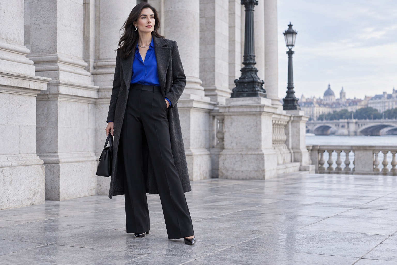
Deep Winter Palette Outfits: A Closet Checklist
Getting dressed with a Deep Winter palette can feel easy when every piece is black, navy, or a jewel tone, then oddly restrictive the moment a favorite sweater is softer, warmer, or lighter. A useful palette should help you make choices, not turn your closet into a pass-or-fail test. The quickest way to use it is to check how an outfit handles depth, coolness, and clarity, then decide where you want contrast to appear.
This checklist is for building deep winter palette outfits with clothes you already own. It moves from a dark base to one lead color, checks the placement of light and pattern, and makes room for pieces you love even when they sit outside a seasonal chart. Use the ideas as styling guidance. Color analysis is a framework, and fabric, lighting, personal taste, and the colors around a garment all affect how a shade looks.
Start with the three checks that make an outfit read Deep Winter
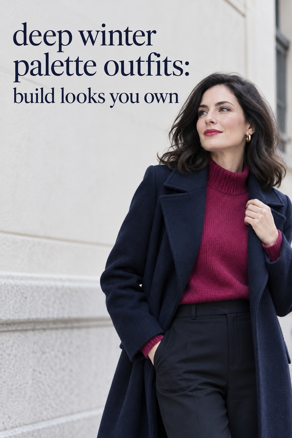
Before matching individual color names, look at the outfit as a whole. Deep Winter is commonly described through three qualities: depth, coolness, and clarity. You do not need to memorize a complicated color chart to use those ideas. Ask whether the outfit has a dark anchor, whether its strongest colors lean cool rather than golden, and whether the colors look clear instead of dusty or muted.
One source describes Deep Winter as deep first and cool second, with icy shades working best when set beside dark colors. That is a useful starting point for outfit planning because it helps explain why a pale blue shirt can feel at home with charcoal while a head-to-toe pale outfit may lose the depth associated with the palette. See this Deep Winter color guide for the underlying color dimensions and examples.
Found the dress? Keep the rest in one place.
Zarellea brings guest details, vendors, timelines, and every next step together — so your wedding plan feels as good as your look.
Check depth before counting colors
Depth means how light or dark a color appears. A Deep Winter outfit often feels grounded by a dark piece such as black trousers, a charcoal coat, an ink-navy skirt, or a deep plum dress. That anchor gives brighter colors somewhere to sit. It also makes it easier to wear a color you might otherwise find intimidating, because the rest of the outfit keeps the overall impression deep.
Try this with a royal-blue blouse. Put it beside black jeans and then beside pale gray trousers. Both combinations can work, but the first will usually look more dramatic and closer to the deep contrast many Deep Winter guides describe. The second can still be wearable if you add a dark coat, shoes, bag, or belt to bring the visual weight back. The goal is not to make every item dark. It is to notice whether the full outfit has enough depth.
Check temperature without treating cool as a ban on warmth
Cool colors have a blue, violet, or crisp quality, while warm colors tend toward yellow, golden, or orange. In a Deep Winter wardrobe, black, charcoal, navy, cool red, berry, sapphire, and emerald are familiar starting points. Real garments can be complicated: a brown may be almost black and cool, a red can lean orange or blue, and a green can look pine-dark or olive-muted.
Do not reject a garment based only on the color name on its tag. Compare it with something you know you enjoy wearing. Place the item next to a true-white tee, a black knit, or a cool navy layer and notice the relationship. A warm tan may look conspicuously golden beside these colors, while a cool taupe can act as a quieter neutral. If you like the warmer item, keep it and use the later section on favorite exceptions.
Check whether the color looks clear or softened
Clarity is the difference between a crisp, saturated color and a grayish or dusty version of a similar hue. A clear cobalt sweater and a soft slate-blue sweater may both be blue, but they make different impressions. Deep Winter examples tend to favor defined colors: cherry red rather than brick, emerald rather than sage, and a clean icy pink rather than a muted blush.
Compare the garment in daylight if possible, because store lighting and phone screens can shift colors. Check it beside the other clothes you plan to wear, rather than judging it in isolation. If the shade looks hazy next to your outfit’s clear darks, it might work better as a small accessory or lower-body piece than as the main color beside your face. This is a styling choice, not a judgment about whether the garment is good or bad.
Build the outfit from a dark base and one clear color
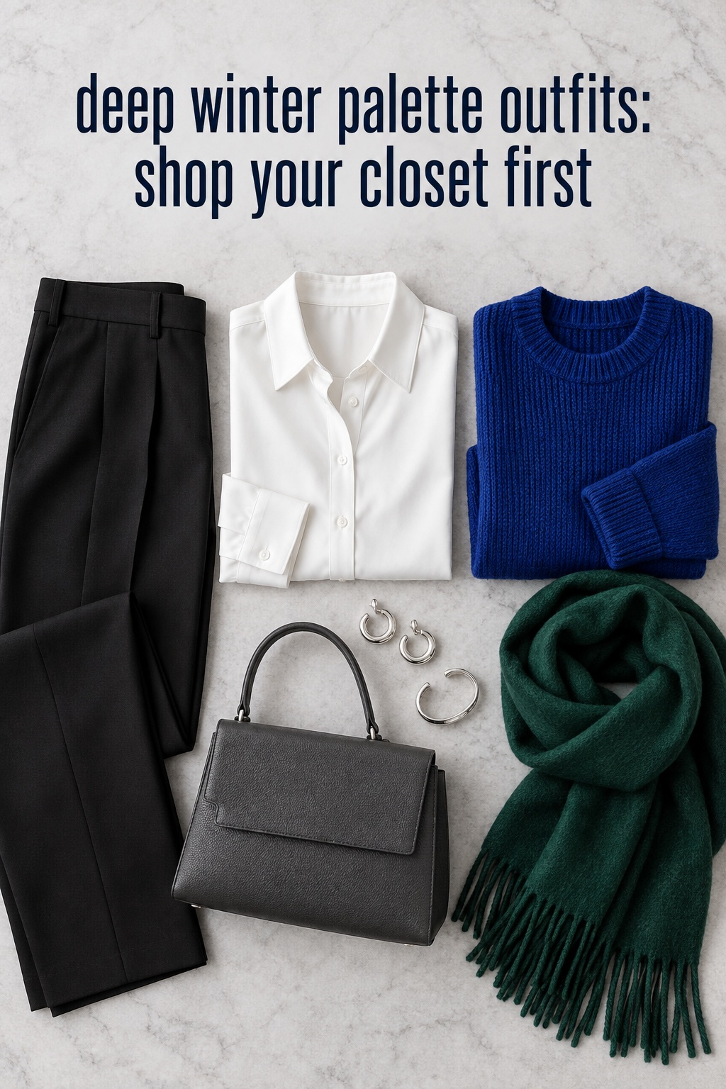
A practical outfit often needs one decision to do most of the work. Choose a dark base, then add one color you want people to notice. This limits the number of competing choices without requiring a matching set. The base may be a coat, trousers, jeans, a skirt, or a dress. The color can come from a top, scarf, shoes, bag, or even a print.
Start with pieces already in your closet. Black and charcoal are easy anchors for many wardrobes, while navy can soften the jump from black to a brighter color. Add one clear accent such as sapphire, cobalt, emerald, cool red, berry, or plum. White and icy colors can create a sharp light point when the outfit also has enough dark color. These are options to experiment with, rather than a mandatory shopping list.
Use a neutral as the anchor, not the whole outfit plan
Picture a black blazer and black straight-leg trousers. Together they create a reliable foundation, but the outfit still needs a point of view. A crisp white shirt makes it high contrast and classic. A sapphire knit makes it saturated and polished. A burgundy top gives it a quieter richness. Choose the version that suits the setting and how much color you feel like wearing.
If you do not own black trousers, use another deep neutral you like. Charcoal jeans can work with a cool pink shirt; navy trousers can support an emerald cardigan; dark denim can sit beneath a plum sweater. The combination does not need to match a printed swatch exactly. What matters is whether the items feel connected when you see them together and whether you will actually reach for the outfit.
Choose one lead color and let the rest support it
A lead color is the strongest accent in the outfit. If you choose a bright red sweater, keep the remaining pieces simple: charcoal trousers, black shoes, and a dark coat. If your lead is a cobalt bag, the clothing can stay navy and black. This gives each outfit a clear focal point and helps you use saturated shades without feeling that every item must be equally vivid.
When two jewel tones appeal to you, look for a reason to connect them. Emerald and burgundy can feel intentional when one appears in a smaller area, such as a bag or scarf, while the other has more surface area. Cobalt and plum can also sit together if the outfit includes a dark neutral to separate them. If the colors compete, keep one in the main outfit and move the other to jewelry, a small accessory, or another day.
Let texture change the mood while the palette stays simple
Repeating the same colors does not mean repeating the same outfit. A smooth black skirt, ribbed knit, crisp shirt, denim, and matte jacket each reflect light differently. Combining two or three surfaces adds interest without adding more colors. Try a plum fine-knit top with black jeans, a charcoal wool coat, and polished silver earrings. The color story is restrained, while the texture keeps it from feeling flat.
Use texture where it makes practical sense for your clothes and setting. A shiny satin blouse can feel dressier than a matte cotton shirt in the same shade. A chunky knit may make a small accent color more prominent. A patterned scarf can add visual texture near the face without introducing a large color block. Consider the fabric’s weight, comfort, and care needs independently from its color. Palette guidance cannot tell you whether a garment feels right on your body or suits the day.
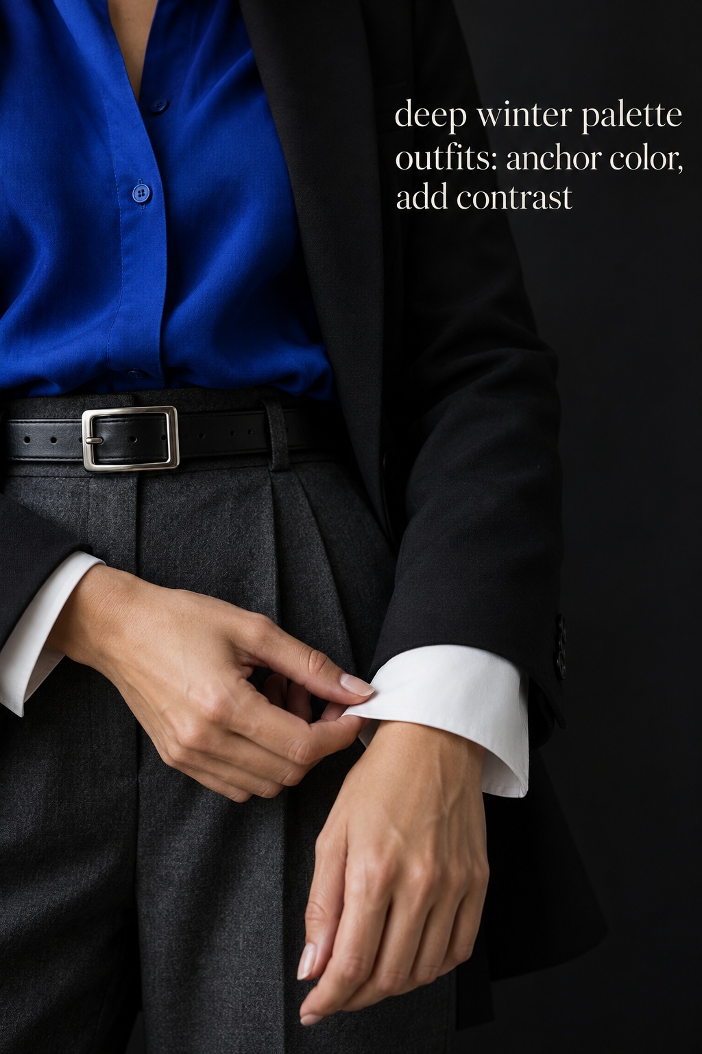
Place contrast where it helps the whole outfit
Contrast is the difference between light and dark, or between colors that stand apart. Deep Winter styling often uses noticeable contrast, but you can choose where it appears. A white shirt under a black blazer gives contrast near the face. A bright bag gives contrast at the side of the body. A pale shoe makes a smaller point at the bottom. You do not need to create sharp contrast in every part of the outfit at once.
Think of contrast as something to place, much like choosing where a print or bright color belongs. Dark cool colors can sit together in a tonal outfit, while a single crisp light shade can give the look a clearer edge. Outfit examples across Deep Winter guides include pairings such as navy with white, charcoal with cobalt, and plum with white. The second color does not have to be a shirt: it can be a collar, shoe, bag, or visible layer.
Use icy shades as a light accent
Icy pink, pale blue, icy lavender, and cool white can brighten a deep outfit. Treat these colors as light accents rather than assuming that every pale pastel will behave the same way. A pale blue blouse under a navy suit creates a clear light-dark relationship. An icy-pink tee with black jeans and a dark jacket gives the pale shade a border. If you wear an icy piece on its own, a dark accessory or outer layer can restore the depth you want.
Try a pale shade in a smaller area first if you are unsure. A scarf, tee, or pair of socks lets you see how the color feels with the rest of your closet without committing to a large garment. You might discover that you prefer it under a dark coat, or that a cool gray works better for you than pink. The point is to test the relationship in a complete outfit instead of deciding from a swatch alone.
Keep prints legible against a dark ground
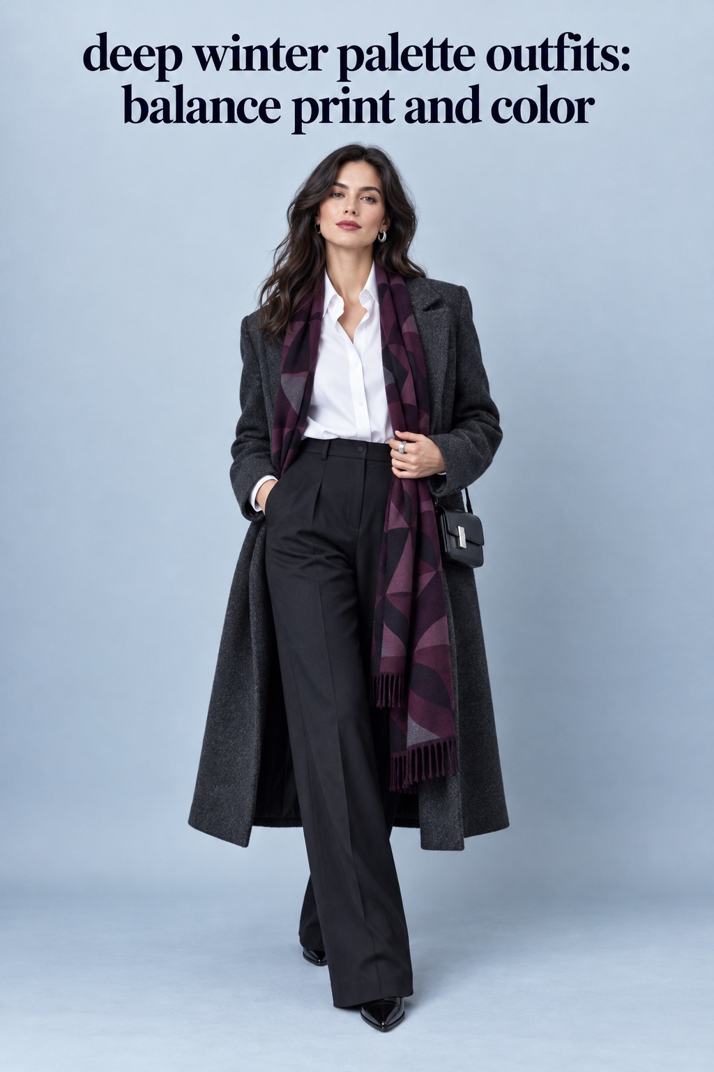
Prints bring several colors together, so examine both their background and their contrast. A black blouse with a crisp white geometric print can support the palette’s dark-and-light character. A deep floral with burgundy, emerald, and blue may provide color without needing extra accents. If the print is low contrast and dusty, ground it with a dark jacket or trousers rather than asking it to set the whole color direction.
Keep the rest of a printed outfit quiet when the print already has many colors. Pull one dark shade from it for the bottom or outer layer, then use a shoe or bag in a related neutral. If you add a second accent, make sure it repeats a color in the print or stays small. A print can be the lead color decision; you do not need to layer several separate bright colors on top of it.
Consider the color nearest your face, then check the full look
Some seasonal color guides emphasize colors worn near the face, where a shirt, collar, scarf, or coat frames the complexion. If that idea is useful to you, start there: test a black turtleneck, a crisp white collar, or a sapphire scarf with a familiar dark bottom. But do not forget the rest of the outfit. A beautiful top can feel disconnected if the shoes, trousers, and outer layer pull in several unrelated directions.
Look at yourself in a mirror from a few steps away and take a quick phone photo in neutral daylight. This is not a test of your features. It simply helps reveal whether one item dominates, whether the contrast feels balanced, and whether an unexpected warm shade is drawing your eye. You can also ask which piece you notice first. If the answer is the one you intended as the focal point, the outfit’s color arrangement is doing its job.
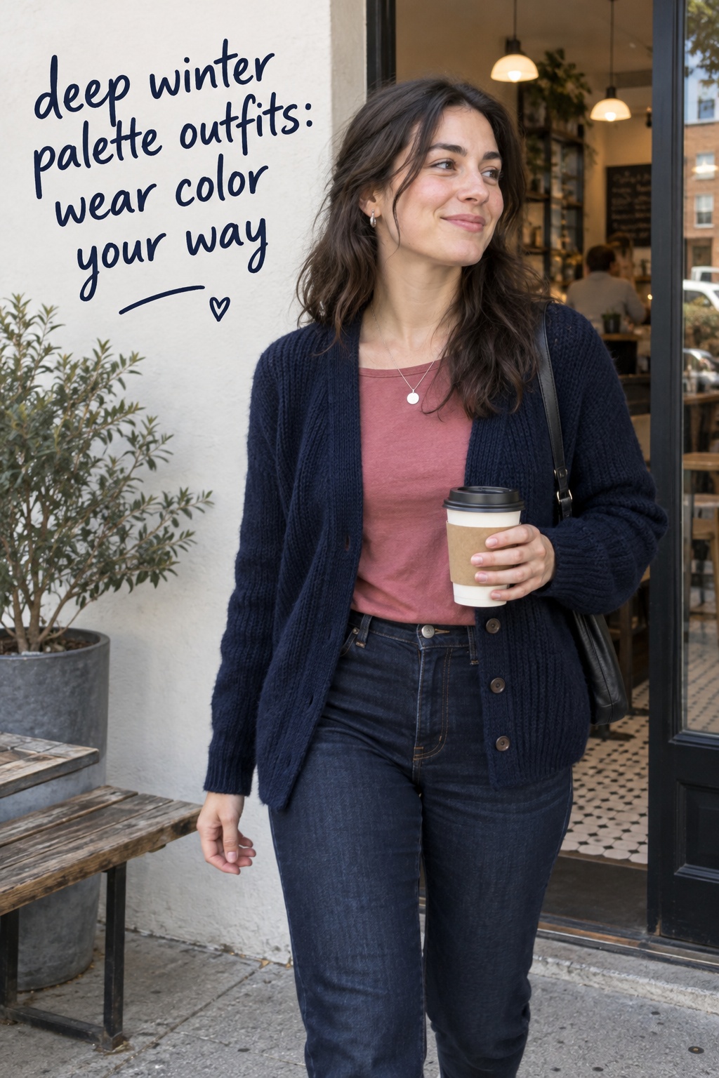
Keep a favorite piece that falls outside the palette
A seasonal palette is not a rule that you must follow to enjoy your clothes. You might love a camel coat, a soft rose sweater, or an olive skirt, even if those colors are often listed outside Deep Winter recommendations. Decide whether the item works with your own style and how you want to feel in it. Then use placement and surrounding colors to help it relate to the rest of the outfit.
One practical method is to keep a preferred color away from the face or use a palette-friendly color to bridge it. Another is to repeat a small detail from the item elsewhere, so it feels like a deliberate part of the look. You do not have to disguise the garment or claim that it has changed temperature. You are simply choosing how it fits into an outfit you like.
Move the color lower or farther from the face
If a warm beige top feels too golden near your face, try it with charcoal trousers and a dark jacket, or switch it for a beige skirt with a black knit. This lets the garment remain in the outfit while the darker color frames the area where you prefer more contrast. You might also wear a favorite warm scarf over a dark coat instead of against a light top, depending on the look you want.
Use this as an experiment, not a prescribed correction. Some people enjoy warm colors near their face regardless of seasonal analysis. If you like the effect, wear it. If you feel that the item draws attention in a way you do not want, try a different neckline or layering piece. Your own response is part of the decision, and the checklist should support that response rather than overrule it.
Use a deep layer to connect a softer favorite
A muted rose cardigan can sit over a black tee and dark jeans, with the black showing at the neckline and hem. A dusty blue skirt can work with a crisp white shirt and a charcoal jacket. These combinations add a deep or clear color around the softer piece. If the palette difference still bothers you, make the softer shade the smallest color area or keep it for an outfit where you want a gentler result.
Accessories offer another way to connect colors. A silver necklace, black belt, or navy bag can repeat an element already present in the outfit and help the favorite piece feel intentional. Avoid adding multiple accessories solely to make a color acceptable. A single useful detail is usually enough. If the outfit feels fussy, remove one piece and see whether the main colors already hold together.
Keep the pieces that serve your life
Not every wardrobe decision is a color decision. A coat may be warm, a blouse may work for an event, and a pair of trousers may fit your budget and daily routine. Keep the role of the garment in view alongside the palette. If a piece fills a real need and you enjoy wearing it, it can earn space in your closet even if it is not among the colors a chart would prioritize.
When you do shop, use color guidance to narrow options rather than to create a new list of obligations. Look at the items you wear most, notice which colors get compliments from yourself in the mirror, and make a note of combinations you already repeat. A new purchase is most useful when it works with several existing pieces and solves a specific dressing problem, not when it matches an imagined ideal version of a palette.
Use this closet checklist before you shop
Set aside five outfits you could realistically wear in the next two weeks. Include different situations, such as a casual day, work or class, an evening plan, and a day when you will wear outerwear. For each look, write down the dark anchor, the lead color, and the light or contrast point. If an outfit has none of these, decide whether it is intentionally soft and low contrast or simply unfinished.
Keep the audit small. You are looking for repeatable combinations, not trying to convert your entire wardrobe into a strict capsule. Some looks may be nearly monochrome; some can use a bright jewel tone; some may include a favorite out-of-palette color. If you can explain why the items belong together and feel comfortable wearing them, the outfit has passed the practical test.
Check that each look has a usable dark anchor
Look for black, charcoal, deep navy, dark denim, deep plum, or another cool dark shade already in the outfit. The anchor does not have to be a bottom. It could be a coat, a dress, a jacket, or a pair of shoes. If you cannot find one, decide whether you prefer the outfit light and soft. There is no need to reject a look simply because it does not express every palette quality at once.
Do the same check across all five outfits. If each one depends on your single black blazer, consider whether your wardrobe needs another dark layer, or whether another item you own can do the job. A navy coat, charcoal cardigan, or black skirt may offer enough variety. The audit helps you identify a real bottleneck: a missing garment you would use, rather than an arbitrary quota of palette colors.
Check whether the accents earn their place
For each look, circle the one color that carries the most attention. If two or three accents compete, try removing one or moving it to a smaller area. If none of the colors feels like a focal point, add one item you already own: a berry scarf, a cobalt bag, an emerald knit, or a cool-red shoe. This is a fast way to explore different versions without buying a full outfit.
Notice which accents appear in more than one outfit. Those are likely to be useful colors for your actual life. If you repeatedly reach for plum and emerald but never wear bright pink, your closet does not need pink just because it appears in a palette chart. Your own repeat behavior is more helpful than a list of every possible seasonal shade.
Write a shopping note only after the combinations work
Once you have tried the outfits, write one specific note about a gap you encountered. For example: “I need a charcoal layer that fits over my plum knit,” or “My navy trousers need a top that works for the office and weekend.” This gives you a useful search. “I need more Deep Winter clothes” is broad enough to lead to purchases you may not wear.
Before buying, name at least three pieces already in your closet that the new item will work with. If you cannot name them, save the idea and look for combinations again. You may discover that the gap is actually a styling habit, such as wearing a favorite bright top only with one specific bottom. Repeating the piece with a dark skirt, jeans, and trousers can expand your outfits at no additional cost.
For inspiration, see these Deep Winter outfit pairings, then translate the color relationship into garments and silhouettes that fit your routine. This article does not promise that a named shade will look identical across every screen, brand, or fabric. Check the actual item in useful light and decide based on the complete outfit.
FAQ
What colors work well in Deep Winter palette outfits?
Common Deep Winter clothing colors include black, charcoal, deep navy, crisp white, cool red, berry, plum, sapphire, cobalt, and emerald. Many guides also include icy shades as accents. Use the list to find starting points, then judge how each item looks with your own wardrobe and the full outfit.
Can Deep Winter wear beige or camel?
You can wear any color you enjoy. If warm beige or camel feels disconnected from the rest of your palette, try placing it farther from your face or balancing it with black, navy, or charcoal. You may also prefer cooler taupe or stone as a neutral alternative.
Does a Deep Winter outfit need to include black?
No. Black is one possible dark anchor, alongside charcoal, deep navy, dark denim, and other cool deep shades. Choose the neutral that works with your clothes and makes the outfit feel comfortable. The goal is a useful combination, not a black-only wardrobe.
Can I wear two bright colors together?
Yes. Try keeping one color dominant and using the other in a smaller area, then add a dark neutral to connect them. If the colors feel busy, swap one for a darker or quieter piece. Your mirror check can help you decide whether the contrast feels intentional to you.
How can I wear a pale color with a Deep Winter palette?
Pair an icy or cool pale shade with a dark color such as navy, black, or charcoal. A pale top under a dark jacket is one option; a light accessory with a dark outfit is another. Keep the rest of the colors clear so the light shade reads as a deliberate accent.
How do I know if an outfit is too low contrast?
Look at the complete outfit from a few steps away. If every piece has a similar lightness and the colors look muted together, add or substitute one deeper or clearer item and compare. A low-contrast outfit can still be a personal choice; this check simply helps you create a more defined Deep Winter effect when you want one.
Should I replace clothes that are outside my color palette?
No. Keep clothes that you enjoy and use. Try styling a preferred shade with a dark layer, wearing it farther from your face, or treating it as a small accent. Replace an item only when it no longer serves you, not because a seasonal guide labels its color as a mismatch.