Streetwear Fashion Moodboard for Modern City-Ready Style
Streetwear fashion moodboard: the visual identity behind modern street culture
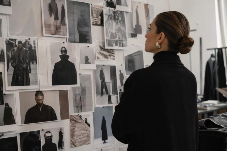
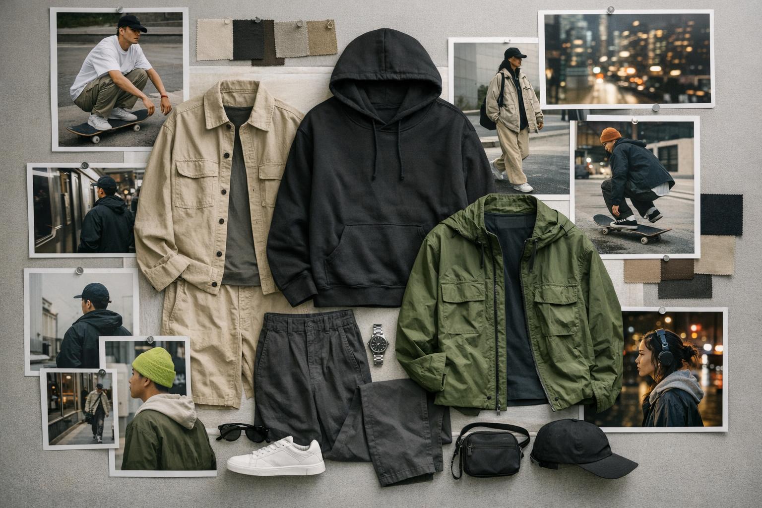
A strong streetwear fashion moodboard doesn’t just collect “cool outfits.” It builds a visual argument: why a silhouette feels current, how texture creates attitude, where a logo becomes a visual anchor, and which cultural references signal the difference between generic casualwear and true street culture aesthetic. The best boards read like design direction—part street photography energy, part lookbook polish, part runway-level styling discipline.
This aesthetic lives where movement and identity meet: downtown commutes in New York, late afternoons in Los Angeles, skate-adjacent weekends, music-forward nights, and any setting where comfort needs to hold its shape under real life. That’s why it stays popular. Streetwear is built for walking, standing, layering, and repeating—yet it still rewards detail, proportion play, and brand storytelling.
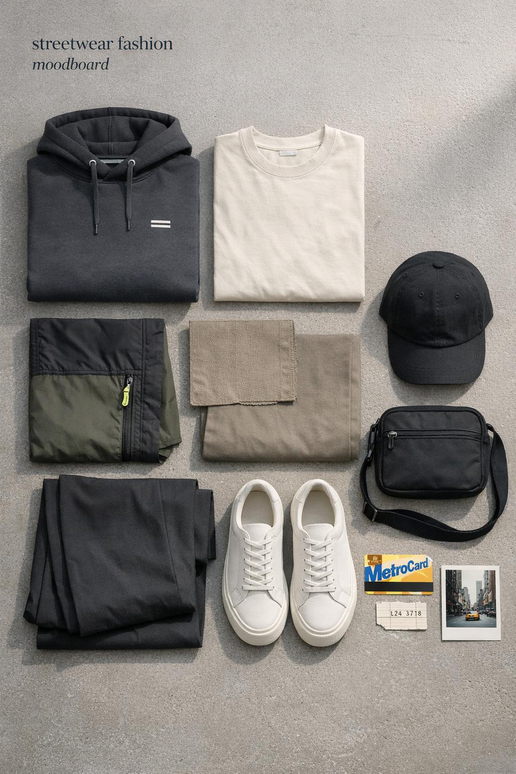
If you’re using a streetwear moodboard for personal style, content creation, or a streetwear brand aesthetic, the goal is the same: curate a consistent visual narrative. That narrative is made of colors, materials like canvas and nylon, recognizable logos, and cultural signals tied to skate, hip-hop, and street photography.
What a streetwear moodboard actually is (and what it isn’t)
A moodboard in fashion is a curated set of images and design references that define a direction—what the style should feel like before you decide every detail. In streetwear, that direction often balances utility with status cues: relaxed silhouettes, intentional branding, and cultural references that communicate taste fast.
Found the dress? Keep the rest in one place.
Zarellea brings guest details, vendors, timelines, and every next step together — so your wedding plan feels as good as your look.
What it isn’t: a random gallery of trending items. A mood board streetwear edit only becomes useful when it has structure—recurring colors, repeated textures, consistent silhouette logic, and a clear “why” behind every image. Even when the vibe is chaotic, the composition should be controlled.
The core elements that make streetwear boards feel intentional
Silhouette, proportion play, and movement
Streetwear silhouettes succeed when they’re designed for movement: shoulders that sit comfortably, pant legs that drape without collapsing, layers that stack without bulk in the wrong places. Moodboards that work show the same silhouette idea from multiple angles—wide-leg with a compact top, oversized outerwear over a streamlined base, or a single statement layer anchoring simpler pieces.
For practical styling, prioritize images that show the outfit mid-motion—walking, skating, turning—because streetwear is a lived aesthetic. This is why street photography references belong next to lookbooks and runway images: they test whether the silhouette reads beyond a controlled set.
Texture contrast: canvas, nylon, and tactile layers
Texture is the quiet engine of a strong streetwear moodboard inspiration. Canvas brings grounded utility; nylon reads technical and urban; cotton-heavy basics soften louder branding. A board that mixes textures well can make neutral outfits look intentional and make bright pieces feel wearable.
When curating, cluster images by tactile categories—matte vs. sheen, rigid vs. drape—so you can see whether the board has enough contrast to feel designed, not accidental.
Color logic: neon shocks vs. earth-tone control
Streetwear color works best when it has a system. Neon can act as a sharp accent that energizes a board, while earth tones stabilize it and prevent the overall mood from feeling like pure trend-chasing. The smartest boards show how neon appears: a single accessory, a logo hit, a panel detail—then repeat that logic across multiple images.
Earth tones, on the other hand, create continuity across different brands and product categories. They’re especially useful if your board needs to function as a repeatable wardrobe direction, not a one-off outfit moment.
Iconic logos and branding as visual anchors
Logos are not just decoration in streetwear—they’re composition tools. A recognizable mark can anchor a busy outfit, direct the eye across the silhouette, and create a “read” from a distance. Including brand references like Supreme, Stüssy, and Nike on your board helps establish the streetwear category instantly, but the key is how you place them: logo as focal point, logo as subtle repetition, or logo as contrast against minimal layers.
A good rule: treat branding like typography in a layout. Too many loud marks flatten the story; a controlled set of logo moments creates rhythm.
Cultural references: skate, hip-hop, and the street photography eye
Street culture aesthetic is built on references. Skate and hip-hop aren’t “themes” you paste on top; they show up in posture, styling choices, and the kind of environments your images capture. A streetwear fashion moodboard gains credibility when you mix garments with context: sidewalks, public transit, storefront lighting, and candid movement.
In practical terms, don’t only collect product images. Collect scenes. The scene tells you what the outfit is for, and that clarity makes styling decisions easier later.
How to source images without losing the plot
Sourcing is where most moodboards either sharpen into a direction or dissolve into an “everything I like” folder. The fix is to use distinct source types, each with a different job: street photography for realism, lookbooks for brand-controlled storytelling, and runway images for silhouette innovation. Together they create a complete mood signal.
Street photography, lookbooks, runways: why you need all three
Street photography tests wearability and movement. Lookbooks show how a streetwear brand aesthetic is deliberately composed—styling, backdrops, casting, and pacing. Runways, even when not purely streetwear, often provide the strongest silhouette experiments and layering concepts that streetwear later translates into daily wear.
When you use these sources together, your board avoids being trapped in one visual register. That range is what keeps a streetwear moodboard from looking like a single shopping haul.
Platforms and workflows: Pinterest and Behance
Pinterest works best for fast collecting and pattern recognition: you can see what you keep saving and identify your recurring silhouette and palette preferences. Behance is useful when you want presentation discipline—how designers format boards, use grids, and build a coherent narrative across a page.
The workflow that holds up over time is simple: collect widely first, then edit aggressively. Your final streetwear moodboard inspiration set should feel narrower than your taste, because it’s meant to guide decisions.
Tip: licensing and usage—what to clarify early
If the moodboard is purely personal, your main concern is organization and clarity. If it will be published as content or used in a brand context, pause and confirm usage expectations for images—especially when pulling from lookbooks, runway photography, and street photography. Building this habit early prevents last-minute rebuilds that compromise the visual story.
Build your board like a stylist: core vs. supporting references
One of the cleanest ways to make a mood board streetwear edit feel professional is to separate what defines the direction from what decorates it. Think of it as casting: the lead roles define the plot, and the supporting roles add dimension without stealing focus.
Core references: the non-negotiables
Core references are the images that must stay for the board to remain itself. In streetwear, these are usually the key silhouette, the dominant color system (neon accents or earth-tone stability), the defining texture mix (canvas and nylon, for example), and one or two brand signals that communicate category fast—often through recognizable logos.
- Pick 6–10 core images that repeat the same silhouette logic
- Limit your palette to a small set: neutrals plus either neon hits or a deeper earth-tone range
- Choose 1–3 branding references (for example, Supreme, Stüssy, Nike) as anchors rather than constant noise
Supporting references: dimension without distraction
Supporting references deepen the story: a typography detail, a street scene that captures attitude, an accessory shot that clarifies the level of polish, or a single runway image that introduces a proportion idea you want to translate to daily wear. These images should explain how the core idea can flex.
The test is practical: if a supporting image changes your direction, it isn’t supporting—it’s competing. Keep it in a separate folder for a future board.
Visual grammar: layouts, grids, and typography that keep the vibe consistent
Streetwear moodboards often fail at presentation, not inspiration. The fix is visual grammar—how you arrange images so the direction reads instantly. A grid layout tends to emphasize discipline and brand clarity, while a looser collage can communicate raw street energy. Neither is “better,” but each changes the tone.
Typography matters when you’re building a streetwear brand aesthetic. A minimal type label under each image (texture, silhouette note, color cue) can turn a beautiful board into an actionable tool. Keep labels short and consistent so they support the images instead of competing with them.
Tip: create a “visual anchor” zone
Reserve one area of the board for anchors: one logo moment, one strong silhouette image, and one color reference. This is the section you glance at when you’re unsure whether a new image belongs. If it doesn’t harmonize with the anchors, it’s likely off-direction.
Outfit-driven streetwear moodboard inspiration: variations on the same aesthetic
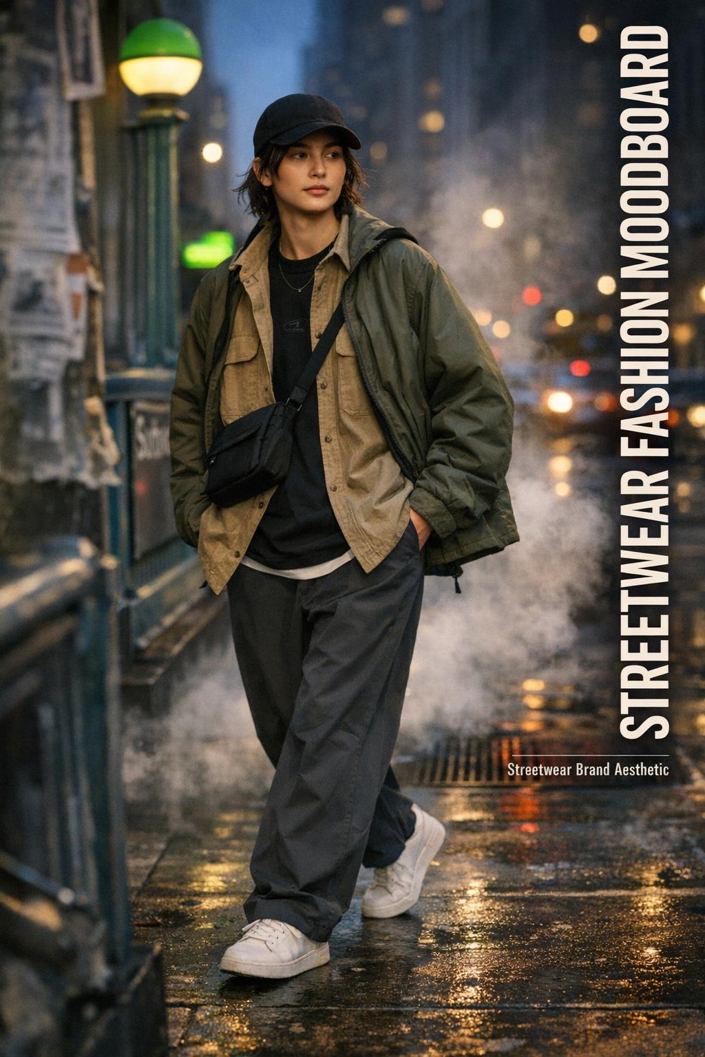
To make the streetwear fashion moodboard usable, translate it into outfit compositions. The looks below are not separate aesthetics—they’re controlled variations of the same street culture aesthetic, shifting proportion, texture, and branding intensity while staying within a coherent visual identity.
Look: logo-anchored city uniform (New York energy)
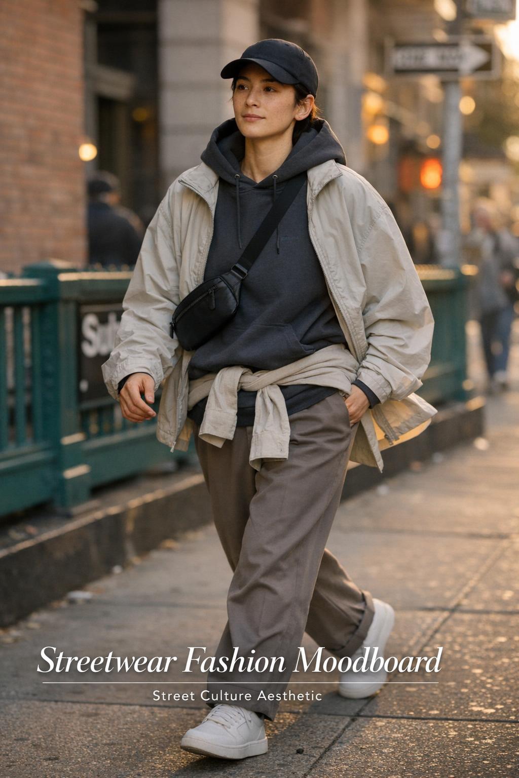
This look is built around a strong visual anchor: a single, unmistakable logo moment that holds the outfit together while the rest stays clean. The silhouette reads confident and street-smart—structured enough to look intentional, relaxed enough to move through a full day without feeling styled “for the camera.”
Keep the base neutral and let branding do the talking. A hoodie or tee with a Supreme or Stüssy logo becomes the focal point, supported by straight or wide-leg pants that drape cleanly. Add a nylon outer layer for sheen contrast, and keep the palette grounded—black, gray, or earth tones—so the logo doesn’t fight the rest of the outfit.
- Key garments: logo hoodie or tee, nylon jacket, clean drape pants
- Footwear: a simple sneaker profile (Nike works as a recognizable streetwear signal)
- Accessories: minimal—one cap or small bag to keep the focus on silhouette
Why this works: the outfit composition uses hierarchy. One loud element leads, and everything else supports it through tonal layering and controlled texture contrast.
Look: earth-tone utility layering (Los Angeles daylight)
This variation leans on warmth and ease. The mood is relaxed, sun-ready, and functional, with layering that feels intentional rather than heavy. The silhouette is roomy but not sloppy: volume appears in one area at a time, so the look stays balanced.
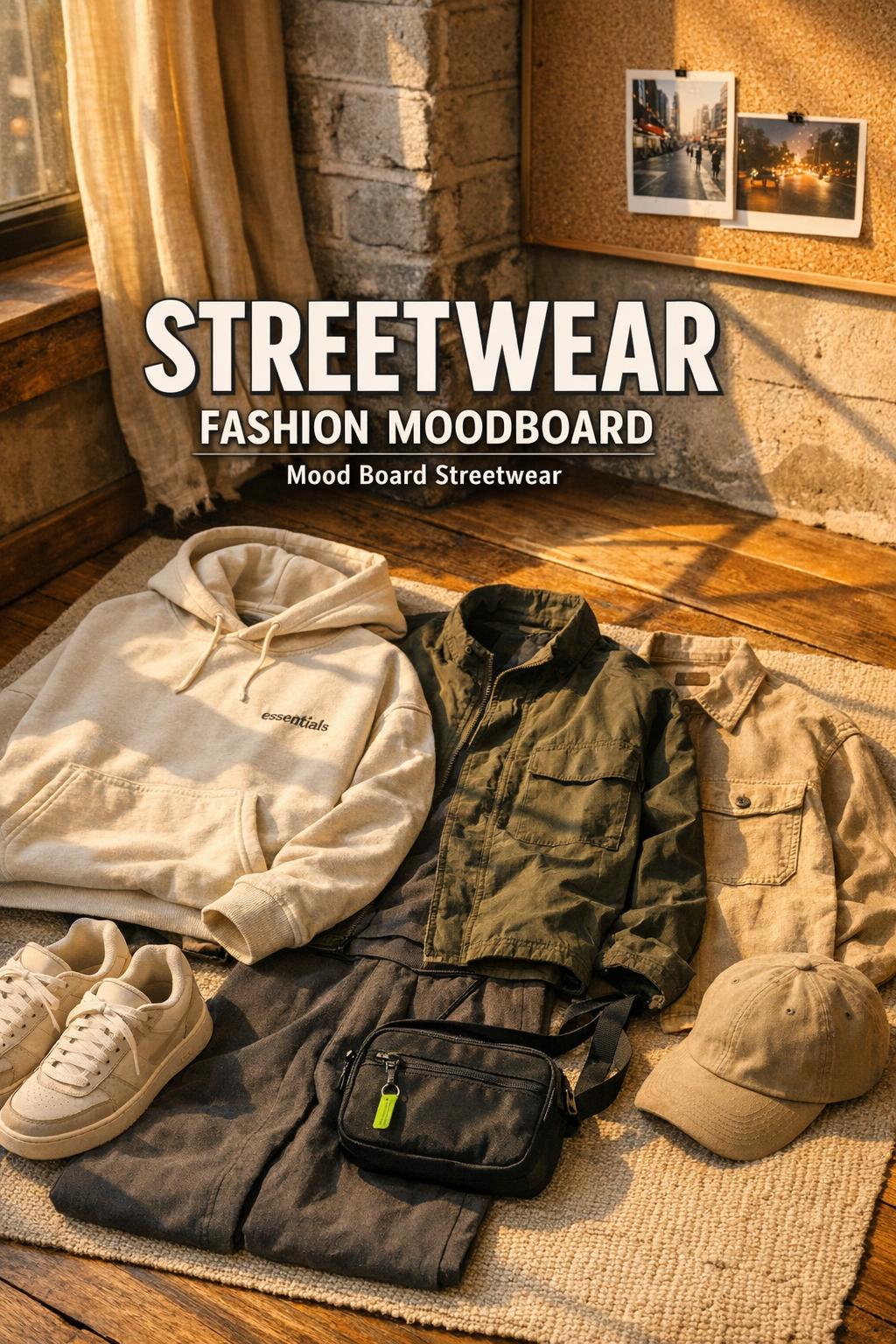
Use earth tones as the palette backbone—sand, olive, brown, muted khaki—then introduce canvas for a grounded, tactile feel. A canvas overshirt or utility jacket adds structure without stiffness. Keep the underlayer simple, then add a nylon detail (like a lightweight shell or bag) to prevent the textures from becoming too matte.
Why this works: earth tones create immediate cohesion across mixed materials, while canvas and nylon deliver the streetwear texture story in a way that reads practical in real daylight.
Look: neon accent minimalism (controlled shock color)
This look is for the person who wants impact without clutter. The mood is graphic and modern, with a minimalist base that makes room for a single neon interruption. The silhouette stays clean and slightly oversized, so the accent color reads as intentional design, not random brightness.
Build the outfit with neutrals first—black, charcoal, off-white—then add neon as a small but undeniable hit: a logo print, a stripe detail, or a single accessory. Keep fabrics crisp: a nylon layer is ideal here because its sheen amplifies neon without adding extra colors.
- Key garments: neutral base layers, one nylon piece, one neon accent element
- Footwear: clean sneaker to keep the palette disciplined
- Accessories: one accent max; avoid stacking multiple bright items
Why this works: it respects color hierarchy. Neon behaves like punctuation—powerful because it’s rare within the composition.
Look: skate-referenced texture mix (street photography realism)
This version is grounded in the street photography eye: the outfit needs to look right while walking fast, waiting outside, sitting on curbs, moving through the city. The mood is raw but curated, with pieces that can take friction and still look deliberate.
Use canvas as your durability signal—pants or a jacket—and contrast it with nylon for lightweight function. Keep branding present but not dominant; a subtle Nike cue or a small Stüssy hit keeps the look in the streetwear lane without turning it into a billboard. The palette stays practical: earth tones and muted neutrals, with optional small neon detail if the board calls for it.
Why this works: the outfit’s texture contrast communicates purpose. It reads as lived-in streetwear rather than a styled costume, which is essential when the inspiration comes from skate and street scenes.
Look: clean grid—lookbook polish without losing edge
Some streetwear needs a sharper finish: the mood is calm, curated, and brand-forward in a subtle way. The silhouette is still relaxed, but the overall impression is cleaner—like a lookbook page brought into real life.
Focus on tonal layering within a tight palette—multiple shades of the same neutral family. Choose one standout detail: a logo placed with intention, or a single nylon layer to add dimension. Keep fabrics smooth and consistent to avoid visual chaos; let the proportions do the work.
Why this works: it uses restraint as a style signal. In streetwear, restraint reads confident when the silhouette balance is correct and the branding is placed like design, not decoration.
How to recreate these looks from a moodboard (without copying images)
A moodboard is direction, not duplication. The skill is extracting rules—silhouette, palette, texture, and branding intensity—then rebuilding them with what you have. This approach keeps your style personal while staying faithful to the board’s visual identity.
- Identify the board’s dominant silhouette: oversized outer + simple base, or wide-leg bottom + compact top
- Choose a two-tier palette: neutrals as the base, neon or earth tones as the secondary system
- Match textures intentionally: canvas for weight, nylon for sheen and function
- Set a branding limit: one major logo moment or two subtle ones, not both
In real-world use, comfort is the accountability check. If you can’t walk, sit, and layer throughout a day, the outfit may photograph well but won’t deliver the streetwear promise of function-first style.
Common moodboard mistakes that flatten the streetwear aesthetic
Mistake: treating logos as the entire concept
Supreme, Stüssy, and Nike can communicate streetwear instantly, but overloading your board with logos often erases silhouette and texture—the two elements that make outfits wearable and repeatable. The fix is to treat branding as punctuation and let proportion and materials carry the mood.
Mistake: mixing too many visual environments
Streetwear is context-sensitive. A board that jumps between unrelated settings without a unifying palette or silhouette can feel unfocused. If you want New York grit and Los Angeles daylight on the same board, unify them through consistent color logic (earth tones or neutrals with neon accents) and repeated material cues like canvas and nylon.
Mistake: collecting only product shots
Product shots are helpful, but street culture aesthetic is also posture, movement, and environment. Without street photography references, your board can lose realism—and your outfits may end up feeling stiff or overly styled. Balance clean lookbook images with candid scenes to keep the mood grounded.
A practical toolkit for building your streetwear fashion moodboard today
Whether you’re building a streetwear moodboard for personal styling or a streetwear brand aesthetic direction, the toolkit is less about software and more about asset discipline. You need a place to collect, a method to edit, and a presentation format that can guide decisions later.
Template structure: a board that stays usable
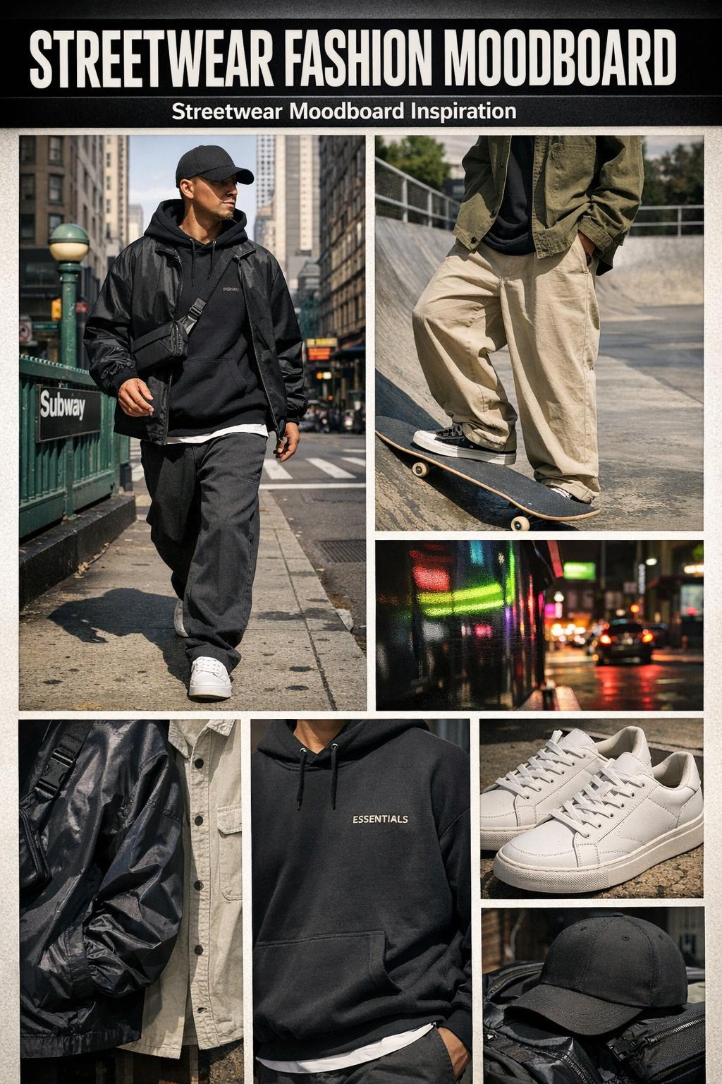
A reliable structure is a 60/40 split: 60% outfit-and-silhouette images, 40% details and context. The outfit images establish proportion and layering; the detail images lock in texture, color, typography, and logo placement.
- Top row: three silhouette anchors (street photography + lookbook + runway)
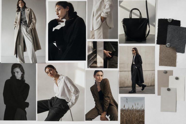
- Middle: palette swatches and texture close-ups (canvas, nylon, cotton basics)
- Bottom: branding moments (Supreme/Stüssy/Nike references) and accessory cues
Tip: name your board like a design brief
Instead of naming a folder “streetwear,” name it by the rules it follows, such as “earth-tone nylon layers + minimal logo” or “neutral base + neon punctuation.” This makes the board easier to apply when you’re actually getting dressed or planning content.
Where this aesthetic wears best: settings that reward the mood
Streetwear’s advantage is versatility, but the styling emphasis shifts by setting. In dense city movement like New York, sharper visual anchors (a clear logo hit, a strong jacket line) help the outfit read quickly. In Los Angeles daylight, texture and palette often carry more weight; earth tones and canvas feel natural, and the styling can stay relaxed without losing intention.
For skate-adjacent days, prioritize comfort and friction-friendly materials—canvas and sturdy cottons—and keep branding secondary so the look feels lived rather than curated. For music-forward nights, a nylon layer with subtle sheen can add visual dimension while keeping the palette controlled.
Conclusion: turn inspiration into a repeatable streetwear identity
A streetwear fashion moodboard works when it behaves like a system: silhouette logic, texture contrast, and a controlled approach to branding and color. Use street photography for realism, lookbooks for composition discipline, and runway references for proportion ideas—then translate the board into outfits that move well in real life. That’s how a streetwear moodboard becomes more than a collage: it becomes a clear, repeatable aesthetic you can adapt to your wardrobe, your city, and your daily rhythm.
FAQ
What is a streetwear fashion moodboard used for?
It’s used to define a clear visual direction for streetwear—capturing silhouette, color palette, textures like canvas and nylon, branding intensity, and cultural references such as skate and hip-hop—so styling decisions stay consistent across outfits, content, or a streetwear brand aesthetic.
How do I keep a streetwear moodboard from looking random?
Separate core references from supporting ones: lock in a dominant silhouette, a limited palette (neutrals with either neon accents or earth tones), and a small set of branding anchors (for example, Supreme, Stüssy, Nike), then only add supporting images that reinforce those rules instead of changing them.
Where can I find streetwear moodboard inspiration online?
Pinterest is strong for fast collecting and spotting patterns in what you save, while Behance is useful for seeing how designers present boards with grids, typography, and structured layouts that make a mood board streetwear edit more actionable.
How many images should be on a mood board streetwear board?
A practical range is enough to show repetition without clutter: start by collecting widely, then edit down to a tight set where most images reinforce the same silhouette and palette, with a smaller portion reserved for detail shots like textures, logo placement, and contextual street scenes.
How do I choose between neon accents and earth tones for streetwear?
Neon works best as controlled punctuation on a neutral base, creating sharp impact with minimal color noise, while earth tones create consistent cohesion across multiple outfits and brands; the strongest boards treat either choice as a system and repeat it across several images.
How can I use logos without overpowering my streetwear aesthetic?
Treat logos as visual anchors rather than constant headlines: use one strong logo moment or a couple of subtle references, then let silhouette balance and texture contrast do most of the work so branding feels designed instead of loud.
What types of images should I include besides outfit photos?
Add texture close-ups (like canvas and nylon), palette references (neon hits or earth tones), and contextual street photography scenes; these elements clarify how the aesthetic should feel in real environments, not only in product-only visuals.
How do moodboards influence drop strategies?
A moodboard can clarify the visual narrative behind a release—what silhouettes, materials, and branding cues belong together—so the collection reads cohesive in lookbooks and street photography-style imagery, rather than feeling like unrelated pieces grouped by trend.
What brands dominate streetwear moodboards in 2026?
Common streetwear moodboards often use recognizable anchors like Supreme, Stüssy, and Nike because their logos and styling cues communicate the category quickly; the strongest boards, however, rely on silhouette, texture, and palette first, using brand references as controlled signals rather than the entire concept.