Moodboard Aesthetic: A Practical Grid for Polished Style
Moodboard aesthetic: the visual system behind a “vibe” that actually styles well
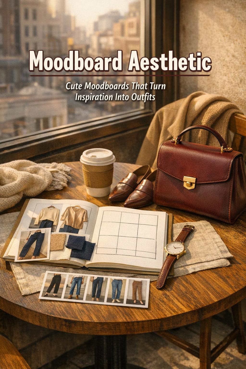
A moodboard aesthetic is often treated like a collage of pretty images, but in practice it works more like a styling system: a set of visual rules that quietly governs color harmony, silhouette balance, texture contrast, and even how “busy” a look can get before it reads chaotic. That’s why the best mood boards don’t just look good on a screen—they make outfit decisions faster, shopping more disciplined, and personal style more consistent.
Think of it as the bridge between inspiration and execution. Your saved moodboard photos aren’t the destination; they’re the data. When curated with intention, a random moodboard becomes a clear wardrobe direction, and cute moodboards become actionable references for proportion play, tonal layering, and signature details you can repeat across seasons without looking repetitive.
This guide breaks down how to build and use a moodboard aesthetic with the same logic a stylist uses to assemble an editorial story: define the concept, pick visual anchors, set boundaries, and then test the system in real outfits and real-life settings.
What a moodboard aesthetic is (and what it isn’t)
A moodboard aesthetic is a curated collection of visual references—images, colors, textures, typography, and objects—that communicate a cohesive style direction. The key word is cohesive. A functioning board creates repeatable outcomes: you can build multiple looks that feel related without looking identical.
What it isn’t: a single trend label, a one-outfit fantasy, or an infinite scroll of unrelated pins. If your mood boards are growing but your closet still feels confusing, the issue is usually structure. A strong board has constraints (palette, silhouettes, materials, and mood), not just inspiration.
The difference between inspiration and direction
Inspiration is broad—anything that catches your eye. Direction is specific—it narrows your choices. The shift happens when you can name your “core ideas aesthetic,” meaning the handful of visual principles you can apply repeatedly (for example: sharp tailoring + soft knit texture; or muted tones + high-contrast accessories). Once you can articulate those principles, your moodboard aesthetic becomes a practical tool.
How to read a moodboard like a stylist: the five signals that matter
Most moodboard photos communicate the same underlying signals, even when the subjects vary. When you learn to read these signals, you stop copying outfits and start extracting the formula behind them.
- Palette logic: neutrals vs. saturated color, warm vs. cool, and how much contrast the looks rely on.
- Silhouette language: fitted vs. relaxed, structured vs. fluid, long lines vs. cropped proportions.
- Texture contrast: matte vs. shine, smooth vs. tactile, crisp vs. drapey fabric behavior.
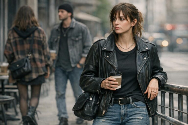
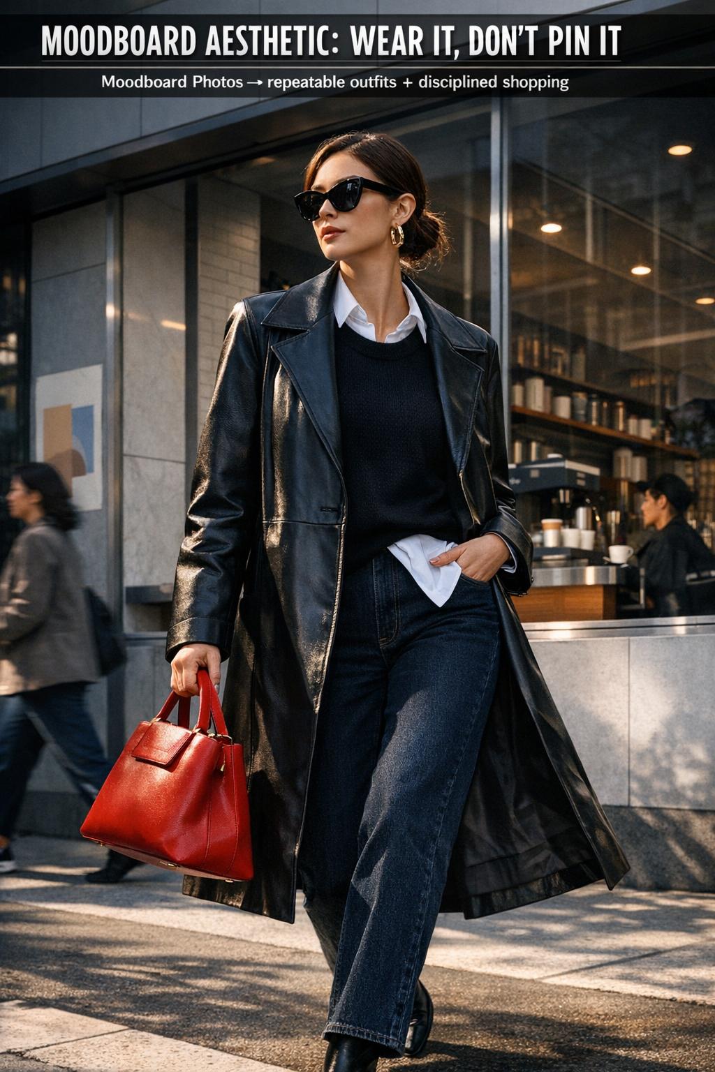
- Visual anchors: one statement piece that tells the story (a coat, bag, shoe, or bold jewelry) while everything else supports it.
- Context cues: where the look “lives” (city errands, work, travel day, weekend café, evening event) and what the styling must handle (movement, weather, duration).
When your board feels scattered, it’s usually because these signals conflict. For example: a board mixing low-contrast tonal layering with high-contrast graphic styling will read visually inconsistent—even if every image is “cute.”
Building mood boards that don’t collapse in real life
The most common moodboard failure is aesthetic overreach: a board that looks editorial but ignores comfort, climate, budget, and the reality of repeated wear. A working moodboard aesthetic anticipates friction—wrinkling fabrics, footwear you can’t walk in, or layering that only works in one temperature band.
Start with two boards, not one
One board should capture aspiration (the “editorial” version). The second should be your translation board: moodboard photos that show the same energy in wearable form. This is where cute moodboards can be surprisingly useful—because they often show simplified silhouettes and accessible styling moves you can repeat.
Set boundaries before you collect more images
Boundaries prevent a random moodboard from turning into visual clutter. Decide your limits: a palette range, a silhouette family, and two or three textures you want to repeat. When you save an image, you should be able to justify it using those boundaries. If you can’t, it’s inspiration—but it doesn’t belong on the board.
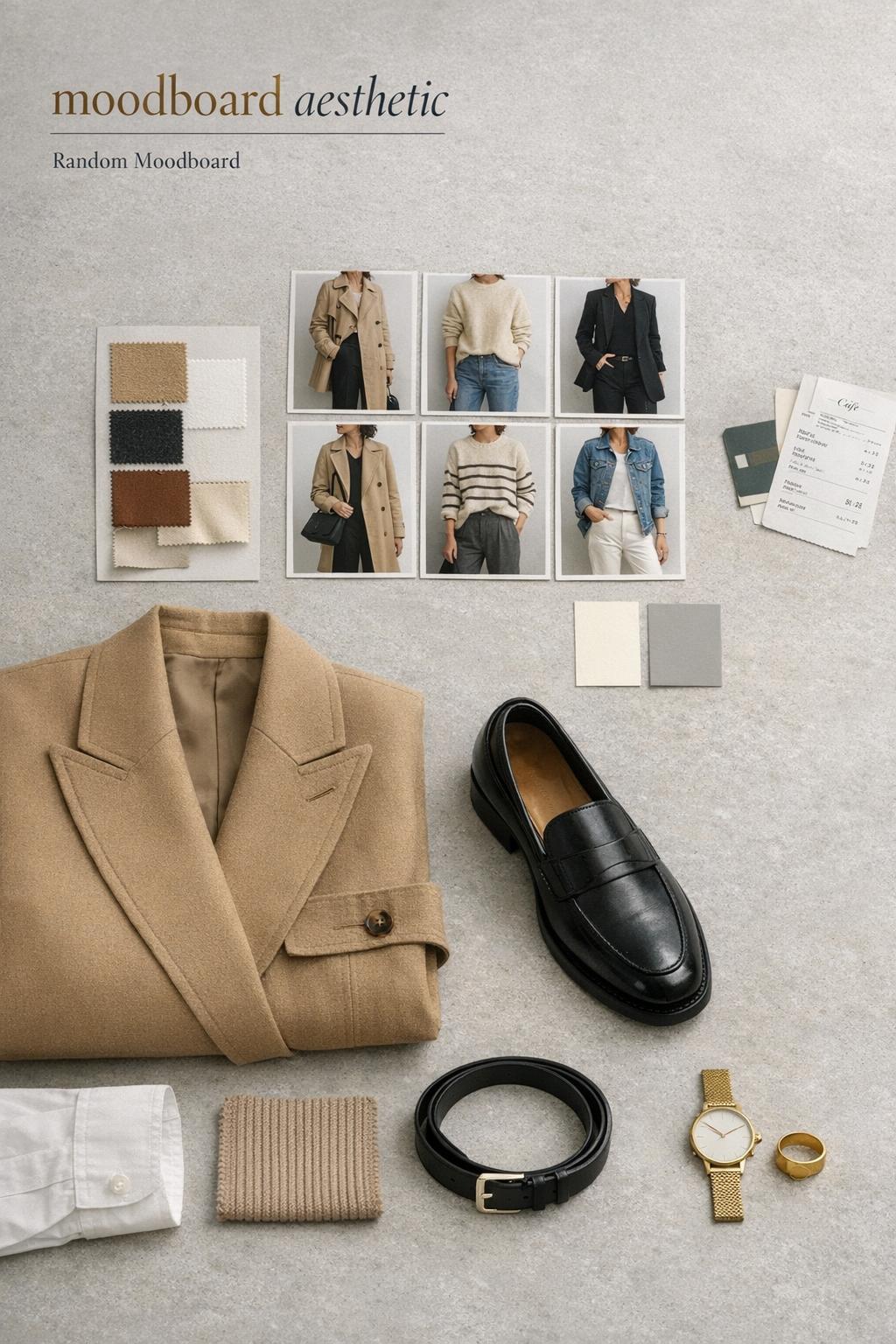
- Palette boundary: choose 3–5 base tones and 1–2 accent tones.
- Silhouette boundary: decide whether your line is mostly tailored, relaxed, or mixed with a consistent rule (e.g., structured top + relaxed bottom).
- Texture boundary: pick two “everyday” textures and one “elevating” texture to act as the board’s signature.
Core ideas aesthetic: how to define yours without boxing yourself in
“Core ideas aesthetic” isn’t about naming an internet microtrend. It’s about extracting the repeatable design principles you’re drawn to. The goal is flexibility: the same principles should work for casual outfits, work outfits, and event looks—just scaled up or down through fabric choice and accessories.
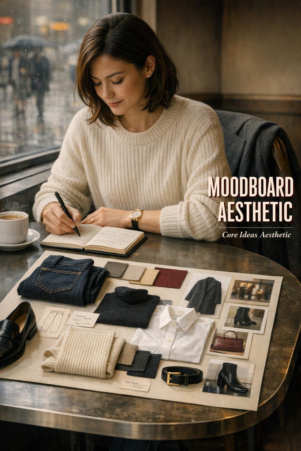
A three-sentence framework that stays useful
Write three sentences and keep them visible near your mood boards. Sentence one describes your silhouette rule. Sentence two describes your palette rule. Sentence three describes your styling signature (the recurring detail that makes the look feel intentional). When you can articulate these, you can stop chasing new references and start building a wardrobe system.
Example logic (not a template to copy): if your silhouette rule is “long lines with one cropped interruption,” your palette rule might be “soft neutrals with a single dark anchor,” and your signature could be “one structured accessory to sharpen the look.” The board becomes a consistent visual thesis instead of a collection.
Random moodboard vs. curated moodboard: when each one helps
A random moodboard has value when you’re in the discovery phase. It surfaces patterns you didn’t know were there—colors you keep saving, styling shapes you repeat, and the kinds of moodboard photos that make you pause. The mistake is staying in discovery forever.
Use a random moodboard to find your repeats
Collect freely, then audit the board. The audit is where the style intelligence happens: you identify what’s truly recurring (silhouette, palette, texture), and you separate it from novelty. The result is a refined board that you can actually use for shopping and outfit composition.
Use a curated board to make decisions fast
A curated moodboard aesthetic should reduce choice fatigue. If you’re about to buy a coat, the board should tell you what length, what degree of structure, and what color temperature keeps your wardrobe cohesive. If it can’t answer those questions, it’s not curated enough.
Style categories that consistently translate from mood boards to outfits
Most people don’t need more aesthetics—they need fewer, stronger categories that can be worn. The following style directions are less about labels and more about how outfits are built: proportion, contrast, and finishing choices.
Tonal minimalism with a sharp anchor
This category works because tonal layering creates length and calm, while a sharp anchor—often a structured outer layer or a defined accessory—prevents the look from drifting into “unfinished.” The silhouette balance is the point: soft base layers, crisp edge.
Practical translation from moodboard photos: repeat one tone across top and bottom to elongate the line, then add a single structured item (jacket, bag, shoe) as the visual anchor. This is one of the easiest moodboard aesthetic directions to maintain across seasons.
Soft structure: relaxed silhouettes with intentional tailoring
Soft structure reads modern because it blends comfort with polish. The styling logic is proportion play: relaxed trousers or denim get paired with a more defined top, or vice versa. Texture contrast matters here—knit softness against a crisp layer keeps the outfit from looking flat.
Playful “cute moodboards” styling without looking juvenile
Cute moodboards often rely on small-scale details: rounded shapes, lighter colors, and accessories that feel graphic. The adult translation is restraint. Keep the silhouette clean and let the “cute” element be singular—a bag shape, a shoe detail, a hair accessory, or a color pop—so the look reads styled, not costume.
Why it works: a controlled base silhouette creates a calm canvas. One playful detail becomes the statement piece, which is exactly how editorial styling stays readable in photos and in real life.
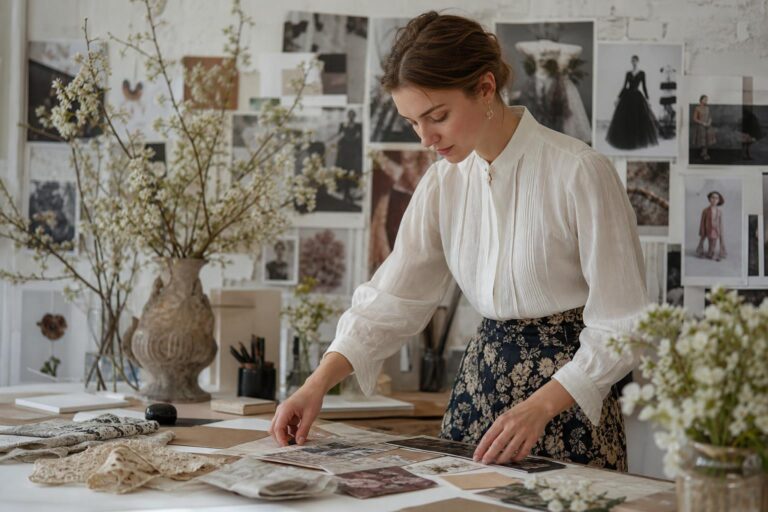
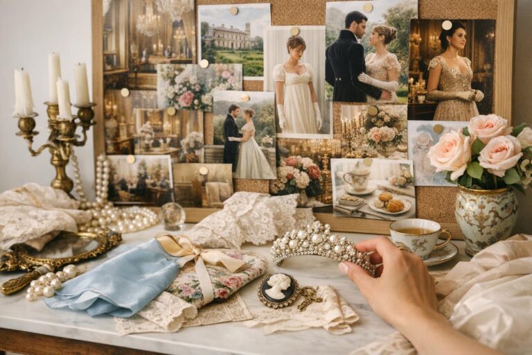
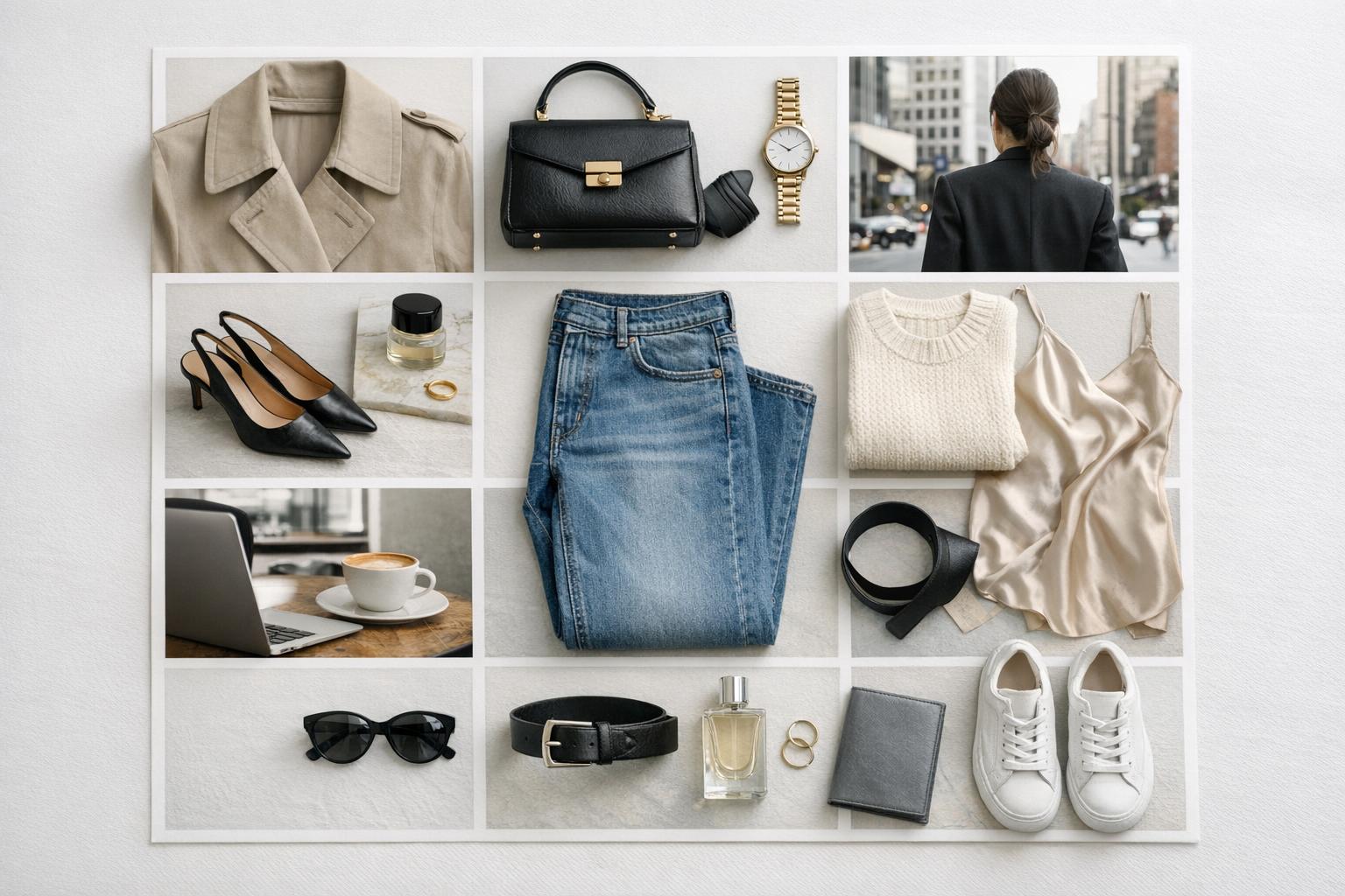
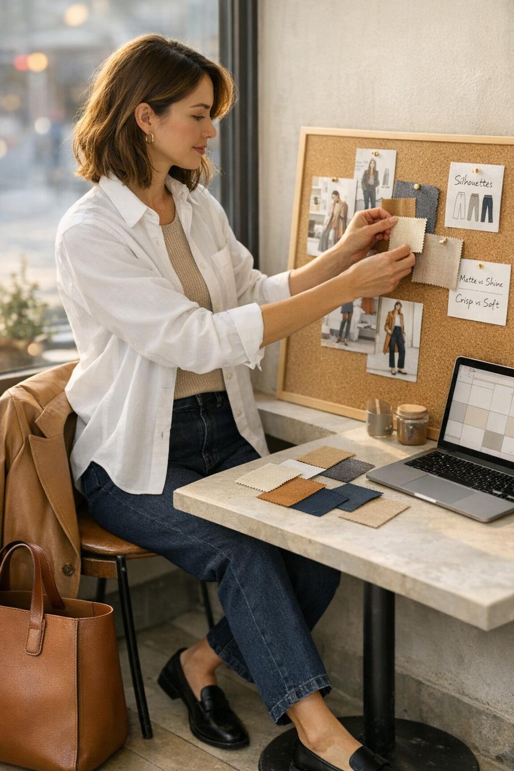
Moodboard photos: how to curate images that teach you something
The best moodboard photos aren’t just attractive—they’re informative. They show you how the outfit is built: where the waistline sits, how the hem lengths relate, whether the fabric drapes or holds shape, and what the styling uses as a focal point.
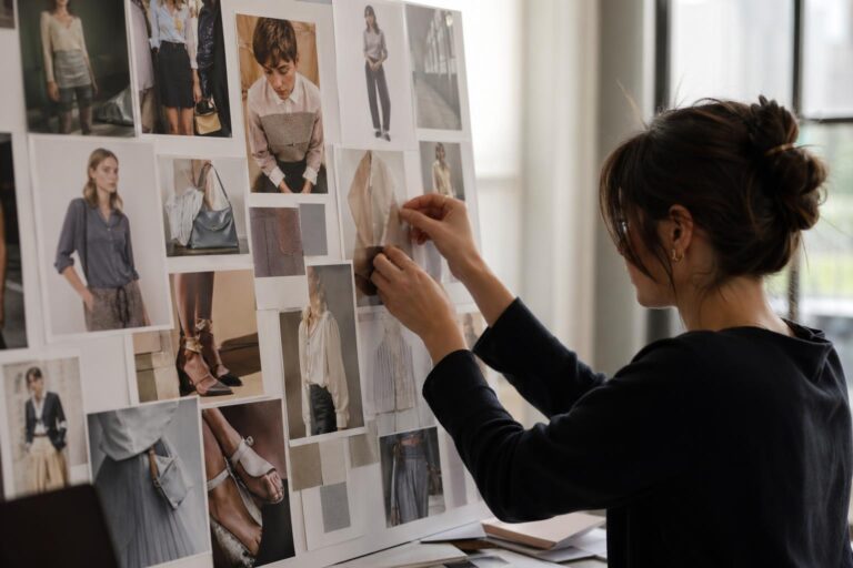
Choose images with visible construction
Prioritize photos that reveal silhouette structure and layering logic. Full-body images are more useful than close-ups when you’re studying proportion. When you do save close-ups, save them for texture, accessory details, or color references—not as outfit blueprints.
Collect “repeatable” outfits, not one-time moments
Red-carpet-level styling can be inspiring, but it’s rarely repeatable. Your moodboard aesthetic gets stronger when you save looks you can realistically wear multiple times with different combinations. If a look depends on a single hyper-specific piece, it may be inspiring, but it won’t build a system.
From mood boards to closet: turning visuals into a shopping and styling filter
The most valuable function of mood boards is editing. They help you stop buying “almost right” items. Once your board is defined, you can test any potential purchase against it: does it support your palette, reinforce your silhouette rule, and add a useful texture to your rotation?
Build a short “key pieces” list from your board
Look at your saved moodboard photos and identify what shows up repeatedly. Those repeats become your key pieces. This is how you translate inspiration into a wardrobe architecture rather than impulse buying.
- One outer layer category you repeat (the piece that frames most outfits)
- One trouser or denim silhouette that anchors proportions
- One shoe profile that matches your board’s mood
- Two texture tools (for example: a knit layer and a crisp layer) that create contrast
- One accessory category that acts as your signature
Know what your board says “no” to
A strong moodboard aesthetic is defined as much by what it excludes as what it includes. If your board is low-contrast and tonal, highly graphic pieces will fight your palette. If your board is built on relaxed silhouettes, overly rigid tailoring may feel costume-like. Your “no list” protects your closet from becoming visually inconsistent.
Occasion-specific styling: making the same moodboard aesthetic work across your week
A useful aesthetic isn’t fragile. It should scale across settings by adjusting fabric weight, finish, and accessory intensity—without breaking the silhouette and palette rules that make it recognizable.
Workday polish without overcomplication
For work, the goal is controlled structure. Keep the silhouette clean, use tonal layering to look cohesive, and rely on one statement piece to signal intention. The outfit composition should read confident from a distance, with texture detail rewarding a closer look.
Weekend ease that still looks styled
Weekend outfits succeed when comfort is built into the silhouette, not added as an afterthought. Use relaxed proportions, then add one anchor—shoes with shape, a defined bag, or a structured layer—to keep the look from feeling like loungewear. This is where cute moodboards translate well: playful details feel natural in off-duty settings, as long as the base stays streamlined.
Event dressing: elevate through fabric and finish
To elevate your moodboard aesthetic for an event, keep your silhouette rule consistent and upgrade the materials. A familiar line in a richer texture reads intentional and sophisticated. This approach also prevents the common mistake of buying an event outfit that doesn’t integrate into the rest of your wardrobe.
Tips: the fastest ways to make mood boards more useful
Most mood boards fail because they’re treated like storage, not strategy. These tips keep your moodboard aesthetic actionable.
- Cap your board: stop at a defined number of images, then replace rather than add. This forces clarity.
- Audit monthly: delete images that no longer match your “core ideas aesthetic” sentences.
- Save styling details: capture hems, footwear profiles, and layering moves—not just “pretty faces.”
- Use a “test outfit” rule: for every new direction you pin, build one outfit version using items you already own.
- Keep one translation board: it should contain only wearable references that match your lifestyle and climate.
Real-world note: if your board depends on one exact item you don’t own, the board is aspirational. If your board can be recreated with substitutions, it’s functional. Aim for functional.
Common moodboard aesthetic mistakes (and what to do instead)
Even visually strong boards can lead to disappointing outfits when the underlying logic is missing. These are the pitfalls that show up most often when people move from mood boards to daily styling.
Mistake: confusing “more images” with “more clarity”
Adding moodboard photos can feel productive, but it often buries the pattern. Instead, remove anything that doesn’t reinforce the same palette and silhouette family. Your board should become more consistent over time, not more varied.
Mistake: copying a look without matching the proportions
Proportion is the most overlooked variable. If your reference uses a long outer layer and you swap it for a cropped one, the entire silhouette balance changes. When recreating, match the line first (lengths and volume), then approximate colors and textures.
Mistake: ignoring texture, then wondering why the outfit looks flat
Many mood boards rely on subtle texture contrast to create depth, especially in tonal palettes. If you recreate the colors but choose all similar finishes, the look loses dimension. Add contrast intentionally: matte against shine, crisp against soft, smooth against tactile.
Mistake: building an aesthetic that doesn’t match your daily context
An aesthetic must survive your day—walking, commuting, long hours, shifting temperatures. If your moodboard aesthetic depends on constant adjustment or discomfort, it will be abandoned. Use your translation board to prioritize references that look good while moving and living, not just standing for a photo.
Using mood boards for more than fashion: beauty, decor, and brand visuals
While fashion is the most immediate application, the same moodboard aesthetic logic extends to beauty and visual branding because the signals are the same: palette, texture, contrast, and focal points. If your style is built on soft tonal layering, beauty choices that emphasize diffused edges and balanced contrast will look more harmonious than harsh, high-contrast shifts.
For decor and content visuals, the board can keep imagery consistent—especially if you use the same “core ideas aesthetic” rules (tone range, material vibe, and a recurring visual anchor). This is where mood boards stop being a personal scrapbook and start functioning like a creative direction tool.
How to keep your moodboard aesthetic current without chasing every new idea
Style evolution should feel like refinement, not reinvention. The most wearable approach is to keep your foundation stable—silhouette rule and palette rule—then update through small shifts: a fresh accessory profile, a new texture, or a slightly different proportion that still fits your system.
A controlled refresh method
When you feel bored, don’t rebuild your mood boards from scratch. Replace a handful of images with new references that still align with your “core ideas aesthetic,” and test the update using one outfit formula. If the update integrates smoothly, it’s a refresh. If it forces you to replace everything, it’s likely a separate aesthetic—better kept on a separate board.
FAQ
What does “moodboard aesthetic” mean?
A moodboard aesthetic is a cohesive visual direction created from curated images, colors, textures, and styling references that work together to communicate a specific look and feel, especially useful for guiding outfit composition and consistent personal style decisions.
How do I make mood boards that actually help me get dressed?
Make your mood boards functional by setting clear boundaries (palette, silhouette, and texture), curating moodboard photos that show full outfits and repeatable proportions, and using the board as a filter for purchases and outfit building rather than as unlimited inspiration storage.
Is a random moodboard useful, or should I curate from the start?
A random moodboard is useful for discovery because it reveals patterns in what you naturally save, but it should be followed by an edit where you remove outliers and convert the repeats into a curated moodboard aesthetic that can guide real decisions.
What are cute moodboards, and how do I wear that vibe without it feeling costume-like?
Cute moodboards usually emphasize playful details, lighter tones, or rounded shapes; the most wearable translation is to keep the base silhouette clean and elevated, then choose one “cute” element as the statement piece so the look reads intentional rather than overly themed.
How many images should I include in my moodboard aesthetic?
Use a limited set of images so patterns stay visible; once the board feels clear, replace images instead of endlessly adding more, which keeps the moodboard aesthetic focused and prevents visual clutter from weakening your direction.
What should I look for when saving moodboard photos?
Prioritize moodboard photos that clearly show proportions, layering, and texture contrast—full outfits, visible hems, and accessory placement—because these details teach you how the look is constructed and make it easier to recreate with items you already own.
How do I define my core ideas aesthetic?
Define your core ideas aesthetic by writing simple rules for silhouette, palette, and a signature styling detail, then curating mood boards that consistently reinforce those rules so your choices become repeatable across casual, work, and event settings.
Why do my outfits look different from my mood boards even when I buy similar pieces?
The gap is usually proportion and texture: if you don’t match the silhouette balance (lengths and volume) or you recreate color without the same texture contrast, the outfit loses the structure and depth that made the original moodboard aesthetic feel compelling.