Quiet-Confidence Daily Style: Moodboard Inspiration in Neutrals
Introduction
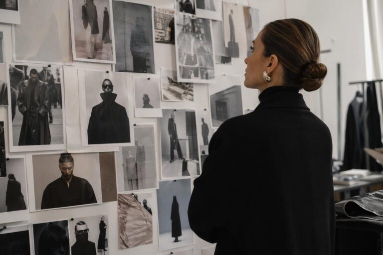
Some aesthetics don’t start with a closet—they start with a collage. A few textures, a few tones, a few silhouettes clipped together until a visual identity clicks. That’s why moodboard inspiration remains the quiet engine behind so many “effortless” outfit aesthetics: it turns vague taste into a repeatable formula you can style on a real morning, under real weather, with real constraints.
The mood here is intentionally cohesive: clean lines, soft structure, tonal layering, and a balanced mix of polished and relaxed pieces. Think visual calm with enough detail to feel styled—never fussy, never chaotic. It’s the kind of aesthetic that reads well in a mirror selfie, a street-style snapshot, and the in-between moments where comfort matters as much as composition.
This style shows up where modern wardrobes actually live: day-to-day city movement, casual work settings, coffee runs, weekend galleries, and travel days when you want to look composed without sacrificing mobility. Its appeal is simple: once you understand the moodboard logic—palette control, silhouette balance, texture contrast—you can build endless variations that still feel like the same “you.”
How moodboard inspiration translates into an outfit aesthetic
A moodboard is a visual decision-making tool. In fashion terms, it’s a system for preventing “random outfit syndrome,” where each item is fine on its own but the outfit composition never resolves. Moodboard inspiration works because it sets boundaries: a tight color story, a defined silhouette direction, and a consistent level of polish.
If you’re building a board for this aesthetic, treat each image as data. Look for repeating signals: oversized outer layers paired with slimmer bases, matte textures anchored by one subtle sheen, and accessories used as punctuation rather than noise. Even a random moodboard becomes useful once you identify what keeps appearing—and then decide what belongs in your wardrobe versus what simply looks good on someone else.
The three anchors: palette, proportion, and texture
The fastest way to make an outfit feel “editorial” is to control these three anchors. Palette keeps the eye calm, proportion creates intention, and texture adds depth so neutrals don’t look flat. When those anchors align, the look reads as a cohesive aesthetic rather than a collection of basics.
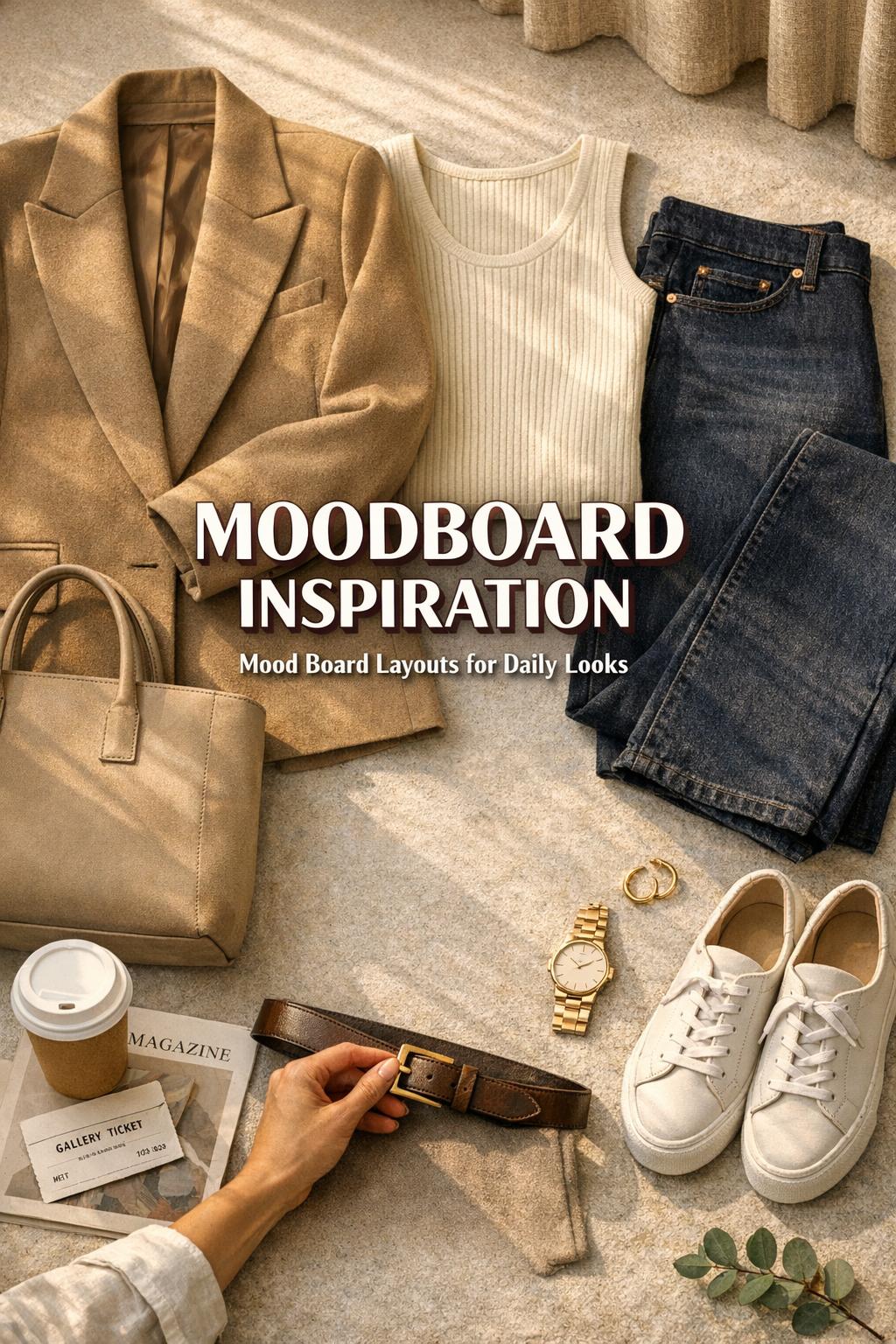
- Palette: build around 2–3 core neutrals, then add 1 muted accent if needed.
- Proportion: balance volume (a relaxed coat) with structure (a straight trouser) or a streamlined base.
- Texture: mix soft knit, crisp cotton, smooth denim, and one tactile element (ribbing, suede-like finish, or brushed fabric).
This is also where mood board layouts matter. A clean grid layout makes it easier to spot what’s consistent across images; a more freeform layout can help you capture “vibe” details like lighting, posture, and styling attitude. Both can work—the key is using the layout to extract repeatable outfit rules.
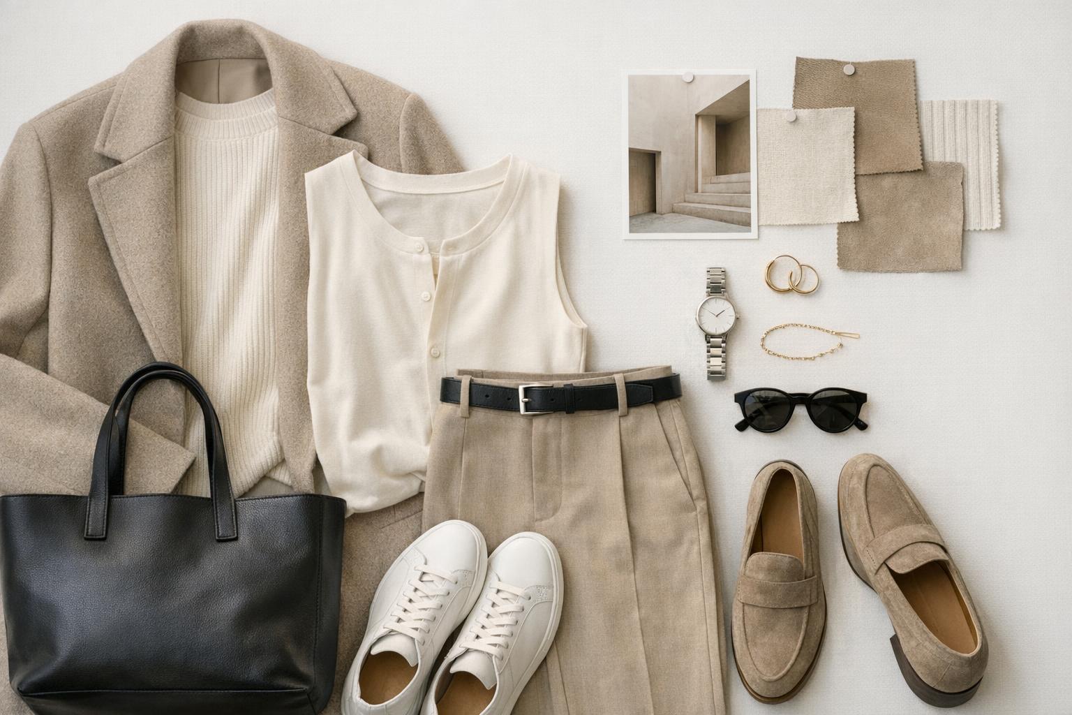
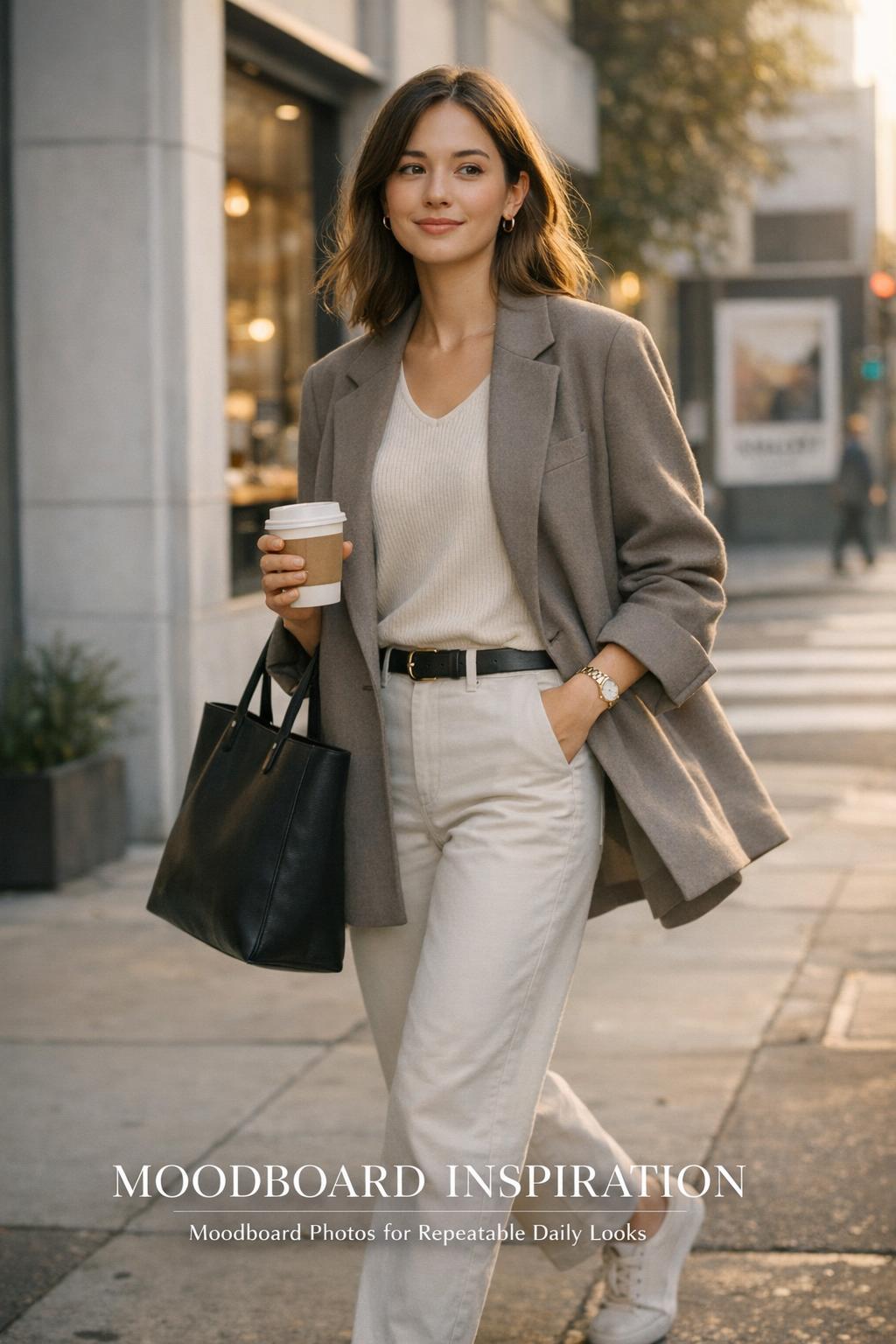
Look: tonal minimal layers with a sharp visual spine
This look is built on controlled volume: a long, clean outer layer that creates a vertical line, paired with a streamlined base that keeps the silhouette intentional. The mood is quiet confidence—polished enough for a casual office, relaxed enough for a long day out.
Start with a neutral coat or structured overshirt in a midweight fabric—something that holds shape without feeling stiff. Underneath, keep the base smooth: a fine knit top and straight-leg trousers in a closely related tone. The palette works best when the neutrals are adjacent rather than high-contrast, allowing the outfit to read as one continuous composition.
- Key garments: long coat or structured overshirt, fine knit top, straight-leg trousers
- Footwear: sleek sneakers or low-profile loafers
- Accessories: simple belt, minimal tote, small earrings as subtle shine
Why this outfit works: tonal layering reduces visual noise, so the silhouette becomes the statement. The “spine” of the look is the clean vertical line from shoulder to hem—an easy way to look put-together even when the pieces are fundamentally simple.
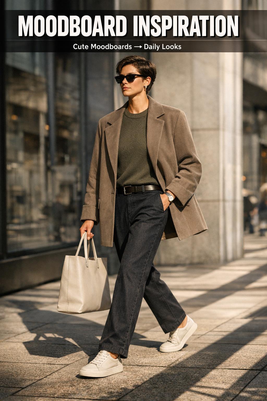
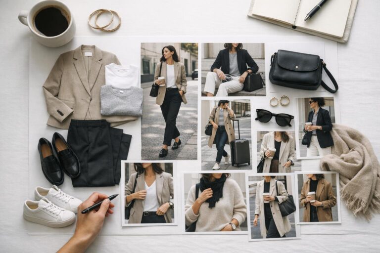
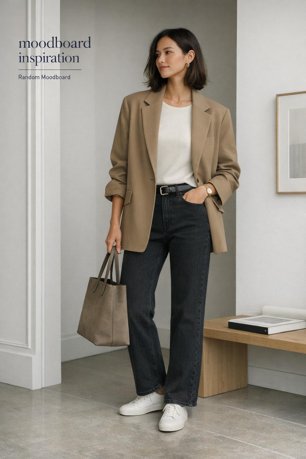
Look: neutral street style with relaxed tailoring energy
This variation leans more urban and movement-friendly. The silhouette is relaxed but not sloppy: slightly oversized on top, clean through the leg, with accessories that act as visual anchors. It’s the type of outfit that photographs well in candid street moments because the proportions are legible from a distance.
Use a boxy blazer or a cropped jacket as the structured element, then soften it with a comfortable base—think a smooth tee or fitted knit. Pair with straight jeans or tailored trousers that skim rather than cling. The color story stays in the neutral zone, but you can introduce a slightly darker shoe or bag to ground the composition.
Why this outfit works: relaxed tailoring is a proportion play. The structure at the shoulders creates polish, while the slightly looser body and clean leg line keep it wearable for everyday. It’s the sweet spot between “styled” and “effortless,” which is exactly what many people want when they save moodboard photos for outfit references.
Style tip: use one “hard” element to keep neutrals from feeling bland
In a neutral street-style look, add one crisp detail—like a sharp collar, a clean belt line, or a shoe with a defined shape. That single hard edge prevents the palette from reading as sleepy and makes the overall vibe moodboard feel intentional rather than accidental.
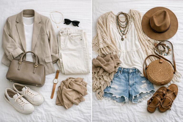
Look: soft weekend aesthetic with knit texture and quiet contrast
This is the softer side of the same aesthetic identity: cozy, touchable, and calm, but still visually composed. The silhouette stays simple—slightly relaxed—while texture does the heavy lifting. It’s ideal for weekends, travel mornings, or casual meetups where comfort has to be real, not performative.
Build around a knit: a ribbed sweater or a fine cardigan layered over a smooth base. Pair it with relaxed trousers or clean denim in a similar tonal family. Keep the palette gentle—creams, taupes, soft grays—then add one quiet contrast, like a darker bag or a deeper neutral shoe, to give the eye a resting point.
- Key garments: ribbed knit or cardigan, relaxed trouser or clean denim, lightweight base layer
- Footwear: minimal sneakers or a simple flat
- Accessories: soft scarf, understated watch, low-shine hair accessory
Why this outfit works: texture contrast replaces loud color. When the knit is tactile and the base is smooth, the look gains depth while staying within a controlled palette. It’s a practical formula for anyone who wants cute moodboards energy without tipping into overly styled territory.
Look: clean monochrome with a deliberate silhouette shift
Monochrome doesn’t have to mean severe. This look uses one color family to create a sleek, continuous line, then introduces a silhouette shift—cropped length, a cinched waist, or a slightly wider leg—to keep the composition dynamic. The mood is modern, crisp, and quietly bold.
Choose a single base tone and commit to it. A knit top and tailored trousers in closely matched shades create that uninterrupted visual flow. Then use a jacket or coat with a distinct shape—cropped and boxy, or long and straight—to define the outfit architecture. The best monochrome looks rely on subtle differences in fabric finish rather than obvious pattern.
Why this outfit works: the eye reads monochrome as instant polish, but the silhouette shift prevents it from feeling flat. This is a strong option when you want moodboard inspiration that translates quickly—especially for mornings when you have limited time but still want an intentional look.
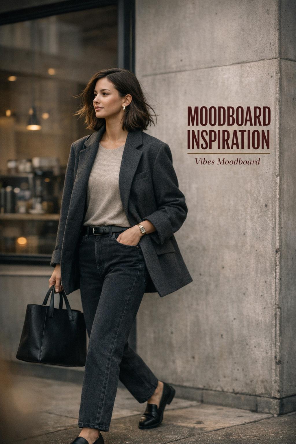
Look: polished casual with denim as the visual anchor
This interpretation uses denim as the stabilizing element—the visual anchor that makes the look feel grounded and wearable. The mood is practical and clean, with just enough refinement to feel elevated. It’s a reliable formula for casual offices, daytime plans, or any setting where you need comfort plus structure.
Start with straight-leg denim in a clean wash and pair it with a crisp top—either a structured shirt or a smooth knit. Add a jacket that sharpens the silhouette: a blazer, a tailored coat, or a structured overshirt. Keep accessories minimal and intentional so denim stays the anchor rather than becoming the whole story.
Why this outfit works: denim provides texture and familiarity, while the crisp top layer supplies polish. The composition feels balanced because one piece is inherently casual and the rest of the outfit refines it. This is also an easy way to translate moodboard photos into something that fits a realistic wardrobe.
How to build mood board layouts that actually lead to outfits
Saving images is easy; converting them into outfits is the skill. Mood board layouts should be functional, not just pretty. The goal is to identify the repeatable outfit components—silhouettes, palettes, and styling cues—so you can shop your closet with clarity.
Three layout formats that keep your style consistent
- Grid layout: best for spotting repeat patterns in color and proportion; ideal for “uniform” dressing.
- Column layout: separate categories (outerwear, tops, bottoms, shoes, accessories) so you can build outfits like a system.
- Vibes-first layout: mix outfit images with lighting, textures, and environment; useful when your goal is a vibes moodboard that guides mood more than exact items.
A practical test: if your layout can’t produce at least three complete outfits using pieces you already own, it’s not an outfit board yet—it’s just inspiration. Adjust by removing images that don’t share the same palette or silhouette logic, even if you love them individually.
From random moodboard to wearable closet rules
A random moodboard can be surprisingly revealing. When your saved images feel scattered, don’t force them into one “perfect” aesthetic. Instead, extract the common denominator: maybe it’s relaxed tailoring, maybe it’s tonal neutrals, maybe it’s soft texture. That common thread becomes your wardrobe rule set.
Turn the thread into constraints you can actually use: choose one dominant palette family, one preferred silhouette direction (relaxed top with clean leg, or structured top with relaxed leg), and one accessory strategy (minimal hardware, one signature bag shape, or a consistent shoe profile). This is the difference between collecting moodboard inspiration and building a personal style system.
Key pieces for this aesthetic (and why they matter)
These pieces aren’t “must-haves” in a rigid sense; they’re high-impact because they solve outfit composition repeatedly. Each one supports palette control and proportion balance, which is why they show up so often when people curate moodboard photos around a clean, modern aesthetic.
- Structured outer layer: defines shoulders and creates polish even over simple basics.
- Straight-leg trouser or clean denim: anchors proportions and keeps the look streamlined.
- Fine knit top: smooth base layer that supports tonal layering without bulk.
- Minimal shoe profile: keeps the outfit from skewing too sporty or too formal.
- One consistent bag shape: provides visual continuity across different looks.
Where this aesthetic is commonly worn (and how to adjust for real life)
This style thrives in everyday contexts because it’s modular: you can add or remove layers without breaking the visual identity. For commuting days, prioritize a structured outer layer and comfortable shoes; the clean silhouette will still read intentional even when you’re moving fast. For casual work settings, use relaxed tailoring to signal polish without feeling overdressed.
On weekends, shift the same palette into softer textures—knits, relaxed trousers, and minimal accessories—so the look feels lived-in but consistent. For travel days, keep the palette tight and use one layer with pockets or structure; it prevents the outfit from collapsing into “sweats energy” while still staying comfortable for long hours.
Tips for making the look comfortable without losing shape
Comfort is the hidden requirement most moodboards ignore. Choose fabrics that move and hold their line: knits that don’t overstretch, trousers with enough ease for walking, and outerwear that layers without pulling at the shoulders. If an outfit looks right but feels restrictive, you won’t wear it—so the board becomes fantasy instead of function.
Common moodboard mistakes that weaken outfit cohesion
Most moodboards fail for one reason: they prioritize aesthetic variety over style clarity. Variety is fun, but if every saved image uses a different palette and silhouette, the resulting outfits feel inconsistent. The goal isn’t to copy images—it’s to identify the repeatable principles behind them.
- Too many palettes at once: mixing warm and cool neutrals without a plan can make outfits feel unresolved.
- No consistent silhouette rule: if every image has a different proportion story, your closet won’t know what to do.
- Accessory overload: when every look relies on multiple statement items, it becomes hard to recreate in daily life.
- Ignoring fabric behavior: an image may look sleek because the fabric holds shape; a similar-looking item in a limp fabric won’t deliver the same effect.
The correction is simple: tighten your board. Remove images until the remaining set looks like it belongs in the same visual world. That’s when moodboard inspiration becomes actionable.
How to recreate the look using your own moodboard photos
Use your moodboard photos as a checklist rather than a shopping list. Start by identifying the “composition pattern” behind the images: what’s the common outerwear shape, what’s the repeat pant silhouette, what’s the typical shoe profile, and how much contrast exists between top and bottom. Then match those categories to what you already own.
Next, build one outfit formula and repeat it with small variations. For example: structured layer + smooth base + straight leg + minimal shoe. Once that formula is stable, rotate textures (knit vs. crisp cotton), adjust proportions (cropped jacket vs. long coat), and refine accessories (one consistent bag shape) to keep the aesthetic coherent across different occasions.
Quick tip: make one “cute moodboards” variation without changing the aesthetic
To lean cuter while staying within the same visual identity, keep the palette controlled and soften only one element: a slightly more delicate knit texture, a smoother silhouette line, or a cleaner, lighter-toned shoe. The outfit stays cohesive because the underlying moodboard rules remain intact.
Conclusion
This aesthetic works because it treats style as composition: controlled palette, intentional proportions, and texture contrast that adds depth without clutter. With the right moodboard inspiration—and a layout that helps you extract repeatable rules—you can build multiple outfit variations that all feel like the same cohesive identity, adapted to your schedule, your comfort needs, and the realities of daily wear.
FAQ
What is a moodboard in fashion terms?
A fashion moodboard is a curated set of images used to define a consistent visual direction for outfits, including color palette, silhouette preferences, texture choices, and overall styling mood, so getting dressed becomes a repeatable system instead of a daily guess.
How do I turn moodboard inspiration into outfits I can actually wear?
Identify what repeats across your images—usually a palette family, a silhouette pattern, and a styling level of polish—then build one outfit formula from those rules and recreate it with small variations using pieces you already own before buying anything new.
What are the best mood board layouts for outfit planning?
Grid layouts help you spot repeating colors and proportions quickly, column layouts make it easier to separate outerwear, tops, bottoms, shoes, and accessories into a usable system, and a vibes-first layout works when you’re building a vibe moodboard that guides mood and texture more than exact items.
Why do my outfits look “random” even when I use a random moodboard?
A random moodboard often contains multiple palettes and conflicting silhouette directions, so the images don’t share a common logic; the fix is to remove outliers until a clear pattern emerges and then turn that pattern into simple wardrobe constraints.
How can I make cute moodboards style without looking overly styled?
Keep the palette controlled and change only one element toward softness—like a gentler knit texture or a cleaner, lighter shoe—so the look reads cute through subtle cues while the overall outfit composition remains calm and cohesive.
How many images should I include in moodboard photos for a usable board?
Use enough moodboard photos to reveal patterns but not so many that the board becomes noisy; a compact set that can produce at least three complete outfit variations using your existing closet is typically more actionable than a large, unfocused collection.
What’s the biggest mistake people make when creating moodboard inspiration for outfits?
The most common mistake is collecting images for variety rather than cohesion, which creates conflicting palettes, proportions, and accessory strategies; tightening the board to one clear visual identity is what makes it translate into wearable outfits.
How do I keep a neutral palette from feeling boring?
Rely on texture contrast and one crisp “hard” detail—like a defined shoe shape, a sharp collar, or a clean belt line—so the look has structure and depth even when the colors stay quiet.