Beige Fabric Texture: The Quiet Detail That Elevates Neutrals
Beige fabric texture: the quiet detail that does the heavy lifting
In real-world styling and interior decisions, the hardest neutrals aren’t the bold ones—they’re the subtle ones. Beige is often selected because it feels safe, but it becomes memorable only when the surface has intention. Beige fabric texture is that intention: the weave, the pile, the nubs, and the grain that turn a “neutral background” into a visual anchor. The result can read polished and tailored, relaxed and coastal, or quietly luxurious, depending on whether the texture is crisp linen, smooth cotton, or tactile bouclé.
This guide breaks down the beige spectrum as it shows up in fashion and interiors, the fabric types most associated with beige, and the weave structures that change how light beige fabric photographs, drapes, and wears over time. It also addresses the practical questions people actually have—durability, care, sourcing, and when a beige wallpaper makes more sense than upholstery—so your “neutral” choice performs as well as it looks.
What “beige fabric texture” really means (and why it reads differently in every room and outfit)
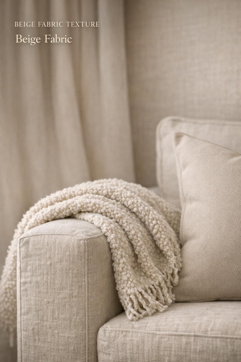
Beige fabric texture is the combined visual and tactile signature of two elements: a beige tone (often perceived as warm neutral) and a fabric surface (created by fiber content and weave). Beige is rarely the star color; it’s a supporting palette that amplifies form, proportion, and material quality. That’s why texture matters more in beige than in many saturated colors—without texture, beige can look flat or unfinished; with texture, it becomes dimensional and deliberate.
In a styling context, beige works best when it is treated as a tonal system rather than a single shade. A light beige fabric can read airy and minimal; a deeper beige can feel grounding. The texture decides whether the beige reads “matte and calm” (linen-like) or “soft and plush” (bouclé-like). This is also where color psychology enters: warm neutrals are commonly used to create a calm, versatile mood, but the surface determines whether that calm feels crisp, cozy, or elevated.
Found the dress? Keep the rest in one place.
Zarellea brings guest details, vendors, timelines, and every next step together — so your wedding plan feels as good as your look.

Beige tones in practice: warm neutrals, light beige, and “linen color” as a styling tool
Beige isn’t a single stop on a color wheel in everyday use; it behaves like a family. In wardrobes and interiors, “linen color” is often used as shorthand for a natural beige that feels organic and breathable, even when the fabric isn’t literally linen. This is why beige remains a staple in both fashion and interior design: it supports tonal layering, it pairs cleanly with other neutrals, and it gives texture contrast room to show up.
Light beige fabric is especially sensitive to environment. In bright daylight, it can look sharp and modern. In lower light, it can flatten unless the weave is pronounced. The practical takeaway is simple: if the space is low-light or the outfit relies on one tone head-to-toe, choose more texture (bouclé, tweed, or a visible weave) to keep the neutral from reading like a blank field.
The core beige fabric types that dominate texture searches
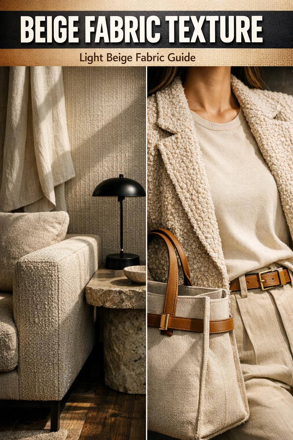
Across common inspiration and shopping intent, a handful of materials repeatedly define what people mean when they ask for beige fabric. The classics—linen, cotton, bouclé, and tweed—cover most of the texture range from crisp to plush. The important point is not just “which fabric,” but what that fabric does to drape, visual weight, and maintenance expectations.
Linen: the benchmark for breathable, structured beige texture
Linen is the reference point for natural-looking beige because its texture is inherently visible: a slightly irregular surface that photographs well as a texture background and reads expensive even in simple silhouettes. In fashion, linen’s value is silhouette balance—its structure gives shape to relaxed cuts. In interiors, linen-like texture can soften a room without becoming overly plush, which is why “linen color” often signals a calm, design-forward neutral.
Tips: When you want beige to feel intentional in a minimal outfit, rely on linen texture to create definition. A clean cut plus a visible weave delivers polish without needing high contrast color.
Cotton: smooth, versatile beige fabric with adaptable surface character
Cotton beige fabric sits on the versatile end of the spectrum. Its texture can read smooth and clean or more tactile depending on the weave. That adaptability makes cotton a workhorse across garments, upholstery, and everyday textiles. In styling terms, cotton beige acts as a neutral base that lets tailoring, proportion play, and accessory choices become the statement—especially when the surface is relatively matte.
Tips: If you’re building a tonal outfit with beige as the dominant color, combine cotton with at least one contrasting texture (for example, cotton next to bouclé) so the look keeps dimension without needing a darker shade.
Bouclé: the tactile statement in a neutral palette
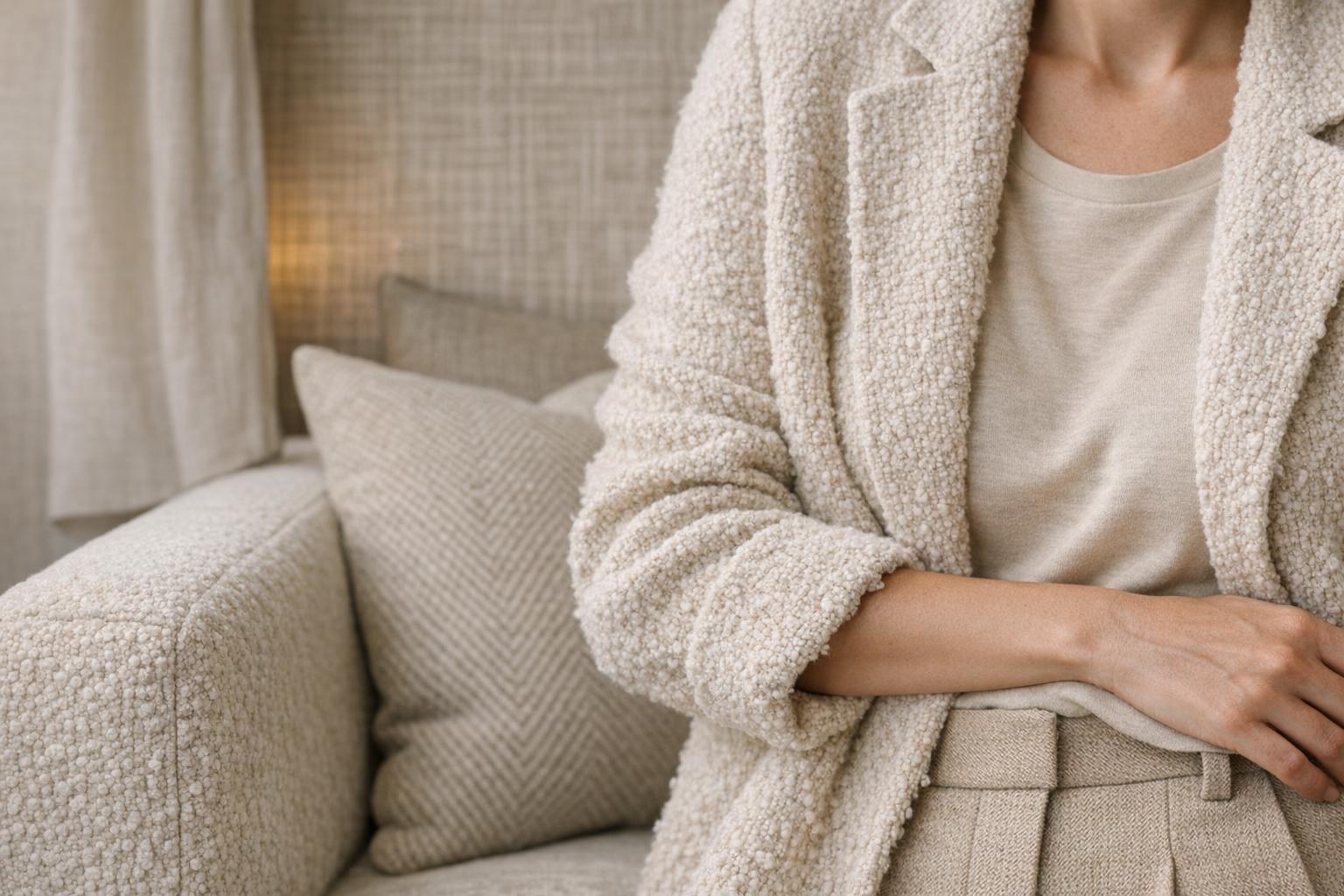
Bouclé is the texture that makes beige feel like a design choice rather than a default. The looped, nubby surface adds depth, catches light in a soft way, and creates a clear tactile identity. In fashion, beige bouclé reads refined but cozy, often functioning as the outfit’s textural focal point. In interiors, bouclé’s popularity ties directly to its ability to add softness and visual warmth without introducing new color complexity.
Because bouclé is already “busy” at the surface level, it pairs best with simpler shapes. This is where fashion logic and interior logic align: bouclé wants clean lines around it. Let the texture be the statement piece.
Tweed: beige texture with visual weight and woven dimension
Tweed brings a different kind of depth to beige: more structured, more woven, often more visually complex. Even when the shade stays firmly neutral, the surface reads layered. In styling, tweed supports a tailored silhouette and gives beige a sharper edge. In interiors, tweed-like upholstery can feel durable and grounded, which makes it a strategic choice when you want beige to function as a long-term anchor rather than a delicate accent.
Weave structures: how plain, twill, and herringbone change the same beige
Fabric type is only half the story; weave structure controls how beige behaves in motion and light. Two fabrics with the same beige tone can look entirely different depending on whether the structure is plain weave, twill, or herringbone. This is why “fabric weave textures” matter when you’re selecting beige for photography, upholstery, or garments.
Plain weave: clean, balanced, and easy to style
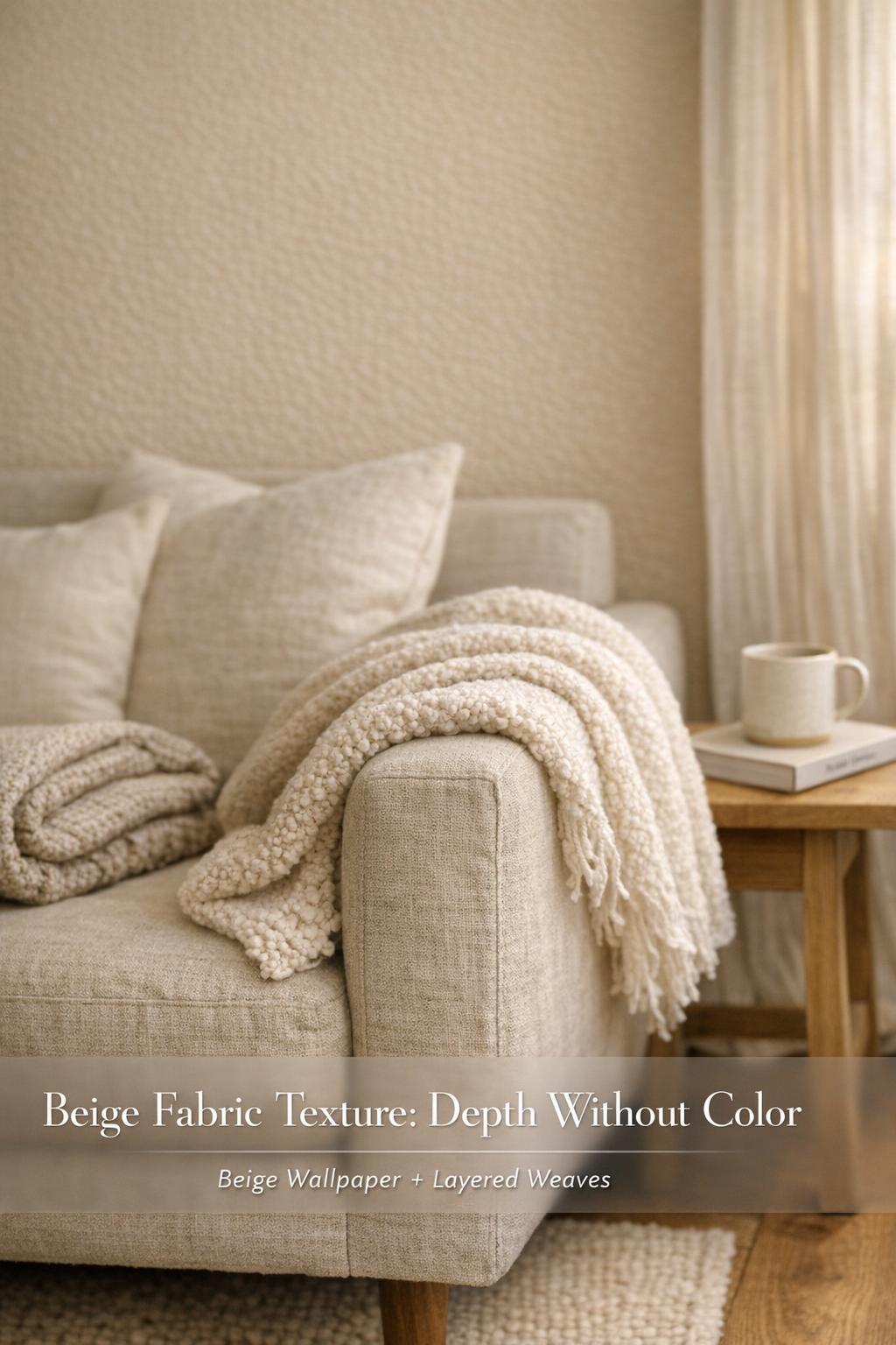
Plain weave tends to read straightforward and stable. In beige, that can look modern and minimal—especially when the goal is an unfussy surface. The trade-off is that plain weave can appear flat in low light or in photos unless there’s enough natural texture in the fiber (as in many linen surfaces). When you want beige to stay quiet and let silhouette balance do the work, plain weave supports that direction.
Twill: subtle diagonal texture with a more dynamic surface
Twill introduces a diagonal rhythm that gives beige more movement. It reads slightly richer than a flat surface without becoming overtly textured. For wardrobe building, twill in beige can be a smart bridge between casual and tailored, because the surface has presence but stays refined. For interiors, twill-like textures can help beige upholstery avoid looking washed out by creating micro-contrast across the surface.
Herringbone: structured patterning that elevates beige without adding color
Herringbone is one of the most effective ways to make beige look intentional. The patterning is tonal—texture-driven rather than color-driven—so it keeps the neutral palette intact while adding architectural detail. In fashion, beige herringbone supports a polished, tailored identity. In interiors, it’s a disciplined way to add interest to large surfaces (like upholstery) while staying within a warm neutral design concept.
Interiors vs. fashion: where beige texture performs differently
Beige texture is a shared language between interiors and fashion, but the performance requirements change. A garment has to move, drape, and hold shape through wear. An interior textile has to sit under consistent light, resist abrasion, and age visibly in a space. The styling logic is similar—texture contrast, tonal layering, and visual anchors—but the practical decision-making shifts.
Interiors: upholstery, drapery, and wall texture as a warm-neutral strategy
In interiors, beige is often chosen to create calm and continuity. Texture prevents that continuity from reading monotonous. Upholstery is where bouclé, tweed, linen-like weaves, and cotton surfaces become high-impact, because they cover large areas. Drapery introduces movement and softness, and it benefits from textures that catch light subtly. Then there’s beige wallpaper: a strategic move when you want texture on the vertical plane without committing to a heavily textured fabric throughout the room.
Beige wallpaper and wall textures can function like a background fabric—creating a cohesive canvas so furnishings can either blend tonally or stand out through stronger texture. This is particularly useful in U.S.-centric design preferences that lean toward warm neutrals and layered textures, where the palette stays restrained but surfaces vary.
Fashion: beige fabric as a canvas for silhouette, tailoring, and proportion play
In fashion, beige fabric texture is often the difference between “basic” and “editorial.” A clean beige cotton can deliver a crisp foundation for a structured blazer or a tailored trouser. A linen texture shifts the same beige into relaxed refinement. Bouclé makes beige feel like a statement piece even in simple cuts. Tweed and herringbone sharpen beige into something more tailored and directional.
The most consistent styling win is tonal layering: stacking slightly different beige tones and letting the textures do the separating. A smooth cotton base with a textured bouclé layer reads intentional because the eye can map the outfit composition through surface changes, not color contrast.
Style breakdown: building outfits around beige fabric texture (without drifting into bland)
Beige-heavy outfits succeed when they have a plan: one dominant texture, one supporting texture, and a clear silhouette hierarchy. The goal is to avoid “all-flat neutrals,” which can look unfinished under indoor lighting and can photograph without depth.
- Choose a hero texture: bouclé for softness, tweed for structure, linen for breathable sharpness, cotton for clean simplicity.
- Control silhouette balance: pair a textured top layer with a cleaner base to keep the look polished rather than bulky.
- Use tonal separation: keep the palette within beige and light beige fabric, but shift surfaces—plain weave next to twill, smooth cotton next to nubby bouclé.
- Anchor with structure: if both layers are soft (for example, bouclé over loose cotton), add a more tailored element to keep proportion play intentional.
Tips: When the entire outfit sits in one beige family, the camera reads texture before it reads shade. If you want a Pinterest-clean look, focus on surface clarity: visible weave, defined loops, or a herringbone line that catches light.
Interior design decisions: choosing beige fabric for sofas, chairs, and drapery
In interiors, beige is often expected to “go with everything,” which means it has to hold up visually over time. Texture is what keeps a beige sofa or chair from fading into the background. The choice comes down to visual weight, comfort, and maintenance reality—especially in lived-in spaces.
Upholstery texture: what changes when you go linen-like vs. bouclé vs. tweed
Linen-like textures tend to read airy and tailored, making them strong for a modern neutral room where you want the silhouette of the furniture to feel crisp. Bouclé reads warmer and softer, functioning as a comfort signal. Tweed reads more structured and grounded, which can help beige feel less delicate and more substantial on large pieces.
The most reliable approach is to decide what the room needs to communicate. If the palette is already warm and layered, a cleaner beige fabric can prevent visual overload. If the room is minimal, bouclé or herringbone can deliver dimension without adding color.
Beige wallpaper as a texture layer (when fabric isn’t the right tool)
Beige wallpaper is a practical alternative when you want texture impact without placing a highly tactile textile on high-contact surfaces. Wall texture can carry the mood of linen color—calm, natural, warm—while leaving upholstery choices more flexible. This is also a useful strategy for low-light rooms: a textured beige wallpaper can catch light in a way that a flat paint-like beige cannot.
Tips: Treat beige wallpaper like you would a textured blazer in an outfit: it becomes the quiet structure behind everything else. Then keep the remaining elements either smoother (to let the wall texture lead) or deliberately contrasting (to create a layered neutral story).
Sourcing: fabrics, wallpapers, and stock textures for visuals
“Sourcing” looks different depending on whether you’re buying material, selecting a finished interior product, or building digital visuals. Beige fabric is a common purchase category, but beige texture also shows up as stock imagery and downloadable texture backgrounds—especially when the goal is mockups, brand visuals, or design boards.
Fabric sourcing: swatches, samples, and why they matter for beige
Beige is highly sensitive to lighting and surrounding colors, so swatches and samples are not optional if accuracy matters. A beige that looks like linen color in one environment can skew flatter or warmer in another. Texture also reads differently at scale: a subtle twill can disappear in a tiny swatch, while bouclé’s surface will announce itself immediately.
- Review beige fabrics under both daylight and evening indoor lighting.
- Compare at least two textures (for example, cotton vs. linen-like) in the same beige range.
- Check how the surface looks from a distance, not only up close.
Beige wallpaper sourcing: using wall textures to control mood
When selecting beige wallpaper, the key is deciding whether you want the texture to read from across the room or only up close. A more visible wall texture creates a stronger design statement; a subtler texture acts like a soft-focus filter that keeps the space calm. Either can work, but the choice should match the role you want beige to play: background continuity or dimensional feature.
Stock imagery and “beige fabric texture seamless” for digital design
For digital projects, the intent often shifts from “how does this wear?” to “how does this tile and render?” That’s where beige fabric texture seamless assets come in: textures designed to repeat cleanly as backgrounds, mockup surfaces, or design elements. A seamless texture is most useful when you need consistency—website sections, product backdrops, or repeated panels—without visible edges breaking the illusion.
Texture choice still follows the same editorial logic. Linen-like assets read natural and breathable; bouclé reads tactile and cozy; twill and herringbone read structured and tailored. The difference is that the surface must remain visually coherent when repeated, so overly dramatic shadows can be harder to use across large areas.
Care, durability, and the reality of beige in daily life
Beige earns its popularity because it’s versatile, but it also exposes wear and stains more quickly than deeper shades. Texture can help or hurt here. A complex surface may disguise minor marks, yet it can also trap debris and require more deliberate cleaning. The smartest approach is balancing aesthetics with maintenance habits you can actually sustain.
Cleaning logic: match the method to the texture
Smooth cotton surfaces are typically simpler to maintain because you can see what needs attention and address it directly. Linen-like textures can show creasing and surface variation as part of their character, but they still benefit from consistent care routines. Bouclé and more heavily textured fabrics can hide small issues but demand patience—loops and nubs can hold onto particles, so gentle, regular maintenance matters.
Tips: If you’re selecting beige upholstery for a high-contact area, choose a texture you’re willing to maintain weekly, not just seasonally. Beige looks best when it’s consistently refreshed; the “effortless” neutral is usually supported by predictable upkeep.
Durability and longevity: what to consider before committing to beige
Durability is less about beige as a color and more about how the fabric is constructed and used. In fashion, texture-heavy fabrics can show friction and wear differently than smoother fabrics. In interiors, upholstery faces repeated abrasion, and wall textures face consistent light exposure. The practical decision is to place the most delicate textures where they will be handled least, and to use sturdier, more structured textures where life happens daily.
Sustainability and ethical considerations: beige, but make it responsible
Neutral textiles are often bought to last, which aligns naturally with sustainability goals—provided the materials are sourced and produced responsibly. If sustainability is part of your decision framework, look for credible textile certifications and transparent standards. Two certifications commonly associated with more responsible textile choices are GOTS and OEKO-TEX, which are frequently referenced in the context of fabric sourcing expectations.
It’s also worth noting that modern textile innovations include synthetic blends that mimic natural textures. These can be visually convincing and sometimes practical, but the decision should be made with clear intent: are you prioritizing the look of linen color and natural texture, the performance of a blend, or a specific certification standard? Beige hides very little in terms of quality—if the material is inexpensive-looking, the neutral shade often makes that more obvious.
Digital texture realism: from inspiration boards to 3D mapping
Beige texture isn’t only a physical choice; it’s also a common visual language in digital design. Beyond stock images, designers often need beige fabric surfaces for realistic rendering. In that workflow, the concept expands into 3D texture mapping, where terms like normal maps and displacement maps are used to simulate how weave depth interacts with light.
The same hierarchy still applies: linen-like textures benefit from subtle, irregular depth; twill and herringbone rely on directional structure; bouclé requires more pronounced surface variation to look believable. If the goal is realism, the texture should support the material story rather than overpower the form—especially in a warm neutral palette where small surface cues carry the entire design.
Common mistakes that make beige textures look cheaper than they are
Beige can look premium or disposable, and the difference often comes down to texture decisions rather than budget. A few missteps show up repeatedly in both wardrobes and interiors because beige is unforgiving when the surface lacks intention.
- Going too flat in low light: a plain, smooth beige surface can read dull without weave definition or layered textures.
- Mixing too many “mid” textures: combining several similar, medium-texture beiges can blur together; use one hero texture and one supporting texture instead.
- Ignoring scale: textures that look refined up close can disappear from a distance; this is especially relevant for upholstery and large garments.
- Overcommitting to plush: bouclé is impactful, but too much of it can overwhelm a minimal palette; balance with cleaner surfaces.
Tips: If you’re unsure, default to structure: herringbone or twill provides built-in visual order. Then layer in softness with a secondary element rather than making every piece equally textured.
Visual gallery in words: high-impact beige texture pairings for fashion and interiors
Even without a literal image grid, you can think like a stylist: identify the visual anchor, decide the supporting surface, and keep the palette within warm neutrals. The following pairings are reliable because they create separation through texture contrast and maintain a cohesive beige story.
Fashion pairing: bouclé outer layer + smooth cotton base
This combination works because bouclé’s tactile surface becomes the statement piece while cotton keeps the silhouette clean. The outfit composition stays tonal, but the eye can clearly map layers. It’s also practical: the smoother base reduces bulk and keeps movement comfortable.
Fashion pairing: linen texture + herringbone structure
Linen texture brings relaxed refinement; herringbone adds tailored discipline. Together, they create proportion play without forcing contrast color. This pairing is especially effective when beige is the dominant palette and you want the look to read intentional rather than under-styled.
Interiors pairing: beige wallpaper + textured upholstery
Beige wallpaper can hold the room’s tone while upholstery carries the tactile interest. This works because the wall texture reads as an atmospheric layer and the furniture texture reads as a touchable, functional layer. The result is warm neutral cohesion with clear surface hierarchy.
Interiors pairing: linen-like drapery + twill upholstery
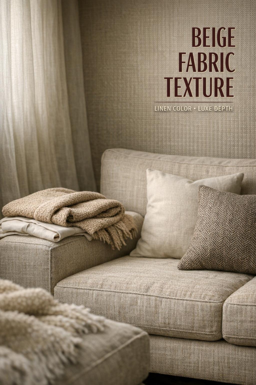
This pairing is controlled and modern. Drapery in a linen-like texture softens light and adds vertical movement, while twill on upholstery provides subtle structure and durability cues. Both stay within beige and linen color territory, but each surface plays a distinct role.
Where beige texture trends feel most “U.S. right now”
Within U.S. design and styling patterns, beige often shows up as a warm neutral foundation that supports layered texture rather than bold color. This is why bouclé upholstery, linen-like textiles, and structured weaves like herringbone continue to circulate in inspiration ecosystems: they deliver visual richness while keeping the palette calm. The trend logic isn’t about beige being new; it’s about texture becoming the primary design language when color is intentionally restrained.
The strongest results come from a cross-domain approach: borrow interior logic for fashion (layer textures, keep tones aligned) and borrow fashion logic for interiors (use one statement texture, control proportion and balance). Beige works when it’s curated, not when it’s accidental.
FAQ
What is beige fabric texture, exactly?
Beige fabric texture refers to the surface character of a beige textile—how the weave, fibers, or pile create visible and tactile dimension—so the neutral color reads with depth rather than looking flat.
Which beige textures are most common for a “linen color” look?
Linen is the classic reference, but the “linen color” effect is often reinforced by visibly woven surfaces such as linen-like weaves and other fabrics that show natural-looking irregularity rather than a perfectly smooth finish.
How do plain weave, twill, and herringbone change beige fabric?
Plain weave reads clean and minimal, twill adds subtle diagonal movement that gives beige more depth, and herringbone introduces structured patterning that elevates beige through texture rather than adding additional colors.
What beige texture works best in low-light rooms?
Low-light spaces typically benefit from more visible texture—such as bouclé, tweed, or a defined weave like herringbone—because the surface creates micro-contrast and prevents light beige fabric and finishes from reading flat.
Is bouclé a good idea for beige upholstery?
Bouclé can be an excellent choice if you want softness and a tactile statement within a neutral palette, but it’s best for spaces where you can maintain the textured surface regularly since loops and nubs can hold onto debris more than smoother fabrics.
When does beige wallpaper make more sense than beige fabric?
Beige wallpaper is a strong option when you want texture across a large visual area without placing a highly tactile material on high-contact surfaces, and it can also help add dimension in spaces where lighting makes flat beige finishes look dull.
What does “beige fabric texture seamless” mean for designers?
It refers to a beige fabric texture image designed to repeat without visible edges, making it practical for digital backgrounds, mockups, and large surfaces where a continuous textile look is needed.
What should I consider first when choosing beige fabric for fashion vs. interiors?
For fashion, prioritize drape, silhouette balance, and how texture supports outfit composition; for interiors, prioritize how the texture reads at room scale, how it handles consistent light, and whether the maintenance level matches daily life.
Are there sustainability markers to look for in beige fabrics?
If sustainability is a priority, look for credible textile certifications such as GOTS and OEKO-TEX and choose materials that align with your performance needs, whether that’s natural fibers or modern blends that mimic natural textures.