Why The Balenciaga Moodboard Still Shapes Fashion Now
On a search results page filled with galleries, press coverage, and fragmented visual references, the phrase balenciaga moodboard points to something larger than a collage of images. It signals a complete fashion language: brand identity, silhouette logic, show atmosphere, and the tension between inspiration and authorship. To understand why the term holds attention, it helps to look at it from two angles at once. One is visual and practical: how a moodboard organizes a Balenciaga aesthetic outfit, a campaign direction, or a runway concept. The other is cultural: how the moodboard became part of larger conversations around Paris Fashion Week, contemporary image culture, and the “I’m Not Your Moodboard” debate.
That dual meaning is what makes the topic especially relevant for designers, students, and image-led readers coming from Pinterest, Behance, Tag-Walk, or a fashion magazine environment. A Balenciaga moodboard can function as a design tool, a branding reference, a visual archive, or a point of critique. It can map color, texture, proportion, and attitude. It can also expose how closely fashion houses, emerging designers, and media outlets watch the same visual ecosystem.
This article breaks the subject down with editorial clarity: what a moodboard means in fashion, how Balenciaga branding translates into board-ready visuals, how show design and campaign references shape the brand image, where controversy enters the conversation, and how to build a strong Balenciaga-inspired board without losing structure or originality.
Why the balenciaga moodboard matters beyond collage
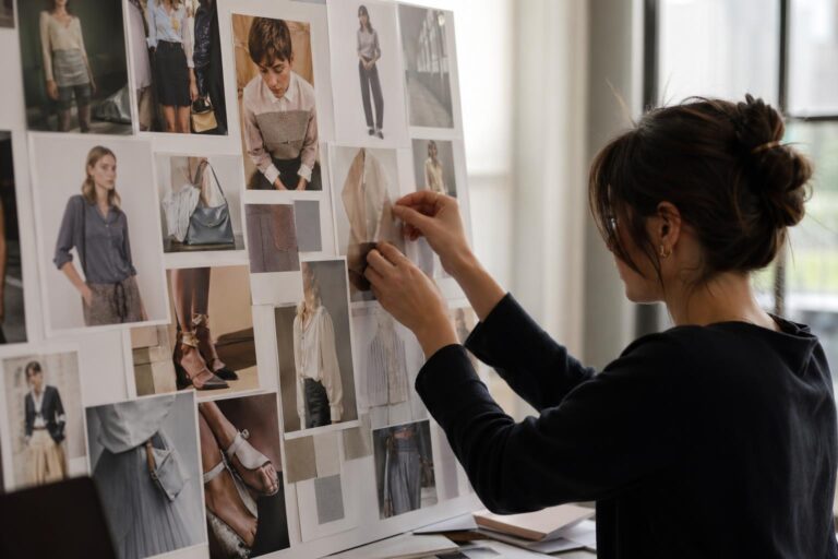
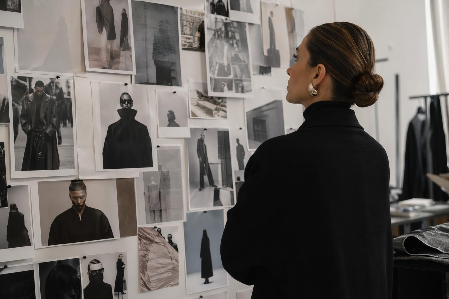
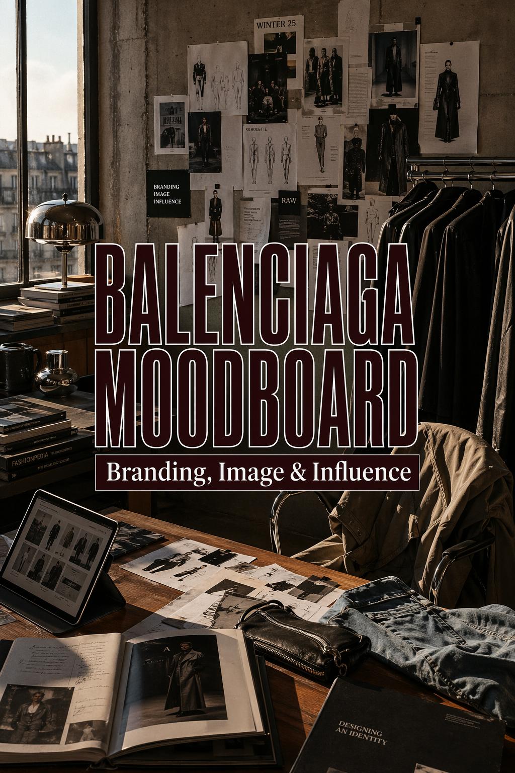
In fashion design, a moodboard is not decoration. It is a working system that collects cues before garments, campaigns, or sets take final form. At its most useful, it creates visual alignment. It helps a designer or creative team test whether references belong together, whether a silhouette direction feels coherent, and whether a brand identity is reading clearly.
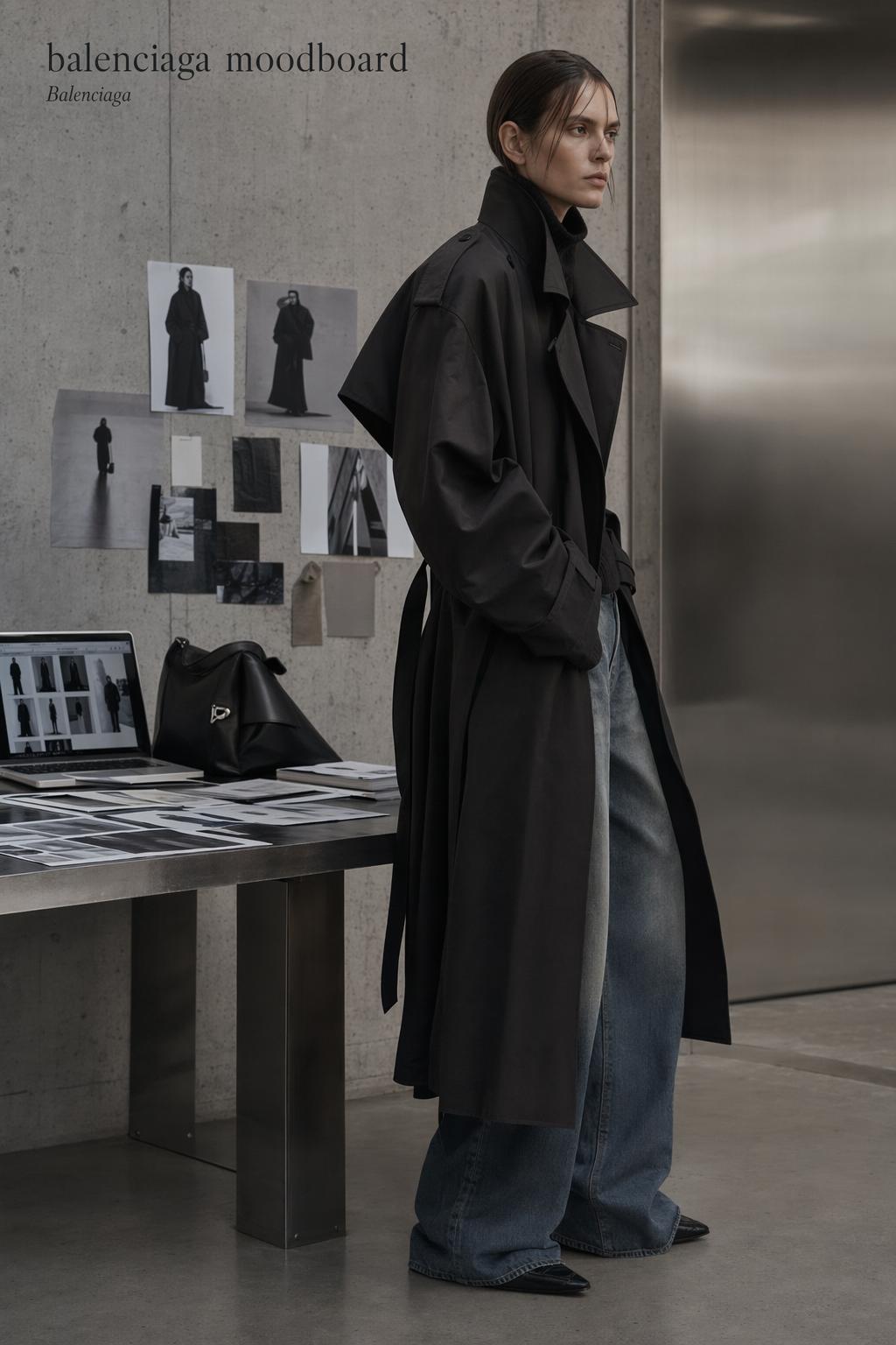
Applied to Balenciaga, the moodboard becomes especially charged because the brand sits at the intersection of luxury fashion, visual experimentation, and cultural scrutiny. Across portfolio platforms and press coverage, Balenciaga appears as the central anchor, while the board itself functions as a bridge between abstract aesthetic ideas and tangible outputs such as collections, show environments, or campaign imagery.
This is also where Balenciaga branding becomes more than a logo exercise. Branding here includes atmosphere, casting logic, set tone, color severity, and the way an outfit creates a visual anchor through proportion play. A strong board clarifies that system before a single look is finalized.
Moodboard as design language
A fashion moodboard works because it compresses multiple decisions into one field of vision. It can hold references for outerwear shape, fabric texture, editorial energy, architectural severity, and pop-cultural atmosphere all at once. In the Balenciaga context, that matters because the brand is frequently discussed not just through products, but through an identifiable world.
When readers search for a Balenciaga moodboard, they are often not looking only for images. They are looking for a method of decoding why the images feel connected. The answer usually lies in repeated visual signals: a disciplined palette, directional styling, strong form, and a controlled imbalance that feels intentional rather than random.
The core visual codes behind a Balenciaga aesthetic
Across moodboard pages, editorial tags, and fashion coverage, the Balenciaga moodboard consistently revolves around a recognizable set of cues. These cues are useful because they can be analyzed separately, then assembled back into a coherent board. That is the difference between a pile of references and a readable concept.
Color, form, and texture signals
The strongest boards usually begin with color discipline. Instead of chasing too many tones, a Balenciaga-led board tends to feel intentional when it narrows the palette and lets texture contrast do more of the visual work. In practical terms, this means a board may rely on stark neutrals, dark values, washed denim cues, or rigid outerwear surfaces rather than decorative color overload.
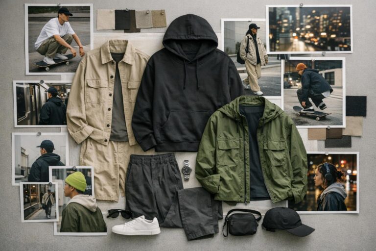
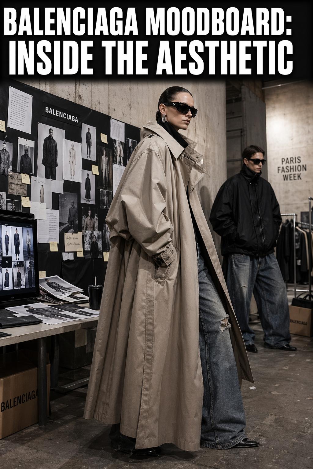
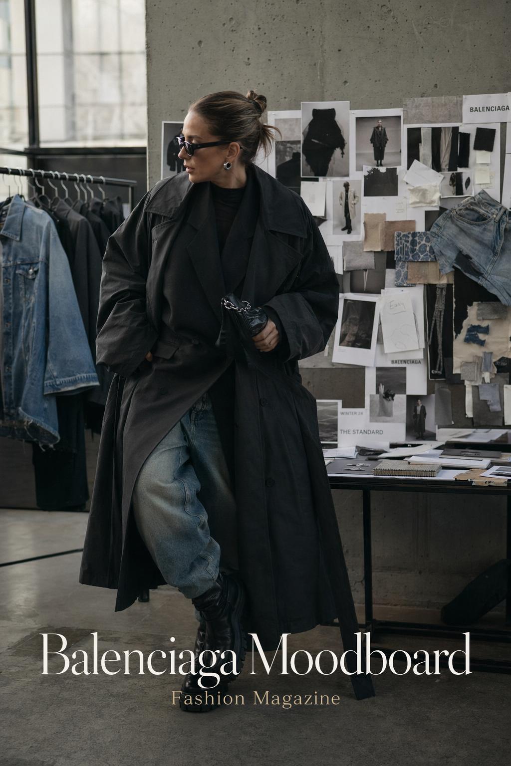
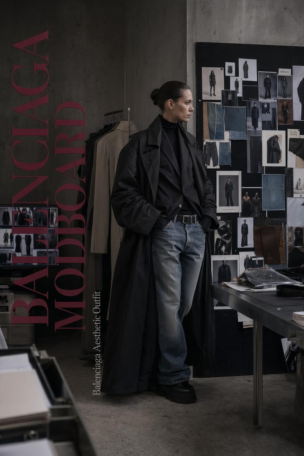
Form is equally important. The board has to show shape clearly enough that the silhouette balance becomes obvious at a glance. This is where trench coats, jeans, outerwear motifs, and sharply defined apparel references matter. They provide proportion cues that help explain why a look feels heavy, elongated, blunt, or controlled.
Texture is what keeps the board from feeling flat. A compelling Balenciaga moodboard usually depends on contrast: smooth against distressed, rigid against fluid, polished against raw. That tension creates depth without requiring visual clutter. It also gives the board a more developed editorial tone, closer to a fashion magazine spread than a casual inspiration dump.
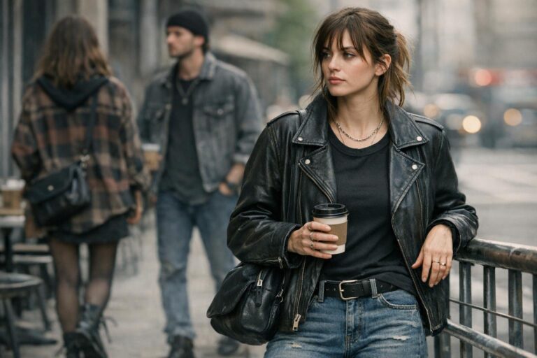
Signature silhouettes and materials
Silhouette is often the first thing a viewer reads. In a Balenciaga aesthetic outfit, the shape frequently functions as the statement piece, while materials reinforce the mood. A board built around this logic should prioritize full-body references, cropped details of fabric behavior, and a few supporting fragments that explain volume, structure, or weight.
This matters because a board can fail even when the references are beautiful. The most common issue is imbalance: too many close-up details and not enough full-form imagery, or too many garments without any atmospheric context. A more effective composition shows both. It allows the viewer to understand the material language and the outfit composition in the same frame.
For readers drawn to a Balenciaga aesthetic vintage angle, the board becomes even more dependent on selective editing. Vintage references should not be included simply because they look archival. They need to support the larger image direction. If the vintage cue interrupts the board’s rhythm, it reads as nostalgia instead of structure.
Balenciaga branding through moodboards, not just marketing
Balenciaga branding is most visible when visual decisions feel coordinated across several layers: collection, campaign, editorial presentation, and set design. A moodboard helps establish that coordination early. It identifies what kind of imagery belongs in the brand world and what weakens it.
That is why moodboards appear not only on creative platforms such as Behance and portfolio aggregators, but also in industry-facing spaces tied to seasonal fashion cycles. The board functions as a planning instrument. It can define whether the direction leans toward brutalist severity, raw architecture, pop-culture mood, or a more stripped-down wardrobe logic such as Garde-Robe framing.
In practical editorial terms, branding is strongest when the board does three things at once: identifies the emotional register, clarifies product or silhouette emphasis, and gives enough visual restriction that the team avoids drift. Without those limits, a board can become generic luxury rather than distinctly Balenciaga.
- A focused palette strengthens recognition faster than excessive variety.
- Consistent silhouette references make campaign and runway visuals feel related.
- Texture contrast creates depth without distracting from the brand’s core shape language.
- Atmospheric images should support the clothing direction, not replace it.
- Editorial references need to align with the intended audience, whether that is collection-driven, campaign-led, or portfolio-oriented.
Show design, Paris, and the moodboard as atmosphere
The moodboard becomes most public during fashion week, when private reference systems translate into visible show environments. In coverage connected to Paris Fashion Week, Balenciaga’s moodboard logic is not limited to garments. It extends to the set, the emotional tone, and the wider cultural signal the show sends.
Paris matters here because it frames the brand within a global fashion district where visual language is scrutinized at the highest level. A runway set does not need to explain itself verbally if the moodboard behind it has already clarified the aesthetic structure: what references the audience should feel, what emotional temperature the collection carries, and how contemporary culture enters the scene.
Euphoria, pop culture, and the set as extension of the board
One of the more revealing ideas associated with Balenciaga show coverage is the role of pop-cultural references such as Euphoria. When a show’s mood is discussed through an outside cultural property, that reference is rarely accidental. It usually means the moodboard was not only about clothes, but also about character psychology, image saturation, and generational styling codes.
A useful takeaway for board building is that pop-culture references should be treated as secondary supports, not primary content. If the board becomes too dependent on a television series, celebrity still, or a single mood image, the fashion direction can lose precision. The stronger method is to use those references to sharpen tone while letting silhouette and material remain central.
References such as Caravaggio, when present in editorial conversation, work similarly. They enrich visual mood through lighting, drama, and contrast, but they only strengthen the board if they connect directly to form, palette, or atmosphere. Otherwise, they become name-dropping rather than a usable design cue.
What runway-related moodboards get right
The best runway-oriented boards are rarely overloaded. They identify a narrow emotional field and repeat it with variation. This is why set-oriented Balenciaga moodboards often feel more effective than general “luxury fashion” collages. They know whether they are building toward severity, tension, restraint, or cultural provocation.
That clarity matters for anyone creating a board for a collection concept, a portfolio project, or a student presentation. If the board has no atmosphere, the garments can read isolated. If it has too much atmosphere and not enough clothing logic, it turns cinematic but unusable. The goal is a controlled exchange between image world and design information.
Where controversy reshaped the meaning of “moodboard”
The phrase “moodboard” does not appear in Balenciaga-related conversations only as a creative tool. It also appears in accusations and critiques around appropriation, plagiarism, and the use of emerging designers’ work as a visual resource. This changes the word’s tone. What sounds neutral in a design studio can become highly charged in public debate.
The “I’m Not Your Moodboard” discourse
Coverage tied to the phrase “I’m Not Your Moodboard!” positioned Balenciaga at the center of a broader discussion about inspiration and ownership. Reports referenced a Vietnamese designer, a student designer, and other unnamed local artists or emerging creatives in relation to alleged appropriation. Even when the exact details varied by outlet, the core issue stayed consistent: where is the line between visual reference and misuse?
This is an important context for any serious discussion of a Balenciaga moodboard because it reminds readers that boards are not ethically neutral. They collect images, but they also imply power relationships. A global brand and an emerging designer do not occupy the same position when similar visual material appears in circulation.
Balanced analysis matters here. Moodboards are a standard part of fashion development, and the practice of gathering references is widely embedded in design culture. At the same time, repeated controversy coverage shows why image sourcing, attribution awareness, and originality are not optional concerns. The stronger and more visible the brand, the greater the scrutiny.
Practical lessons for designers and students
For emerging creatives building portfolio boards on platforms like Behance or portfolio aggregators, the controversy offers a clear lesson: distinguish inspiration from replication. A moodboard should support idea development, not serve as a shortcut to someone else’s finished visual identity. If the board is too dependent on one designer’s exact output, it narrows creative thinking instead of expanding it.
- Use multiple image sources so the board reflects a direction, not a single borrowed solution.
- Separate reference categories clearly: silhouette, texture, color, atmosphere, and editorial tone.
- Avoid building a board from one emerging designer’s portfolio and then presenting it as a broad brand study.
- Test whether your concept still stands when the most recognizable image is removed.
- When presenting a student or portfolio project, frame references as analytical material rather than proprietary design outcomes.
These steps do not eliminate every risk, but they improve creative discipline and produce a stronger final board. They also align with what fashion professionals already know from real design work: the best concepts survive beyond their first image source.
How to construct a Balenciaga-inspired moodboard with editorial precision
One of the clearest gaps in existing coverage is practical guidance. Many pages show Balenciaga-inspired imagery, but fewer explain how to build a board that feels intentional. The process matters because a moodboard is only useful when it helps decision-making. If it cannot guide styling, campaign thinking, or collection development, it remains decorative.
Start with a narrow concept, not a broad label
“Balenciaga” is too broad to function as a workable creative brief on its own. A stronger board begins with a concise angle: Paris show severity, campaign restraint, denim and outerwear focus, pop-culture intensity, or Balenciaga aesthetic vintage references filtered through a present-day lens. Narrowing the concept immediately improves visual consistency.
This is also where many boards become stronger for Pinterest readers. Instead of collecting every dramatic image associated with the brand, select only those that reinforce the same atmosphere. Consistency is what makes the board usable for outfit planning, editorial art direction, or portfolio development.
Choose tools that match the workflow
Different tools support different outcomes. Pinterest is useful for broad visual gathering. Photoshop supports collage control and precise image composition. Figma helps when the goal is clean layout, annotation, and team collaboration. Behance is better suited to presentation once the concept is complete. The right tool depends on whether the board is exploratory or final.
That distinction matters in real practice. An exploratory board can be looser and more associative. A final board for a campaign or collection review should be edited down, with clearer hierarchy and stronger alignment between references. Mixing the two stages often leads to clutter.
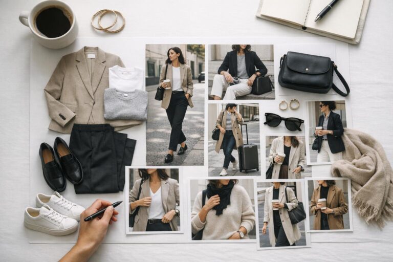
A working composition that actually helps styling decisions
A useful structure is to divide the board into zones: one for silhouette, one for texture and materials, one for atmosphere, and one for contextual references such as Paris, editorial pages, or campaign cues. This prevents the board from collapsing into a single aesthetic mood without practical value.
- Include two to four full-look images to establish proportion.
- Add detail crops that show surface quality, finish, or fabric weight.
- Use one or two environmental references to set emotional temperature.
- Reserve a small area for text notes if the board is for collaborative review.
- Remove duplicates that repeat the same idea without adding clarity.
The result should feel editorial but readable. If every image competes equally, the board loses hierarchy. If one image dominates too much, it narrows the concept too aggressively. Balance is the goal.
Tips for a stronger final board
Tip: treat color restraint as a structural choice, not a personal preference. A tighter palette helps shape and texture stand out more clearly.
Tip: include negative space when using digital layout tools. A crowded board often looks energetic at first, but becomes harder to use when styling or reviewing concepts.
Tip: test the board at thumbnail size. If the concept disappears when scaled down, the composition relies too heavily on details rather than strong visual anchors.
Tip: if you are building a Balenciaga aesthetic outfit board rather than a full campaign board, prioritize proportion images over mood scenery. Outfit planning depends more on silhouette clarity than cinematic atmosphere.
From moodboard to Balenciaga aesthetic outfit
A board becomes truly practical when it can inform what someone wears, styles, or shoots. The translation from board to outfit is where fashion intelligence matters most. Instead of copying a single look, the goal is to pull out the styling logic: what creates visual weight, what sharpens the line, what softens the severity, and what keeps the outfit coherent.
Why certain outfit compositions work
A Balenciaga aesthetic outfit usually works when one element acts as the visual anchor and the rest support it. That anchor could be an oversized outerwear shape, a firm denim line, or a sharply controlled all-over palette. The supporting pieces should stabilize the look rather than compete with it.
This is where silhouette balance becomes essential. If the upper half is dominant, the lower half needs enough structure to avoid collapse. If the outfit relies on tonal layering, the textures must vary enough that the look still reads dimensionally. If the board suggests severity, then overly decorative styling can weaken the result.
Readers interested in Balenciaga aesthetic vintage interpretations should pay special attention to proportion. Vintage-inspired pieces can add authority and history, but they should still align with the board’s contemporary shape language. The strongest outcome feels edited rather than costume-like.
Adapting the board for season and setting
Seasonal practicality changes how the moodboard should be applied. A heavy outerwear-led board may work for editorial direction, but it needs adjustment for everyday styling in warmer climates. Likewise, a highly atmospheric Paris-inspired board may need simplification for real wardrobe use in New York or Milan contexts where movement, weather, and day-to-day function shape outfit decisions.
The key is to preserve the board’s logic even when the exact pieces change. Keep the palette controlled, maintain one clear statement shape, and use texture contrast to hold the mood in place. That approach allows the board to stay useful across contexts instead of becoming tied to one idealized image.
Comparing the moodboard ecosystem: Balenciaga, Gucci, and Saint Laurent
A strong board becomes clearer when viewed alongside peer fashion houses. In the broader Kering-related moodboard ecosystem, Balenciaga, Gucci, and Saint Laurent can all occupy luxury territory, but they do not organize references in the same way. This comparative view helps sharpen what is specifically Balenciaga rather than generally high-fashion.
Balenciaga boards are most effective when they foreground tension, proportion, and controlled visual abrasion. By contrast, a peer-oriented board might prioritize a different rhythm, whether that is more overt glamour, a more polished classicism, or a different relationship between clothing and atmosphere. The purpose of comparison is not to flatten brands into one visual category, but to identify where one board language diverges from another.
For creative teams and students, this comparison is useful because it reduces accidental blending. If a supposed Balenciaga board starts drifting into another house’s visual logic, the problem is often visible in the silhouette choices, the tonal spread, or the editorial references selected. Comparative analysis is therefore a discipline tool, not just a branding exercise.
A focused entity map of the Balenciaga moodboard world
Understanding a Balenciaga moodboard becomes easier when the references are grouped by role. Some elements are core, meaning they appear as the central structure. Others are supporting, adding context or variation without replacing the main frame.
Core references
Balenciaga is the central brand reference, and the moodboard itself is the central concept. Everything else in the board should support those two anchors. If a board does not clearly communicate both, it risks becoming an unstructured collage rather than a defined fashion study.
Demna is also important in this context because the designer is logically tied to the conversation around Balenciaga’s current aesthetic direction, show language, and campaign interpretation. Even when not every board names him directly, the connection helps clarify why the visual world feels contemporary rather than merely archival.
Supporting references that deepen the board
Supporting references include Paris, Paris Fashion Week, Euphoria, Caravaggio-linked visual atmosphere, Garde-Robe framing, Adidas collaboration context, trench coats, jeans, outerwear motifs, and the digital tools used to assemble the board. These references should deepen the board’s meaning, not distract from it.
Location references such as Paris, Milan, and New York matter because they frame how fashion image culture circulates. A board tied to Paris often carries runway and set expectations, while one shaped in a digital-first environment may prioritize image velocity and social spread. Both are relevant, but they should be distinguished.
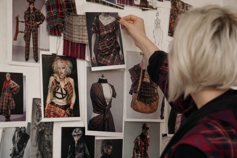
Common mistakes that make a Balenciaga-inspired board feel weak
Many boards fail for simple reasons that become obvious once you know what to look for. The first is overcollection. Too many images create visual noise and make the concept unreadable. The second is aesthetic imitation without structure. This happens when the board relies on dramatic photos but does not explain silhouette, material, or styling direction.
Another frequent issue is confusion between campaign moodboards and editorial moodboards. A campaign board needs stronger branding discipline and clearer product emphasis. An editorial board can allow more atmosphere and image play. Combining both approaches without hierarchy often produces a board that feels unfinished.
A final weakness is ethical carelessness. In light of the “I’m Not Your Moodboard” discourse and related allegations involving a Vietnamese designer, student designers, and emerging creatives, it is no longer enough to gather references casually. Professional-quality boards require selectivity, transformation of ideas, and awareness of how influence is being used.
Quick correction tips
If the board feels messy, cut the image count first. If it feels generic, clarify the concept sentence. If it feels visually strong but practically useless, add more proportion and material references. If it feels too close to one source, expand the reference base and rework the hierarchy. These are simple edits, but they often create the largest improvement.
Why this topic stays relevant in a fashion magazine and portfolio context
The lasting interest in the Balenciaga moodboard comes from how many functions the term now carries. It belongs to fashion students shaping portfolio work, editors discussing show aesthetics, industry readers tracking seasonal image language, and broader audiences watching controversy unfold through the lens of inspiration and ownership.
That wide relevance explains why the topic appears across gallery platforms, trade press, cultural publications, and moodboard documents. Each one captures a different slice of the same subject. Together, they show that the moodboard is not a minor visual accessory. It is one of the clearest ways fashion communicates intention before the final product arrives.
For readers using moodboards to build an outfit direction, plan a project, or sharpen a visual brief, the practical lesson is consistent: the best boards are selective, structured, and critically aware. They clarify the Balenciaga aesthetic rather than merely echoing it. They use branding logic, not just branding language. And they recognize that in contemporary fashion culture, image gathering is never purely neutral.
FAQ
What is a Balenciaga moodboard in fashion terms?
A Balenciaga moodboard is a curated visual board that organizes references connected to Balenciaga’s aesthetic direction, including silhouette, texture, palette, show atmosphere, and campaign cues. It functions as a planning tool rather than just a collage, helping define how a concept should look and feel before it is translated into outfits, editorials, or collection ideas.
Why do people search for “balenciaga moodboard”?
People usually search the term for one of three reasons: visual inspiration, analysis of Balenciaga’s aesthetic language, or context around controversy tied to the phrase “I’m Not Your Moodboard.” Some want outfit and branding references, while others want to understand how the moodboard relates to runway shows, campaigns, and public debate around inspiration.
How is a Balenciaga moodboard different from a general luxury fashion board?
A Balenciaga moodboard typically feels more specific in its proportion play, texture contrast, and atmospheric control. Instead of relying on broad luxury signals, it usually emphasizes stronger silhouette direction, a narrower palette, and a sharper relationship between clothing, branding, and cultural mood. That specificity is what makes it readable as Balenciaga rather than generic high fashion.
Which tools are most useful for building a Balenciaga-inspired moodboard?
Pinterest is effective for broad visual gathering, Photoshop is useful for detailed collage work, and Figma is strong for structured layouts and collaborative review. Behance works well when the board is ready to be presented as a polished portfolio piece. The right tool depends on whether the board is still exploratory or already in its final edited stage.
How can I create a Balenciaga aesthetic outfit from a moodboard?
Start by identifying the board’s main visual anchor, such as outerwear shape, denim structure, or a controlled tonal palette. Then build the outfit so supporting pieces reinforce that anchor instead of competing with it. The goal is to translate the board’s silhouette balance, texture logic, and overall mood into a wearable composition without copying one exact image.
What does the “I’m Not Your Moodboard” phrase mean in relation to Balenciaga?
The phrase refers to criticism around the use of designers’ or artists’ work as inspiration in ways that may feel extractive or too close to appropriation. In coverage connected to Balenciaga, it framed debate involving emerging or unnamed designers, including a Vietnamese designer and student-focused accusations. It shifted the word “moodboard” from a neutral creative term to one with ethical and cultural weight.
Can a Balenciaga moodboard include vintage references?
Yes, but the vintage material should support the board’s larger direction rather than dominate it. A Balenciaga aesthetic vintage approach works best when archival cues strengthen proportion, texture, or branding logic. If the board becomes too nostalgic or overly dependent on one archival image, it can lose clarity and drift away from a coherent present-day concept.
What are the most common mistakes when making this type of moodboard?
The most common mistakes are overloading the board with too many similar images, relying on mood without enough silhouette information, and blurring the difference between inspiration and replication. Another issue is mixing campaign, runway, and editorial references without hierarchy. A strong board is edited, readable, and built around a clear concept.
Why is Paris Fashion Week relevant to the Balenciaga moodboard conversation?
Paris Fashion Week matters because it is where private visual concepts often become public through runway sets, collection styling, and broader cultural framing. In Balenciaga’s case, discussions around Paris show design, pop-culture references like Euphoria, and overall visual mood make the moodboard visible as an atmosphere system, not just a behind-the-scenes design document.
Does a Balenciaga moodboard need to focus on clothing only?
No, but clothing should remain central. The strongest boards balance garments with supporting atmosphere, such as show cues, editorial imagery, or location references like Paris. If the board includes only clothes, it can feel narrow; if it includes only mood images, it can lose practical value. The most effective version connects outfit logic with a clear visual world.