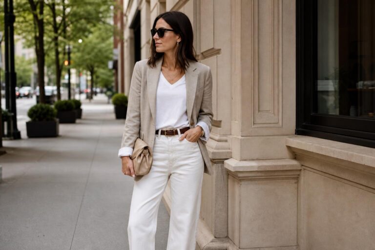

Spring Capsule Wardrobe Color Palette For Polished Style
There is a particular kind of calm that comes from opening a closet and seeing colors that already understand one another. Nothing competes. Nothing feels accidental. A strong capsule wardrobe color palette creates that effect: a wardrobe that looks edited, intentional, and fully wearable in real life.
The appeal is not only visual. A well-built palette reduces decision fatigue, gives wardrobe staples more range, and makes even practical pieces feel like part of a personal style identity. That is why capsule dressing continues to resonate across minimalist wardrobes, fashion editorials, brand blogs, and styling circles alike.
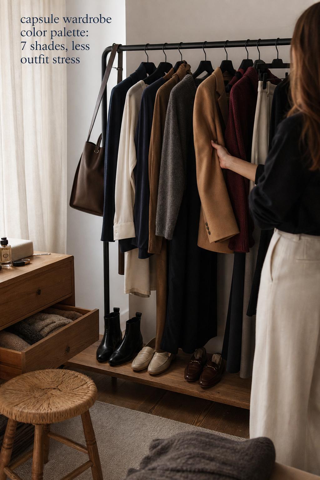
In everyday terms, this matters most on ordinary mornings. Workdays, travel days, seasonal transitions, last-minute plans, and budget-conscious shopping all become easier when your neutrals, accents, and silhouettes are working from the same visual language. The result feels polished without becoming rigid.
Aspirational wardrobes often fail because they look beautiful in isolation but collapse in daily use. A thoughtful capsule wardrobe color palette does the opposite. It turns style into a system: harmonious enough to feel elevated, flexible enough to survive the realities of climate, mood, and repeated wear.
Found the dress? Keep the rest in one place.
Zarellea brings guest details, vendors, timelines, and every next step together — so your wedding plan feels as good as your look.
Why color is the backbone of a capsule wardrobe
A capsule wardrobe is often discussed through item counts, checklists, and wardrobe staples, but color is the structure holding everything together. Before a blazer becomes useful or a knit becomes versatile, it has to belong to a palette that allows multiple combinations. Without that foundation, even good pieces stay isolated.
This is where many wardrobes become visually crowded. The problem is not always too many clothes. Often it is too many disconnected color stories. A navy trouser, ivory shirt, charcoal knit, and camel coat naturally create outfit cohesion because they share a common logic. Add random impulse shades with no relationship to those anchors, and the wardrobe starts to fragment.
There is also a psychology to this. Neutral colors and consistent accent choices create a recognizable visual identity, which supports what many style guides describe as personal brand. In practice, that means your wardrobe starts to feel like yours rather than like a collection of separate purchases made across different moods and seasons.
Top fashion and capsule-focused publishers approach this similarly, whether the tone is minimalist, practical, or trend-aware. The common thread is clear: the palette comes first, and the pieces follow.
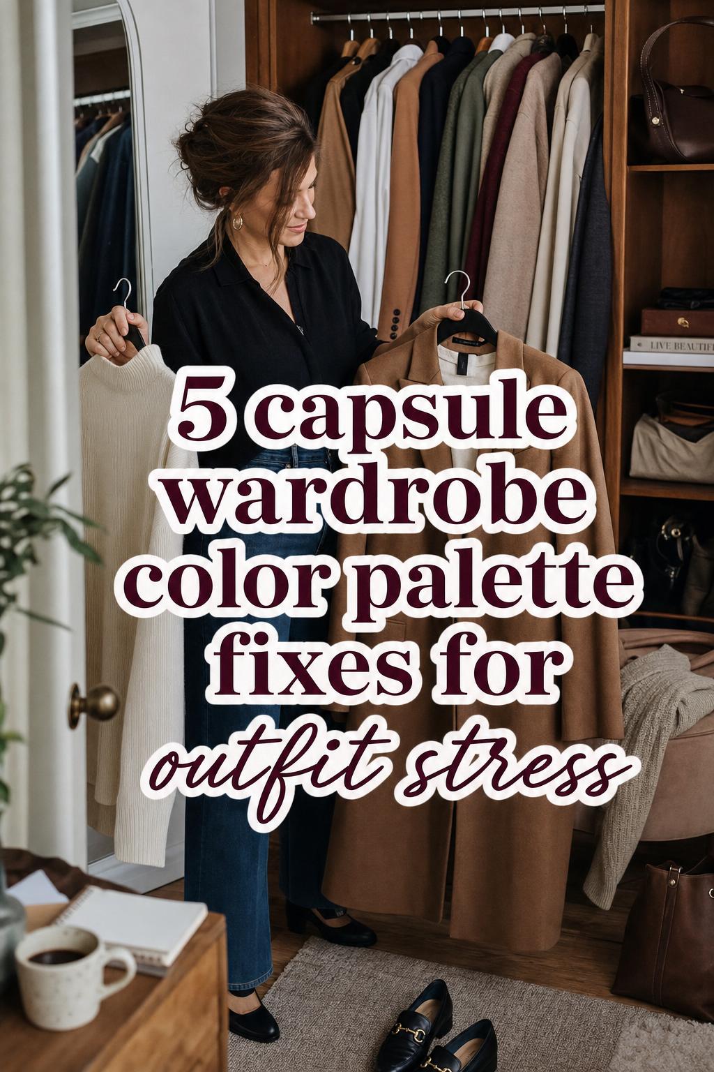
The three-part palette logic: neutrals, accents, and personal coloring
The most wearable palettes are rarely built from statement colors alone. They usually rely on three layers: core neutrals that do most of the work, accent colors that create interest, and a personalization layer shaped by undertones or color seasons. When these three levels are aligned, the wardrobe feels harmonious rather than flat.
Core neutrals that make a wardrobe function
Neutrals are the visual anchors of a capsule wardrobe. Across capsule-focused blogs and styling sites, the recurring palette language centers on black, white or ivory, navy, gray, camel, beige, taupe, charcoal, and espresso. These shades earn their place because they repeat well, pair easily, and support both casual and polished dressing.
Not every neutral belongs in every closet. A black-and-charcoal foundation creates a sharper, more urban effect. Ivory, camel, and taupe read softer and often feel warmer. Navy can replace black for readers who want structure without harsh contrast. The strongest wardrobes are not built from every neutral available; they are built from the right few.
Accent colors that prevent minimalism from feeling generic
Accent colors give a capsule wardrobe depth, mood, and individuality. They are the reason a closet can feel classic without becoming anonymous. Repeated accent examples across palette-focused content include forest green, burgundy, sage, powder blue, and coral, with seasonal shifts influencing which tones feel most current and wearable.
The role of accent colors is not to dominate every outfit. They operate best as controlled focal points. A forest green knit against charcoal trousers and ivory shirting brings richness without visual noise. Powder blue can soften a navy-and-white base. Burgundy adds depth to camel and gray. The effect works because the accent is limited and intentional.
Undertones and color seasons as the personalization layer
One of the clearest areas where many wardrobe palette discussions become too generic is personal coloring. Not every neutral flatters every person in the same way, and this is where undertones and color seasons become useful. Warm, cool, and neutral undertones influence which versions of beige, ivory, navy, gray, sage, or burgundy look most natural against the skin.
Seasonal color analysis adds another layer. Spring, summer, autumn, and winter palettes are often used to help narrow choices rather than dictate strict rules. Within a capsule wardrobe, this matters because a flattering palette tends to get worn more often. A color can be versatile on paper but still fail if it never feels right on the body.
A practical framework: 3 neutrals plus 2 accents
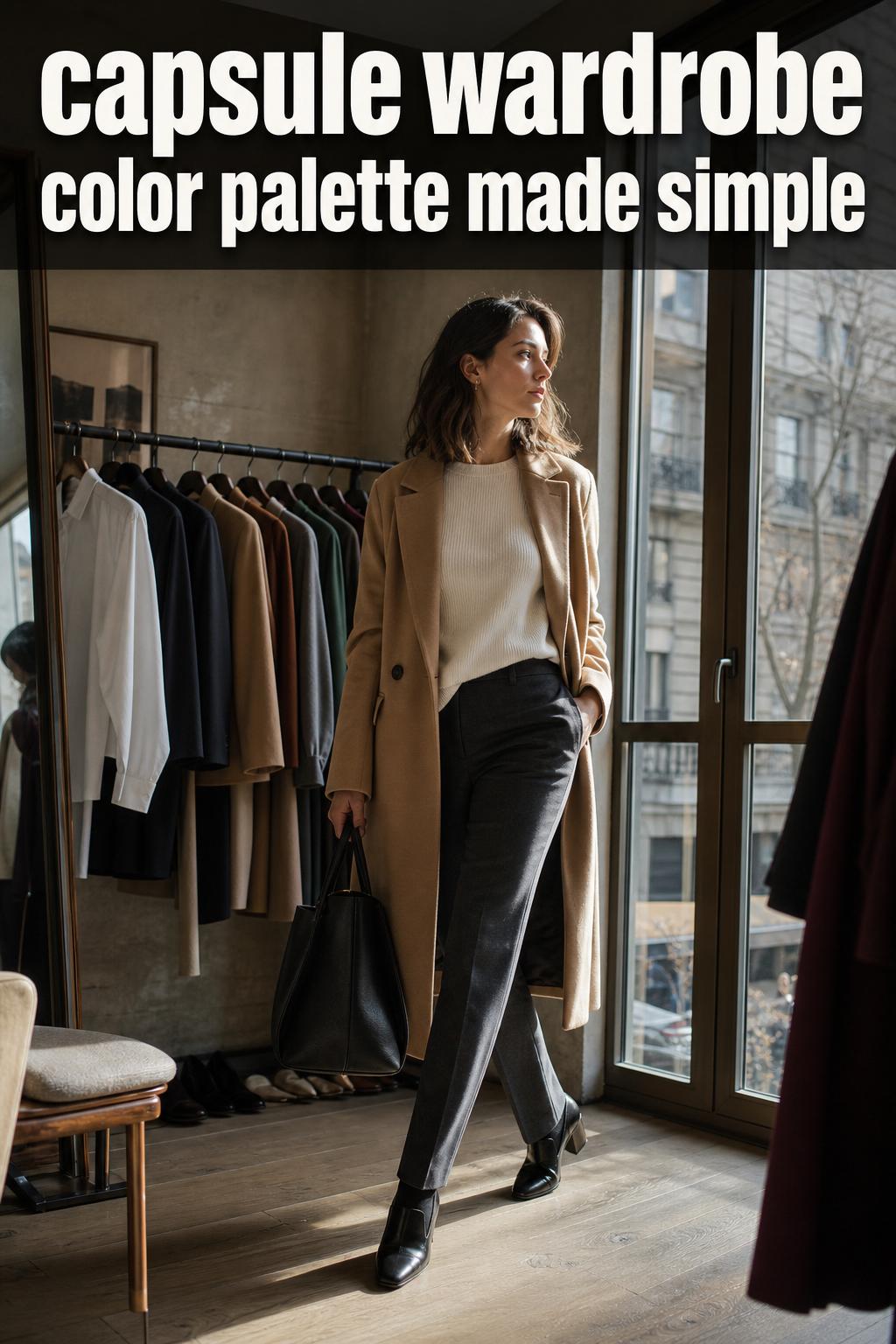
Many capsule articles discuss palettes in broad terms, but the most useful approach is a fixed, repeatable structure. A strong starting point is three baseline neutrals and two accent colors. This is narrow enough to create cohesion and broad enough to avoid boredom.
- Choose 3 neutrals that can appear in outerwear, trousers, knits, shoes, and basics.
- Add 2 accent colors that work with all three neutrals.
- Use one accent more often than the other so the wardrobe keeps a visual hierarchy.
- Reserve trend shades for small seasonal updates rather than the foundation of the closet.
This framework succeeds because it balances discipline with flexibility. It also maps well onto both a 15-piece mini capsule and a 30-piece capsule wardrobe checklist. The exact garments can shift by lifestyle, but the palette logic stays intact.
Step 1: identify your baseline neutrals
Start with the colors you want carrying the largest wardrobe categories: coats, trousers, denim alternatives, knitwear, shoes, and bags. If you love strong contrast, black, ivory, and charcoal create a crisp minimalist base. If you prefer softness, camel, taupe, and navy create a warmer and more dimensional mood.
This is also the stage where undertone matching matters most. A reader with warm coloring may find camel and beige more natural than icy gray. A cooler palette may respond better to navy, charcoal, and true white or cool ivory. Neutral undertones often have the most flexibility, but even then, consistency matters more than variety.
Step 2: choose one to two core accent colors
Accent colors should feel expressive, but they still need to cooperate with your neutrals. This is where many shopping mistakes happen. A beautiful color is not automatically a useful color. If a shade only works with one pair of pants or one jacket, it is operating more like a special-occasion purchase than a capsule piece.
Sage works especially well with ivory, taupe, camel, and soft navy. Burgundy has stronger depth and pairs cleanly with charcoal, camel, gray, and black. Powder blue can brighten navy and white combinations without feeling loud. These accents add range while keeping the outfit composition controlled.
Step 3: add a complementary color family only if your lifestyle supports it
Some wardrobes need a little more movement across seasons. In that case, a complementary color family can create flexibility, especially between spring and fall transitions. The key is not to mistake more options for better styling. A second color family should support the first, not compete with it.
For example, a neutral base of ivory, taupe, and navy with sage as the main accent can absorb powder blue in spring and summer. A charcoal, black, and camel base with burgundy can extend naturally into forest green for fall and winter. The connection between shades should feel deliberate, not merely adjacent.
Step 4: map the palette to a real capsule
A color palette becomes practical only when it is translated into wardrobe staples. This is where a 30-piece baseline can be useful. The exact count is less important than making sure every category is represented by colors that actually mix.
- Outerwear and tailoring: mostly neutrals
- Tops and knitwear: primarily neutrals with selected accent repetition
- Bottoms: two or three dependable neutral shades
- Dresses or one-piece options: neutrals or your strongest accent
- Shoes and bags: repeat your dominant neutrals to reinforce cohesion
This mapping prevents a common problem: having a beautiful palette on paper but no practical distribution in the closet. If all your accent colors live in tops while your shoes and outerwear sit outside the same system, the wardrobe still resists easy outfit building.
How a 30-piece capsule wardrobe checklist works with color
Some of the strongest capsule guides connect color selection to a fixed wardrobe count because numbers create discipline. A 30-piece capsule wardrobe checklist is not valuable because 30 is a magic number. It is valuable because it forces prioritization. When space is limited, every color has to justify its place.
In a 30-piece closet, neutral repetition does not mean monotony. It means strategic coverage. If navy appears in trousers, a blazer, knitwear, and a shoe category, those pieces begin to cross-support one another. The same logic applies to ivory shirting, camel outerwear, gray knitwear, or black footwear. Repetition is what turns separate garments into a functioning wardrobe.
Accent colors then become controlled points of personality. A sage blouse worn with taupe trousers and ivory layers adds freshness without breaking the system. Burgundy knitwear paired with charcoal tailoring creates depth. The checklist keeps the wardrobe practical; the palette keeps it beautiful.
Wearable palette directions for different style identities
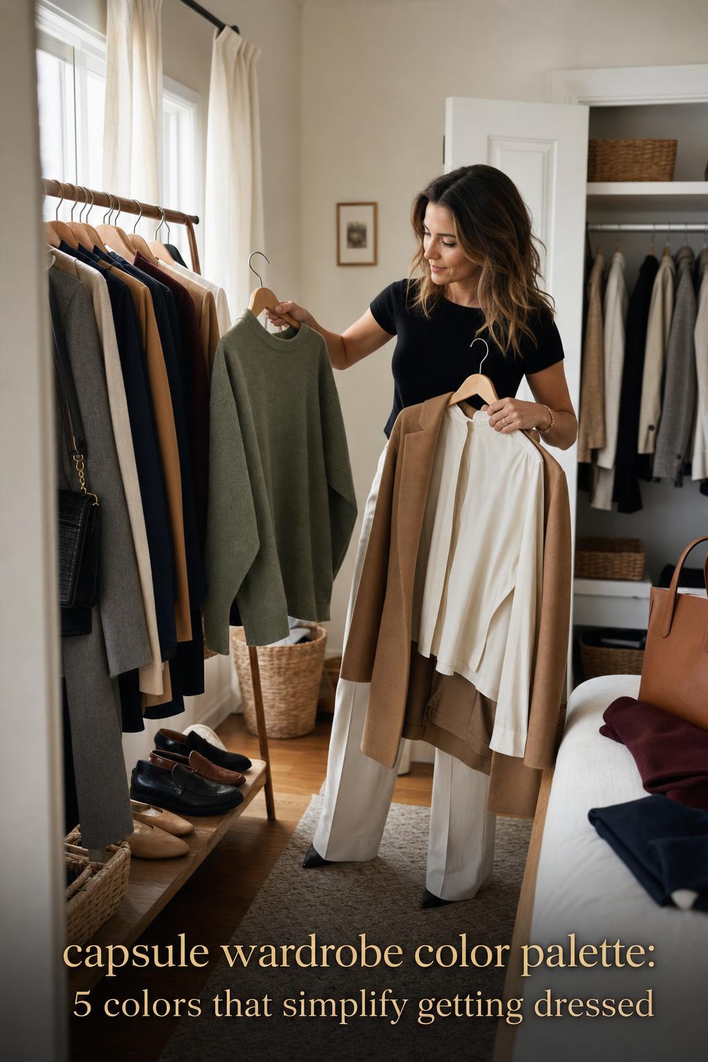
Not every capsule wardrobe should look minimalist in the same way. Personality, industry, mood, and lifestyle all shape how color should behave. The goal is not uniformity. The goal is coherence within your own styling language.
Quiet structure with a classic minimalist mood
This direction relies on strong neutrals and low visual noise. Think navy, ivory, charcoal, camel, and occasional black. The effect is polished, restrained, and highly adaptable for work, travel, or city dressing. It mirrors the kind of wardrobe logic that appears often in minimalist wardrobe content because it consistently delivers outfit coverage.
Why this works: classic neutrals create tonal layering without requiring trend-heavy styling. The visual anchor usually comes from tailoring or outerwear, while knit textures and subtle contrast add enough variation to keep the palette from feeling flat.
Most versatile item: a navy or camel layer that can sit over ivory, gray, taupe, or black basics. When the outerwear color belongs to the core palette, the entire wardrobe appears more expensive and more coherent.
Soft modern color with a playful edge
A softer capsule wardrobe color palette often begins with ivory, beige, taupe, and soft navy, then introduces sage, powder blue, or coral in measured doses. This approach feels lighter and more current, especially for spring and summer capsule dressing, while still preserving the logic of interchangeable pieces.
The styling power here comes from restraint. One powder blue shirt against taupe trousers and ivory knitwear feels intentional. Multiple pastel directions introduced at once can dilute the wardrobe. The elegance comes from using a playful accent within a disciplined structure.
Seasonal adaptation tip: in warmer months, let the lighter accent appear in tops and dresses. Keep bags, shoes, and tailoring in the same neutrals so the wardrobe does not lose its visual center.
Deep contrast for a bold but controlled wardrobe
Bold dressing within a capsule does not require constant bright color. Often it is stronger to use deep, saturated shades against grounded neutrals. Charcoal, black, and espresso can support forest green or burgundy particularly well, creating a wardrobe that feels rich rather than loud.
This palette suits readers who want presence without sacrificing repeat wear. The silhouettes can remain simple while the color depth does the work. A burgundy knit, charcoal trouser, and black shoe combination has enough intensity to feel directional, yet it still functions as everyday dressing.
Styling mistake to avoid: using too many dark shades without a point of relief. Ivory, softer gray, or even a cooler navy can open the palette and stop it from becoming visually heavy.
Three sample capsule wardrobe color palettes that translate to real life
Examples help because color theory is easier to understand when attached to actual wardrobe decisions. These sample palettes are not rigid formulas. They are wearable structures that show how neutrals and accents can distribute across a closet.
Neutral foundation palette: ivory, taupe, navy, with gray support
This palette is especially effective for readers who want quiet sophistication. Ivory brightens without the starkness of pure white. Taupe softens the wardrobe. Navy grounds it. Gray extends the palette into knitwear and tailoring without creating harsh contrast.
Why this combination works: the colors sit close enough in intensity to allow tonal layering, but there is still enough contrast to keep silhouettes readable. This is an ideal palette for wardrobe staples, especially when the goal is maximum outfit interchangeability.
Spring and summer palette: ivory, camel, soft navy, plus sage and powder blue
This interpretation leans airy without becoming overly delicate. Camel prevents the lighter tones from drifting into sweetness, while soft navy gives structure. Sage and powder blue bring freshness in a way that still feels grounded. It is especially practical for seasonal shifts, where readers want lighter color but still need the wardrobe to remain efficient.
Easy way to recreate the look: keep bottoms and layers in camel, navy, or ivory, and let sage or powder blue appear in tops, light knitwear, or one statement piece per outfit. The accent shades should lift the palette, not dominate it.
Fall and winter deep palette: charcoal, espresso, camel, plus forest green and burgundy
This palette creates a more substantial mood and works well for colder seasons or readers who prefer visual richness. Charcoal and espresso create depth, camel prevents the wardrobe from feeling too severe, and forest green with burgundy add controlled drama.
Key piece breakdown: in this kind of palette, outerwear and shoes should stay firmly within the neutrals. Let forest green and burgundy appear in knitwear, scarves, or selected tops so the overall wardrobe remains anchored.
Color seasons, undertones, and why some palettes feel better on the body
Two wardrobes can be equally cohesive and still produce different results depending on the person wearing them. That is the practical value of color analysis. When people talk about spring, summer, autumn, and winter palettes, they are usually trying to explain why certain color families create more harmony with individual coloring.
Warm undertones often align more comfortably with camel, beige, ivory, sage, and some softer earthy shades. Cool undertones may prefer navy, charcoal, cool gray, powder blue, or sharper contrast. Neutral undertones can borrow from both directions, but the strongest result still comes from repeating the colors that feel most natural rather than collecting every flattering option.
This is especially helpful when shopping online. If a reader already knows that warm ivory is better than bright white, or that cool charcoal is more useful than camel, impulse decisions become easier to edit. Personal color analysis does not replace wardrobe planning; it sharpens it.
Tip: test color before you commit to a full category
If you are unsure whether a color belongs in your capsule wardrobe color palette, test it in a smaller category first. A knit, scarf, or top reveals more about compatibility than buying a coat or tailored trouser immediately. This is a low-risk way to evaluate both skin harmony and wardrobe utility.
Palette curation in a digital wardrobe: photos, moodboards, and hex code thinking
Modern capsule building increasingly moves between physical clothes and digital planning. Moodboards, saved product pages, outfit photos, and palette tools can all make the process more precise. That matters because many wardrobe mistakes happen before a purchase arrives. They begin when colors are imagined as compatible but never actually viewed together.
Using personal photos to generate a wardrobe direction can be especially revealing. It shows which colors dominate your most-worn outfits, where repetition already exists, and which purchases sit outside your natural palette. Some newer styling approaches also reference hex codes as a way to create cleaner digital moodboards and compare close variations of beige, navy, sage, or burgundy.
AI-assisted palette builders are becoming part of that conversation as well. Their practical value is not that they make final style decisions for you. It is that they help visualize combinations, test color families, and build outfit suggestions around a more disciplined framework. Used well, they support judgment rather than replace it.
Practical checks before buying
- Compare the new item against your three main neutrals, not just one favorite piece.
- Review outfit photos to see whether the color repeats naturally in your existing wardrobe.
- Ask whether the shade works across at least two seasons if it is intended as a core piece.
- Use a digital moodboard if the color is close to a tone you already own, such as taupe versus beige or navy versus charcoal.
Where style theory meets everyday wearability
The strongest capsule wardrobe color palettes are not merely attractive in flat lays or curated images. They survive laundry cycles, work schedules, changing weather, and repetitive wear. That is where styling logic matters more than trend language.
For example, a wardrobe can look beautiful in a gallery of spring tones, but if the reader lives through colder mornings, office air-conditioning, or long commuting days, the palette still needs enough grounding in navy, charcoal, camel, or ivory to support layers. Seasonal palettes work best when they migrate from a stable base rather than replacing it entirely.
This is also why many stylists and capsule-focused brands emphasize a repeatable system over dramatic novelty. Whether the source is a personal style site like Destination Iman, a color analysis platform, a stylist-led blog such as Capsule Closet Stylist or Mademoiselle, or a fashion publisher like Woman & Home, the practical lesson is consistent: wearable wardrobes need structure.
US shopping considerations: climate, availability, and budget
For U.S. readers, a palette has to work across varied climates, retail cycles, and spending realities. A strong wardrobe foundation should be stable enough to adapt whether you are shopping during seasonal drops, replacing basics gradually, or balancing a limited budget with a desire for a more coherent closet.
This is where a neutral-led approach becomes especially practical. Core neutrals are generally easier to find across retailers and more likely to remain available in recurring categories such as trousers, knitwear, outerwear, and shoes. Accent colors often shift more quickly with seasonality, so it makes sense to buy those selectively.
Budget also changes how you should distribute color. If you are investing carefully, place your strongest neutrals in the more expensive categories first: coats, tailoring, bags, and shoes. Let accent colors enter through less costly pieces or seasonal updates. That keeps the wardrobe cohesive even when purchases happen slowly.
Tips for shopping a palette instead of shopping isolated pieces
- Buy foundational neutrals first, especially in outerwear and footwear.
- Do not duplicate near-identical shades unless they add real function.
- Use accent colors where repetition is realistic, not aspirational.
- Adapt the palette to climate rather than forcing a seasonal trend that does not match your actual wardrobe needs.
Brand and editorial influences shaping the modern capsule palette
The current conversation around capsule wardrobes is shaped by a mix of sources: editorial publishers, independent stylists, personal style sites, e-commerce blogs, and color analysis platforms. Closette approaches the subject through practical structure and a checklist mindset. Capsule and Kovlos frame the palette through modern wardrobe simplicity. Woman & Home brings seasonal editorial emphasis, especially around spring dressing.
Stylist-led spaces such as Capsule Closet Stylist and Mademoiselle tend to push the conversation closer to personal coloring and wardrobe harmony, while AI Color Analysis introduces a more visual, analysis-driven layer. Destination Iman adds a personal style lens rooted in staple building and palette foundations. Taken together, these perspectives reinforce a useful truth: a successful palette lives at the intersection of taste, system, and realism.
That variety also explains why there is no single ideal capsule wardrobe color palette for everyone. What remains stable is the method: establish neutrals, select accents carefully, personalize through undertones and color seasons, and map the result to actual wardrobe pieces.
Common palette mistakes that make a capsule feel less functional
Many wardrobe frustrations can be traced to a few repeated missteps. These are less about taste and more about structure. Even beautiful clothing can feel unwearable when the palette lacks hierarchy or practical distribution.
- Choosing too many neutrals at once, which weakens the clarity of the wardrobe.
- Buying accent colors that do not pair with outerwear, shoes, or bottoms already owned.
- Ignoring undertones, which can make an otherwise sensible palette feel off on the body.
- Building a spring palette or fall palette that does not connect back to year-round foundation colors.
- Letting trend shades enter expensive categories before the core palette is established.
Why this matters: a capsule wardrobe is not simply smaller shopping. It is edited shopping. The objective is not reducing color for its own sake, but making sure each color increases outfit possibilities.
A 14-day wardrobe audit to refine your palette
If your closet already contains useful pieces but still feels visually inconsistent, a short audit can reveal what is actually happening. Over 14 days, photograph or note the outfits you wear most confidently. Then review the recurring colors. You will often notice that the wardrobe already favors certain neutrals and avoids others.
This process is especially useful for readers who feel torn between trend inspiration and practical dressing. The audit highlights the colors that survive real life: the shades you reach for when dressing quickly, layering for weather, or repeating a favorite formula. Those colors deserve to become the foundation.
A wardrobe audit also shows where your palette is breaking down. If beautiful accent tops never get worn because they do not align with your bottoms, shoes, or layers, the issue is not that you need more clothes. It is that your color system needs editing.
Building a capsule wardrobe color palette that still feels like you
The most successful palettes do not erase personality in favor of restraint. They clarify it. A wardrobe can be minimalist, playful, deep-toned, classic, or seasonally expressive and still follow a disciplined palette structure. What matters is that the colors support one another and support the way you actually dress.
That is why the best capsule wardrobes never feel sterile. They use neutrals as architecture, accents as mood, and personal coloring as a filter. The result is not a closet that looks identical to everyone else’s, but one that feels composed, repeatable, and unmistakably personal.
When a palette is working, style becomes less about constant searching and more about subtle refinement. The closet looks calmer. Outfits come together faster. And getting dressed starts to feel less like a decision and more like a language you already know how to speak.
FAQ
How many colors are enough for a capsule wardrobe?
A strong starting point is three neutrals and two accent colors. This gives enough variety for outfit building while keeping the wardrobe cohesive. You can expand later, but starting narrow usually creates a more functional foundation.
What are the best neutral colors for a capsule wardrobe?
The most reliable neutral colors are black, ivory or white, navy, gray, camel, beige, taupe, charcoal, and espresso. The best choice depends on your personal coloring, preferred level of contrast, and the overall mood you want your wardrobe to project.
How do I choose accent colors for my capsule wardrobe color palette?
Choose one or two accent colors that pair well with all of your core neutrals. Sage, burgundy, forest green, powder blue, and coral are useful examples because they can add personality without making the wardrobe harder to style.
Should my palette change with the seasons?
Yes, but the shift should usually happen through accent colors rather than a complete reset. A stable neutral base can move from spring to winter more easily, while seasonal accents bring freshness without disrupting the overall wardrobe structure.
Do undertones really matter when building a capsule wardrobe?
Yes. Undertones affect how natural and flattering a color looks against your skin, which directly influences how often you will wear it. Warm, cool, and neutral undertones can help guide whether shades like camel, navy, ivory, gray, or sage feel right for your palette.
Can I have a colorful capsule wardrobe and still keep it practical?
Yes, as long as the color has structure. A colorful capsule works best when deep or expressive shades are anchored by dependable neutrals. The goal is not avoiding color, but using it in a way that still supports repeat outfits and easy coordination.
How do I test whether a new color works before buying more of it?
Start with one smaller item, such as a knit or top, and see how often it pairs well with your existing neutrals, shoes, and layers. You can also use outfit photos or a digital moodboard to check whether the shade integrates naturally with your current wardrobe.
Is a 30-piece capsule wardrobe better than a 15-piece one?
Neither number is universally better. A 30-piece capsule can offer more lifestyle coverage, while a 15-piece version creates stronger discipline. What matters most is that your color palette is clear enough for every piece to work across multiple outfits.
What is the biggest mistake people make with capsule wardrobe palettes?
The most common mistake is choosing attractive colors that do not relate to the rest of the wardrobe. A capsule fails when shades are bought in isolation rather than as part of a system. Cohesion matters more than the appeal of any single item.